Things You Didn’t Know CSS Grid Could Do
 brian treese
With CSS grid we can do some pretty amazing things. We can easily place items in the center of containers. We can stack items without positioning. We can create complex layouts quickly with ease. And, we can even animate to unknown heights which used to be near impossible without using Javascript. So, in this post we’ll look at a few of my favorite grid provided abilities. Alright, let’s get to it!
Placing Grid Items in the Center
Positioning items in the center of a container vertically used to be surprisingly difficult. With flexbox it got a lot easier. And now with grid, we can do it in just two lines of code. Let’s look at an example.
Let’s say we want to place a blue square in the center of a box with a border. Well, all we need to do is add display:grid; to the outer container with the border.
div {
  ...
  display: grid;
}
And then, we can just add place items, center.
div {
  ...
  place-items: center;
}
It’s just that easy.
Stacking Multiple Items in the Center
With CSS grid, we can even add another item, in the same cell and center it without any positioning. Here, we’ll add an after pseudo element. We’ll make it a purple circle. And, we'll simply place each of these items in the first cell with grid-column and grid-row properties:
div::before,
div::after {
  ...
  grid-column: 1;
  grid-row: 1;
}
We’ll see that they are now stacked on top of each other in the center. This is a slick way to do this type of thing for sure. Here's the final working example:
CSS Layout Without Positioning or Negative Margins
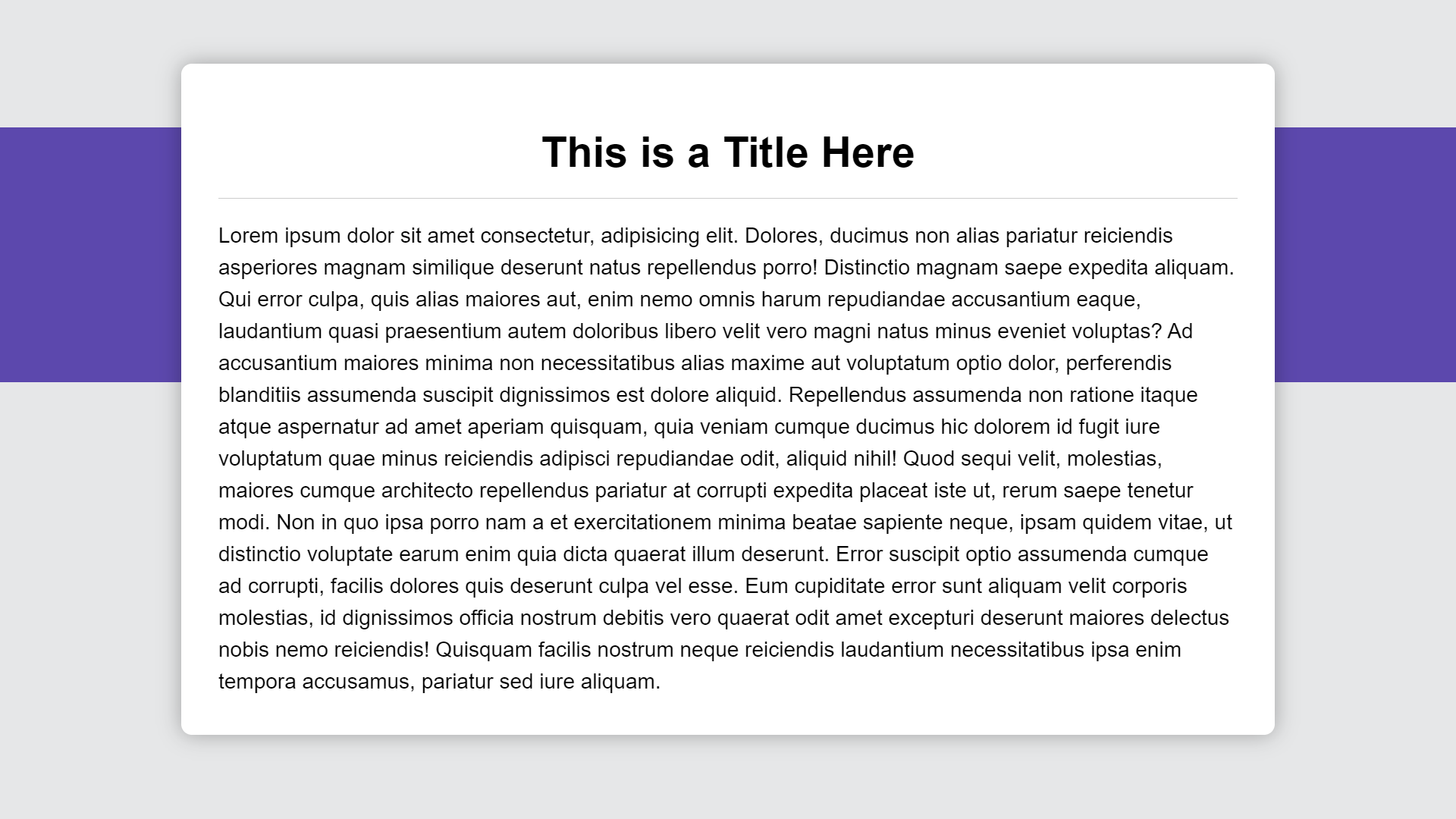
Along these lines, grid allows us to pretty easily pull of some layouts that used to require more complicated positioning or negative margins. For example, this style of layout is fairly common.

But how do you get this purple bar in the background here with the content on top? With grid, this is easy.
First thing we need to do is set the container to display:grid;.
.container {
  ...
  display: grid;
}
Then, we need to set up our rows, so we add our grid-template-rows property. We’ll make the first row 3em, this will be the transparent area above the purple bar. We’ll make our second row 12em. This is the row that our purple bar will go in. And the last row will just be auto sized to the remaining content. This will be the transparent area underneath the purple bar.
.container {
  ...
  grid-template-rows: 3em 12em auto;
}
Now we need to place both of these items into a single grid column. We can do this with the grid-column property. We will start at the first column and end on the last column. When we use -1, this means the column will always extend to the end of the last column even if we were to add more columns.
.container::before {
  ...
  grid-column: 1 / -1;
}

.content {
  ...
  grid-column: 1 / -1;
}
Ok, so now both items will sit in the same grid column, let’s place the purple bar. Since the first row is reserved for the area above the bar, we will be placing it on grid-row two.
.container::before {
  ...
  grid-row: 2;
}
Ok, now our content is going to span all three rows. So we’ll start on grid-row 1, and in this case, since we have a specific number of rows defined, like our grid column, we can add a value of -1.
However, it’s important to note that this would not work if we hadn’t explicitly defined our grid rows and we dealing with a dynamic number of rows. But for this example, with the explicit rows, this works out perfectly.
.content {
  ...
  grid-row: 1 / -1;
}
No positioning or negative margins needed. Here's the final working example:
CSS Transition to an Unknown Height
This final example is probably my favorite. You can now easily transition to an unknown height. Now, you could kind of, so of, almost pull this off by transitioning a max-height before grid was available but it was always a little strange because you needed to specify a really large arbitrary value to animate to. Well, not anymore. Since the fractional unit is a transitional property, we can simply use it now.
So, here in this example, we'll have a button that toggles our content. It does this by toggling an expanded class on our container with JavaScript. To show and hide this content, we are switching between 0fr when it’s collapsed and the 1fr when the expanded class is added.
Well, since fr is an animatable property, we can simply add a transition to ease our grid-template-rows property when it changes.
.content {
  display: grid;
  grid-column: 1 / -1;
  grid-row: 1 / -1;
  grid-template-rows: min-content 0fr min-content;
  transition: grid-template-rows 0.5s;
}

.expanded {
  grid-template-rows: min-content 1fr min-content;
}
And now, when we click the button we can see that it’s simply easing between an unknown height and a known height. Check out the working demo:
So hopefully these tips help to ease some of your day to day workflow working with CSS. If you found it helpful, or heck, even if you hated it, let me know with a comment below.
Until next time, thanks for reading!
Found This Helpful?
If you found this article helpful and want to show some love, you can always buy me a coffee!
Subscribe to my newsletter
Read articles from brian treese directly inside your inbox. Subscribe to the newsletter, and don't miss out.
Written by
