Angular Animations Tutorial: Enter & Leave
 brian treese
Table of contents
- Before We Get Started…
- The Demo Application
- Conditionally Injecting the Menu Component With @if and a Boolean Property
- Creating the Enter Animation Using the transition(), style(), and animate() Methods With the :enter Alias
- Creating the Leave Animation Using the transition(), style(), and animate() Methods With the :leave Alias
- Simplifying the Animations With a Few JavaScript Variables
- Found This Helpful?
- Want to See It in Action?

When building things with Angular have you ever found yourself with the need to animate mark-up as it physically enters and leaves the DOM? This isn’t possible right? Actually, it is. In Angular we have access to a powerful animation framework. It’s packed with many features that just aren’t possible, at least at the moment, with CSS by itself. In this post we’re going to dive into one such feature, the ability to animate mark-up as it’s added and removed from the document with the :enter and :leave aliases. Alright, let’s get to it!
Before We Get Started…
Ok, before we get too far into it, if you haven’t seen my previous post on the basics of Angular animations, you’ll probably want to check it out first. We covered how to include the animations module and some of the basics of the API. So, if you’re not familiar with these concepts, the examples in this post might not make much sense.
Angular Animation Tutorials:
Ok, onto the example for this post.
The Demo Application
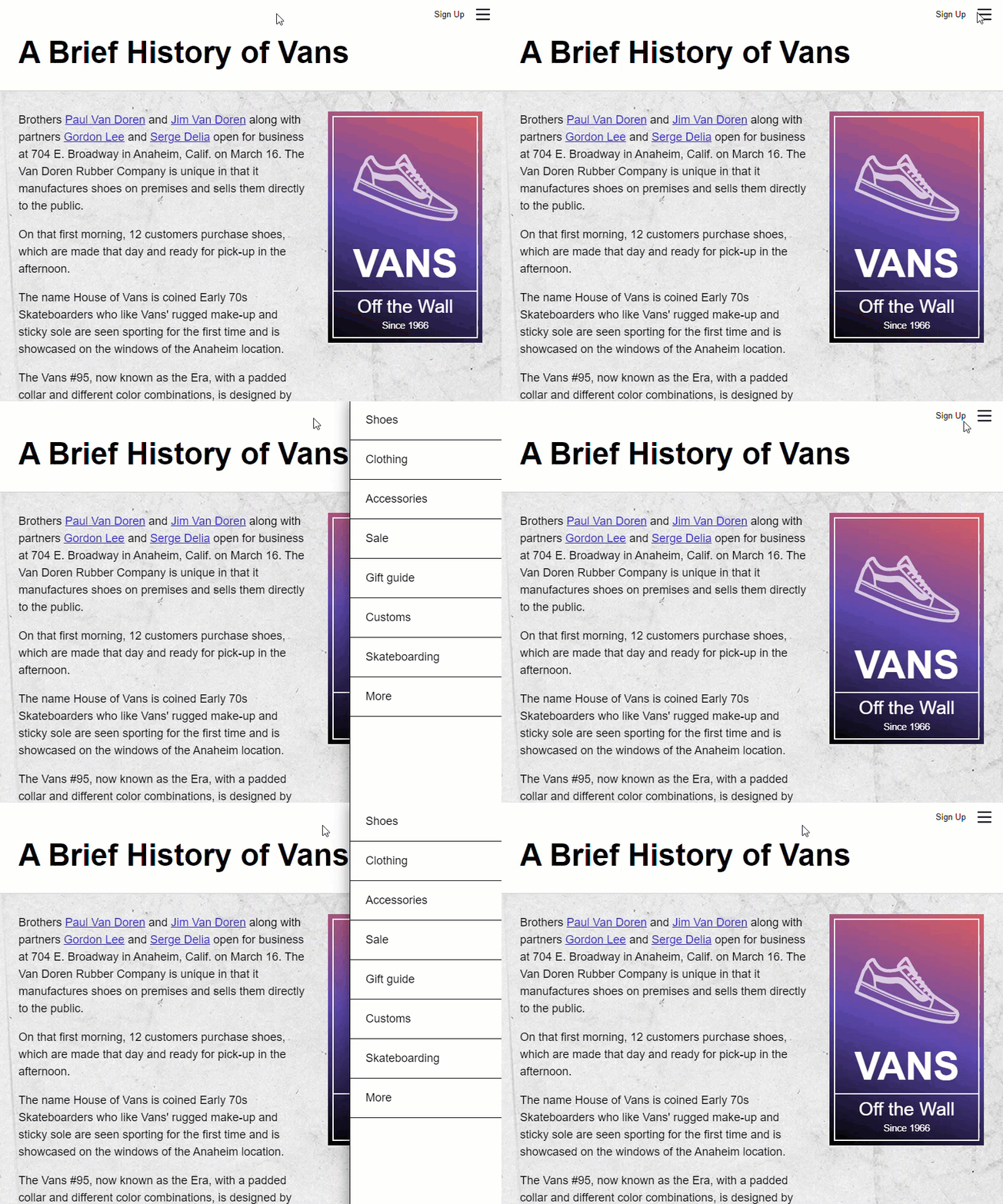
Here’s the application that we’re starting with. Currently our menu is always in the DOM, and we’re transitioning it as it opens and closes using the Angular state-based animation that we added in the previous post.

In this example, we’re actually going to change this logic so that the menu will be removed from the DOM when it’s closed and added when it’s opened. One way to do this is wrap our menu in an if statement.
Conditionally Injecting the Menu Component With @if and a Boolean Property
For this we’ll start by adding a new Boolean property called “menuOpen”, and we’ll initialize it to false.
main.ts
@Component({
    selector: 'app-root',
    ...
})
export class App {
    ...
    protected menuOpen = false;
}
Now, we’ll add our if statement around our menu component and the condition will be the value of our new “menuOpen” property. Let’s go ahead and remove the old “menuState” property because we’re going to switch to our new Boolean property instead. On our page content component “menuClick” event, we’ll instead set our “menuOpen” value to true. And on our menu component “close” event, we’ll set it to false. This will properly handle the display toggling for the menu. Also, we can leave the “openClose” animation trigger on our menu component, but we’ll unbind it from our old property.
@Component({
    selector: 'app-root',
    template: `
        <app-page-content (menuClick)="menuOpen = true"></app-page-content>
        @if (menuOpen) {
            <app-page-menu @openClose (close)="menuOpen = false"></app-page-menu>
        }
    `,
    ...
})
export class App {
    protected menuOpen = false;
}
Ok, let’s save and make sure this is working correctly.

Ok, it’s still opening and closing correctly but it’s not transitioning like we want. We need to change our animation to handle this first.
Creating the Enter Animation Using the transition(), style(), and animate() Methods With the :enter Alias
To change our animation to support an entering and leaving animation we’ll start by adding another transition() method. This time we’re going to use the :enter alias for our state change expression. It may be obvious, but in case it’s not clear, this will allow the menu to transition as it enters the DOM.
@Component({
    selector: 'app-root',
    animations: [
        trigger('openClose', [
            transition(':enter')
        ])
    ],
    ...
})
Ok, then we have our array of animations. First, we’ll pass the state that we want our menu to animate from when it enters. We’re going to want it to start translated out of view and transition it into its final open spot. So, we’ll use the style() method and pass it a transform value of translateX, one hundred twenty percent.
@Component({
    selector: 'app-root',
    animations: [
        trigger('openClose', [
            transition(':enter', [
                style({ transform: 'translateX(120%)' })
            ])
        ])
    ],
    ...
})
Next, we add the animate() method. The first parameter will be our duration and easing function as a string, so one second and an easing function of ease-in. And, for the second parameter, we need to pass it the value that we want to animate to. So, we’ll use the style() method again and we’ll pass a transform with a translateX value of zero this time.
@Component({
    selector: 'app-root',
    animations: [
        trigger('openClose', [
            transition(':enter', [
                style({ transform: 'translateX(120%)' }),
                animate('1s ease-in', style({ transform: 'translateX(0)' }))
            ])
        ])
    ],
    ...
})
Ok, so that’s the animation for when it enters, next we need to handle when it leaves.
Creating the Leave Animation Using the transition(), style(), and animate() Methods With the :leave Alias
For this, let’s copy the enter transition. Now we’ll use the :leave alias. And for our from state, let’s switch this to zero. And, for our to state, we’ll leave the duration and easing as is and we’ll switch the translateX to one hundred twenty percent.
@Component({
    selector: 'app-root',
    animations: [
        trigger('openClose', [
            ...
            transition(':leave', [
                style({ transform: 'translateX(0)' }),
                animate('1s ease-in', style({ transform: 'translateX(120%)' }))
            ])
        ])
    ],
    ...
})
Ok, that’s it. Let’s save and take a look.

Nice, now it transitions again as it opens, and when we click on the shield, it eases out as it closes.
When you sit back and think about this, it’s really pretty cool. The markup is injected into the document and immediately transitioned to its opened state. And then on the flip side, when it’s closed, it isn’t removed from the document until the animation completes. Pretty neat.
Simplifying the Animations With a Few JavaScript Variables
Something else we can do here is simplify this code a little with a few variables. Let’s add a variable called “hidden”, and put our style object for our hidden state as the value. Then we can replace the two instances of this style with the variable.
...
const hidden = { transform: 'translateX(120%)' };

@Component({
    selector: 'app-root',
    animations: [
        trigger('openClose', [
            transition(':enter', [
                style(hidden),
                animate('1s ease-in', style({ transform: 'translateX(0)' }))
            ]),
            transition(':leave', [
                style({ transform: 'translateX(0)' }),
                animate('1s ease-in', style(hidden))
            ])
        ])
    ],
    ...
})
Next let’s add a variable for our “visible” state and give it our visible style object. Then we’ll replace these instances with our visible variable.
...
const visible = { transform: 'translateX(0)' };

@Component({
    selector: 'app-root',
    animations: [
        trigger('openClose', [
            transition(':enter', [
                style(hidden),
                animate('1s ease-in', style(visible))
            ]),
            transition(':leave', [
                style(visible),
                animate('1s ease-in', style(hidden))
            ])
        ])
    ],
    ...
})
And then let’s create one more variable for our animation duration and timing string. And then we’ll replace both instances with this variable too.
...
const timing = '1s ease-in';

@Component({
    selector: 'app-root',
    animations: [
        trigger('openClose', [
            transition(':enter', [
                style(hidden),
                animate(timing, style(visible))
            ]),
            transition(':leave', [
                style(visible),
                animate(timing, style(hidden))
            ])
        ])
    ],
    ...
})
There. Not a huge difference but that will make it a little easier to maintain in the long run.
Ok, so now you should have the ability and know-how to animate items as they are added and removed from the DOM in Angular.
Now, like I mentioned in the last post on Angular Animations, there’s a lot to the animation framework so I’ll go ahead and stop here for now, but I will be creating several more posts covering much more on Angular animations very soon.
Found This Helpful?
If you found this article helpful and want to show some love, you can always buy me a coffee!
Want to See It in Action?
Check out the demo code and examples of these techniques in the in the stackblitz example below. If you have any questions or thoughts, don’t hesitate to leave a comment.
Subscribe to my newsletter
Read articles from brian treese directly inside your inbox. Subscribe to the newsletter, and don't miss out.
Written by
