Key Takeaways from the Oracle Analytics Cloud January 2024 Update
 Federico Venturin
In a previous article published on the Rittman Mead's blog, I provided an overview of the features included in the January 2024 Update for Oracle Analytics Cloud. I had the opportunity to test it further recently, and in this article I'm going to share my key takeaways about this experience.
The Best Things Happen Unexpectedly
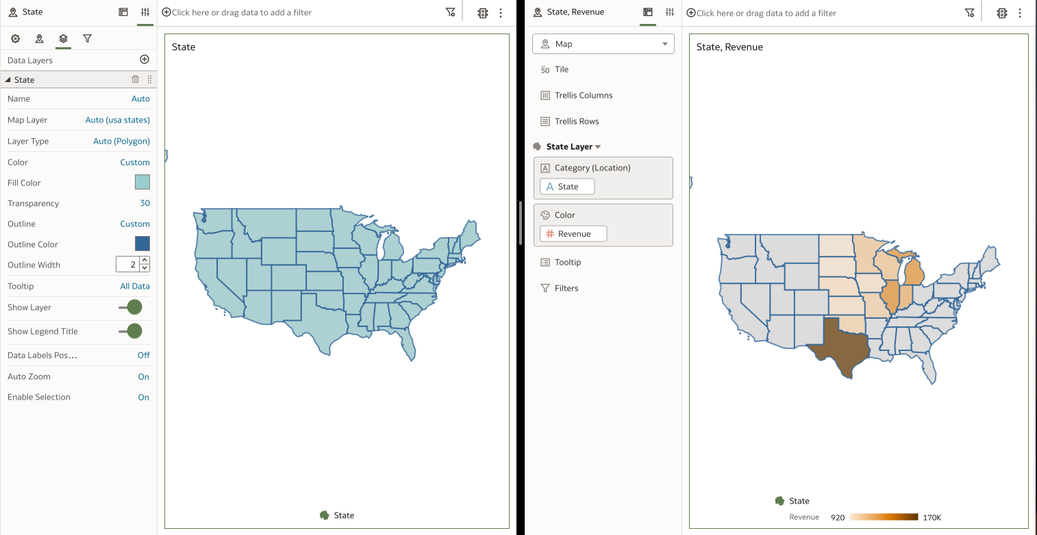
When I read for the first time about the enhanced formatting options for map layers, I didn't realize how useful they could actually be. I was skeptical at the beginning because as soon as you include a measure column to a Map visualization, any default formatting that you previously defined for a map layer gets overwritten (Figure 1).
 Figure 1. The default map layer formatting (left) gets overwritten when measure columns are added to the Map visualization (right)
However, they quickly became my favourite features from this update, and have proved to be extremely useful in the following circumstances:
You need to plot only attribute values on a map such as the location of your customers, suppliers, offices or warehouses.
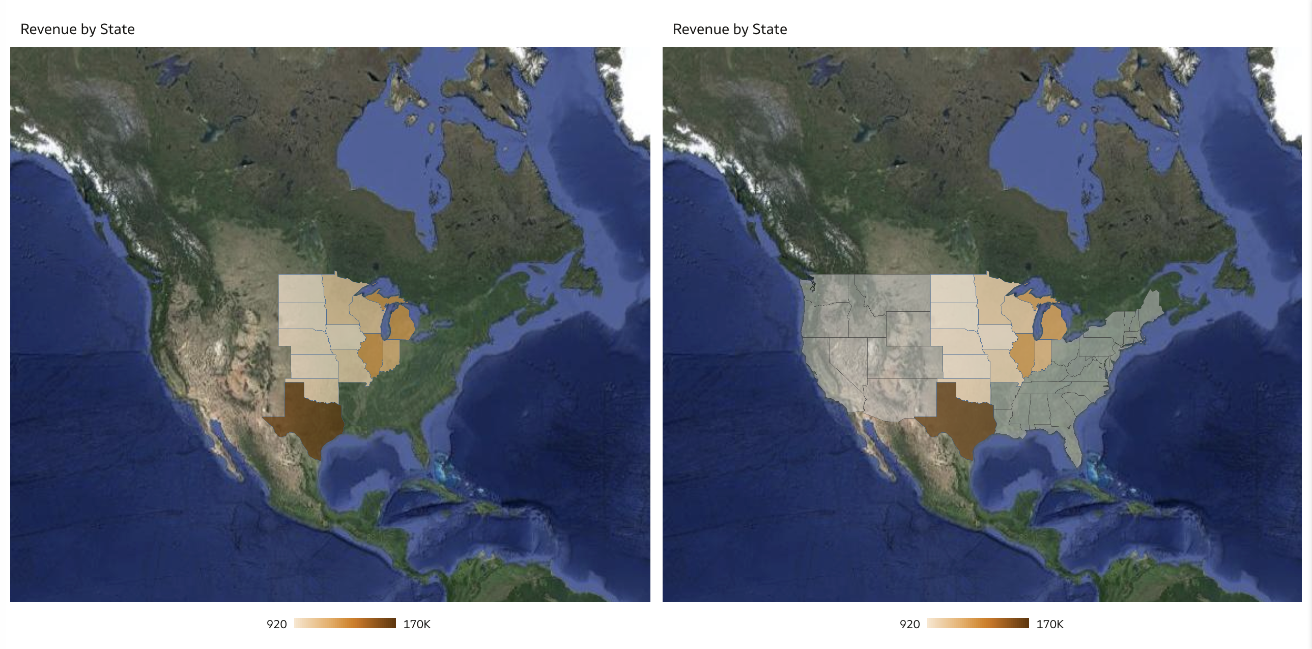
You also need to include on a map the locations for which there are no corresponding measure values in your datasets. For instance, in a Revenue by Region map, you may want to include also regions where your business has no existing customers to gain a holistic understanding of the geographic landscape and identify potential areas for future expansion (Figure 2).
 Figure 2. Using an additional map layer with default formatting (right) to identify potential areas for future expansion
The Favourite that Didn't Impress Me
Emojis!? Who the hell is going to use emojis in a corporate report???
It was my (internal) reaction when I heard about annotating measures with icons and emojis from a product manager back in December, and I didn't change my mind in the meantime, despite the big amount of articles and posts about it.
I understand that many people are happy to use conditional formatting in Data Visualization for displaying images as in Classic Analytics, but I firmly think that emojis are either unnecessary and inappropriate in reports. I would have provided users with a way to apply conditional formatting rules also to attribute columns instead.
This Wedding Cannot Go On!
The new Navigation Menu, which offers a convenient pathway to shared dashboards and workbooks, and the capability to localize workbook captions are among my favourite features in this update, but unfortunately they don't like each other.
The language-specific JS files within the exported captions ZIP file do not include any element related to workbooks that have been added to the Navigation Menu. Furthermore, if the selected catalog folder exclusively consists of workbooks added to the Navigation Menu, the exported captions ZIP file will lack any language-specific JS files, rendering localization efforts unfeasible.
While I'm confident that this issue will be fixed in a future release, as a workaround I recommend to localize your workbook captions before adding the related workbooks to the Navigation Menu.
Desupported Features: Don't Panic!
Albany fonts, BI Composer Wizard, Catalog Manager GUI, several dashboard style (Fuse, Skyros, SkyrosCloud, blafp and FusionFX), and the Manage Favorites option have been desupported in January 2024.
If you are having a panic attack, then breathe deeply and relax your body: you have plenty of time to leave the Earth before Vogons are going to blow it up! Oracle no longer fixes bugs related to the above features and may remove the code altogether, but they are actually still there (for now)!
Moreover, better alternatives such as Go Noto fonts, workbook editor, Catalog Manager CLI, Redwood and Alta styles are already available and you can use them to replace the desupported features.
Conclusion
The January 2024 Update include several new features, enhancements and fixes that significantly improve the suite facilitating the transition from on-premises solutions to the cloud (in general), and from Analytics Classic to Data Visualization (in particular). Whatever Oracle Analytics PMs say, it appears evident to me that there is a clear intention to eventually replace Analytics Classic with Data Visualization. I strongly advise beginning to familiarize yourself with it, granting users access to it, and providing them proper training. This proactive approach will ensure your organization is well-prepared when the transition eventually occurs, perhaps not tomorrow but in the coming years.
Subscribe to my newsletter
Read articles from Federico Venturin directly inside your inbox. Subscribe to the newsletter, and don't miss out.
Written by

Federico Venturin
Federico Venturin
Federico Venturin is an Oracle ACE Associate and a seasoned Oracle Analytics enthusiast with over 14 years of experience. He has been speaking at major Oracle conferences (OUG Ireland, UKOUG, RMOUG, ODTUG Kscope), sharing insights and best practices. He maintains a technical blog with regular articles about Oracle Analytics, and actively contributes to Oracle community forums, providing solutions and guidance. Outside of work, Federico likes to play videogames, travel all around the world and taste local food.