React & Javascript Optimization Techniques - Part II
 Tuan Tran Van
In the previous article, we covered five techniques, including debouncing, throttling, memoization, bundle size optimization, and keeping the component state local when necessary. In this article, we'll explore the remaining four techniques. Without further ado, let's dive in.
The Dangers of Background Images
Assume, you have code where you get images from CMS.
These images should be background images that keep changing.
You approach it in a way where you map out the images and set them as background images.
import React from "react";

const BackgroundImages = ({ images }: { images: string[] }) => {
  return (
    <div className="flex">
      {images.map((image, index) => (
        <div
          key={index}
          className="w-32 h-32 bg-cover bg-center"
          style={{ backgroundImage: `url(${image})` }}
        />
      ))}
    </div>
  );
};

export default BackgroundImages;
Now, your code may look different, but this code is just to demonstrate the dangerous code.
When the browser receives an HTML document, it parses it from top to bottom, building the DOM tree.
If the parsers encounter a <script> tag referencing an external script, it stops parsing the HTML document and fetches the script. You don’t want this to happen. Solutions like async and defer are there to help.
When the parser encounters a <link> tag referencing a stylesheet, it requests that file. However, the parsing of the HTML document can continue. A new parser is started. This is the CSS parser. It builds the CSSOM (CSS Object Model) tree.
Why does the browser need the CSSOM tree:
Allow the browser to efficiently apply styles.
Javascript can access and modify styles via the CSSOM API.
CSSOM is used in the critical rendering path. The critical rendering path is the sequence of steps the browser goes through to convert HTML, CSS, and Javascript into pixels on the screen.
What happens when the CSS parser encounters an external link?
It triggers a request and downloads the file. It blocks the CSS parser from continuing.
If you think through this, this “blocking” is a serious issue. It blocks the critical rendering path from completing because we need the CSSOM tree to complete the critical rendering path.
DOM size optimization
The Document Object Model (DOM) represents the structure of a web page, and the size of this structure directly impacts a React application's performance. Large and complex DOM trees can slow down rendering and increase memory usage.
Let's explore some techniques that can be used to optimize the DOM.
Windowing or list virtualization in React applications
Imagine we have a very long list of data, whether or not any of them is displayed in the browser viewports, they will render in the DOM all then the DOM will become very large. That may have a bad effect on the performance of our applications.
The question is "How do we improve it?". We all know that we only need to see data on the browser viewport. Therefore, We will only render to the DOM only the visible portion to the user. Then, when scrolling, the remaining list items render while replacing the items that exit the viewport. To better understand this technique, consider the following example:

Virtualization can also be applied to tables, where both rows and columns can be virtualized and achieve significant performance improvements.

You can implement windowing in your React app by utilizing libraries like react-window or react-virtualized. Here's an example:
import { VariableSizeList as List } from 'react-window';

const data = [...]; // Your list of data

const RowRenderer = ({ index, style }) => {
  return <div style={style}>{data[index]}</div>;
};

const VirtualizedList = () => {
  return (
    <List
      height={500}
      itemCount={data.length}
      itemSize={(index) => 50} // Row height
      width={300}
    >
      {RowRenderer}
    </List>
  );
};
Avoid complex nesting
Every DOM element adds to the rendering cost. Minimizing the DOM is necessary to reduce the render cost. Furthermore, optimizing HTML might help us code faster, avoiding minor UI bugs.
There are some examples of minimizing the DOM:
Use Fragment: When no container node is needed, use a <Fragment>(usually <>...</>) to group them.
Use Semantic HTML: Utilize semantic HTML to convey the structure effectively while keeping the DOM hierarchy shallow. For example, instead of multiple nested div elements, use semantic tags like <header>, <main>, <section>, and <footer>.
  // COMPLEX NESTING ❌
  <div className="container">
    <div className="content">
      <div>
        Content
      </div>
    </div>
  </div>

  // SIMPLIFIED STRUCTURE ✅
  <main className="container">
    <section className="content">Content</div>
  </div>
Use Inline Styles Sparingly: Instead of applying inline styles to individual elements, consider using CSS classes or styled-components. Inline styles can bloat your HTML and make it harder to maintain.
Optimize Lists: When rendering lists, use the
keyprop to help React efficiently update and re-render list items. Avoid using array indexes as keys when possible, as this can cause unnecessary re-renders.import React from 'react'; const MyComponent = ({ items }) => { return ( <ul> {items.map((item) => ( <li key={item.id}>{item.name}</li> ))} </ul> ); }; export default MyComponent;
Applying web workers in React
Have you ever faced a situation in which you are excuting a block of code and it is freezing the UI for few seconds? If not, you should try running such a code block in your browser console.
const start = Date.now();
while (Date.now() < start + 5000) {console.log("hihi")}
You might notice that your browser freezes, right? This is a similar result to what happens when executing a very expensive function, such as creating 25,000 user records. You probably wouldn't want your users to experience such a poor performance. Therefore, you need a solution to handle such code blocks in the background.
In React, we have a simple way to perform these types of CPU-intensive processes in the background with the help of web workers. But first, what is a web worker?
A web worker is a JavaScript feature that allows you to run scripts in the background, separate from the main thread of your web page. This background execution enables you to perform tasks concurrently without blocking the user interface (UI) or causing it to become unresponsive. Web workers are particularly useful for handling computationally intensive or time-consuming operations without impacting the user experience.
The use cases for the web worker are:
Complex Calculations: Web workers are ideas for performing complex mathematical calculations or data processing tasks without impacting the main thread.
Large Data Handling: When dealing with the large datasets or files, webworker can help process and parse the data in ther background.
Background Services: Web workers can be used to run background services such as periodic data synchoronization or background notifications.
So, Let's try to implement a web worker in a React application:
export default function App() {
  const [noOfTomatoes, setNoOfTomatoes] = useState(0);
  const [noOfApples, setNoOfApples] = useState(0);

  const addApples = () => {
    const start = Date.now();
    while (Date.now() < start + 5000) {}
    setNoOfApples(noOfApples + 1);
  }
  return (
    <main>
      <p> Tomato: {noOfTomatoes} | Apple: {noOfApples} </p>
      <div>
        <button onClick={() => setNoOfTomatoes(noOfTomatoes + 1)}>
          Tomato
        </button>
        <button onClick={() => addApples()}>Apple</button>
      </div>
    </main>
  );
}
In the code snippet above, nothing happens if we click on the Tomato button. However, when we click on the Apple button, the browser freezes. This occurs because the condition inside the while loop always returns true, causing it to block the UI.
Let's fix the blocking effect by using a web worker to handle the addApples functionality:
//apple-worker.js

self.onmessage = async ($event) => {
    if ($event && $event.data && $event.data.msg === 'increaseAppleCount') {
        const newCounter = addApples($event.data.noOfApples);
        self.postMessage(newCounter);
    }
};

function addApples(noOfApples) {
    const start = Date.now();
    while (Date.now() < start + 5000) {
    }
    return noOfApples + 1;
}
onmessage serves as the entry point of the web worker and acts as the listener we trigger in the app. If an event containing data with the property msg (in this case, increaseAppleCount) is received, we invoke the addApples function to increase the number of apples.
Finally, we return the value of the count to the application through postMessage(). Subsequently, we utilize the apple worker we created in the UI:"
function App() {
  const [noOfTomatoes, setNoOfTomatoes] = useState(0);
  const [noOfApples, setNoOfApples] = useState(0);

  useEffect(() => {
    appleWorker.onmessage = ($event) => {
      if ($event && $event.data) {
        setNoOfApples($event.data);
      }
    };
  }, []);

  function addApples() {
    appleWorker.postMessage({
      msg: "increaseAppleCount",
      noOfApples: noOfApples,
    });
  }
  return (
    <main> ... </main>
  );
}
In the useEffect, we register a listener that updates the noOfApples when the web worker emits a result. Finally, we modify the addApples function to invoke the web worker. With this setup, the app can execute multiple processes simultaneously without blocking the UI rendering.
Asset Optimization
The HTTP Archive found that at least 70% of all websites have an image as the most prominent. Optimizing your website assets is vital for improving website loading speed and getting better at FCP, LCP, and CLS. Large, unoptimized assets can drastically increase page load times and consume unnecessary bandwidth. Let's look at ways to optimize assets in our web apps.
Serving Images And Videos Properly
Here are some practices to consider when handling images and videos in your projects:
Use the right format: Choosing the right image format for each type of image can significantly impact the image's file size and quality. Here's the list of different image formats that you can choose for your project.
WebP
WebP is an image format developed by Google that offers better compression and small file sizes compared to JPEG and PNG. It's supported by modern browsers (excluding some versions of Safari and Internet Explorer). To use WebP, you can provide both WebP and fallback formats like JPEG or PNG in your HTML.
  <!-- 👇 Set image sources with different formats in the `srcSet`
        the attribute in order of preference -->
  <!-- 👇 Fallback image source for browsers that don't
        support srcSet in `src` attribute  -->
  <img
   srcset="car.webp, car.jpg"
   src="car.jpg"
   alt="Car"
  />
JPEG 2000
JPEG 2000 is another high-quality image format with good compression. However, Its support in browsers is limited. Similar to WebP, you can provide JPEG 2000 version and fallback formats.
  <img
   srcset="car.jp2, car.jpg"
   src="car.jpg"
   alt="Car"
  />
AVIF
AVIF is a newer image format that provides excellent compression and image quality. It is supported in modern browsers like Chrome and Firefox.
  <img
   srcset="car.avif, car.jpg"
   src="car.jpg"
   alt="Car"
  />
While WebP and AVIF are supported in modern browsers, JPEG 2000 has limited support. Therefore, It's essential to test your website or application across browsers.
Serve Responsive Images
Responsive images allow you to serve different images based on the user's device and screen size. This prevents large images from being loaded on smaller screens, saving bandwidth. Use the
srcsetand sizes attributes in theimgelement to archive this:<img src="img.jpg" alt="" sizes="(max-width: 63.9375em) 100vw, (min-width: 64em) 750px" srcset="img/content/small.jpg 480w, img/content/medium.jpg 750w, img/content/large.jpg 1024w" />sizes: Defines the viewport sizes and corresponding image widths to determine which image source to use based on the available space. It consists of two parts:(max-width: 63.9375em) 100vw: If the viewport width is less than or equal to63.9375em(around 1023px), the image will take up the full viewport width (100vw).(min-width: 64em) 750px: If the viewport width is greater than or equal to64em(around 1024px), the image will have a fixed width of750px.
srcset: Specifies a list of image sources with their corresponding widths, separated by commas. This allows the browser to choose the most appropriate image is closest to the width descriptor source based on the device's pixel density and viewport width. Each source is followed by its intended width in pixels (wunit).img/content/small.jpg 480w: Specifies an image source (small.jpg) with a width of480px.img/content/medium.jpg 750w: Specifies an image source (medium.jpg) with a width of750px.img/content/large.jpg 1024w: Specifies an image source (large.jpg) with a width of1024px.
Lazy loading
Lazy loading is a technique used to defer the loading of offscreen images until they are needed. This optimization can reduce initial page load times, especially for the web page with multiple images.
React supports lazy loading through the lazy attribute in the
imgtag:import React from 'react'; const LazyImage = () => { return ( <img src="image.jpg" alt="Description" loading="lazy" width="200" height="150" /> ); };This is just a simple way to lazy load images. In more complex scenarios, you might want things like:
An image placeholder during the loading
Effects like blurring during the loading
Setting specific thresholds for loading image
For these scenarios, you can make use of libraries like react-lazy-load-image-component.
Important: Do not lazy load any images(such as your website's logo or hero images) visible in the user's initial viewport. This approach ensures your website's critical images are immediately visible, which improves your page load time.
Compress images and videos: Utilize compression tools or plugins to compress your images or videos before deploying them to production. Tools like ImageOptim or TinyPNG for images and HandBrake or FFmpeg for videos can reduce file sizes without compromising quality.
Replace Animated GIFs with video: Animated GIF are large files and can slow down page loading. Consider replacing animated GIFs with video formats(such as MP4) for smoother animation and faster page loads. Video generally offers better compression and can be auto-played or controlled based on user interactions.
Preloading LCP Image and Caching:
An LCP image is the largest image element on the webpage rendered within the user's initial viewport. By preloading this image, you can ensure it's available in the browser cache and ready to be displayed when it enters the user's viewport. This can significantly improve the LCP metric and perceived page loading speed.
  <!DOCTYPE html>
  <html lang="en">
      <head>
          ...
          <link
              rel="preload"
              fetchpriority="high"
              as="image"
              href="/path/to/hero-image.jpg"
          />
      </head>
      ...
  </html>
The
<link>element with therel="preload"attribute is used to initiate the preloading process. Here is the breakdown of the attributes used in the<link>element.rel="preload": Specifies that the browser should preload the resource.fetchpriority="high": Indicates a high priority for fetching the specified resource. This helps the browser prioritize the preloading of this resource over others.as="image": Specifies the type of resource being preloaded, in this case, an image.href="/path/to/hero-image.jpg": Specifies the path to the LCP image file that needs to be preloaded.
In the React app, you can use the react-helmet package to add the preload link in the HTML head section for critical images.
    import React from 'react';
    import { Helmet } from 'react-helmet';
    import PreloadImage from './assets/preload-image.png';

    const ImageComponent = () => {
      return (
        <>
          <Helmet>
            <link rel="preload" href={PreloadImage} as="image" />
          </Helmet>
          <img src={PreloadImage} alt="Preload image alt" />
        </>
      );
    };
Additionally, consider using service workers to cache images for subsequent visits. The following is a basic example of using a service worker to cache images:
    // Service worker code (sw.js)
    self.addEventListener('install', event => {
      event.waitUntil(
        caches.open('images-cache').then(cache => {
          return cache.addAll([
            'image.jpg',
            'other-image.jpg',
            // Add more images to the cache here
          ]);
        })
      );
    });

    self.addEventListener('fetch', event => {
      event.respondWith(
        caches.match(event.request).then(response => {
          return response || fetch(event.request);
        })
      );
    });
Serve Images and Videos with Correct Dimensions
Specifying the image's dimensions in HTML or CSS is essential to prevent layout shifts and improve page rendering speed. By specifying the image's dimensions in HTML or CSS, you provide the browser with the necessary information to allocate the correct space for the image during the initial rendering process.
Benefits:
Prevents Layout Shifts: Specifying the dimensions ensures that the browser knows the image's exact size before loading it, preventing sudden layout shifts.
Faster Page Rendering: With the image dimensions known in advance, the browser can render the layout more efficiently, leading to faster page loading times.
Improved User Experience: By eliminating layout shifts, users have a more consistent and pleasant browsing experience.
To specify the image dimensions, you can directly include the width and height attributes within the img tag or apply a specific style by adding a class attribute to the img tag in CSS.
    <img src="logo.jpg" alt="logo" width="300" height="200" />

    <!-- or -->

    .logo {
      width: 300px;
      height: 200px;
    }

    <img src="logo.jpg" alt="logo" class="logo" />
Use SVG for icons and logos
SVGs are simple ideas for icons and logos because they are vector-based and can be scaled without losing quality.
  <!-- logo.svg -->
  <svg width="100" height="100" viewBox="0 0 100 100">
    <circle cx="50" cy="50" r="40" fill="blue" />
  </svg>

  <!-- index.html -->
Using SVGs for logos and icons provides a lightweight, scalable, and visually appealing solution that improves web page performance, ensures crisp visuals, and enhances the overall user experience across various devices and browsers.
Image Sprites
An image sprite sheet in a single image that contains multiple smaller images and icons. It's used to reduce the number of HTTP requests when rendering numerous small images on the web page. By loading a single sprite sheet, you can display specific images by adjusting the CSS
background-position.Suppose you are building a social media web application and want to display various icons for actions such as liking a post, commenting, and sharing. Each icon is a small image that is typically used in different parts of the application.
Without Image Sprites:
In a traditional approach, you would include each icon as a separate image file in your HTML or CSS, like this:
  <!-- Separate images for each icon -->
  <img src="like-icon.png" alt="Like">
  <img src="comment-icon.png" alt="Comment">
  <img src="share-icon.png" alt="Share">
  <!-- and so on... -->
With Image Sprites:
Using image sprites, you can combine all these icons into a single sprite sheet, reducing the number of HTTP requests. Here is an example of how it would look:
/* CSS using image sprites */ .icon { background-image: url("icons-sprite.png"); background-repeat: no-repeat; } .like-icon { background-position: 0 0; width: 24px; height: 24px; } .comment-icon { background-position: -24px 0; width: 24px; height: 24px; } .share-icon { background-position: -48px 0; width: 24px; height: 24px; } /* and so on... */<div class="icon like-icon"></div> <div class="icon comment-icon"></div> <div class="icon share-icon"></div>In this example, all the icons(like, comment, share) are combined into a single icons-sprite.png sheet. The CSS classes(.like-icon, .comment-icon, .share-icon) use the background-position property to display the correct part of the sprite sheet as the background for each icon.
Benefits:
Instead of loading multiple image files, the web application now loads just one image(icons-sprite.png), reducing the number of HTTP requests.
The sprite sheet is loaded once and can be cached by the browser, improving subsequent page loads.
CSS classes control the display of individual icons from the sprite sheet, allowing for seamless hover and rollover effects without additional loading delays.
This leads to faster and more efficient user experiences with improved overall page loading times.
Preconnect to 3rd Party Hosts
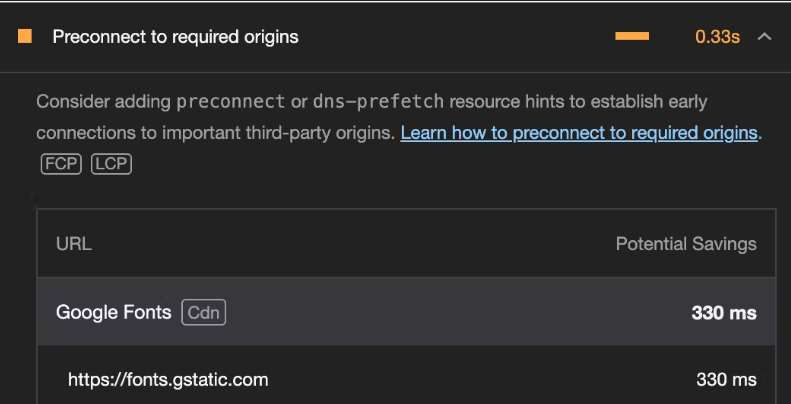
Third-party(3P) hosts are external servers or domains that provide services, assets, or resources a website uses. Examples include social media platforms, content delivery networks(CDNs), and external font services like Google Fonts.
By pre-connecting to these 3P hosts, you are instructing the browser to establish early connections to them, reducing the latency when the actual resources are made.
Consider a scenario where your application relies on Google Fonts to style its text. To optimize the loading of the fonts, you can pre-connect to these domains. Here's how you can do it.
<!-- /index.html -->
<!DOCTYPE html>
<html lang="en">
<head>
  <!-- Other head elements -->

  <!-- Preconnect to Google Fonts and link to the stylesheet -->
  <link rel="preconnect" href="https://fonts.googleapis.com">
  <link rel="preconnect" href="https://fonts.gstatic.com" crossorigin>
  <link rel="stylesheet" href="https://fonts.googleapis.com/css2?family=YourFontFamily">

  <!-- Your other stylesheets and scripts go here -->
</head>
<body>
  <!-- React application content -->
</body>
</html>
In the above example:
The
<link>tags with therel="preconnect"attribute establish an early connection to Google Font's domainThe
hrefattributes specify the domain URL.The
crossoriginattribute is added for security reasons, ensuring the pre-connection adheres to the browser's CORS(Cross-Origin Resource Sharing) policies.The last
<link>tag imports the desired font styles into your application.
Using a content delivery network(CDN)
A Content Delivery Network (CDN) is a network of servers distributed across various geographic locations, strategically positioned to deliver web content to users more efficiently.
A CDN helps to improve website performance, reduce latency, increase reliability, and enhance security by delivering web content more efficiently to users around the world.
By hosting your assets on CDN providers like Cloudinary, CloudFront, CloudFlare, etc, you ensure fast and efficient delivery for visitors across the globe.
Rendering patterns
Rendering patterns in React applications play a vital role in shaping how your application is delivered to clients. Common rendering patterns like client-side rendering (CSR), server-side rendering(SSR), etc have distinct advantages and use cases. Let's explore these rendering patterns, understand how to implement each, and know when to use them.
Client-side rendering
Most web applications like Angular or React support out of the box. This is commonly suitable for single-page applications (SPA) or applications with a lot of interactions (e.g Games) and highly dynamic content such as forms, and chat applications.
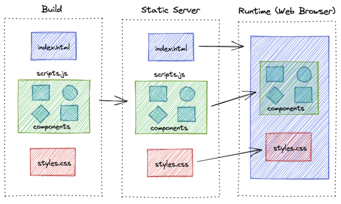
Basically, the initial HTML is minimal, the server only sends to the client a blank page that contains the minimal HTML and CSS to bootstrap the application. Most of the rendering and logic execution occurs in the client's browser.
Server-side rendering
The main disadvantage of CSR is that is not Search Engine Optimized. Therefore, most of the web frameworks, provide the ability to render the server pages as well.
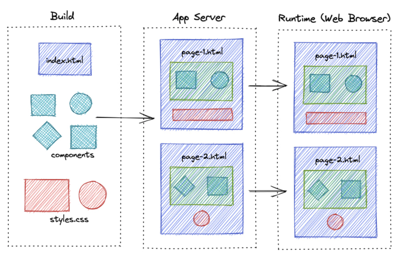
Unlike CSR, React components are rendered on the server side in response to a user request. The server sends the pre-rendered HTML and any necessary Javascript to the client, providing a complete page. Once the client receives the HTML, it can hydrate the page, adding interactivity by attaching event listeners and setting up the React application.
Static site generation
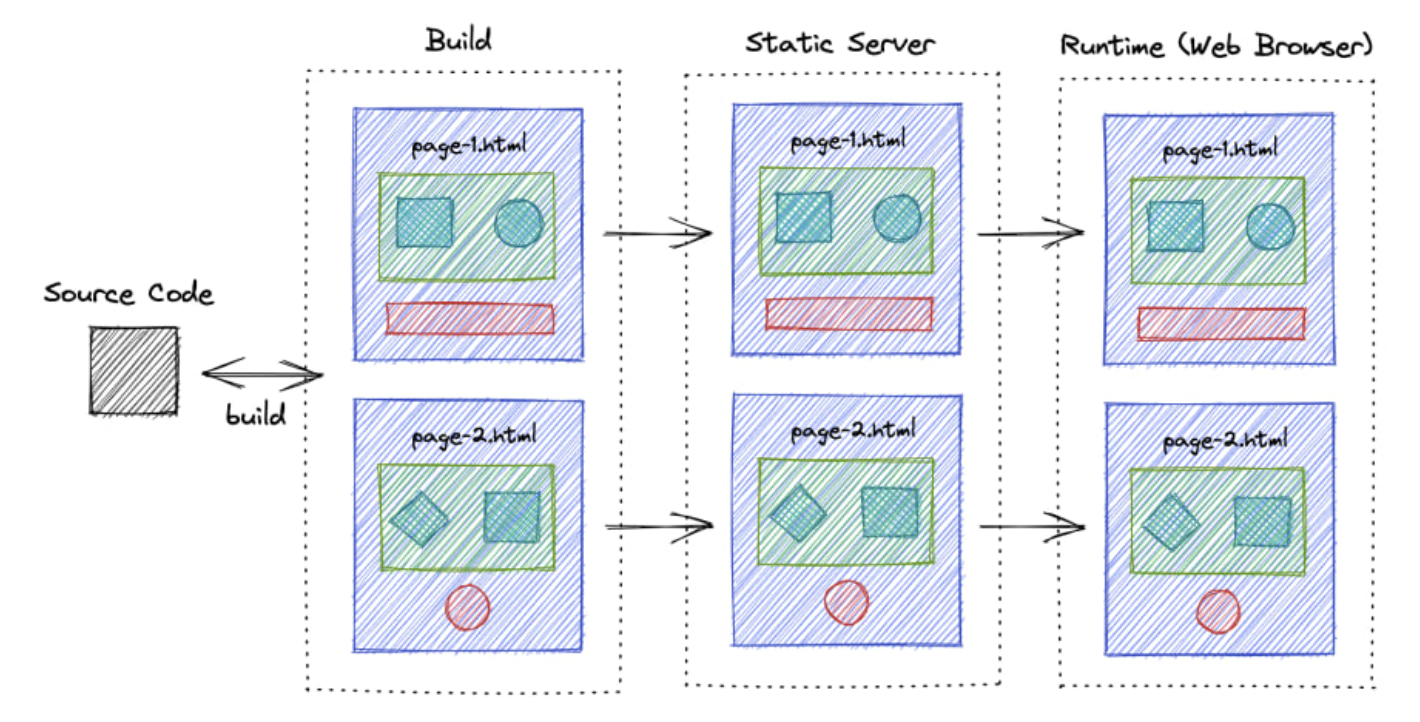
The difference between server-side rendering and static site rendering lies in how React components are rendered. In server-side rendering, the React components are rendered for each request. To avoid this, we can generate these files during build time so that we can serve pages instantly when a user requests them.
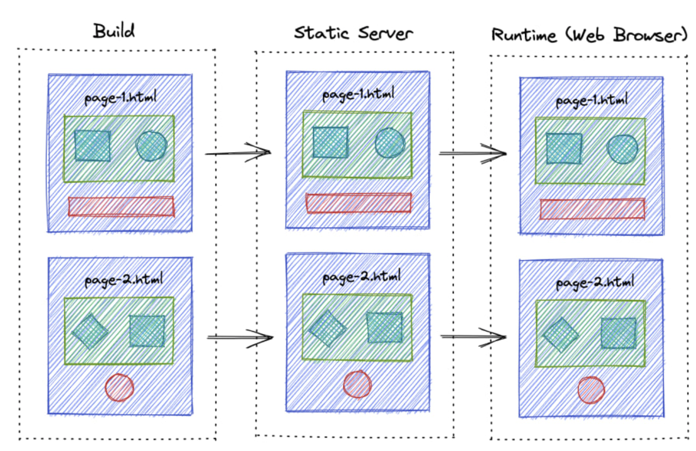
This technique is particularly useful for building web applications with predominantly static content, such as a blog. However, one drawback is that the content might become outdated, requiring the application to be rebuilt and redeployed each time the content is changed.
Incremental Static Regeneration
ISR is the next improvement to SSG, where it periodically builds and revalidates the new pages so that content never gets too outdated.
Comparison
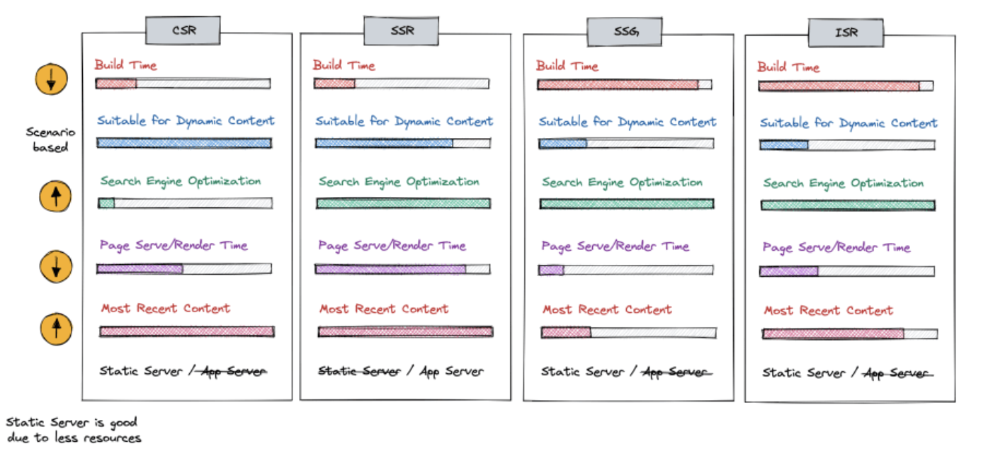
At a high level, we can divide these rendering techniques into two major categories based on the level of dynamic interactions that your app has.
CSR and SSR can be used to develop highly dynamic web applications and both have their pros and cons depending on the scenario.
If you have highly static content, you can use SSG or ISR. ISR is more advanced and optimized, but it requires specific platforms to work.
Summary
In conclusion, We have covered a range of topics related to optimizing React applications. Remember, optimizing React apps is not just a one-time task but an ongoing process. Regularly audit your app, monitor performance metrics, and stay updated with the latest tools and best practices to keep your React applications running smoothly.
References
https://medium.com/globant/javascript-optimization-techniques-20d8d167dadd?ref=dailydev
https://blog.logrocket.com/optimizing-performance-react-app/
https://compile7.org/decompile/how-to-fix-memory-leaks-in-react/
https://dev.to/sumankalia/web-workers-in-reactjs-4bc7?ref=dailydev
https://dev.to/arulvalananto/9-image-optimization-tricks-for-a-seamless-web-experience-29dc
https://kurtextrem.de/posts/modern-way-of-img#appendix-file-formats--quality
https://tigerabrodi.blog/web-performance-the-dangers-of-background-images
Subscribe to my newsletter
Read articles from Tuan Tran Van directly inside your inbox. Subscribe to the newsletter, and don't miss out.
Written by

Tuan Tran Van
Tuan Tran Van
I am a developer creating open-source projects and writing about web development, side projects, and productivity.