Bento Responsive Grid Design with CSS Grid
 Lin.Schmitz
First creating a container element that will serve as our grid container. Inside, we'll have items named item1,item2 and... .
    <div class="container">
      <div class="item item1">item1</div>
      <div class="item item2">item2</div>
      <div class="item item3">item3</div>
      <div class="item item4">item4</div>
      <div class="item item5">item5</div>
      <div class="item item6">item6</div>
    </div>
That’s it, this is all you need in HTML.
now moving on to CSS, we'll style the container like this:
.container {
  background-color: #bdbbbb;
  width: 90%;
  margin: 30px auto;
  padding: 1rem;
}
I keep it simple to structured first, then you can add more features, I’m using this colors, feel free to use any color pallet you want:
:root {
  --color-b1: #98d4fe;
  --color-b2: #9d87fc;
  --color-b3: #ccfe3b;
  --color-b4: #314876;
}
since we haven't defined any columns or rows, there's no visible change. Let's write general style for all items:
/* general style for all items */

.item {
  padding: 0px;
  font-size: 30px;
  font-family: sans-serif;
  color: #ebe8e8;
  background-color: rgb(226, 204, 164);
  text-align: center;
  border-radius: 20px;
}
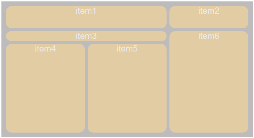
The background-color here is temporary, we change it later, now I put just to see what we see on screen.This is the output so far.

Now you can set the colors or placed items on container, ther is no order, I’ll go with placed items. it's time to turn our element into a grid container with display: grid.
Introducing the properties grid-template-rows and grid-template-columns, we specify 3 rows, each 1fr in height, and 3 columns, different size wide.
Why 3 * 3 ? we consider the smallest item sze in row and column , here we have 3 rows and 3 columns:
1fr: In CSS grid layout, the unit fr stands for "fraction." When you use 1fr as a value for a grid row or column, it means that the space is divided into equal fractions, and each unit takes up one of those fractions.
  display: grid;

  /* Create 3 rows, each taking 1 fraction of available space */
  grid-template-rows: repeat(3, 1fr);

  /* Create columns with a minimum size of 200px and maximum 1 fraction of available space,
   automatically fitting as many columns as possible within the container */
  grid-template-columns: repeat(auto-fit, minmax(200px, 1fr));

  /* Set a 10px gap between grid items */
  grid-gap: 10px;

  /* Automatically generate rows with a height of 150px as needed */
  grid-auto-rows: 150px;
and the output :

Now all elements get the grid-gap and since they have the same content inside, All have the same size, now time to put name on lines and grid and assign them to items:
.container {
  background-color: #bdbbbb;
  width: 90%;
  margin: 30px auto;
  padding: 1rem;

  display: grid;
  grid-template-rows: repeat(3, 1fr);
  grid-template-columns: repeat(auto-fit, minmax(200px, 1fr));
  grid-gap: 10px;
  grid-auto-rows: 150px;

   /* Define a grid template with named areas for layout */
  grid-template-areas:
    'item1 item1 item2' /* Rows 1-2 */
    'item3 item3 item6' /* Row 3 */
    'item4 item5 item6'; /* Rows 4-5 */
}

/* general style for all items */
.item {
  padding: 0px;
  font-size: 30px;
  font-family: sans-serif;
  color: #ebe8e8;
  background-color: rgb(226, 204, 164);
  text-align: center;
  border-radius: 20px;
}

/* placed items on grid */
.item1 {  grid-area: item1;}
.item2 {  grid-area: item2;}
.item3 {  grid-area: item3;}
.item4 {  grid-area: item4;}
.item5 {  grid-area: item5;}
.item6 {  grid-area: item6;}
This animation might show why grid-template-areas code is like a matrix

This is the output:

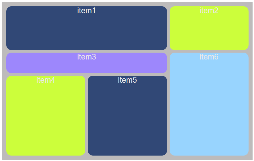
Now the colors of the items are set, and styles are applied for items.
/* add each item style and color */

.item1 {
  grid-area: item1;
  background-color: var(--color-b4);
}
.item2 {
  grid-area: item2;
  background-color: var(--color-b3);
}
.item3 {
  grid-area: item3;
  background-color: var(--color-b2);
  height: 5rem;
}
.item4 {
  grid-area: item4;
  background-color: var(--color-b3);
}
.item5 {
  grid-area: item5;
  background-color: var(--color-b4);
}
.item6 {
  grid-area: item6;
  background-color: var(--color-b1);
}
This template is responsive too, And the final result is:

This straightforward example showcases the simplicity and efficiency of CSS Grid, eliminating the need for floats or complex HTML structures.
Source on my github:
Live Preview:
Subscribe to my newsletter
Read articles from Lin.Schmitz directly inside your inbox. Subscribe to the newsletter, and don't miss out.
Written by

Lin.Schmitz
Lin.Schmitz
JavaScript lover, Reactjs enthusiast. I code during the day and dream about perfect syntax at night.|Artist | polyglot |😻.