How to add responsive font size according to viewport width?
 Sanket chaware
First of all you must know the following:
Max viewport width.
Min viewport width.
Min font size.
Max font size
Clamp function in CSS.
Next Steps:
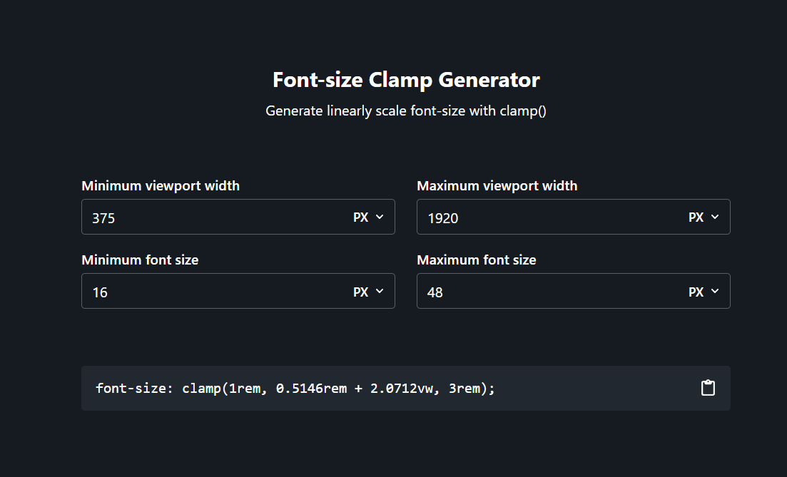
- Open this link Clamp Generator. There you have to put the values as shown below.

So while building the website, consider you are using font size 16 px (min font size) for heading1 in mobile screen and 48 px in Desktop (maximum font size).
And your screen sizes are 1920 for Desktop (max) and 375 for Mobile (min).
So as you entered the values over there in the clamp generator you will get the clamp function as shown in the above snap.
font-size: clamp(1rem, 0.5146rem + 2.0712vw, 3rem);
Usage:
h1 {
font-size: clamp(1rem, 0.5146rem + 2.0712vw, 3rem);
}

h2 {
font-size: clamp(0.875rem, 0.6019rem + 1.165vw, 2rem);
}

.body1{
font-size: clamp(1rem, 0.8786rem + 0.5178vw, 1.5rem);
}
Just copy and paste and you are ready to reuse these tags for all over the application or website as you can see in above snap.
So for every screen, the font-size will be based on the viewport which you are using.
Hope It will be helpful for you !
Thanks for reading ! Happy Coding !😁
Subscribe to my newsletter
Read articles from Sanket chaware directly inside your inbox. Subscribe to the newsletter, and don't miss out.
Written by

Sanket chaware
Sanket chaware
Dedicated and proficient Full Stack Web Developer with two years of hands-on experience specializing in frontend development utilizing HTML, CSS, JavaScript, React, Tailwind CSS, and Next.js. Possessing an average proficiency in Node.js, Express.js, and RESTful APIs, I am keen on leveraging my skills to contribute effectively to the growth of both individuals and the company. Seeking a role where I can utilize my expertise to drive innovation, enhance user experiences, and foster the growth of both personal and organizational objectives.