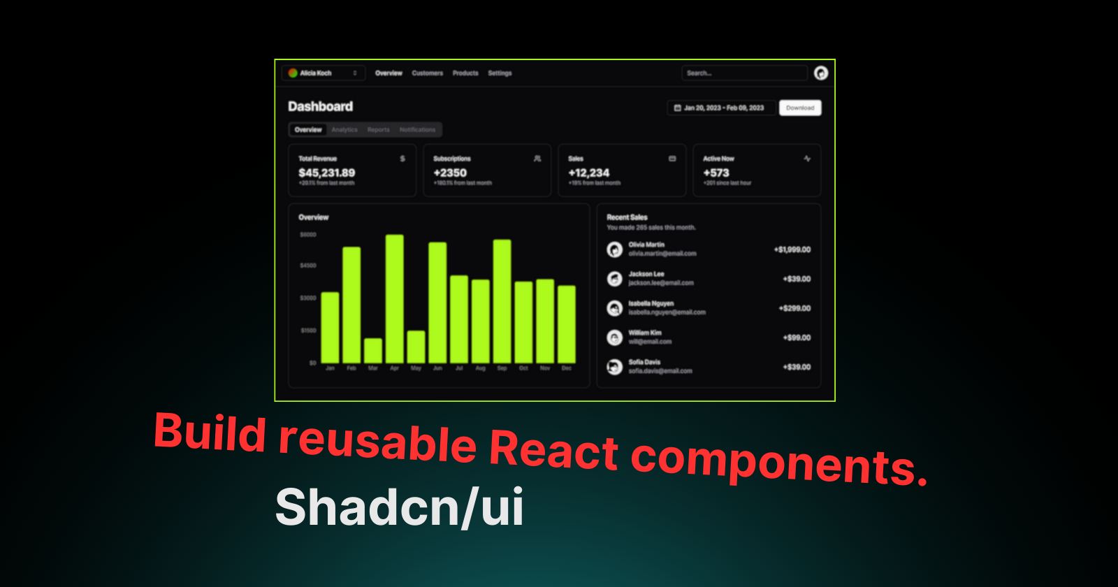
Building Reusable and Styled React Components with Tailwind CSS: Inspired by Shadcn/ui
 Lokesh Sharma
Shadcn/ui has become a popular choice for building UIs in React projects. a strength rests in a set of well-styled and reusable components that take advantage of Tailwind CSS. This blog post has shown you how to create identical components in your React apps, promoting consistency and maintainability.
Project Structure and Dependencies
Folder Structure: Organize your components within a dedicated directory, such as
src/components/ui. This promotes a clear separation of concerns.Dependencies: Install the necessary dependencies:
tailwindcss: The core utility-first CSS framework.clsx: A utility for joining class names together.tailwind-merge(Optional): A helper function specifically designed for Tailwind CSS withinclsx. (Consider using it for a more Tailwind-centric approach.)
Building a Reusable Button Component
Let's create a Button component similar to Shadcn/ui's implementation:
// button.tsx

// Import necessary functions
import { cn } from "@/utils/cn";
import { cva } from "class-variance-authority";

// Define Button component props type
type ButtonProps = React.HTMLAttributes<HTMLButtonElement> & {
  variant?:
    | "default"
    | "destructive"
    | "outline"
    | "secondary"
    | "ghost"
    | "link";
  size?: "default" | "sm" | "lg" | "full" | "icon";
};

// Button component
const Button = ({ variant, size, className, ...props }: ButtonProps) => {
  return (
    <button
      {...props}
      className={cn(buttonVariants({ variant, size, className }))}
    />
  );
};

// Define base styles and variants for the button
const buttonVariants = cva(
  "inline-flex items-center justify-center whitespace-nowrap rounded-md text-sm font-medium transition-colors focus-visible:outline-none focus-visible:ring-1 focus-visible:ring-black disabled:pointer-events-none disabled:opacity-50",
  {
    variants: {
      variant: {
        default: "bg-black text-white shadow hover:bg-black/90",
        destructive: "bg-red-500 text-white shadow-sm hover:bg-red-500/90",
        outline:
          "border bg-transparent shadow-sm hover:bg-gray-100 hover:text-gray-800",
        secondary: "bg-gray-200 text-black shadow-sm hover:bg-gray-200/80",
        ghost: "hover:bg-gray-200 hover:text-gray-800",
        link: "text-black underline-offset-4 hover:underline",
      },
      size: {
        default: "h-9 px-4 py-2",
        sm: "h-8 rounded-md px-3 text-xs",
        lg: "h-10 rounded-md px-8",
        full: "w-full h-9 px-4 py-2",
        icon: "h-9 w-9",
      },
    },
    defaultVariants: {
      variant: "default",
      size: "default",
    },
  }
);

export default Button;
Explanation
We define a
Buttoncomponent that accepts properties such asvariation,size, and standard button attributes.The
cnfunction (explained later) combines classes based on their variation and size.buttonVariantsusesclass-variance-authority(or a similar library) to create a base class and variants for various button types and sizes.
Note that this is a simplified example. You can extend it to include more customization props, such as the disabled status or icon rendering.
Utility Functions for Class Handling
// cn.ts

import clsx from "clsx";
import { ClassValue } from "clsx";
import { twMerge } from "tailwind-merge"; // Optional

export function cn(...props: ClassValue[]) {
  return twMerge(clsx(...props));
}
The cn function first spreads the props array into the clsx function. clsx then processes and concatenates these class values based on their truthiness. The result is then sent to twMerge, which appears to combine Tailwind CSS classes when the tailwind-merge library is used. Finally, the merged class names are returned.
Overall, this code snippet provides a utility function cn that can be used to concatenate and merge Tailwind CSS classes.
Conclusion
By following these steps and embracing the concepts of reusable components and Tailwind CSS variants, you can significantly enhance your React development experience.
Remember, this is just the beginning. Explore the vast Tailwind ecosystem for additional plugins and utilities to further streamline your component creation. With practice and a focus on reusability, you can build beautiful, maintainable, and scalable React applications using the power of Tailwind CSS.
Bye Bye👋
Subscribe to my newsletter
Read articles from Lokesh Sharma directly inside your inbox. Subscribe to the newsletter, and don't miss out.
Written by

Lokesh Sharma
Lokesh Sharma
Passionate Developer and Tech Enthusiast | Sharing Insights on React, JavaScript, Web Development, and MERN Stack.