Display - Width
 Jalaj Singhal
CSS Width
The CSS width property is used to set the width of the content area of an element.
It does not include padding borders or margins. It sets the width of the area inside the padding, border, and margin of the element.
CSS width values
| Value | Description |
| auto | It is a default value. It is used to calculate the width. |
| length | It is used to define the width in px, cm, etc. |
| % | It defines the width of the containing block in %. |
| initial | It is used to set the property to its default value. |
| inherit | It is used to inherit the property from its parent element. |
Width Example
INPUT:
<!DOCTYPE html>
<html>

<head>
    <title>width and height</title>
    <style>
        .js{
            height: 120px;
            width: 50%;
            border: 5px solid black;
            padding-left: 50px;
            padding-top: 50px;
            font-size: 42px;
            font-weight: bold;
            color: green;
            margin-left: 50px;
            margin-top: 50px;
        }
    </style>
</head>

<body>
    <div class="js"> Jalaj Singhal Blogs </div>
</body>

</html>
OUTPUT:

Set the max-width and min-width of an element
max-width
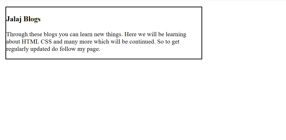
It is used to set the maximum width of the box. Its effect can be seen by resizing the browsers.
Example:
INPUT:
<!DOCTYPE html>
<html>
<head>
    <title>max-width of element</title>
    <style>
        .js{
            max-width: 500px;
            border: 2px solid black;
        }
    </style>
</head>
<body>
    <div class="js">
        <h3>Jalaj Blogs</h3>
        <p>
            Through these blogs you can learn new things. Here we will be learning about HTML CSS and many more which will be continued. So to get regularly updated do follow my page.
        </p>
</div>
</body>
</html>
OUTPUT:
min-width
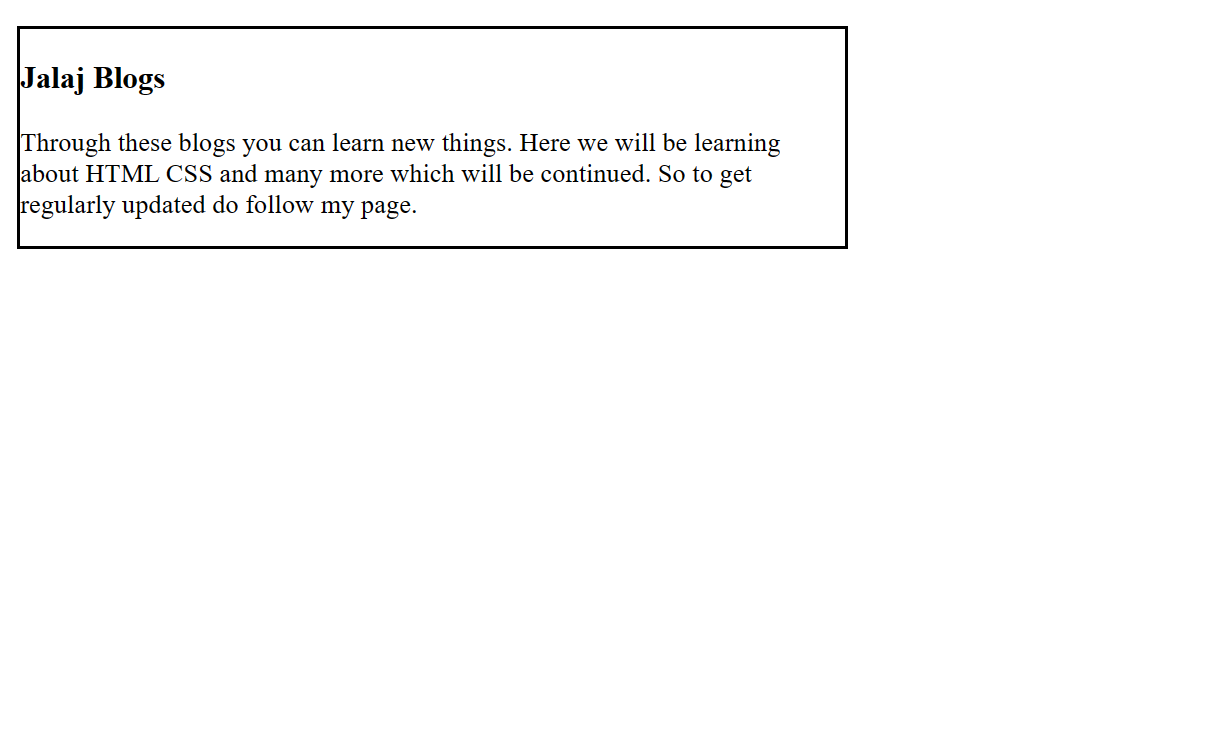
It is used to set the minimum width of the box. Its effect can be seen by resizing the browsers.
INPUT:
<!DOCTYPE html>
<html>
<head>
    <title>max-width of element</title>
    <style>
        .js{
            max-width: 500px;
            border: 2px solid black;
        }
    </style>
</head>
<body>
    <div class="js">
        <h3>Jalaj Blogs</h3>
        <p>
            Through these blogs you can learn new things. Here we will be learning about HTML CSS and many more which will be continued. So to get regularly updated do follow my page.
        </p>
</div>
</body>
</html>
OUTPUT:
Height and Width together
INPUT:
<!DOCTYPE html>
<html>
<head>
    <title>max-width of element</title>
    <style>
        .js{
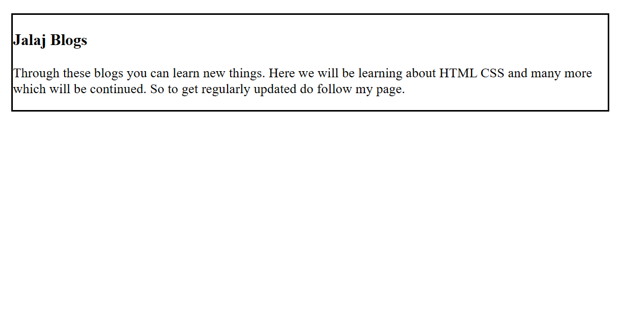
            min-width: 500px;
            border: 2px solid black;
        }
    </style>
</head>
<body>
    <div class="js">
        <h3>Jalaj Blogs</h3>
        <p>
            Through these blogs you can learn new things. Here we will be learning about HTML CSS and many more which will be continued. So to get regularly updated do follow my page.
        </p>
</div>
</body>
</html>
OUTPUT:
CSS Width Example: width in px
INPUT:
<!DOCTYPE html>
<html>
<head>
<style>
img.normal {
    width: auto;
}
img.big {
    width: 150px;
}
p.ex {
    height: 150px;
    width: 150px;
}
    </style>
</head>
<body>
    <img class="normal" src="good-morning.jpg" width="95" height="84"><br>
    <img class="big" src="good-morning.jpg" width="95" height="84">
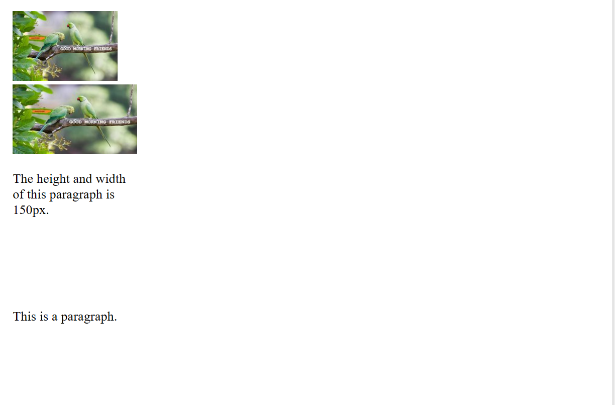
    <p class="ex">The height and width of this paragraph is 150px.</p>
    <p>This is a paragraph.</p>
    </body>
</html>
OUTPUT:
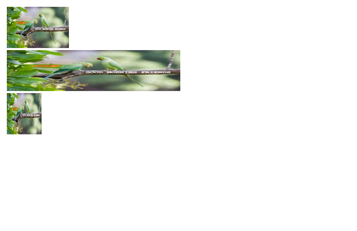
CSS Width Example: width in %
The percent width is a measurement unit for the containing block. It is great for images.
INPUT:
<!DOCTYPE html>
<html>
<head>
<style>
img.normal {
    width: auto;
}
img.big {
    width: 50%;
}
img.small {
    width: 10%;
}
</style>
</head>
<body>
    <img class="normal" src="good-morning.jpg" width="95" height="84"><br>
    <img class="big" src="good-morning.jpg" width="95" height="84"><br>
    <img class="small" src="good-morning.jpg" width="95" height="84">
</body>
</html>
OUTPUT:
Subscribe to my newsletter
Read articles from Jalaj Singhal directly inside your inbox. Subscribe to the newsletter, and don't miss out.
Written by

Jalaj Singhal
Jalaj Singhal
👋 Greetings, Jalaj Singhal here! 🚀 I'm an enthusiastic blogger who enjoys delving into the world of technology and imparting my knowledge to the community. 📃 Having experience in HTML and CSS, I enjoy creating interesting and educational content that demystifies difficult ideas and gives readers the tools they need to advance their knowledge. 🌐 I try to contribute to the active tech community and encourage relevant discussions on Hash Node, where you can find my writings on the subject of web development. 💡 Together, let's connect and go out on this fascinating path of invention and learning!