Understanding CSS Positioning Fundamentals
 Adegoke Ayobami Seun
Table of contents

Introduction
As a web developer, you must use CSS positioning throughout your career.
Imagine building a website with plain HTML. It would be like having all the ingredients for a cake laid out on the counter, but nothing baked and decorated. That's where CSS comes in! It's like the frosting and sprinkles, bringing all those HTML elements to life. Positioning is a key part of this magic; it allows you to arrange everything on the page just the way you want, just like placing the candles and decorations on your cake. It's not just about making things look pretty, but also about making them easy to use and navigate, just like a well-decorated cake is beautiful and inviting!
In this article, we will discuss CSS positioning, go over the many kinds of positioning, and show you how to use them correctly to create visually appealing websites.
Navigating CSS Positioning
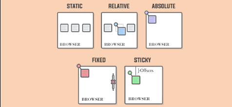
Forget rigid, grid like websites, CSS positioning takes control, letting you arrange HTML elements exactly where you want them. It offers five amazing tools: static, relative, absolute, fixed, and sticky. Each has its own superpower, from subtle nudges to complete freedom to elements that stick around as you scroll. Let's explore and unlock your web design potential.
Static Positioning:
By default, HTML elements are positioned statically. This means they flow naturally in the order they appear in the HTML document, without any special positioning rules applied.
In other words, static-positioned elements are not affected by the top, bottom, left, and right properties. As much as this is the default behavior of HTML elements, understanding other CSS position types is crucial for creating a dynamic web layout.
Relative Positioning:
A relative position is more like a static position, but it changes when properties like top, right, bottom, and left are added to the element. When a relative position is applied to an element, it enables developers to change the position of an element without affecting the original layout of the website. Relative positioning is very crucial when trying to position a child component without affecting the layout around it.
Absolute Positioning:
Absolute positioning removes an element from the document flow and situates it relative to its nearest positioned ancestor or the initial containing block. This attribute is indispensable and formidable for crafting overlays, tooltips, or elements necessitating liberation from their default placement. Diverging from its relative equivalent, absolutely positioned elements emancipate themselves from the ordinary document flow. They are no longer bound to their HTML counterparts, instead evolving into autonomous entities governed solely by your directives. By leveraging properties such as top, bottom, left, and right, you can pinpoint their precise location, while controlling their stacking order with the z-index confers remarkable adaptability.
Fixed Positioning:
Fixed positioning is commonly used when creating a navbar, banner, or floating Contact Us button. As the name implies, it allows the element to stay fixed in a particular position on the viewport. Unlike its absolute counterpart, fixed positioning doesn't make the element completely independent. Instead, it sticks to the viewport, the visible area of your browser window. This is often employed for navigation bars or elements that should persistently stay in view.
Sticky Positioning:
Ever feel like your website design needs a dash of "stay with me"? That's where sticky positioning in CSS comes in! Imagine elements that magically blend the best of both worlds: fixed when needed, flexible when not.
Here's how it works: when you apply position: sticky; to an element, you're essentially telling the browser to treat it as a hybrid between position: relative; and position: fixed;. Initially, the element behaves like a relatively positioned element, flowing with the document as normal. However, once it reaches a specified scroll position relative to its container block or the viewport, it becomes "stuck" in place, as if it were fixed to the screen.
Conclusion
You don't need to know all CSS properties, mastering positioning properties will enhance your web engineering skills, as they're among the most frequently used properties for creating well crafted and flexible layouts. While modern layout tools like CSS Grid and Flexbox streamline the process, a solid grasp of the fundamentals remains essential.
Subscribe to my newsletter
Read articles from Adegoke Ayobami Seun directly inside your inbox. Subscribe to the newsletter, and don't miss out.
Written by

Adegoke Ayobami Seun
Adegoke Ayobami Seun
Hi, I'm Adegoke Ayobami Seun, a software developer. I'm proficient in working with languages such as JavaScript, TypeScript, and C#. I also build frontend applications using libraries like React and Next.js and backend applications with Node Express and .NET. Additionally, I have experience working with AWS services.