World App: An Inquisitive User Experience Analysis
 Daniel Anthony
Over the past few years I have witnessed the rapid improvision of decentralized applications. Products that used to look and feel like some advanced system probably teleported from some high tech alien world are starting to look and feel like our everyday apps which we all know and love.
Of course this has been nothing but amazing to not only witness but also contribute in some minute (hopefully it's as big as minute) ways. Anyway, my interest stems around the user - in my books, the user is the market. Historically the products that have done great impact are those that target the users needs and put it first. That being said I think I have populated enough words to say we have our introduction!
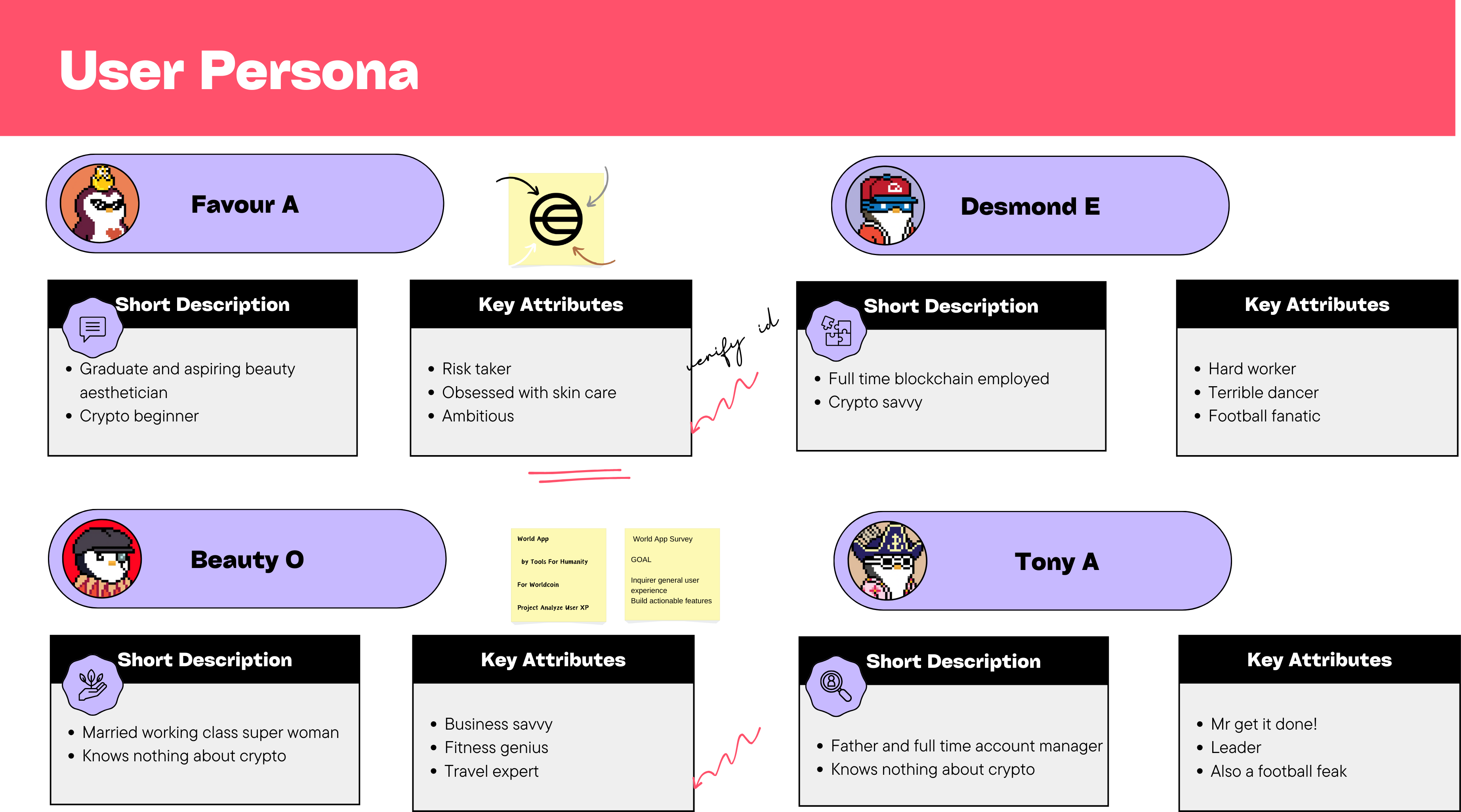
This article is centered around a user interview I conducted amongst 4 people on their overall experience getting onboarded into the World App.
Why World App?
Great question - the goal the team behind the World App have for the product is simply HUGE. Yes I had to type that in all caps. Impactful products don't build themselves rather by ambitious, smart and talented people, all of which the World App team possesses in high proportions. To be honest I love the idea and super curious about how they are solving intricate issues like decentralized digital human id. I think they are doing an amazing job at it.
User Persona

Interview a - Favor
Daniel: Hello Favor, how are you feeling today?
Favor: Amazing, love the interview already
Daniel: haha, let's dive in shall we
Question 1: Onboarding Experience How would you describe your experience with the onboarding process of the Worldcoin app? Did you find the setup process intuitive and user-friendly, or did you encounter any challenges or areas of confusion?
Favor: The Onboarding process was user friendly and straightforward so it wasn’t a hassle at all. However, I wasn’t able to sign up my phone number; so I ended up skipping that step.
Question 2: Customer Support Interaction Have you ever felt the need to reach out to customer support for assistance while using the Worldcoin app?
Favor: it was pretty easy to navigate, so I didn’t feel the need to contact customer service.
Question 3: App Functionality and Navigation Did you find the app's interface intuitive and easy to navigate, or were there any aspects that you found confusing or difficult to understand?
Favor: As stated in my answer to the second question, I found the app easy to navigate. I also liked how the design of the app is not over congested and complicated, so it’s easy to deduce what each icon represents. Also, I liked that there is a nice use of humor in the app as well; making it interesting to use.
Question 4: Overall Impressions and Suggestions What are your overall impressions of the Worldcoin app in terms of user experience and functionality? Based on your experience, are there any specific features or improvements you would suggest to enhance the app's usability and customer experience?
Favor: My overall impression and review is that I’m impressed. It seems pretty easy to use, so it’s something I can recommend to my Parents and older people around me who aren’t exactly tech savvy. I think they’ll get the hang of it just fine. However, it would be nice if there’s a night mode included. Also, if the customer service will be readily accessible. Lastly, I noticed that the World app was at capacity, that meant longer processing times for transactions. I hope you can work on that. Because, for an app like World App I imagine convenience and fast transactions. So, that’s my biggest concern.
Interview b - Desmond
Daniel: Hello Desmond, how was your day
Desmond: Very fine thank you, let's knock this out
Daniel: Alrighty
Desmond question 1 reply: Straightforward, simple and direct, easily understandable.
Question 2 reply: Really needed to reach out to customer support to make enquiry regarding verification.
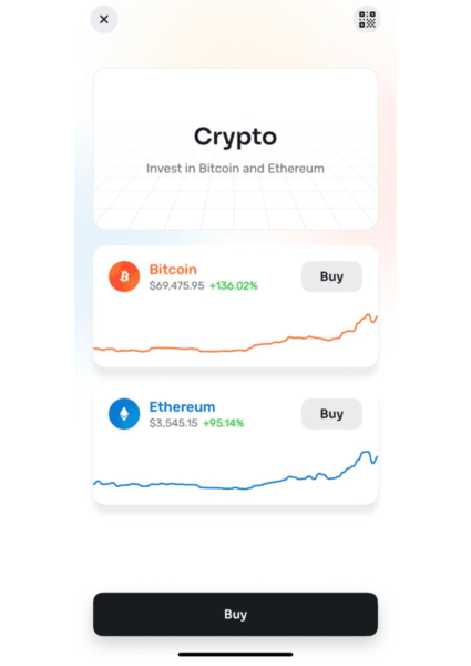
Question 3 reply: Functionality seems ok only challenge is not finding a menu to withdraw crypto assets , seems as though only deposits are allowed. Here's my screenshot

Question 4 reply: Verification challenges, withdrawal challenges and lack variety in available digital assets need to be looked into. Nevertheless app looks good.
Interview c - Beauty
Daniel: Hello Beautiful, ready for this?
Beauty: Born ready
Daniel: Ah that's the spirit!
Beauty's question 1 reply: There was no challenge when onboarding, it was seamless
Question 2 reply: Yes I hoped to see a button to easily give me access to customer support
Question 3 reply: The app is very easy to understand and navigate
Question 4 reply: I found it reasonably easy to understand. When you told me it's somewhat of a crypto wallet I felt it would be difficult but to my surprise it felt easier than my fitness app lol.
Daniel: Wow, that's great
Interview d - Tony
Daniel: Hello Tony, had a stressful day?
Tony: Not really, I like the setup here
Daniel: Thanks, maybe I went overboard, it's only 4 questions
Tony's question 1 reply: on the on boarding....they should make it less ambiguous... use very simple words.
Daniel: Interesting
Question 2 reply: Yes, feels like you need a manual to fully understand what the app does.
Question 3 reply: Yes, pretty smooth to move through.
Question 4 reply: The UI looked really good, made up for possibly anything else.
Analysis - Key Takeaways
The onboarding process received generally positive feedback, with users appreciating its straightforwardness and simplicity. However, there were instances of minor issues such as difficulty signing up phone numbers and challenges with language clarity.
Customer support interaction varied among users, while a user breezed through without a hitch, others encountered issues that required assistance. A reminder that accessible and responsive customer support is the real MVP in any app journey.
App functionality and navigation were generally well-received, with users praising the intuitive interface and ease of use. However, there were some challenges reported, such as difficulty finding specific features like withdrawal menus, suggesting potential usability improvements.
Overall impressions of the app were positive, with users impressed by its usability and functionality. However, there were also suggestions for enhancements such as improving transaction processing times, adding a night mode, and enhancing customer service accessibility. Additionally, feedback on simplifying language indicates a potential opportunity to improve clarity and accessibility for all users.
Closing The Curtains
Through the lens of various user personas, we've gained valuable insights into the strengths and areas for improvement within the platform.
As we look ahead, carrying the spirit of empathy and innovation, striving to create digital products that not only meet the needs of users but exceed their expectations. With a commitment to continuous improvement and a focus on user feedback, World App can continue to evolve and thrive in the dynamic landscape of decentralized applications.
I encourage you to read through World Apps whitepaper here if you haven't.
Website: https://worldcoin.org/world-app
X: https://twitter.com/worldcoin
Cheers!
Subscribe to my newsletter
Read articles from Daniel Anthony directly inside your inbox. Subscribe to the newsletter, and don't miss out.
Written by

Daniel Anthony
Daniel Anthony
A technical extrovert building smart contract dapps. Specialized in communicating technical blockchain concepts to the web2 maxis.