SBA, not SPA - The most minimal UI
 Adam Brakhane
Here's why it matters
I'm no front-end engineer. Sometimes it sucks, but mostly, I'm incredibly grateful for my shortcoming. It's easy to build minimal backend services that do one job very well. Your customer or "consumer" is usually a webpage and you can communicate with them over very precise and constrained channels. Almost always JSON over HTTP.
User interfaces are a little more complicated...
UI's suck (up time)

Humans are messy and usually need something more squishy than JSON. We start to build fields, forms, flows, wizards, buttons, colors, helper text, placeholder values, page hierarchy... I'm getting exasperated just thinking about thinking about all the decisions to be made.
The Single Button App
It's simple:
Your architecture is:
Backend API of your choosing (even serverless)
Process data
Integrate with 3rd party services
Google sheets
Stores data
One sheet for input
One or more sheets for the output data
Standard API (accessed with a service account)
Your SingleButtonApp
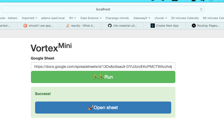
- Text box for Google Sheet URL, big "Go" button to send it to the API

This is a real UI we built for a tool called Vortex.
Not exactly no-code
But it's close.
First, what do you get for "free" by using Google Sheets as a part of your UI?
Robust data storage engine
Data validation and formatting (conditional formatting, drop downs, buttons)
Auto-save
Real-time syncing between multiple contributors
Familiar UI
Private & Public sharing URLs
Woah. All that in an MVP?
You're still in control
Because you've got a webpage in the mix, you can eventually grow it to a SPA or multipage app. It's a simple start AND it sets you up for easy expansion and evolution.
Adding additional input options
Run job A or job B. Run the fast model or the slow model. ...
Multi-step funnels
Run job A, add some context, then run job B on the result from job A. Example:
Scrape a website for Employees. Job A outputs into the sheet. Check the box next to 10 records. Job B will scrape the LinkedIn profiles for each person.
Better output
View the results directly in the webpage either for ease of use or a more branded way to share.
Embracing change
As the app evolves, you'll first expand the UI. For our tools, they eventually get to a point where the web tool is creating new google sheets and reading/writing from them without you ever actually seeing the sheet.
At that point, replacing it with a standard database becomes quite easy. The table schemas closely match your worksheet tabs. It's the sort of change you can make without your users even noticing.
Your Homework
Make your next MVP or internal app a Single Button App. Write me on LinkedIn if you'd like some guidance or inspiration on how to do this.
Sign up for my newsletter below. I'll follow up with specific steps/examples to get you running with one of these fast.
Subscribe to my newsletter
Read articles from Adam Brakhane directly inside your inbox. Subscribe to the newsletter, and don't miss out.
Written by

Adam Brakhane
Adam Brakhane
CTO at a venture studio that launches profitable businesses with a marketing flare. Follow along for the technical executive POV on building new, bootstrapped businesses that aren't (usually) selling software.