AntDesign simplified
 FASUNHANMI PELUMI
Table of contents
Ant Design is a UI library that provides simple components for creating interactive user interfaces.
It is a popular choice for React-based web application design due to its ease of use and seamless integration features. Ant Design provides a collection of high-quality components that are easy to use.
Features:
It has high-quality React components.
It supports internationalization in several languages.
TypeScript is used with the use of static types .
Complete collection of design resources and development tools.
Installation:
AntD can be install using npm or yarn. Ensure Node.js and npm are already installed
Using yarn
yarn add antd
Using npm
npm install antd
Getting started with antd:
Let's delve into Ant Design's functionality through a practical example focusing on the Form component.
Step-by-Step Guide:
Set Up React Application:
Create a new React application using the command:
npx create-react-app my-appor
yarn create react-app my-appNavigate to Project Directory:
Move to the created project folder (my-app) using:
cd my-appInstall Ant Design Module:
After setting up the React application, install the necessary module with:
yarn add antdGetting the Form component: Go to https://ant.design/ , navigate to the component ( this contains lists of contains a list of various UI components provided by Ant Design) search for the Form component, click on the component, to view its details and look for the one that matches your design. Then copy the code (based on the Typescript or Javascript depending on which you are using) Into your component
Implementation:
In the App.js file, the default component (App) houses the code for our demonstration.
 import React from 'react';
 import "antd/dist/antd.css";
 import { Form, Button, Input, InputNumber } from 'antd';

  function App() {
     const onFinishFailed = () => {
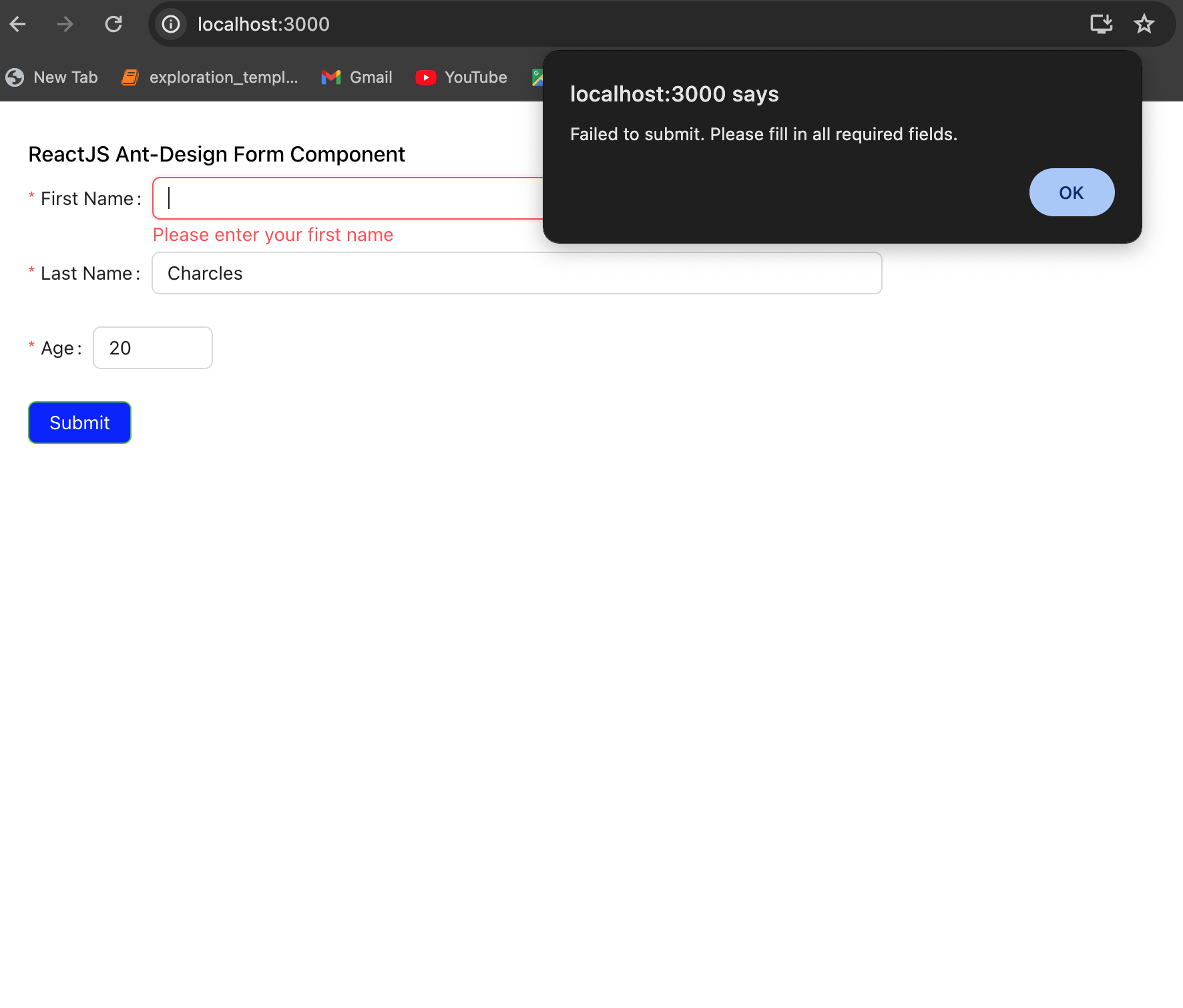
         alert('Failed to submit. Please fill in all required fields.');
     };

     const onFinish = (values) => {
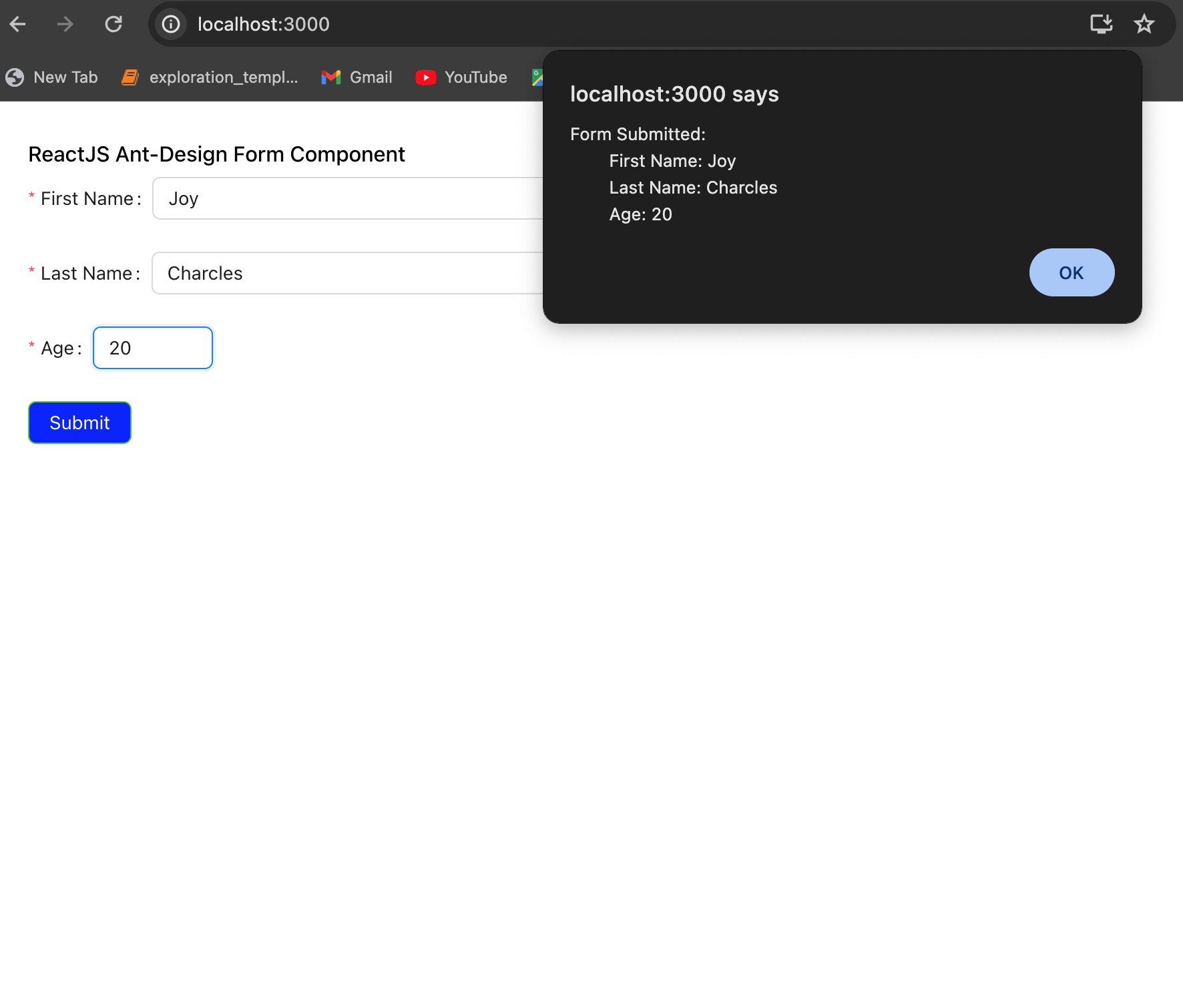
         alert(`Form Submitted:
         First Name: ${values.firstName}
         Last Name: ${values.lastName}
         Age: ${values.age}`);
     };

     return (
         <div style={{
             display: 'block', width: 700, padding: 30
         }}>
             <h4>ReactJS Ant-Design Form Component</h4>
             <Form
                 name="basicform"
                 onFinishFailed={onFinishFailed}
                 onFinish={onFinish}
                 initialValues={{ remember: true }}
             >
                 <Form.Item
                     label="First Name"
                     name="firstName"
                     rules={[{
                         required: true,
                         message: 'Please enter your first name'
                     }]}
                 >
                     <Input />
                 </Form.Item>
                 <Form.Item
                     label="Last Name"
                     name="lastName"
                     rules={[{
                         required: true,
                         message: 'Please enter your last name'
                     }]}
                 >
                     <Input />
                 </Form.Item>
                 <Form.Item
                     label="Age"
                     name="age"
                     rules={[{
                         required: true,
                         type: 'number',
                         min: 1,
                         max: 150,
                         message: 'Please enter a valid age between 1 and 150'
                     }]}
                 >
                     <InputNumber />
                 </Form.Item>
                 <Form.Item>
                     <Button type="success" htmlType="submit">
                         Submit
                     </Button>
                 </Form.Item>
             </Form>
         </div>
     );
 }
 export default App
Running the Application: Execute the application from the project's root directory using:
yarn startGo to your web browser and navigate to http://localhost:3000/ to check the output of the design.


Subscribe to my newsletter
Read articles from FASUNHANMI PELUMI directly inside your inbox. Subscribe to the newsletter, and don't miss out.
Written by
