CSS Positioning Made Easy: Learn the Basics with Examples
 Shubham Vandara
Table of contents

CSS positions are integral to web development, enabling designers to precisely control the layout and positioning of elements on a webpage. Whether you're just starting out or looking to refresh your knowledge, understanding CSS positions is essential for creating visually appealing and functional websites. In this blog, we'll explore the basics of CSS positions.
What are CSS Positions?
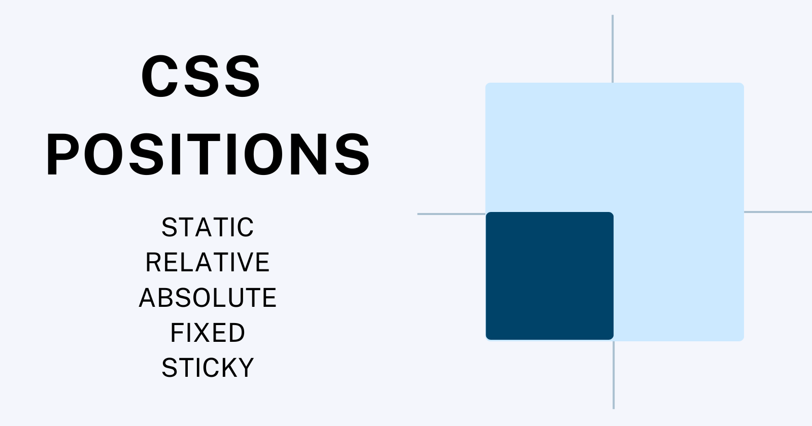
In CSS, positions determine how an element is placed within its containing element. There are five primary position values:
Static: This is the default position value. Elements with position: static; are positioned according to the normal flow of the document. They cannot be moved using the top, bottom, left, or right properties.
Relative: Elements with position: relative; are positioned relative to their normal position in the document flow. Using top, bottom, left, or right properties, you can offset the element from its original position.
Absolute: Elements with position: absolute; are removed from the normal document flow and positioned relative to their nearest positioned ancestor. If there is no positioned ancestor, they are placed relative to the initial containing block, which is typically the <html> element.
Fixed: Elements with position: fixed; are positioned relative to the browser window or the viewport. They remain fixed in their position even when the page is scrolled.
Sticky: Elements with position: sticky; are positioned based on the user's scroll position. They behave like position: relative; until the user scrolls to a specified point, then they become fixed until the user scrolls past a specified point.
Examples
Let's demonstrate each position value with simple examples:
Static Position
<!DOCTYPE html>
<html>
<head>
  <style>
    .static-box {
      width: 100px;
      height: 100px;
      background-color: red;
    }
  </style>
</head>
<body>
  <div class="static-box">Static Box</div>
</body>
In this example, the .static-box element is positioned statically, so it appears in the normal flow of the document.
Relative Position
<!DOCTYPE html>
<html>
<head>
  <style>
    .relative-box {
      position: relative;
      left: 50px;
      top: 20px;
      width: 100px;
      height: 100px;
      background-color: blue;
    }
  </style>
</head>
<body>
  <div class="relative-box">Relative Box</div>
</body>
</html>
Here, the .relative-box element is positioned relative to its normal position. We've shifted it 50 pixels to the right and 20 pixels down.
Absolute Position
<!DOCTYPE html>
<html>
<head>
  <style>
    .relative-container {
      position: relative;
      height: 200px;
      width: 200px;
      background-color: lightgray;
    }
    .absolute-box {
      position: absolute;
      top: 50px;
      left: 50px;
      width: 100px;
      height: 100px;
      background-color: green;
    }
  </style>
</head>
<body>
  <div class="relative-container">
    <div class="absolute-box">Absolute Box</div>
  </div>
</body>
</html>
In this example, the .absolute-box element is positioned absolutely within its relative container .relative-container. It's offset 50 pixels from the top and 50 pixels from the left of its containing block.
Fixed Position
<!DOCTYPE html>
<html>
<head>
  <style>
    .fixed-box {
      position: fixed;
      bottom: 20px;
      right: 20px;
      width: 100px;
      height: 100px;
      background-color: yellow;
    }
  </style>
</head>
<body>
  <div class="fixed-box">Fixed Box</div>
  <p>Lorem ipsum dolor sit amet, consectetur adipiscing elit.</p>
  <!-- Add enough content to enable scrolling -->
</body>
</html>
In this example, the .fixed-box element is positioned fixed to the bottom-right corner of the viewport. It remains in place even when scrolling.
Sticky Position
<!DOCTYPE html>
<html>
<head>
  <style>
    body {
      margin: 0;
      font-family: Arial, sans-serif;
    }
    .navbar {
      position: sticky;
      top: 0;
      background-color: #333;
      padding: 10px 0;
      width: 100%;
      text-align: center;
    }
    .navbar a {
      color: white;
      text-decoration: none;
      padding: 0 15px;
    }
    .content {
      padding-top: 50px; /* Ensure content doesn't start behind the sticky navbar */
    }
    .section {
      height: 400px;
      background-color: #f2f2f2;
      text-align: center;
      line-height: 400px;
    }
  </style>
</head>
<body>

<div class="navbar">
  <a href="#">Home</a>
  <a href="#">About</a>
  <a href="#">Services</a>
  <a href="#">Contact</a>
</div>

<div class="content">
  <div class="section">Section 1</div>
  <div class="section">Section 2</div>
  <div class="section">Section 3</div>
</div>

</body>
</html>
When you scroll down the page in this example, you'll notice that the navbar remains sticky at the top of the viewport, providing easy access to navigation links as you explore the content below. This is a typical use case for a sticky element and enhances user experience by keeping important navigation readily accessible.
Conclusion
Understanding CSS positions is essential for mastering web layout and design. By familiarizing yourself with these position values and their behaviors, you gain greater control over the placement of elements on your webpage. Experiment with different position values and properties to achieve the desired layout for your projects. With practice and exploration, you'll become proficient in using CSS positions to create stunning and functional web designs.
Subscribe to my newsletter
Read articles from Shubham Vandara directly inside your inbox. Subscribe to the newsletter, and don't miss out.
Written by
Shubham Vandara
Shubham Vandara
Hi, I'm Shubham Vandara, a Java Full-Stack developer who focuses on building scalable web applications. I have experience with React, Spring Boot, and MySQL. I create impactful web applications with a passion for learning and problem-solving.