Why my image has this weird extra space
 mishoko
Problem: Some mysterious space under when an image is added:

TLDR fix:
img {
  display: block;
}
Why Does This Happen?
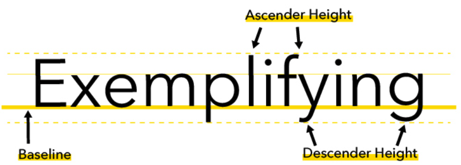
The culprit behind the phantom gap is the <img> tag itself. By default, it's treated as an inline element, similar to a single letter in a sentence. Imagine inserting a picture of a cute animal awkwardly between words in a sentence. That's kind of what happens in our code. The browser sees the image as having a baseline, just like some letters (like "p" or "y"), which creates a small gap below it.

So the browser is adding this extra space under the image, potentially expecting a descender under the baseline.
Few simple ways to eliminate the phantom gap and make our images look their best:
Solution 1: The blockbuster fix
This solution is a quick and easy one. By setting the display property of our <img> tag to block, you're essentially telling the browser to treat the image as a separate block, similar to a paragraph or heading.
Here's the code to fix the gap:
<img src="my-awesome-image.jpg" style="display: block;">
or
img {
  display: block;
}
Solution 2: Breaking free from the baseline
By default, the vertical-align attribute is set to baseline. This aligns the bottom of the image with the baseline of the surrounding text, which can lead to the phantom gap.
To eliminate the gap, you can change the value of the vertical-align attribute to bottom. This essentially tells the browser to push the image all the way down to the bottom of its container, eliminating any extra space below it.
img {
  vertical-align: bottom;
}
Solution 3: The line-height hack - the power of zero
Solution involves creating a wrapper element around our image and manipulating its line-height property.
By setting the line-height of the wrapper element to 0%, you essentially remove any default line height associated with the container. This ensures that the image doesn't inherit any unwanted space from its parent element and eliminates the phantom gap.
<div class="image-wrapper">
  <img src="my-awesome-image.jpg" alt="Img description">
</div>
.image-wrapper {
  line-height: 0;
}
Note 1: Might affect the spacing of other elements within the wrapper.
Note 2: <div> might not be the best semantic HTML element for that wrapper-specific purpose.
Solution 4: Shrinking that font (but not the image):
Similar as above we use a wrapper container:
By setting the font-size of the wrapper element to 0, you essentially remove any default font size and its associated baseline. This eliminates any potential gap below the image inherited from the container.
.image-wrapper {
  font-size: 0;
}
Phantom Gap? No More!
These solutions empower us to eliminate the phantom gap and ensure our images sit perfectly within our webpages. No more wrestling with unwanted space – just beautiful, gap-free layouts!
Subscribe to my newsletter
Read articles from mishoko directly inside your inbox. Subscribe to the newsletter, and don't miss out.
Written by
