CSS Word Wrap and Border
 Jalaj Singhal
CSS word wrap property.
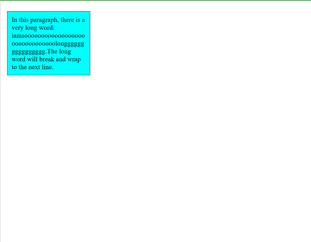
It is used to break the long words and wrap onto the next line. This property is used to prevent overflow when an unbreakable string is too long to fit in the containing box.
CSS Word Wrap Values
| Value | Description |
| normal | This property is used to break words only at allowed break points. |
| break-word | It is used to break unbreakable words. |
| initial | It is used to set this property to its default value. |
| inherit | It inherits this property from its parent element. |
CSS Word Wrap Example
INPUT:
<!DOCTYPE html>
<html>
<head>
<style>
p.test {
    width: 11em;
    background-color: #00ffff;
    border: 1px solid #000000;
    padding:10px;
    word-wrap: break-word;
}
</style>
</head>
<body>
    <p class="test"> In this paragraph, there is a very long word: iamsooooooooooooooooooooooooooooooolongggggggggggggggg.The long word will break and wrap to the next line.</p>
</body>
</html>
OUTPUT:
Box-shadow CSS
As soon as we have made a box, we give it a box shadow.
Syntax
box-shadow: h-offset v-offset blur spread color |inset|inherit|initial|none;
Let's understand property values.
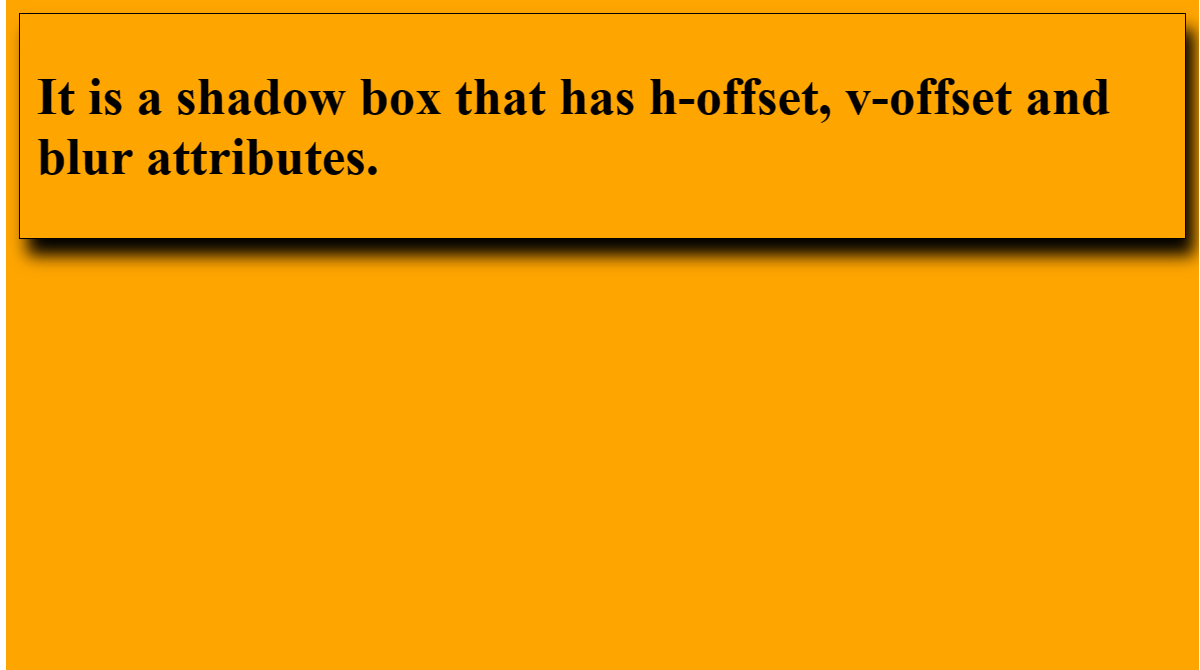
h-offset: It horizontally sets the shadow position. Its positive value will set the shadow to the right side of the box. Its negative value is used to set the shadow on the left side of the box.
v-offset: Unlike the h-offset, it is used to set the shadow position vertically. The positive value in it sets the shadow below the box, and the negative value sets the shadow above the box.
blur: As its name implies, it is used to blur the box-shadow. This attribute is optional.
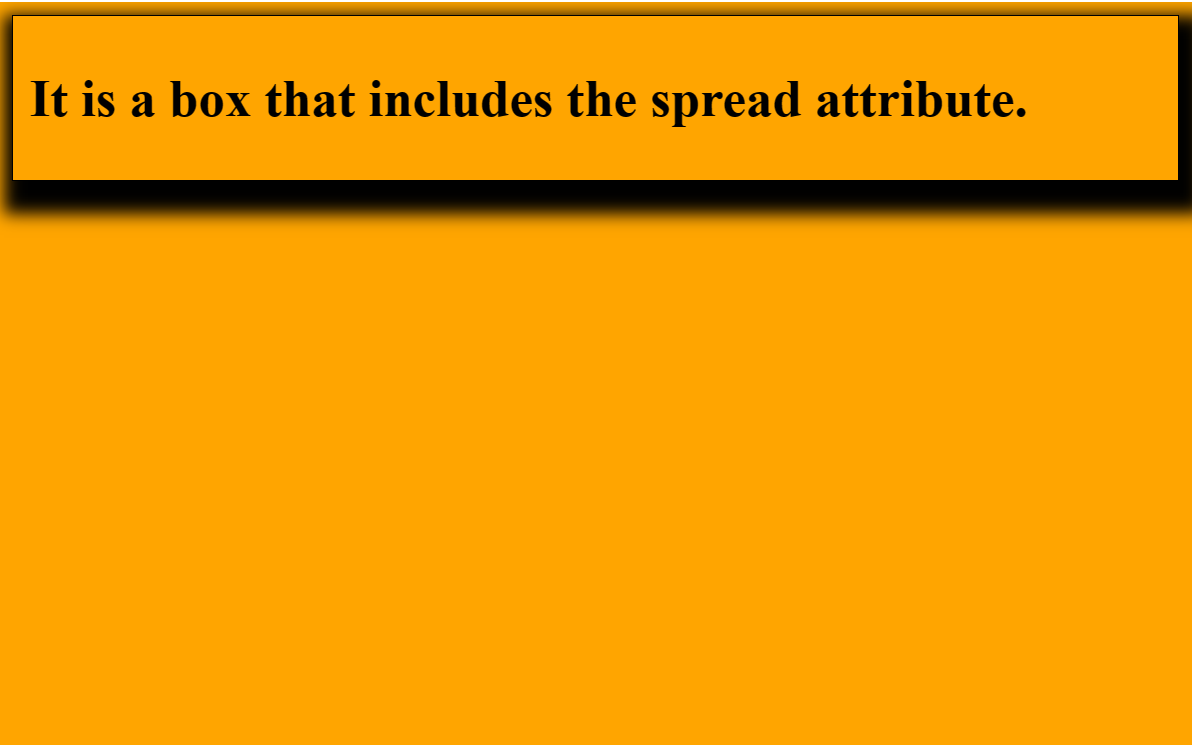
spread: It sets the shadow size. The spread size depends upon the spread value.
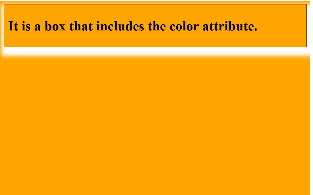
color: As its name implies, this attribute is used to set the color of the shadow. It is an optional attribute.
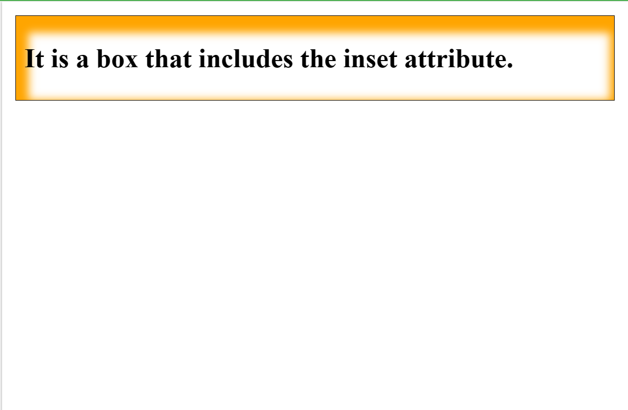
inset: Normally, the shadow generates outside of the box, but by using inset, the shadow can be created within the box.
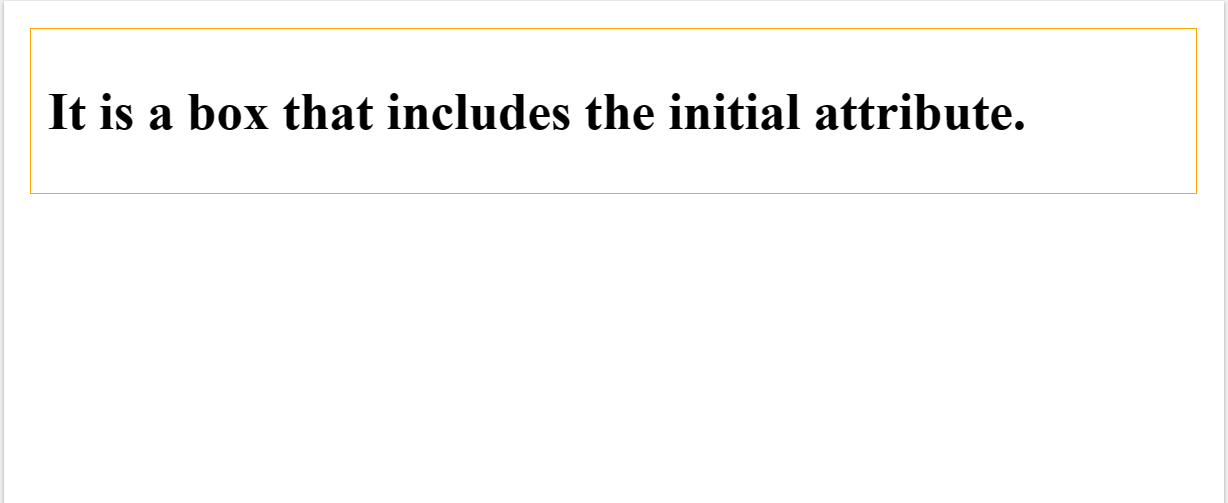
initial: It is used to set the property of the box-shadow to its default value.
inherit: it is inherited from its parent.
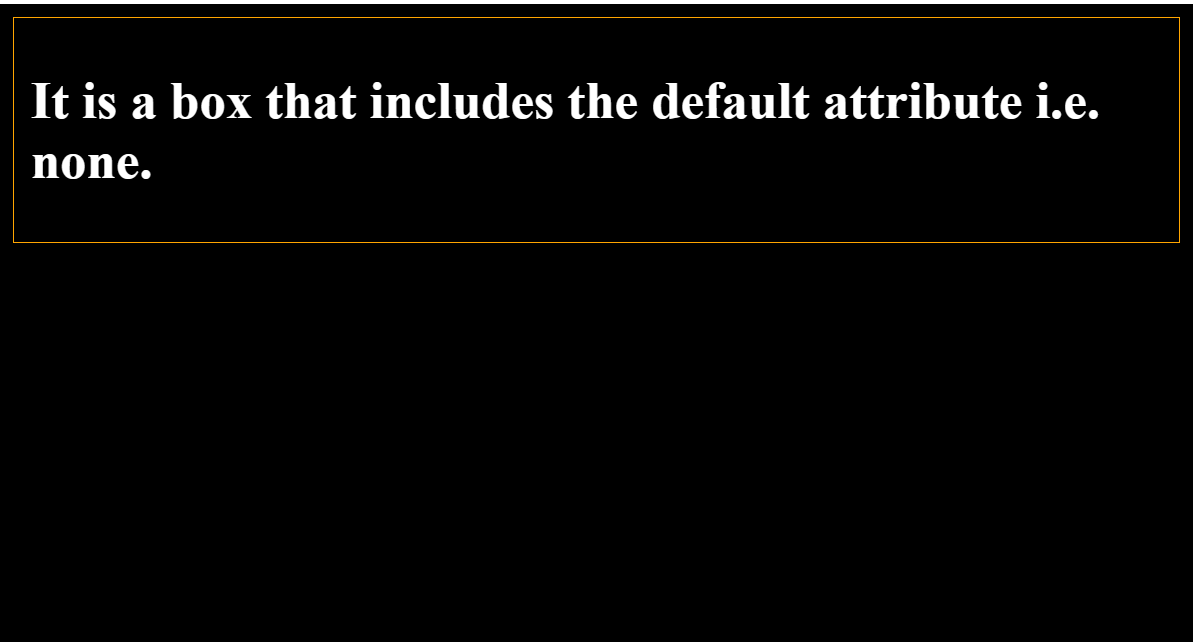
none: It is the default value that does not include any shadow property.
Example:
h-offset v-offset blur
INPUT:
<!DOCTYPE html>
<html>
    <head>
        <title>CSS box-shadow Property</title>

        <style>
            * {
                background-color: orange;
            }
            div
            {
            border: 1px solid;
            padding: 10px;
            }
            #hvb
            {
                /* box-shadow: h-offset v-offset blur */
                box-shadow: 5px 10px 10px;
            }
        </style>
    </head>

    <body>
        <div id = "hvb">
            <h1>It is a shadow box that has h-offset, v-offset and blur attributes.</h1>
       </div>
    </body>
</html>
OUTPUT:
h-offset v-offset blur spread
INPUT:
<!DOCTYPE html>
<html>
    <head>
        <title>CSS box-shadow Property</title>

        <style>
            * {
                background-color: orange;
            }
            div
            {
            border: 1px solid;
            padding: 10px;
            }
             #spr
            {
                /* box-shadow: h-offset v-offset blur spread */
                box-shadow: 5px 10px 10px 10px;
            }
        </style>
    </head>

    <body>
        <div id = "spr">
            <h1>It is a box that includes the spread attribute.</h1>
        </div>
    </body>
</html>
OUTPUT:
h-offset v-offset blur spread color
INPUT:
<!DOCTYPE html>
<html>
    <head>
        <title>CSS box-shadow Property</title>

        <style>
            * {
                background-color: orange;
            }
            div
            {
            border: 1px solid;
            padding: 10px;
            }
             #col
            {
               /* box-shadow: h-offset v-offset blur spread color */
                box-shadow: 5px 10px 10px 10px white;
            }
        </style>
    </head>

    <body>
        <div id = "col">
        <h1>It is a box that includes the color attribute.</h1>
     </div>
    </body>
</html>
OUTPUT:
h-offset v-offset blur spread color inset
INPUT:
<!DOCTYPE html>
<html>
    <head>
        <title>CSS box-shadow Property</title>

        <style>
            div
            {
            border: 1px solid;
            padding: 10px;
            }
             #ins
            {
                  /* box-shadow: h-offset v-offset blur spread color inset */
                box-shadow: 5px 10px 10px 10px orange inset;
            }
        </style>
    </head>

    <body>
         <div id = "ins">
      <h1>It is a box that includes the inset attribute.</h1>
   </div>
    </body>
</html>
OUTPUT:
Box shadow initial
INPUT:
<!DOCTYPE html>
<html>
    <head>
        <title>CSS box-shadow Property</title>

        <style>
            div
            {
            border: 1px solid orange;
            padding: 10px;
            }
              #init
            {
                  /* box-shadow: initial */
               box-shadow: initial;

            }
        </style>
    </head>

    <body>
         <div id = "init">
      <h1>It is a box that includes the initial attribute.</h1>
   </div>
    </body>
</html>
OUTPUT:
Box shadow none
INPUT:
<!DOCTYPE html>
<html>
    <head>
        <title>CSS box-shadow Property</title>

        <style>
            *{
             BACKGROUND-COLOR: BLACK;
             COLOR: WHITE; }
            div
            {
            border: 1px solid orange;
            padding: 10px;
            }
             #non
            {
                /* box-shadow: none */
                box-shadow: none;
            }
        </style>
    </head>

    <body>
         <div id = "non">
      <h1>It is a box that includes the default attribute i.e. none.</h1>
  </div>
    </body>
</html>
OUTPUT:
Subscribe to my newsletter
Read articles from Jalaj Singhal directly inside your inbox. Subscribe to the newsletter, and don't miss out.
Written by

Jalaj Singhal
Jalaj Singhal
👋 Greetings, Jalaj Singhal here! 🚀 I'm an enthusiastic blogger who enjoys delving into the world of technology and imparting my knowledge to the community. 📃 Having experience in HTML and CSS, I enjoy creating interesting and educational content that demystifies difficult ideas and gives readers the tools they need to advance their knowledge. 🌐 I try to contribute to the active tech community and encourage relevant discussions on Hash Node, where you can find my writings on the subject of web development. 💡 Together, let's connect and go out on this fascinating path of invention and learning!