0 to 1: A Gentle introduction to CSS Flex box
 kxzazz
CSS Flexbox is a way to specify the layout and interactions of HTML elements in a webpage. It is a container with HTML elements inside it called items.
Flexbox is about how to distribute items along a row or column.
Why do we need Flexbox? Due to its ability to adjust size based on the device it is viewed on and content it has. Therefore, It is always a prime Layout Algorithm for responsive design.
Have a look at this Demo by Adam Argyle, It uses no media queries to adjust size and position. Yet, It is able to change and adjust based on size of page.
So,
Let's make a flexbox!!
Make an HTML file named
index.htmland copy and paste the below code.<!DOCTYPE html> <html lang="en"> <head> <title>Flexbox</title> <link rel="stylesheet" href="style.css" /> </head> <body> <div class="container"> <div class="item" id="zero">0</div> <div class="item">1</div> <div class="item">2</div> <div class="item">3</div> <div class="item">4</div> </div> </body> </html>Make a CSS file named
style.cssin the same directory and add the default styles into the file. This resets the browser default styles.*, *::after, *::before { padding: 0; margin: 0; box-sizing: border-box; } body{ height: 100vh; }To make the items visible, let's add a border to it.
 .item {
   padding: 5px;
   border: 1px;
   border-style: solid;
 }
Open up the HTML using file explorer or Live Server
Remember, editing this way, you always have to refresh the browser after you make any changes in the code.
If you are using VSCode use Live Server Extension to automatically updates changes. Just click on
Go Livethe button in the Status bar.The Browser Page should look something like this.
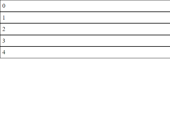
Make the container a flexbox by changing the
displayproperty of container toflex.container { display: flex; }Congratulations! This is your FIRST FLEXBOX!!!

By default, all elements have the property display: flow; When we change the display property to flex, We change how the elements behave.
Tip: You can Zoom in for a closer look.
Flex direction
By default, the items are stacked side-by-side. Or another way of looking at this is that, The items are stacked on the Main Axis. Which is controlled by flex-direction property on the container. By default, flex-direction: row
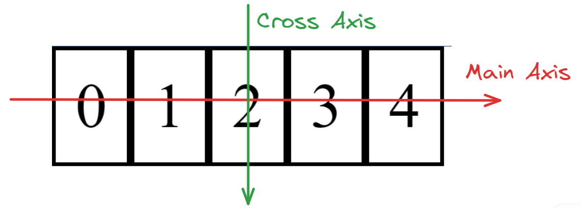
The direction of the axis, tells us in which order the elements are stacked.
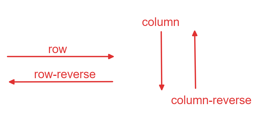
The possible values of flex-direction are:
rowrow-reversedcolumncolumn-reversed
The direction and position of Main Axis as per flex-direction
Justify content
You might have noticed that the items don't take up all the space in the flex box.
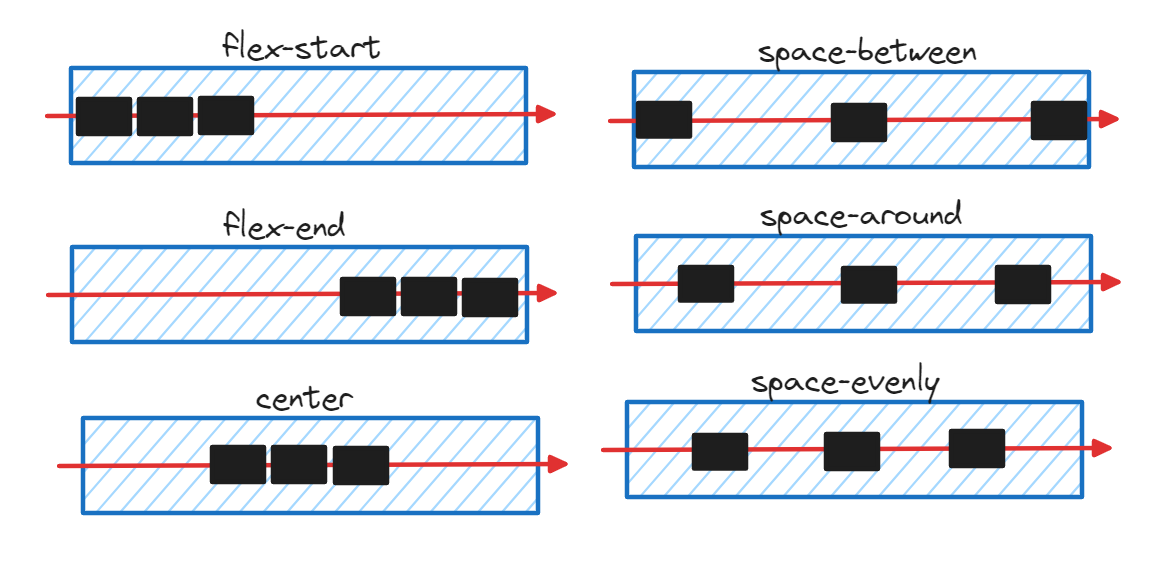
How this extra space is distributed along the Main Axis is controlled by justify-content By default, justify-content: flex-start;
What is flex-start? It is the "top" position along the Main Axis and similarly there is flex-end which is the "bottom" position along the Main Axis, this is where the flex box ends.

When we change the justify-content to flex-end. This is the result.
.container{
    /*code before*/
    justify-content: flex-end;
}

The possible values of justify-content are:
flex-startflex-endcenterspace-betweenspace-aroundspace-evenly
To have more control over how much space should be between items, use gap.
Align Items
Since every item has the same height, our flexbox also has the same height. What happens if one of the items is taller/shorter than the rest of the items.
Let's set the height of item zero with a height of 50px
#zero{
 height: 50px;
}
This is the result.
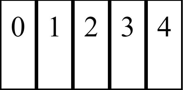
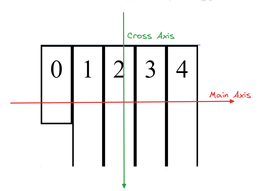
Why are other items have increased their size? This is due to align-items property which defines how the items are distributed along the Cross Axis.
By default, it is set to stretch which expands all items to the height of the flex box.
The height flex box by default is set to the maximum height of items. Let's change that and set it to height of the body.
.container{
    height: 100%;
    /*Rest of code*/
}
Now, our items should take up the height of the page except item0
Let's remove the #zero CSS to avoid further confusion.
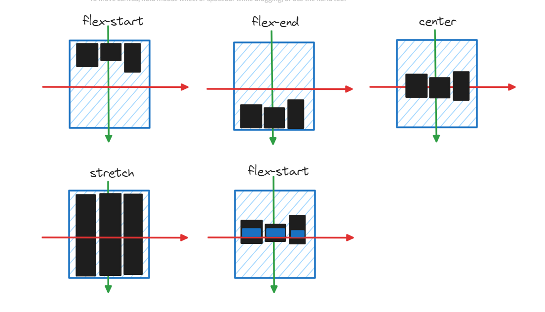
align-items has the same purpose as justify-content but it controls the Cross Axis, instead of Main Axis.
Confusingly, the "top" of the Cross Axis is also called flex-start and the "bottom" is also called flex-end. Remember that these values have different meaning depending on where it is used.
Let us set the align-items to flex-start
.container{
    /*Rest of Code*/
    align-items: flex-start;
}
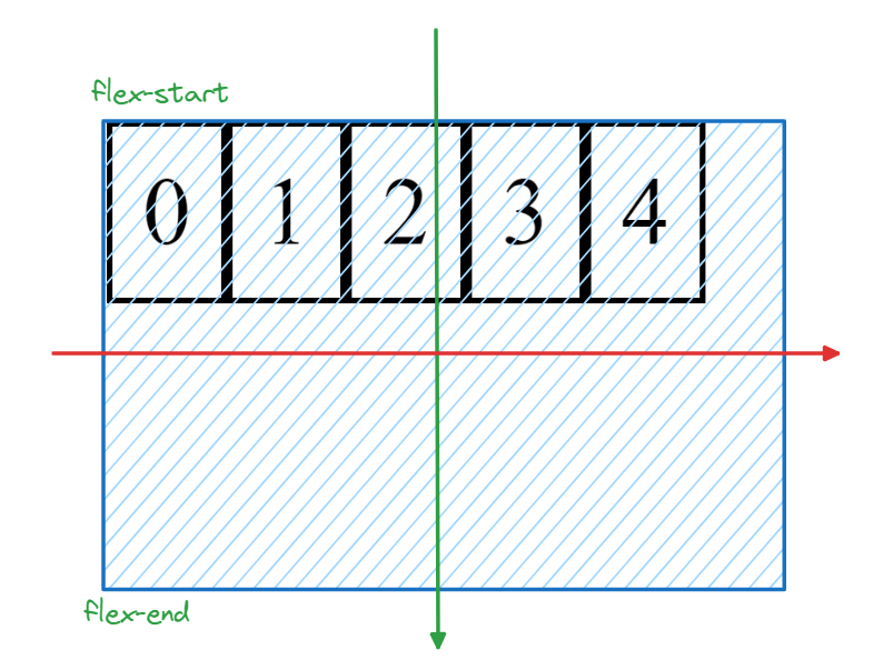
The possible values of align-items are:
stretchflex-startflex-endcenterbaselineThis aligns all the items based on the contents of the items such that all item content is aligned.
Align self
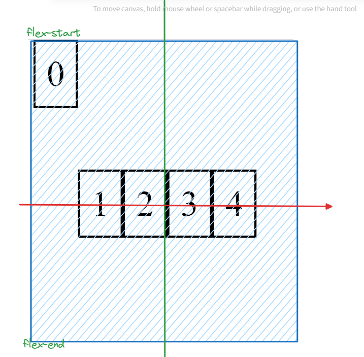
Every item has a align-self that is used to align itself along the Cross Axis. Infact align-items is a shorthand that sets all items align-self to property mentioned.
For Example,
#zero{
    align-self: flex-start;
}
.container{
    /*Rest of Code*/
    align-items: center;
}
This sets all items alignment to center and item0 alignment as flex-start. Below is the result.
How to center a div?
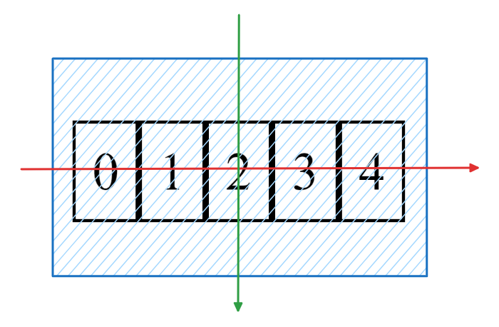
Using flex box, we can center a div by setting the parent's justify-content: center; and align-items: center;
.container {
  display: flex;
  justify-content: center;
  align-items: center;
}
This is the result. This remains centered even when the size of screen changes.
1 to 100: Advanced Topics
wrap
gap
flex-grow
flex-shrink
order
Further Reading
Subscribe to my newsletter
Read articles from kxzazz directly inside your inbox. Subscribe to the newsletter, and don't miss out.
Written by

kxzazz
kxzazz
I am developer from Hyderabad. I explore tech and software in my free time.