Establishing a Complete SwiftUI Design System for iOS Applications
 Codefy Labs
Creating a full design system is a clever method to ensure that your design and development run smoothly and have a unified look. This article will demonstrate how to enhance the SwiftUI protocol by adding extra useful methods for creating and utilizing a design system in iOS apps.
Contents Table
Design system: what is it?
Giving our app a colour scheme
Including text
Producing Reusable Elements
Final Thoughts
Design system: what is it?
A design system is a complete set of rules, ideas, elements, and tools that define how a digital product looks and works. It provides a unified approach for design and development, ensuring that the project can grow, work efficiently, and stay consistent.
To achieve this, we will use extensions to introduce a color scheme and typography, and then create components that can be reused.
Colour Scheme
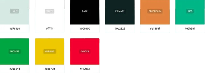
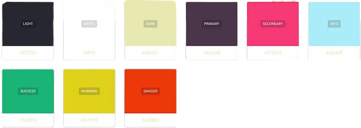
Let's begin by setting up a color scheme. I prefer using huemint, but feel free to make your own or use the one I've selected.
Random Color Palette Light Mode
Random Color Palette Dark Mode
It's time to incorporate the colors into our codebase now that they have been defined.
There are different ways to add colors to our app: we can use assets, expand the Colour struct, or utilize ShapeStyle, which is my favorite method.
To create our own custom colors, we can start by making a way to convert hex strings into their RGB parts.
import SwiftUI

extension Color {

    /// Initializes a `Color` using a hexadecimal string.
    /// - Parameter hex: A string representing the hex code for the color.
    init(hex: String) {
        let cleanedHex = hex.trimmingCharacters(in: .whitespacesAndNewlines).trimmingCharacters(in: CharacterSet(charactersIn: "#"))

        var rgbValue: UInt64 = 0
        Scanner(string: cleanedHex).scanHexInt64(&rgbValue)

        let red = Double((rgbValue & 0xFF0000) >> 16) / 255.0
        let green = Double((rgbValue & 0x00FF00) >> 8) / 255.0
        let blue = Double(rgbValue & 0x0000FF) / 255.0

        self.init(red: red, green: green, blue: blue)
    }

    /// A boolean indicating if the current user interface style is dark mode.
    static var isDarkMode: Bool {
        UITraitCollection.current.userInterfaceStyle == .dark
    }

    // Predefined dynamic colors for different uses.
    static var dsLight: Color {
        Color(hex: isDarkMode ? "#d7e8e4" : "#272731")
    }
    static var dsWhite: Color {
        Color.white // Simplified as white remains the same in either mode.
    }
    static var dsDark: Color {
        Color(hex: isDarkMode ? "#000100" : "#e8e9b1")
    }
    static var dsPrimary: Color {
        Color(hex: isDarkMode ? "#0d2322" : "#4a3549")
    }
    static var dsSecondary: Color {
        Color(hex: isDarkMode ? "#e1853f" : "#f73975")
    }
    static var dsInfo: Color {
        Color(hex: isDarkMode ? "#00b587" : "#abebf9")
    }
    static var dsSuccess: Color {
        Color(hex: isDarkMode ? "#00a544" : "#1cb376")
    }
    static var dsWarning: Color {
        Color(hex: isDarkMode ? "#eec700" : "#ded219")
    }
    static var dsDanger: Color {
        Color(hex: isDarkMode ? "#f40033" : "#ed380b")
    }
}
The first new feature in this extension is a method to set a color using its hex code. Then, you can easily create the colors you want.
Let's now add an image to show the colors.
import SwiftUI

struct DSColors: View {
    // Array of all dynamic color properties from the Color extension
    private let colors: [Color] = [.dsLight, .dsDark, .dsPrimary, .dsSecondary, .dsInfo, .dsSuccess, .dsWarning, .dsDanger]

    var body: some View {
        GeometryReader { geometry in
            ScrollView {
                VStack(spacing: 20) {
                    ForEach(colors, id: \.self) { color in
                        Circle()
                            .fill(color)
                            .frame(width: 64, height: 64)
                    }
                }
                .frame(width: geometry.size.width)
                .padding(.vertical, 20) // Adds padding to the top and bottom
            }
        }
    }
}

struct DSColors_Previews: PreviewProvider {
    static var previews: some View {
        DSColors()
    }
}
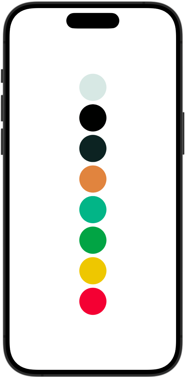
Although the colors are currently visible in the sample, it would be beneficial to show more information on that canvas.
To better display the colors in our program, we will make a small change to the code above.
Let's add this new function to our ShapeStyle extension, right under init().
import SwiftUI

extension Color {
    /// Converts `Color` to a hexadecimal color string.
    func toHex() -> String {
        // Attempt to create a UIColor from the SwiftUI Color, and access its components
        guard let components = UIColor(self).cgColor.components, components.count >= 3 else {
            return "#000000"  // Return black if unable to get components
        }

        // Extract RGB components and convert to integers
        let red = Int(components[0] * 255.0 + 0.5)
        let green = Int(components[1] * 255.0 + 0.5)
        let blue = Int(components[2] * 255.0 + 0.5)

        // Format as a hexadecimal string
        return String(format: "#%02X%02X%02X", red, green, blue)
    }
}
We can now change any color to hex format. This will save time by not having to manually write each hex string in the preview panel.
Next, swap out the preview macro and struct DSColors for the following:
import SwiftUI

struct DSColors: View {
    let color: Color
    let colorName: String

    var body: some View {
        HStack {
            Circle()
                .fill(color)
                .frame(width: 64, height: 64)
            VStack(alignment: .leading) {
                Text(colorName)
                    .font(.headline)
                Text(color.toHex())
                    .font(.subheadline)
                    .foregroundColor(.gray)
            }
        }
    }
}

struct DSColors_Previews: PreviewProvider {
    static var previews: some View {
        ScrollView {
            VStack(alignment: .leading, spacing: 24) {
                DSColors(color: .dsLight, colorName: "Light")
                DSColors(color: .dsDark, colorName: "Dark")
                DSColors(color: .dsPrimary, colorName: "Primary")
                DSColors(color: .dsSecondary, colorName: "Secondary")
                DSColors(color: .dsInfo, colorName: "Info")
                DSColors(color: .dsSuccess, colorName: "Success")
                DSColors(color: .dsWarning, colorName: "Warning")
                DSColors(color: .dsDanger, colorName: "Danger")
            }
            .padding()
        }
    }
}
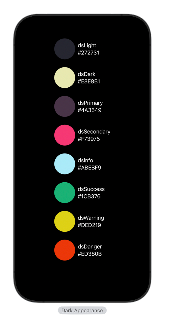
The preview panel's colour representation will ultimately be considerably nicer.
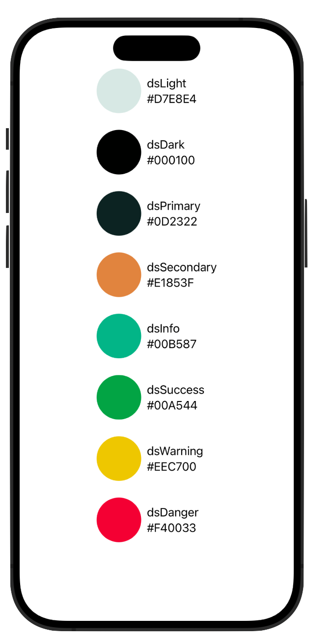
Update: color representation in Dak Mode
Fonts
The fonts that the application will utilise will then be created by extending the SwiftUI Font struct and adding our custom variables.
I'll be using my preferred font, "TrebuchetMS."
import SwiftUI

extension Font {
    /// The font name to be used across the app.
    static let fontName: String = "TrebuchetMS"

    // MARK: - Design System Fonts

    /// Large title font with customizable weight.
    /// - Parameter weight: The weight of the font. Default is `.regular`.
    /// - Returns: A large title font of size 34.
    static func dsLargeTitle(_ weight: Font.Weight = .regular) -> Font {
        Font.custom(fontName, size: 34).weight(weight)
    }

    /// Title font with customizable weight.
    /// - Parameter weight: The weight of the font. Default is `.light`.
    /// - Returns: A title font of size 28.
    static func dsTitle(_ weight: Font.Weight = .light) -> Font {
        Font.custom(fontName, size: 28).weight(weight)
    }

    /// Secondary title font with customizable weight.
    /// - Parameter weight: The weight of the font. Default is `.regular`.
    /// - Returns: A secondary title font of size 22.
    static func dsTitle2(_ weight: Font.Weight = .regular) -> Font {
        Font.custom(fontName, size: 22).weight(weight)
    }

    /// Tertiary title font with customizable weight.
    /// - Parameter weight: The weight of the font. Default is `.regular`.
    /// - Returns: A tertiary title font of size 20.
    static func dsTitle3(_ weight: Font.Weight = .regular) -> Font {
        Font.custom(fontName, size: 20).weight(weight)
    }

    /// Headline font with customizable weight.
    /// - Parameter weight: The weight of the font. Default is `.semibold`.
    /// - Returns: A headline font of size 17.
    static func dsHeadline(_ weight: Font.Weight = .semibold) -> Font {
        Font.custom(fontName, size: 17).weight(weight)
    }

    /// Body text font with customizable weight.
    /// - Parameter weight: The weight of the font. Default is `.regular`.
    /// - Returns: A body font of size 17.
    static func dsBody(_ weight: Font.Weight = .regular) -> Font {
        Font.custom(fontName, size: 17).weight(weight)
    }

    /// Callout text font with customizable weight.
    /// - Parameter weight: The weight of the font. Default is `.regular`.
    /// - Returns: A callout font of size 16.
    static func dsCallout(_ weight: Font.Weight = .regular) -> Font {
        Font.custom(fontName, size: 16).weight(weight)
    }

    /// Subhead text font with customizable weight.
    /// - Parameter weight: The weight of the font. Default is `.regular`.
    /// - Returns: A subhead font of size 15.
    static func dsSubhead(_ weight: Font.Weight = .regular) -> Font {
        Font.custom(fontName, size: 15).weight(weight)
    }

    /// Footnote text font with customizable weight.
    /// - Parameter weight: The weight of the font. Default is `.regular`.
    /// - Returns: A footnote font of size 13.
    static func dsFootnote(_ weight: Font.Weight = .regular) -> Font {
        Font.custom(fontName, size: 13).weight(weight)
    }

    /// Caption text font with customizable weight.
    /// - Parameter weight: The weight of the font. Default is `.regular`.
    /// - Returns: A caption font of size 12.
    static func dsCaption(_ weight: Font.Weight = .regular) -> Font {
        Font.custom(fontName, size: 12).weight(weight)
    }

    /// Smaller caption text font with customizable weight.
    /// - Parameter weight: The weight of the font. Default is `.regular`.
    /// - Returns: A smaller caption font of size 11.
    static func dsCaption2(_ weight: Font.Weight = .regular) -> Font {
        Font.custom(fontName, size: 11).weight(weight)
    }
}
To have a visual representation, I always like to include a preview macro in the file where I'm making the fonts.
import SwiftUI

struct FontPreview: View {
    var body: some View {
        ScrollView {
            VStack(spacing: 14) {
                Text("dsLargeTitle").font(.dsLargeTitle())
                Text("dsTitle").font(.dsTitle())
                Text("dsTitle2").font(.dsTitle2())
                Text("dsTitle3").font(.dsTitle3())
                Text("dsHeadline").font(.dsHeadline())
                Text("dsBody").font(.dsBody())
                Text("dsCallout").font(.dsCallout())
                Text("dsSubhead").font(.dsSubhead())
                Text("dsFootnote").font(.dsFootnote())
                Text("dsCaption").font(.dsCaption())
                Text("dsCaption2").font(.dsCaption2())
            }
            .padding()
        }
    }
}

struct FontPreview_Previews: PreviewProvider {
    static var previews: some View {
        FontPreview()
    }
}

Reusable Components
Let's finally put all we've learned to use by creating a few reusable parts that will speed up development and guarantee consistency.
Make a primary button and a secondary button first.
struct PrimaryButton: View {
    var title: String
    var callBack: () -> Void
    var body: some View {
        HStack {
            Button(action: { callBack() }, label: {
                Spacer()

                Text(title)
                    .foregroundStyle(.dsWhite)
                    .font(.dsBody())

                Spacer()
            })
            .frame(minHeight: 50)
            .background(
                RoundedRectangle(cornerRadius: 4)
                .fill(.dsPrimary))
        }
    }
}

struct SecondaryButton: View {
    var title: String
    var callBack: () -> Void
    var body: some View {
        HStack {
            Button(action: { callBack() }, label: {
                Spacer()

                Text(title)
                    .foregroundStyle(.dsWhite)
                    .font(.dsBody())

                Spacer()
            })
            .frame(minHeight: 50)
            .background(
                RoundedRectangle(cornerRadius: 4)
                .fill(.dsSecondary))
        }
    }
}

Let’s see everything we’ve done in action, if we want to create a sign in page, all we have to do is this
struct SignInView: View {
    var body: some View {

        LinearGradient(gradient: Gradient(colors: [.dsLight, .dsPrimary]), startPoint: .topLeading, endPoint: .bottomTrailing)
            .edgesIgnoringSafeArea(.all)
            .overlay(
                VStack {
                    Text("My App")
                        .font(.dsLargeTitle(.semibold))
                        .foregroundStyle(.dsWhite)
                    Spacer()
                        .frame(height: 40)
                    VStack {
                        PrimaryButton(title: "Sign in", callBack: {})
                        Spacer()
                            .frame(height: 14)
                        SecondaryButton(title: "Create Account", callBack: {})
                    }.padding()
                })
    }
}

#Preview {
    SignInView()
}
Closing Thoughts
You can include various design elements in your app, such as spacing, layout, accessibility features, and more.
Subscribe to my newsletter
Read articles from Codefy Labs directly inside your inbox. Subscribe to the newsletter, and don't miss out.
Written by

Codefy Labs
Codefy Labs
We build products that scale
