Implementing Dark and Light Mode in Angular: A Beginner's Guide
 Shikhar Shukla
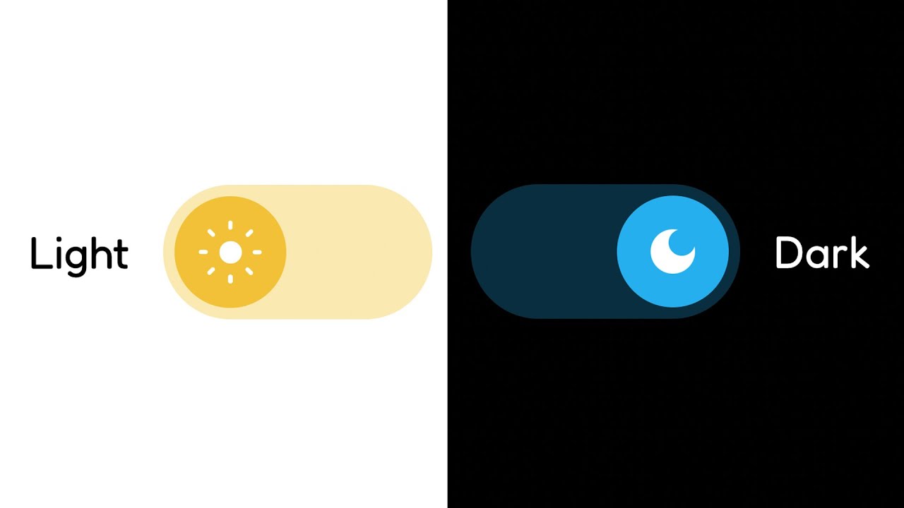
In today's digital era, providing users with a choice of interface themes has become a standard practice for enhancing user experience. Dark mode, in particular, has gained popularity due to its aesthetic appeal and potential benefits such as reduced eye strain and improved battery life for certain devices.
In this guide, we'll walk through the process of implementing dark and light mode in an Angular application. We'll cover the essential steps, from setting up a ThemeService to managing global styles and toggling between themes. Whether you're a beginner in Angular development or looking to enhance your application's user experience, this guide will provide you with the necessary knowledge to implement dark and light mode seamlessly. Let's dive in!
1. Theme Service
First, let's create a ThemeService that manages the dark mode state and provides an observable to components.
// theme.service.ts
import { Injectable } from '@angular/core';
import { BehaviorSubject } from 'rxjs';

@Injectable({
  providedIn: 'root'
})
export class ThemeService {
  private darkMode = new BehaviorSubject<boolean>(false);
  isDarkMode = this.darkMode.asObservable();

  toggleDarkMode() {
    this.darkMode.next(!this.darkMode.value);
  }
}
2. Global Styles
Define the global styles for both light and dark modes in your styles.scss file.
// styles.scss
@import '~@angular/material/theming';
@import './_themes';

@include angular-material-theme($dark-theme); // Apply dark mode theme

// Dark mode styles
.dark-mode {
  background-color: #333;
  color: #fff;
}
3. AppComponent
In your AppComponent, provide a button to toggle between dark and light modes.
// app.component.ts
import { Component } from '@angular/core';
import { ThemeService } from '../services/theme.service';

@Component({
  selector: 'app-root',
  templateUrl: './app.component.html',
  styleUrls: ['./app.component.css']
})
export class AppComponent {
  constructor(public themeService: ThemeService) {}

  toggleTheme() {
    this.themeService.toggleDarkMode();
  }
}
<!-- app.component.html -->
<button (click)="toggleTheme()">Toggle Theme</button>
<router-outlet></router-outlet>
4. Any Component
Apply the dark-mode class conditionally in any of you component's template. For example I'm applying on side navigation component here in my example.
<!-- side-nav.component.html -->
<div [class.dark-mode]="themeService.isDarkMode | async">
  <!-- Your side nav content here -->
</div>
/* side-nav.component.css */
.dark-mode {
  background-color: #333;
  color: #fff;
}
The dark-mode class will be applied conditionally based on the dark mode state provided by the ThemeService. Adjust the styles inside the dark-mode class to match your design preferences for dark mode.
Summary
Create a
ThemeServiceto manage the dark mode state.Define global styles for dark and light modes in
styles.scss.Use the
dark-modeclass in component templates and styles to apply dark mode styles.Toggle dark mode in the
AppComponentand observe changes throughout the application.
This simplified implementation should help your readers understand how to implement dark and light mode in an Angular application.
Subscribe to my newsletter
Read articles from Shikhar Shukla directly inside your inbox. Subscribe to the newsletter, and don't miss out.
Written by
