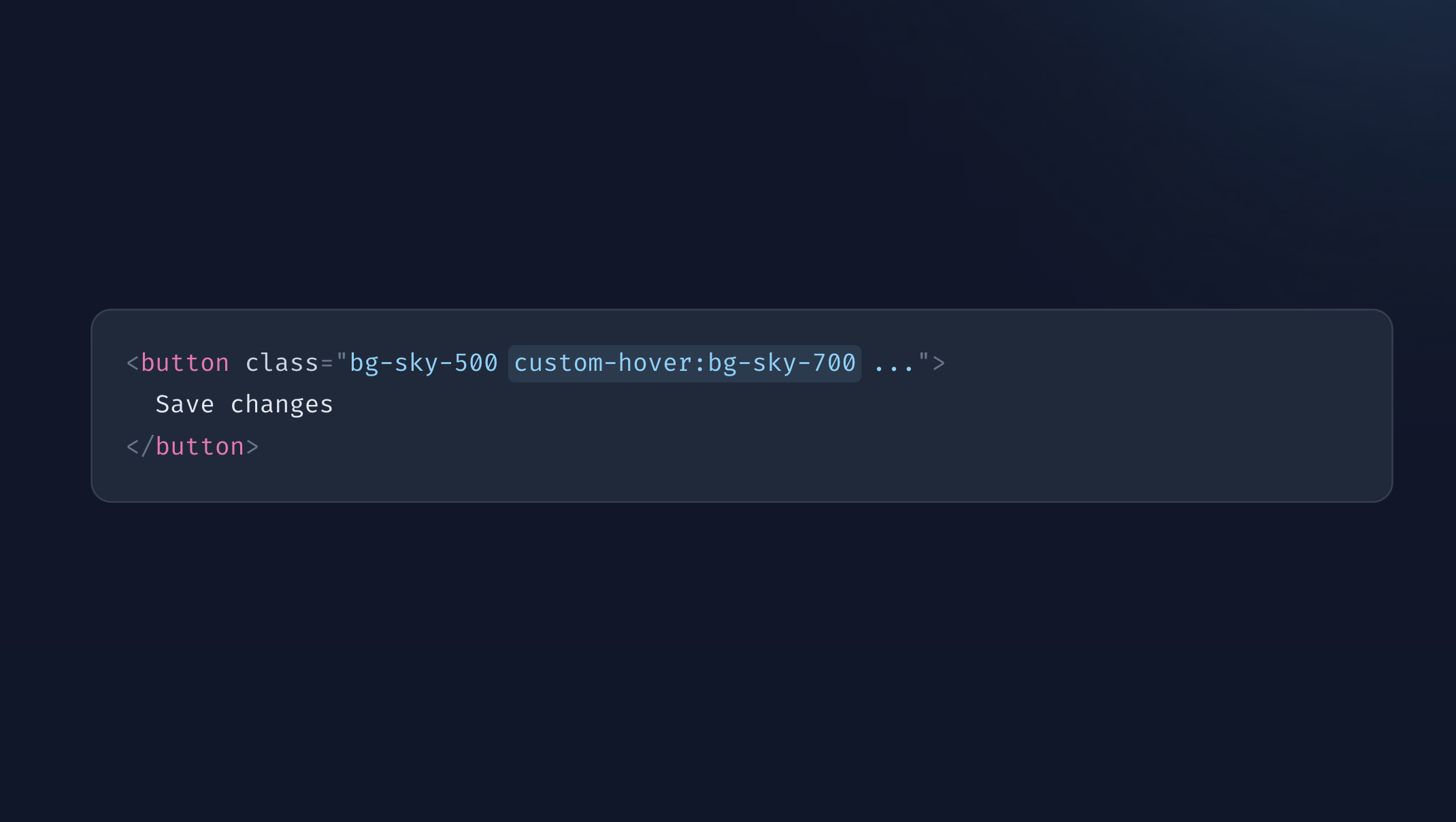
Create your own tailwind modifiers
 Nader Ikladious
What are tailwind Modifiers?
Dive into the innovative concept that can revolutionize your web development workflow. Picture yourself on a quest to create a sleek and responsive website, eager to leverage the capabilities of Tailwind CSS to simplify your styling efforts. Introducing Tailwind modifiers, your reliable allies in achieving pixel-perfect designs.
Within the domain of Tailwind CSS, modifiers act as enchanting tools that adjust the utility classes' behavior, enabling precise and elegant customization of styles. They serve as the secret ingredient that effortlessly infuses additional panache into your user interface.
Modifiers examples that are available by default?
Tailwind enables the use of numerous modifiers by default, allowing for easy customization of styles, here are few examples for reference.
:hover– styles the hover state of an element.sm:– styles the element when the screen width is640pxor above.dark:– styles the element when the dark theme is applied.
Understanding addVariant function with basic examples
You can use the addVariant function in the tailwind.config.js plugins section to configure your own modifiers.
module.exports = {
  // ...
  plugins: [
    plugin(function({ addVariant }) {
      addVariant('name', '&:modifier')
      addVariant('name', ['&:modifier_1', '&:modifier_2'])
    })
  ]
}
This is the basic structure for the addVariant function, it accepts the modifier name which will be use in the HTML as a first parameter (name:bg-red-50) and as a second parameter it can be either an array or string for how the selector should be modified.
Structure of the modifier
The modifier should either contain an & standing for where the selector will be modified or @ which represents either @media, @supports blocks.
Understanding with basic examples
Here are 2 examples from the TailwindCSS documentation, they might be hard to understand how it works from the first glance.
addVariant('hocus', ['&:hover', '&:focus'])
addVariant('inverted-colors', '@media (inverted-colors: inverted)')
Example of using the modifiers in HTML
<input class="hocus:bg-blue-600 inverted-colors:bg-green-50" />
Compiled css
/* First Modifier */
.hocus\:bg-blue-600:hover {
  --tw-bg-opacity: 1;
  background-color: rgb(37 99 235 / var(--tw-bg-opacity));
}
.hocus\:bg-blue-600:focus {
  --tw-bg-opacity: 1;
  background-color: rgb(37 99 235 / var(--tw-bg-opacity));
}
/* Second Modifier */
@media (inverted-colors: inverted) {
  .inverted-colors\:bg-green-50 {
    --tw-bg-opacity: 1;
    background-color: rgb(240 253 244 / var(--tw-bg-opacity));
  }
}
Lets take a look at the first example and break it down to be able to understand it. As you see, the second parameter is an array which means once this modifier is used together with any class it will produce 2 modified selectors as a result.
If you pay attention to the & in the modifier this tells you what will be the structure of the end selector as the & will be replaced with current utility class. meaning if you use hocus:bg-red-30 one of the end css would be .hocus:bg-red-30:active
For the second example, for any of the modifiers that have @ they would usually get wrapped in that block similar to the @support or @media (ie: media queries)
Using matchVariant to dynamically create modifiers
matchVariant behaves exactly the same as addVariant with only 1 core difference, which the second parameter is a function to dynamically create list of variants and alongside it it takes a list of values to create from.
Additionally, it out of the box allow usage of arbitrary values.
module.exports = {
  // ...
  plugins: [
    plugin(function({ matchVariant }) {
      matchVariant('name', (value) => {return `&:${value}`}, {values: {key: 'value'}})
    })
  ]
}
Understanding matchVariant with basic example
Here is a basic example using matchVariant to dynamically create nth-child modifier
matchVariant(
  'nth',
  (value) => {
    return `&:nth-child(${value})`;
  },
  {
    values: {
      1: '1',
      2: '2',
      3: '3',
    }
  }
);
Example of using the modifiers in HTML
@foreach($list as $content)
  <p class="nth-[10]:text-green-500 nth-2:text-red-500">{{$content}}</p>
@endforeach
Compiled CSS
.nth-2\:text-red-500:nth-child(2) {
  --tw-text-opacity: 1;
  color: rgb(239 68 68 / var(--tw-text-opacity));
}
/* Arbitrary Value 10 */
.nth-\[10\]\:text-green-500:nth-child(10) {
  --tw-text-opacity: 1;
  color: rgb(34 197 94 / var(--tw-text-opacity));
}
Looking at this example, by defining matchVariant for called nth it can be used in html as nth-{value} for values that are defined in the list while you can also use arbitrary values without being predefined like nth-[{value}]
Advanced usage of modifiers in a real-world example
Recently, I have been working on Spur – Blade UI Components – and I noticed the need to provide custom modifiers for field components to allow users to style custom checkbox and radio buttons based on their :hover , :checked states
<x-spur.checkbox>
  <div class="bg-white spur-checked:bg-indigo-400 spur-hover:bg-gray-50 dark:spur-hover:bg-neutral-50/20 ">
    <div class="flex-col flex text-white">
        Insurance
    </div>
  </div>
</x-spur.checkbox>
Considering that the simplified blade component looks like this
<div class="group/field">
  {{$slot}}
  <input type="checkbox" class="hidden" />
</div>
And to be able to allow users to style different states of the component without having to worry about the inner structure of the blade component, it was best to use the matchVariant.
Defining dynamic variants to handle this use case
matchVariant(
  'spur',
  (value) => {
    return `:merge(.group\\/field):has(:${value}) &`
  },
  {
    values: { checked: 'checked', hover: 'hover' },
  },
)
In the example above, We use the matchVariant to handle both cases of being hover or checked but also allows arbitrary usage.
We are also using the :has() modifier which apply the utility class in the case of the enclosed condition applies
Last but not least, we are using the :merge directive to ensure that the group name .group/field is only constructed once in the final css.
Compiled CSS
.group\/field:has(:hover) .spur-hover\:bg-red-100 {
  --tw-bg-opacity: 1;
  background-color: rgb(254 226 226 / var(--tw-bg-opacity));
}
Now, Spur users can customize the checkbox and radio buttons hover they like without needing to worry about where is the input field and how to check its state.
Conclusion
Modifiers and creating your own variants can be very powerful for you own use case, sometimes you will find yourself avoiding writing them but at the cost of adding more complex approach.
Subscribe to my newsletter
Read articles from Nader Ikladious directly inside your inbox. Subscribe to the newsletter, and don't miss out.
Written by
