Chart of the Week: Creating a WPF 100% Stacked Area Chart to Visualize the World Vehicle Production in Major Countries
 syncfusion
TL;DR: Let’s collect and showcase the world vehicle production data across major countries using the Syncfusion WPF 100% Stacked Area Chart. We will also customize the chart elements, such as title, axis, and tooltip, to provide an insightful snapshot of the automotive industry’s global landscape.
Welcome to another edition of the Chart of the Week blog series!
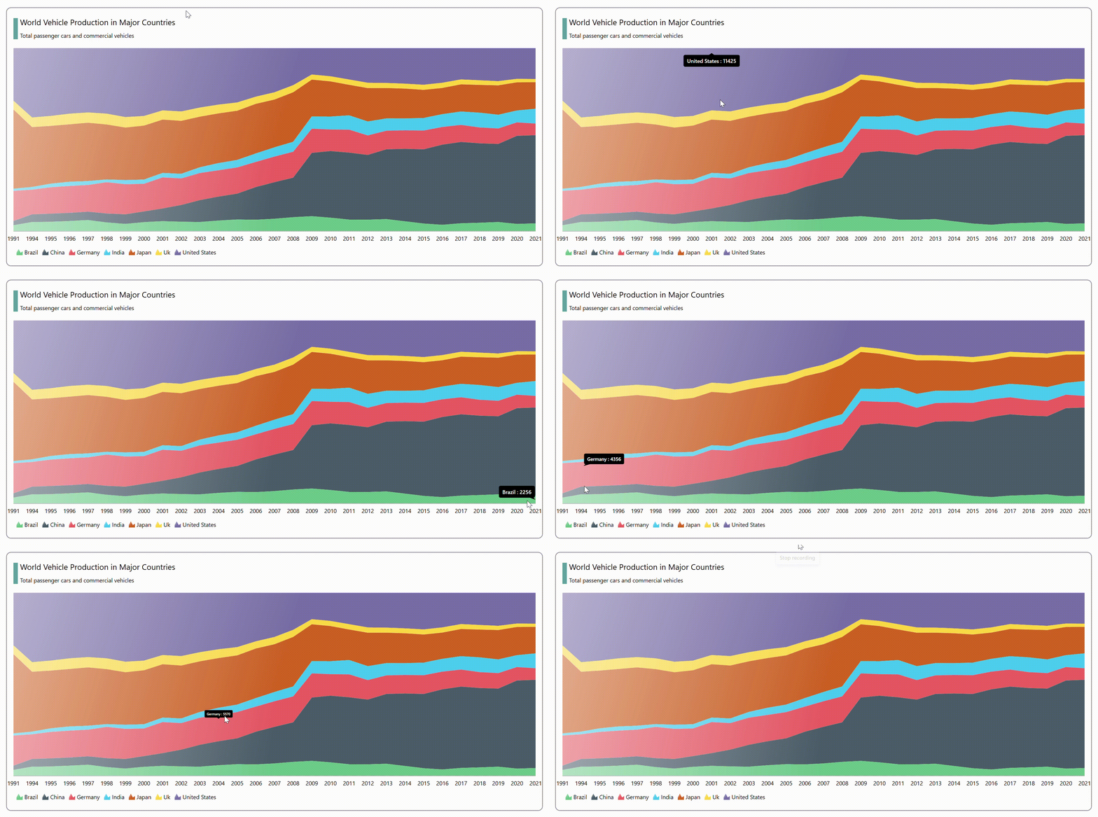
Today, we’ll visualize the world vehicle production across major countries using the Syncfusion WPF 100% Stacked Area Chart.
Refer to the following image.

Let’s get started!
Step 1: Data collection
Let’s collect data on world motor vehicle production from the Bureau of Transportation Statistics. The dataset provides insights into vehicle manufacturing over several years in key countries. You can also download the data and convert it to CSV format.
Step 2: Populate data for the chart
Create a Model class with the properties for storing data specific to each year and selected countries. Refer to the following code example.
public class Model
{
        public string Year { get; set; }
        public double BrazilValue { get; set; }
        public double ChinaValue { get; set; }
        public double GermanyValue { get; set; }
        public double IndiaValue { get; set; }
        public double JapanValue { get; set; }
        public double UKValue { get; set; }
        public double USAValue { get; set; }

        public Model(string category, double brazil, double china, double germany, double india, double japan, double uk, double usa)
        {
            Year = category;
            BrazilValue = brazil;
            ChinaValue = china;
            GermanyValue = germany;
            IndiaValue = india;
            JapanValue = japan;
            UKValue = uk;
            USAValue = usa;
        }
}
Next, create a ViewModel class and use its Collection property to generate the data collection. Then, assign the CSV data collection using the ReadCSV method, which stores it in the Collection property. Refer to the following code example.
public class ViewModel : INotifyPropertyChanged
{
       private ObservableCollection<Model> collection;
       public ObservableCollection<Model> Collection
       {
           get { return collection; }
           set
           {
               collection = value;
               NotifyPropertyChanged();
           }
       }


       public ViewModel()
       {
           Collection = new ObservableCollection<Model>(ReadCSV("WPFStackedArea100Chart.productionbycountry.csv"));
       }

       public event PropertyChangedEventHandler? PropertyChanged;

       public void NotifyPropertyChanged([CallerMemberName] String propertyName = "")
       {
           PropertyChanged?.Invoke(this, new PropertyChangedEventArgs(propertyName));
       }

       public IEnumerable<Model> ReadCSV(string fileName)
       {
           Assembly executingAssembly = typeof(App).GetTypeInfo().Assembly;
           Stream inputStream = executingAssembly.GetManifestResourceStream(fileName);
           List<string> lines = new List<string>();
           List<Model> collection = new List<Model>();
           if (inputStream != null)
           {
               string line;
               StreamReader reader = new StreamReader(inputStream);
               while ((line = reader.ReadLine()) != null)
               {
                   lines.Add(line);
               }
               string[] headers = lines[0].Split(',');
               lines.RemoveAt(0);

               for (int i = 1; i < headers.Length; i++)
               {
                   double[] doubles = new double[lines.Count];
                   for (int j = 0; j < lines.Count; j++)
                   {
                       string[] data = lines[j].Split(',');
                       if (data[i] == string.Empty)
                       {
                           continue;
                       }

                       doubles[j] = Convert.ToDouble(data[i]);

                   }

                   collection.Add(new Model(headers[i], doubles[0], doubles[1], doubles[2], doubles[3], doubles[4], doubles[5], doubles[6]));

               }

           }
           return collection;
       }
}
Step 3: Configuring the Syncfusion WPF Charts control
Now, let’s proceed to configure the Syncfusion WPF Charts control using this documentation. Refer to the following code example.
<chart:SfChart>
 <chart:SfChart.PrimaryAxis>
  <chart:CategoryAxis/>
 </chart:SfChart.PrimaryAxis>

 <chart:SfChart.SecondaryAxis>
  <chart:NumericalAxis/>
 </chart:SfChart.SecondaryAxis>
</chart:SfChart>
Step 4: Bind data to the WPF 100% Stacked Area Chart
To display detailed information about the data series for each country’s vehicle production, we’ll use the Syncfusion WPF StackingArea100Series.
The Syncfusion WPF Charts control allows for the arrangement of multiple series within the same chart area. Here, we’ll use seven stacked area series to analyze the data for seven different countries.
Refer to the following code example.
<chart:StackingArea100Series Label="Brazil" ItemsSource="{Binding Collection}" XBindingPath="Year" YBindingPath="BrazilValue" >
</chart:StackingArea100Series>

<chart:StackingArea100Series Label="China" ItemsSource="{Binding Collection}" XBindingPath="Year" YBindingPath="ChinaValue" >
</chart:StackingArea100Series>

<chart:StackingArea100Series Label="Germany" ItemsSource="{Binding Collection}" XBindingPath="Year" YBindingPath="GermanyValue" >
</chart:StackingArea100Series>

<chart:StackingArea100Series Label="India" ItemsSource="{Binding Collection}" XBindingPath="Year" YBindingPath="IndiaValue" >
</chart:StackingArea100Series>

<chart:StackingArea100Series Label="Japan" ItemsSource="{Binding Collection}" XBindingPath="Year" YBindingPath="JapanValue" >
</chart:StackingArea100Series>

<chart:StackingArea100Series Label="Uk" ItemsSource="{Binding Collection}" XBindingPath="Year" YBindingPath="UKValue">
</chart:StackingArea100Series>

<chart:StackingArea100Series Label="United States" ItemsSource="{Binding Collection}" XBindingPath="Year" YBindingPath="USAValue">
</chart:StackingArea100Series>
In the above code example, we’ve bound the ViewModel‘s Collection property with the ItemsSource property. The XBindingPath is bound with the Year property, and the YBindingPath is bound with the respective countries’ values.
Step 5: Customizing the chart appearance
Let’s customize the WPF 100% Stacked Area Chart’s appearance to enhance the readability of the data.
Adding a chart title
We can significantly improve the readability of the plotted data by including a title in the chart, as shown in the following code example.
<chart:SfChart.Header>
    <Border BorderBrush="White" Margin="0, 0, 0, 10">
        <StackPanel Orientation="Horizontal">
            <Grid Width="10" Background="CadetBlue" Margin="0, 8, 0, 5"/>
            <StackPanel>
                <TextBlock FontSize="18" Margin="5"
            Text="World Vehicle Production in Major Countries"/>
                <TextBlock FontSize="13" Margin="5"
                    Text="Total passenger cars and commercial vehicles"/>
            </StackPanel>
        </StackPanel>
    </Border>
</chart:SfChart.Header>
Customizing the axis
Let’s customize the primary and secondary axes using the following properties:
FontSize: Alters the font size of the axis label to the desired scale.
ShowGridLines: Toggles the visibility of gridlines.
TickLineSize: Alters the major ticks line size in the chart axis.
Visibility: Defines the visibility of the axis line.
Refer to the following code example.
<chart:SfChart.PrimaryAxis>
    <chart:CategoryAxis  ShowGridLines="False" FontSize="13" TickLineSize="0" >
    </chart:CategoryAxis>
</chart:SfChart.PrimaryAxis>

<chart:SfChart.SecondaryAxis>
    <chart:NumericalAxis ShowGridLines="False" Visibility="Collapsed" >
    </chart:NumericalAxis>
</chart:SfChart.SecondaryAxis>
Step 6: Enabling the tooltip
Finally, we’ll incorporate the tooltip feature into the chart. This will enhance interactivity by allowing you to track a data point with your cursor. Tooltips provide additional context and information about specific data points, making it easier for users to interpret the chart. Refer to the following code example.
<DataTemplate x:Key="tooltipTemplate">
    <StackPanel  Orientation="Horizontal">
            <TextBlock Text="{Binding Series.Label}"
        Foreground="White" FontWeight="Medium" FontSize="12" HorizontalAlignment="Center" VerticalAlignment="Center"/>
            <TextBlock Text=" : " Foreground="White" FontWeight="Medium" FontSize="12" HorizontalAlignment="Center" VerticalAlignment="Center"/>
            <TextBlock Text="{Binding YData,StringFormat='###'}"
        Foreground="White" FontWeight="Medium" FontSize="12" HorizontalAlignment="Center" VerticalAlignment="Center"/>
    </StackPanel>
</DataTemplate>

<chart:StackingBarSeries TooltipTemplate="{StaticResource tooltipTemplate}" ShowTooltip="True" Interior="#002748" ItemsSource="{Binding Collection}" XBindingPath="Category" YBindingPath="AlmostConstantly" >
</chart:StackingBarSeries>
After executing the above code examples, we will get the output that resembles the following image.

Visualizing world vehicle production using Syncfusion WPF 100% Stacked Area Chart
GitHub reference
For more details, refer to Creating a WPF 100% Stacked Area Chart to visualize the world vehicle production GitHub demo.
Conclusion
Thanks for reading! In this blog, we have seen how to showcase the world’s vehicle production using the stunning WPF 100% Stacked Area Chart. This chart not only enhances data interpretation but also adds a visually appealing element to your apps or reports. Feel free to explore further enhancements, such as animations, interactivity, and responsive design, to elevate the charting experience.
The existing customers can download the latest version of Essential Studio from the License and Downloads page. If you are new, try our 30-day free trial to explore our incredible features.
You can also contact us via our support forum, support portal, or feedback portal. We are always happy to help you!
Related blogs
Creating a WPF Stacked Area Chart to Visualize Wealth Distribution in the U.S.
Creating a WPF 3D Column Chart to Visualize the Panama Canal’s Shipment Transit Data
Creating a WPF Chart Dashboard to Visualize the 2023 World Billionaires List
Harmonizing Powerhouses: Syncfusion WPF Controls Are Now Compatible with Avalonia XPF
Subscribe to my newsletter
Read articles from syncfusion directly inside your inbox. Subscribe to the newsletter, and don't miss out.
Written by

syncfusion
syncfusion
Syncfusion provides third-party UI components for React, Vue, Angular, JavaScript, Blazor, .NET MAUI, ASP.NET MVC, Core, WinForms, WPF, UWP and Xamarin.