AsyncAPI Website UI Kit Development
 Ashmit JaiSarita Gupta
This summer I will be working as a Google Summer of Code mentee at the AsyncAPI Initiative to develop a UI Kit for the AsyncAPI Website using Storybook v8 in Next.js v14 and Typescript under the mentorship of Akshat Nema, Elegbede Azeez, and Aishat Muibudeen. This blog will cover my journey for the next four months working on developing this UI Kit. In this blog post, I will introduce you to the AsyncAPI Website, why we need a UI kit for this website, and what Storybook is.
AsyncAPI Website: Problem & its Solution
AsyncAPl is an open-source initiative that seeks to improve the current state of Event-Driven Architecture (EDA). It has a set of tools for documentation, code and model generation, event management, etc. which helps to easily build and maintain EDA. The AsyncAPI Website is the primary source of information for users and developers.
Currently, the website lacks visual consistency, repeated elements lack consistency in design, and duplicate styling is used for similar visual styles. This makes the codebase and design non-modular. Existing Ul patterns are undocumented which results in miscommunication and re-inventing the wheel instead of building new features.
The goal of this project is to develop a comprehensive Ul Kit that can enhance the existing design, and streamline the development process to simplify the creation and management of cohesive elements in the website. This website Ul Kit will help in preventing the process of rebuilding similar components.🚀
The current state of the project
The issue #2090 in the website repository (adopted from issue #4 in the design-system repository) is currently monitoring the progress of this project. This project was divided into two sub-parts:
Design
Audit the current website, and audit all design patterns such as common reusable UI components and design tokens(such as brand colors, spacing, and typography).
Create a Design System in Figma that includes design tokens, atomic and molecular components, and their various states.
Development
Develop the stories for various states of these components in the storybook.
Do the visual tests, interaction tests, and accessibility tests of all these components in the storybook.
Create documentation of all these components giving their appropriate usage.
The design part of this project has been completed by Aishat Muibudeen (Maya) under the mentorship of Ace. This is the Figma file for the design system created by Maya. The next step and the scope of this GSoC project will be to do the development part and deliver the complete UI Kit.
Approach and Implementation

Modern user interfaces are assembled from hundreds of modular UI components rearranged to deliver different user experiences. AsyncAPI Website UI Kit will contain reusable UI components that will help developers build complex, durable, and accessible user interfaces across the website. It will be a source of truth for the website's common components. We will use Storybook for developing our website UI kit. Storybook provides a live, visual platform to develop and test UI components, enhancing efficiency and organization.
Tech we will be using
Storybook for UI component development and documentation
React for developing component-centric UI
Typescript
Tailwind CSS for styling
Prettier for automatic code formatting
ESLint for JavaScript linting
Chromatic to catch visual bugs in components
GitHub Actions for Continuous Integration
Besides Storybook and Chromatic, the technologies listed above are already used in the AsyncAPI ecosystem. The next section introduces Storybook and Chromatic and discusses why we need them.
Storybook
Storybook is a front-end workshop for building UI components and pages in isolation. It helps us to develop hard-to-reach states and edge cases without needing to run the whole app. It provides an interactive playground to develop, test, and browse your components, making it an invaluable tool for component-driven development in React. Using it, developers can build UI components detached from their app's business logic and context. This enhances the reusability of components and improves testing and consistency across the application.
The need for a Storybook can easily be understood from the following scenario: Say we have to build a form that uses many smaller components like inputs, buttons, etc. Since the Async API Codebase is very huge, it might be difficult to check whether these smaller components are already available in the website codebase or not. Through Storybook developers can search through our project and be able to quickly kind of visually check and how it looks, its properties, play with them to get ideal props values.
Chromatic
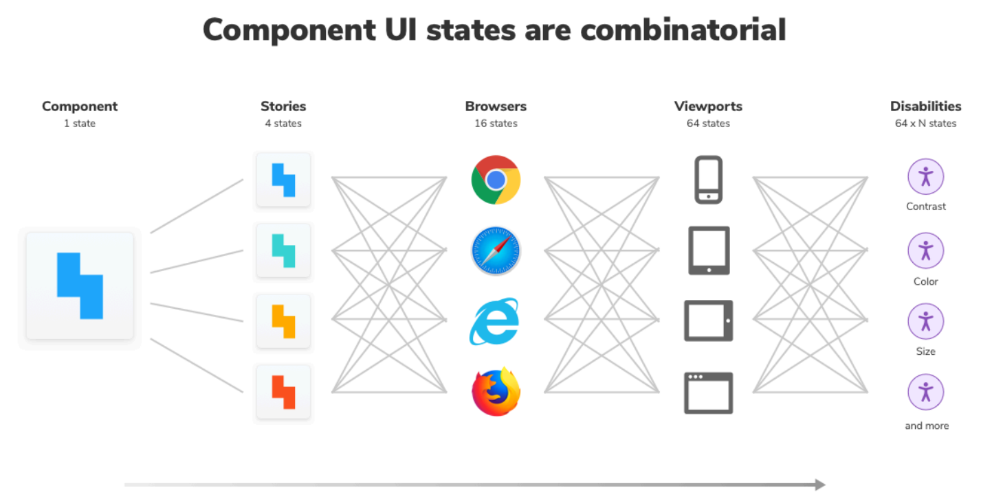
Chromatic is a visual testing & review tool that scans every possible UI state across browsers to catch visual and functional bugs. It catches visual and functional bugs in stories automatically. It runs UI tests across browsers, viewports, and themes to speed up front-end teams. We can assign reviewers and resolve discussions to streamline team sign-off. It streamlines the process of shipping UI components with higher quality. Chromatic is the maintainer of Storybook.
Workflow
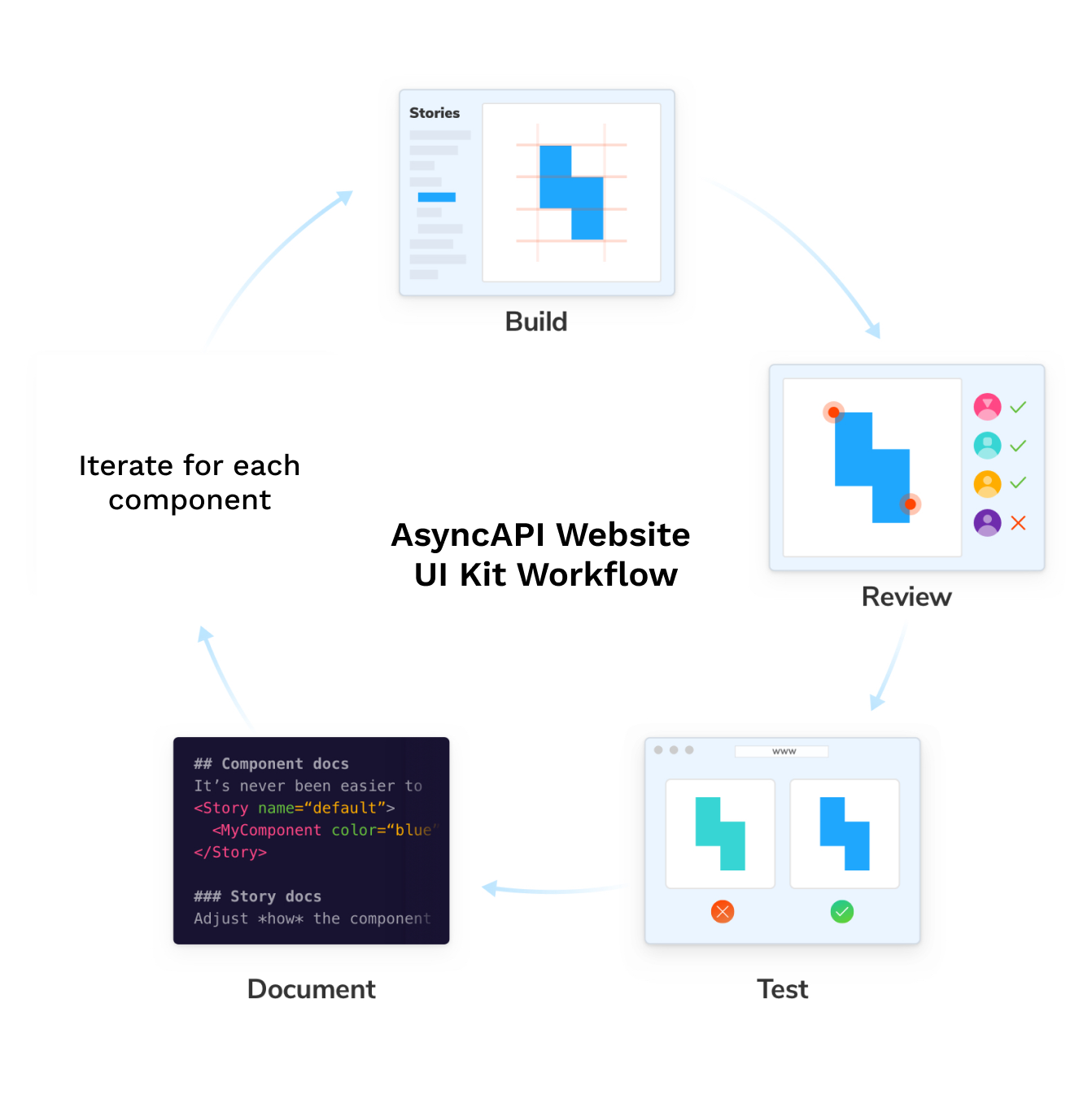
Different organizations use different workflows for building UI kits for their website. However, the engineers at Storybook after researching the best practices used by developers of successful UI Kits and Design Systems suggested the following workflow:
Build stories for components
Most of the components present in the Design System made by Maya are already developed on the website. Now we will be developing stories for each of these components covering all states that it can have. However, I will be developing the missing components and updating the existing components if required to make them independent of any specific business logic. Currently, I am part of the team working on the migration of the website to TypeScript and have migrated more than 35 components. Through this work, I have developed a deep understanding of the codebase which will help me in the future while working on them.

Get a review of the component
Once all the stories for a component are developed, get a review from mentors and the designer. However, we can move this step to the end of the loop, once tests and documentation for the component are completed. We can add the Figma frame for each of the components from the Design System in Figma to Storybook using the Figma plugin. This will help developers to cross-reference from the design of the components.
Test the component to prevent UI bugs
Each UI component includes stories (permutations) that describe the intended look and feel given a set of inputs (props). Stories are then rendered by a browser or device for the end-user. Keeping manual track of all these stories is an unsustainable and hectic task. Storybook enables us to automate tests which helps to detect and rectify bugs. Many types of tests can be performed on the components, but the research done by Storybook engineers suggests that these UI tests are most effective for UI Kit:

Visual tests
Visual tests capture an image of every UI component in a consistent browser environment. New screenshots are automatically compared to previously accepted baseline screenshots. When there are visual differences, you get notified. This will save the time and effort required for manual reviews. We will use Chromatic for this and automate this using GitHub actions.
Interaction tests
If our components handle state management or fetch data, we should do the interaction testing of our component using mocked data, Storybook play function, Storybook test package based on the Vitest, and Storybook test-runner for automation. However, in our case, we won’t necessarily need this test.
Accessibility tests
Disabilities affect 15% of the population, according to the World Health Organization. Therefore we need to check the accessibility of our components. We will do this easily using the accessibility addon by Storybook which verifies the web accessibility standards (WCAG) in real-time.
We will automate all these tests using GitHub workflows. Though there are other tests like code coverage tests, snapshot tests, and end-to-end tests, they are not suitable for website UI kits and design systems since they contain atomic components with simple functionality. In our case, Visual tests and accessibility tests are best to have.
Document the component
To achieve the full work-saving benefits of a website UI kit, components should be easy to understand and widely reused. This can be made possible using documentation for components in the UI kit. However, maintaining and keeping the documentation up-to-date is a tedious task. Storybook enables us to auto-document the components which can be further customized. They provide boilerplate code and offer customizability so that developers don’t have to rewrite common patterns. We will generate documentation from existing stories using the docs add-on which will reduce the maintenance time.
Code formatting and lining
Enforcing code consistency increases the readability and maintainability of the code. Using tools that fix syntax and standardize formatting serves to improve contribution quality. To ensure a consistent code style, we will be using tools like Prettier and ESLint. These tools are widely used, support multiple languages, and seamlessly integrate with most editors.
Organizing the Storybook
Appropriately organizing our storybook is important for sending a clear and effective message to developers who will be using it and to those who will be maintaining it in the future. I will be using the following widely used structure for organizing our storybook:
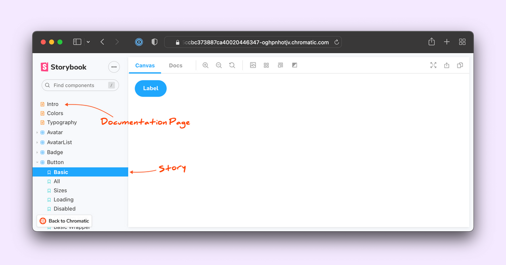
Introduce the UI Kit Storybook
We will have documentation pages for the Introduction, Getting Started, and changelog at the top. This will be followed by Design Tokens Documentation.

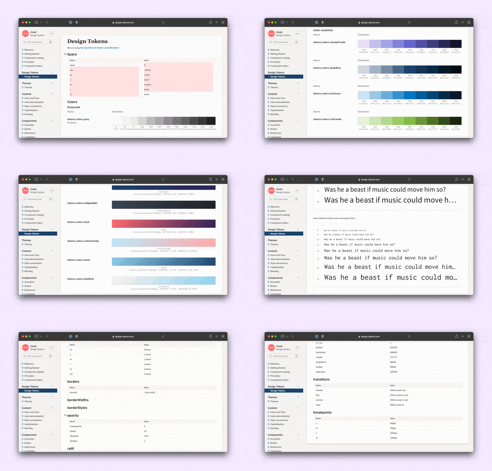
For example, Talend Coral uses a mix of DocBlocks and custom components to document their design tokens.

Grouping and sorting the components in Storybook
Stories for a component are automatically grouped by Storybook. Storybook also allows you to group multiple components into categories and adjust their order in the sidebar. We will be following the Atomic Design hierarchical system. It classifies components into five levels: atoms, molecules, organisms, templates, and pages. However, our UI kit will only have atoms, molecules, and organisms. Each component will have its documentation page inside its category.
File Structure in the codebase
As suggested by the default installation of the storybook, we can keep all stories in one folder separate folder since our website has a large number of components which can make it hard to navigate between stories and components. So instead of having a single big stories/ directory, I will keep my stories for a component in the same folder in which the component is located.
References
I have developed the above workflow from the following resources where engineers from Storybook have given detailed suggestions on working with Storybook after researching about more than 60 production Storybooks:
Besides these, I have studied the Design System created by Maya in Figma and the website codebase in detail. The images I have used belong to various Storybook and AsyncAPI tutorials.
Conclusion
With a well-defined workflow and a comprehensive understanding of the project, the next step is to integrate Storybook and Chromatic into the AsyncAPI Website codebase. In the upcoming blog post, I'll delve into the setup process, discuss the challenges I encountered, and share the valuable lessons I learned. Till then take care and don't forget to push your code before giving your laptop to your siblings for downloading and playing random games from the internet displaying ads of downloading free 64 GB RAM.
Subscribe to my newsletter
Read articles from Ashmit JaiSarita Gupta directly inside your inbox. Subscribe to the newsletter, and don't miss out.
Written by

Ashmit JaiSarita Gupta
Ashmit JaiSarita Gupta
I am an engineering physics undergraduate passionate about Quantum Computing, Machine Learning, UI/UX, and Web Development. About two years ago, when I first discovered the field of Web Development and Quantum Computing, it totally amazed me and I have been dedicating my education to them ever since. Over the past two years, I have dedicated a considerable amount of time and effort to learning and developing skills in these fields by taking various online courses, reading different articles, making several projects, and being involved in various research internships and mentorship programs. Fast forward to today, I am currently working on a modern streaming platform and researching QUBO Relaxation Parameter Optimisation using Learning Surrogate Solver (QROSS).