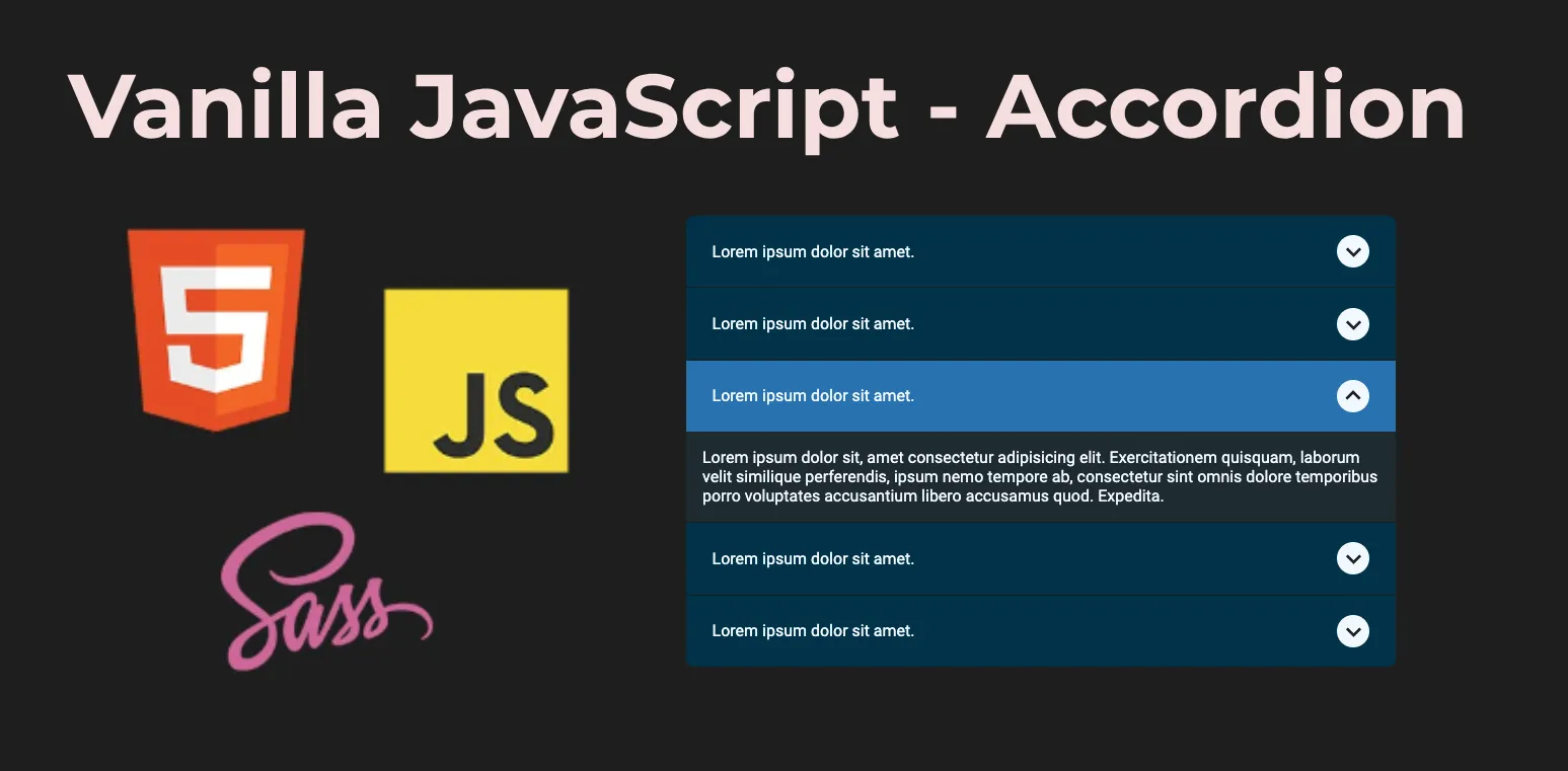
Vanilla JavaScript - Accordion
 Serhat Bek
Accordions are a popular UI pattern for presenting collapsible content sections. In this tutorial, we'll walk through how to create a basic accordion component using plain JavaScript, HTML, and CSS.
Before we start I'd like mention that I used:
- Boxicons for icons.
- BEM methodology for reusability of css for accordion.
- Google Fonts Roboto.
- SCSS (SASS) for styling.
- $self: &; and #{ $self } logic in scss to prevent any selector scope issues. If you want to read more about this, you can check my Solving SCSS Parent Selector Scope Issue article on topic.
Accordion HTML Structure
First, let's create the HTML structure for our accordion. We'll have an accordion-wrapper classed div for the accordion items, each consisting of a header and a body.
<div class="accordion-wrapper">
<div class="accordion">
<div class="accordion__header">
<h4>Lorem ipsum dolor sit amet.</h4>
<i class="bx bx-chevron-down"></i>
</div>
<p class="accordion__body">
Lorem ipsum dolor sit, amet consectetur adipisicing elit. Exercitationem
quisquam, laborum velit similique perferendis, ipsum nemo tempore ab,
consectetur sint omnis dolore temporibus porro voluptates accusantium
libero accusamus quod. Expedita.
</p>
</div>
<!-- You can add more accordion items here -->
</div>
Styling
First we'll add the font, reset our css and assign color variables.
@import url('https://fonts.googleapis.com/css2?family=Roboto:wght@300;400;500;700&display=swap');

// COLORS
$black: #202b2f;
$black2: #141111;
$white: aliceblue;
$grayish-blue: #003249;
$blue: #2971af;

// RESET
*,
*::before,
*::after {
  box-sizing: border-box;
  margin: 0;
  padding: 0;
}

body {
  font-family: 'Roboto', sans-serif;
  background-color: $black2;
  color: $white;
}

.accordion-wrapper {
  max-width: 700px;
  width: 100%;
  margin: 0 auto;
}
Now, we can style our accordion using scss.
.accordion {
  $self: &;
  display: flex;
  flex-direction: column;
  overflow: hidden;

  &:not(:last-child) {
    border-bottom: 1px solid $black2;
  }

  &:first-child {
    border-top-left-radius: 8px;
    border-top-right-radius: 8px;
  }

  &:last-child {
    border-bottom-left-radius: 8px;
    border-bottom-right-radius: 8px;
  }

  #{ $self }__header {
    background-color: $grayish-blue;
    padding: 1.2rem 1.6rem;
    display: flex;
    justify-content: space-between;
    align-items: center;
    cursor: pointer;
    transition: all 0.2s ease-out;

    > h4 {
      font-weight: normal;
    }

    .bx {
      width: 32px;
      height: 32px;
      border-radius: 50%;
      background-color: $white;
      display: flex;
      justify-content: center;
      align-items: center;
      color: $black2;
      font-size: 32px;
      transition: 400ms all ease-in-out;
    }
  }

  &--expand #{ $self }__header {
    background-color: $blue;
  }

  &--expand #{ $self }__header .bx {
    transform: rotate(180deg);
  }

  #{ $self }__body {
    overflow: hidden;
    background-color: $black;
    max-height: 0px;
    padding: 0 16px;
    opacity: 0;
    transition: 400ms all ease-in-out;
  }

  &--expand #{ $self }__body {
    opacity: 1;
    max-height: 500px;
    padding: 16px;
  }
}
Adding JavaScript Functionality
Now, let's add the JavaScript code to make our accordion interactive. First, we'll check if the accordion items are in the DOM and then toggle the accordion--expand class on the accordion items when clicked to expand or collapse them.
const accordionItems = document.querySelectorAll('.js-accordion');

if (accordionItems) {
  accordionItems.forEach((accordion) => {
    accordion.addEventListener('click', (e) => toggleAccordion(e));
  });
}

const toggleAccordion = (e) => {
  let target = e.currentTarget;

  if (!target.classList.contains('accordion--expand')) {
    accordionItems.forEach((item) => {
      item.classList.remove('accordion--expand');
    });
    target.classList.add('accordion--expand');
  } else {
    target.classList.remove('accordion--expand');
  }
};
We've just created a simple accordion component using vanilla JavaScript. You can customize it for your project's needs. Check here for Live Demo and detailed code.
Thank you for reading. If you find the article useful, please do not forget to like and comment so that others can access it. If you’re on a generous day, you can even buy me a coffee. 🙃
Subscribe to my newsletter
Read articles from Serhat Bek directly inside your inbox. Subscribe to the newsletter, and don't miss out.
Written by

Serhat Bek
Serhat Bek
Hi! I'm a Frontend Developer from Istanbul. I like 🐈 cats, 🌱 plants, 🎵 music, 🎨 art, 📗 sci-fi and anything that empowers the imagination.