A Day In Dev Life: First Trial Customer, Flutter Coding, and Work Process
 Ultra Wide Turbo Devs

A new release is ready and I got my first trial customer! Very exciting day. I go a bit more into code this time, hope you like it 🤞.

Coding with ADHD
I tried ADHD medication again yesterday after a long time. Worked great and was able to get significantly more done and stay focused longer. I was also less restless and less stressed about whether what I was currently doing was the "best move". Something I wonder about a lot lately. I was able to just keep working. The only disadvantage of these medications is that after a few days I often suffer from side effects such as dizziness, palpitations and less focus because I am constantly busy with my breathing. Every time I think, okay, this is the last time, I can do without. But when you have been without again for a while you think oh well, you know, I could use some extra focus today. It's the same with smoking. Beautiful thing, reflection. And then not learning anything. Story of my life. Anyway I started the day with a nice cup of coffee, some ADHD medication and a disco training (chest + arms). My workout went great and then I suddenly received a wonderful message.
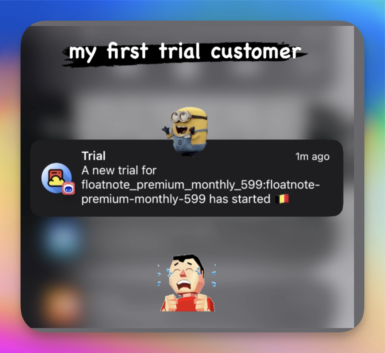
First Trial Customer
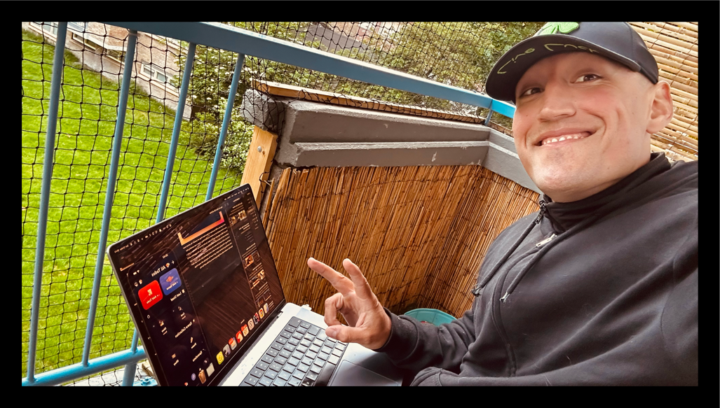
I couldn't stop smiling. I spent the last two months doing a lot of work to develop a trial system with coupons. I noticed this was a bottleneck in the app. The first impression is good but people are not bound and not yet properly onboarded so to speak. I am very happy that the first steps to improve this are having a clear effect for the first time today. After gym I went to one of my favorite places to work in the sun.

Search Improvements
Okay we'll start today by making the search results smaller. Currently they are the same size as the cards used for normal navigation. I find that for on mobile, this disrupts the user experience because there is not enough space because of the keypad coming up.
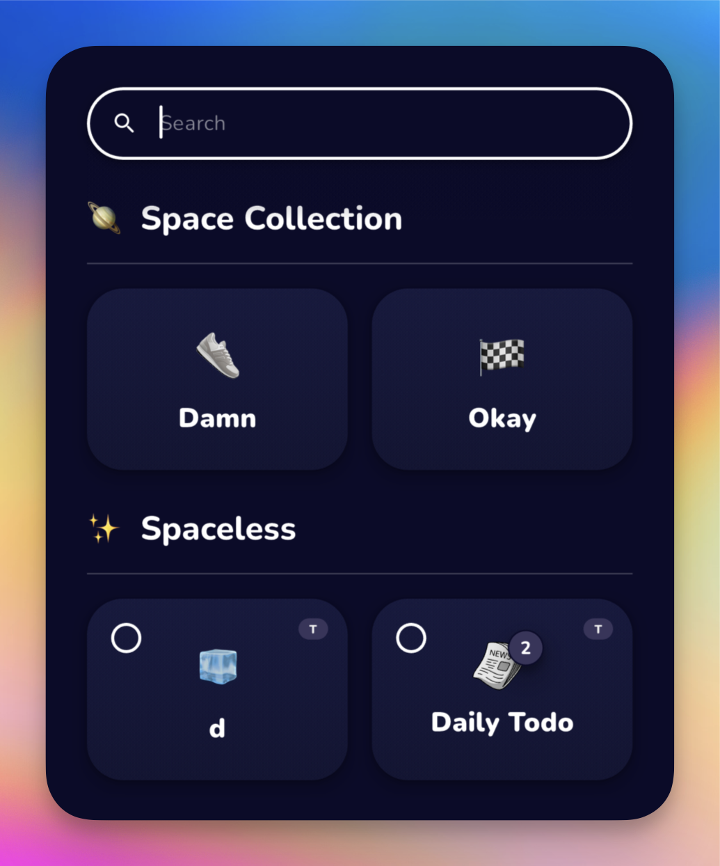
We start by making the headers a little smaller and putting the elements in Row instead of a Column.
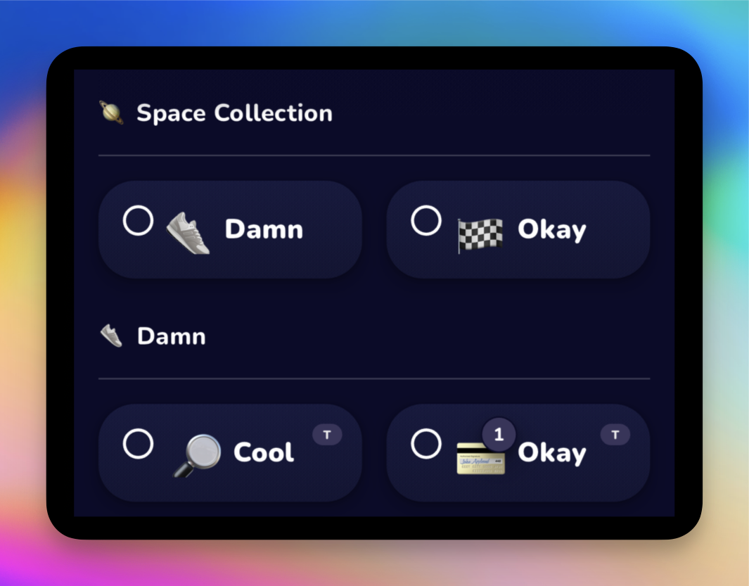
I thought maybe nice to put everything in a Column but then you actually need twice as much space. So that idea will go in the trash (note from Brian in the future, I took it out of the trash and put it back).
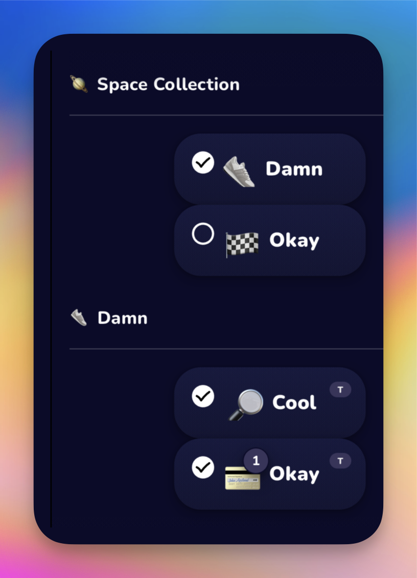
I actually want to get rid of the headers too but am a little hesitant. This is is how I usually work on my own projects. Most of the designs are in my head roughly how I want them. And I just start playing around with it until I have something like. It’s a creative process where I often end up with something entirely different than I initially had in mind. Creativity and constant optimization tendencies at work.
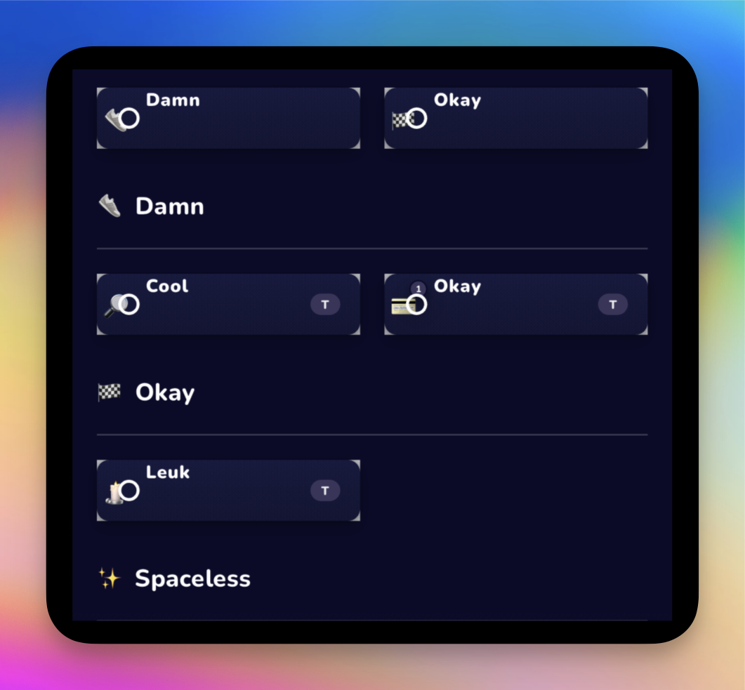
This is starting to look a lot better by now. Still decided to make it a Column. Looks a lot better. I'm a little annoyed with how the code looks. I like to work with enums in these cases, clear difference between two types of use cases. However, if you don't plan this well in advance and use booleans to force things everywhere, it can quickly become a mess. So too in this case. There are a lot of boolean checks and duplicated code. Totally not maintainable. I think a lot in this case from a business perspective and my personal situation. What do I gain from refactoring this right now and losing half a day. Yes in the long run something of course, but right now there are other things that have priority. And so ladies and gentlemen, I have fulfilled my obligatory contribution to the tech debt as well again this week.
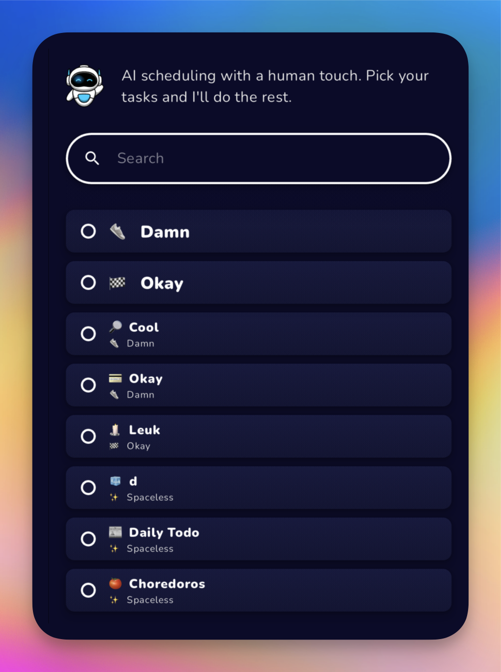
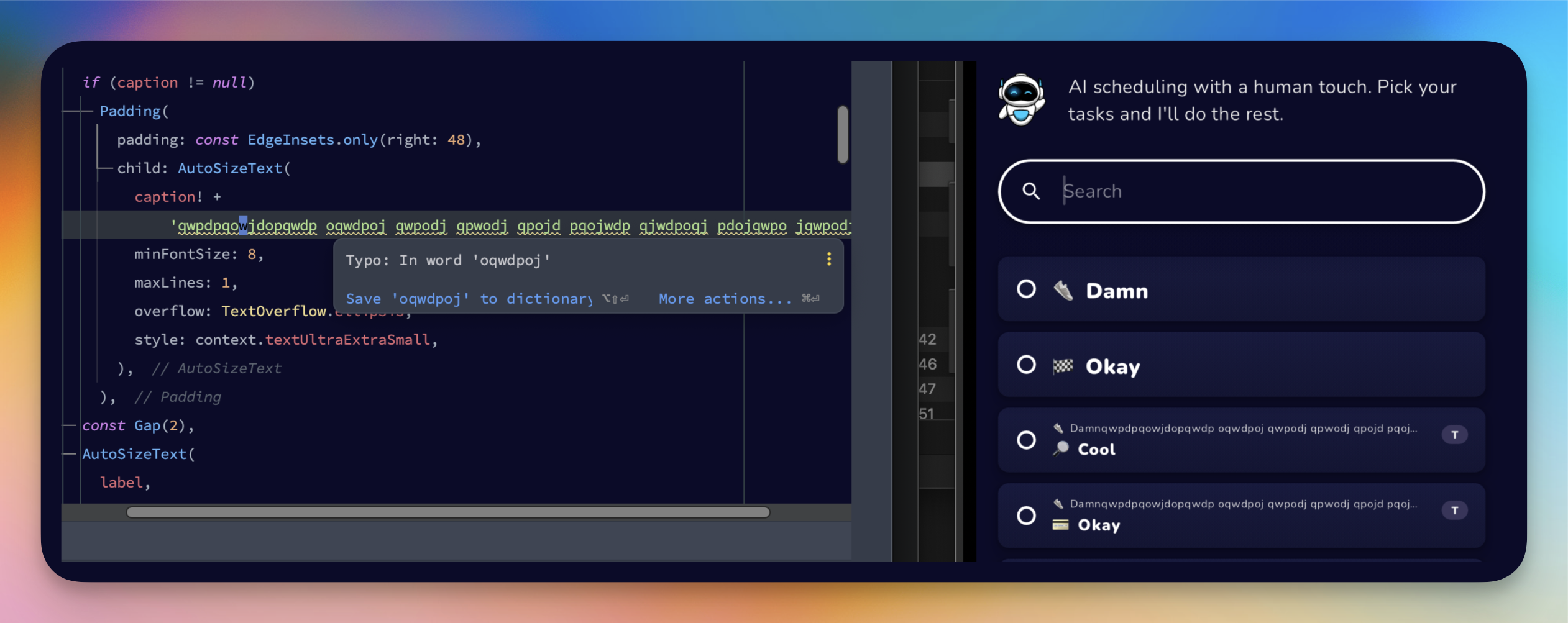
Almost there, stress testing the overflows.
I am quite satisfied with the result, but there is one last thing I want to implement. The intro text has no use after search, but I like the sliver UI behind it. So what I want to do is scroll the view up when the search field gets attention. This way the sliver stays there and you have even more space for the actual search.
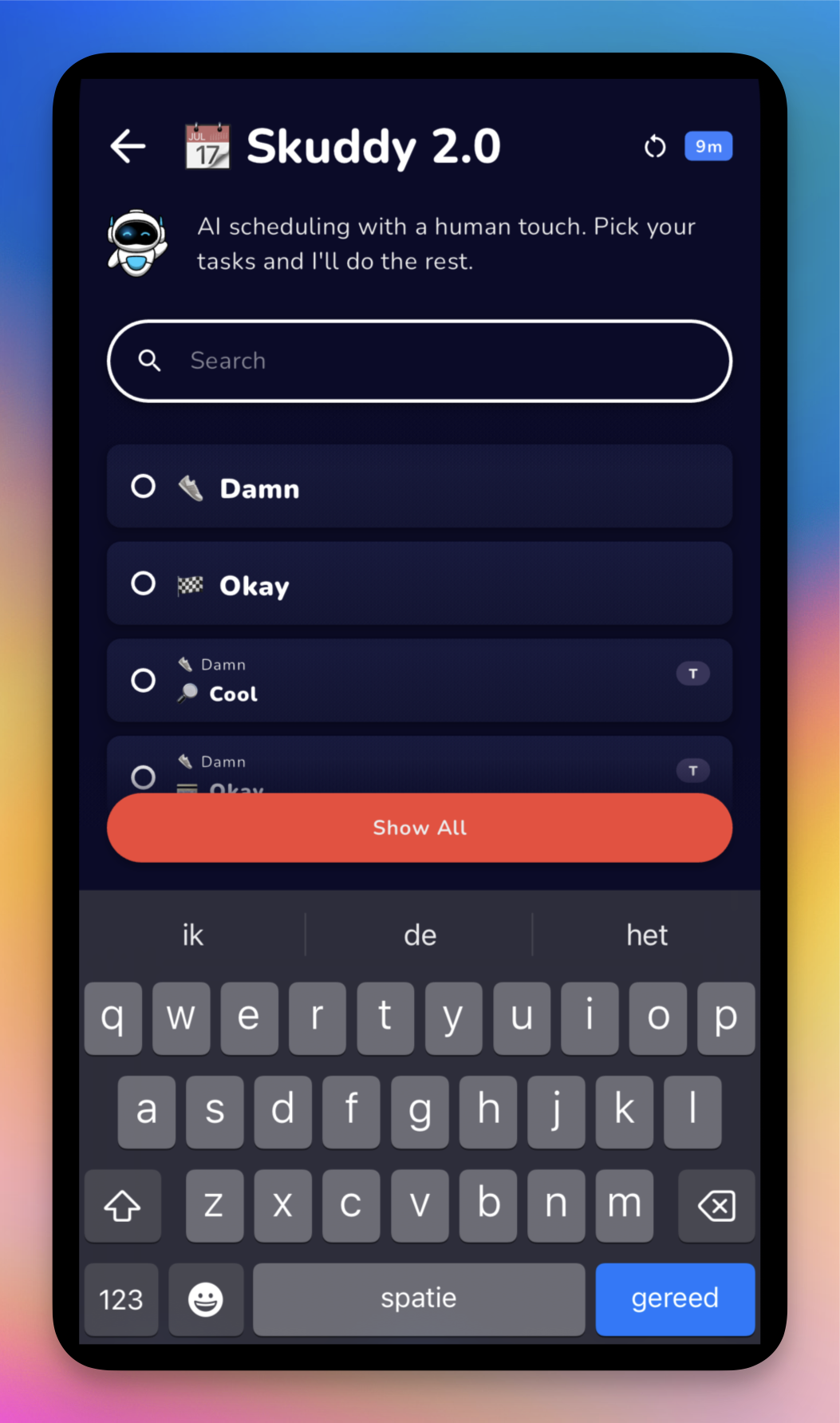
So one way to accomplish this is to grab the scrollable via a global key and add a listener to ValueListenable that indicates whether the search is active. The amount is hardcoded for now because we only apply it here, but in the future the amount should also be passed to the widget.
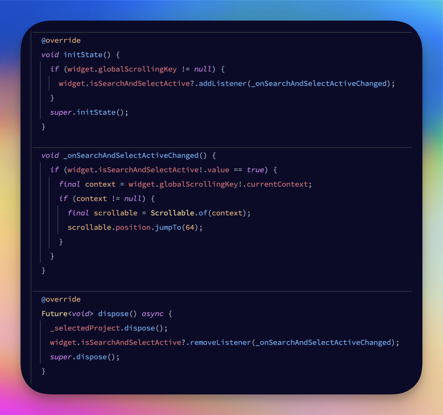
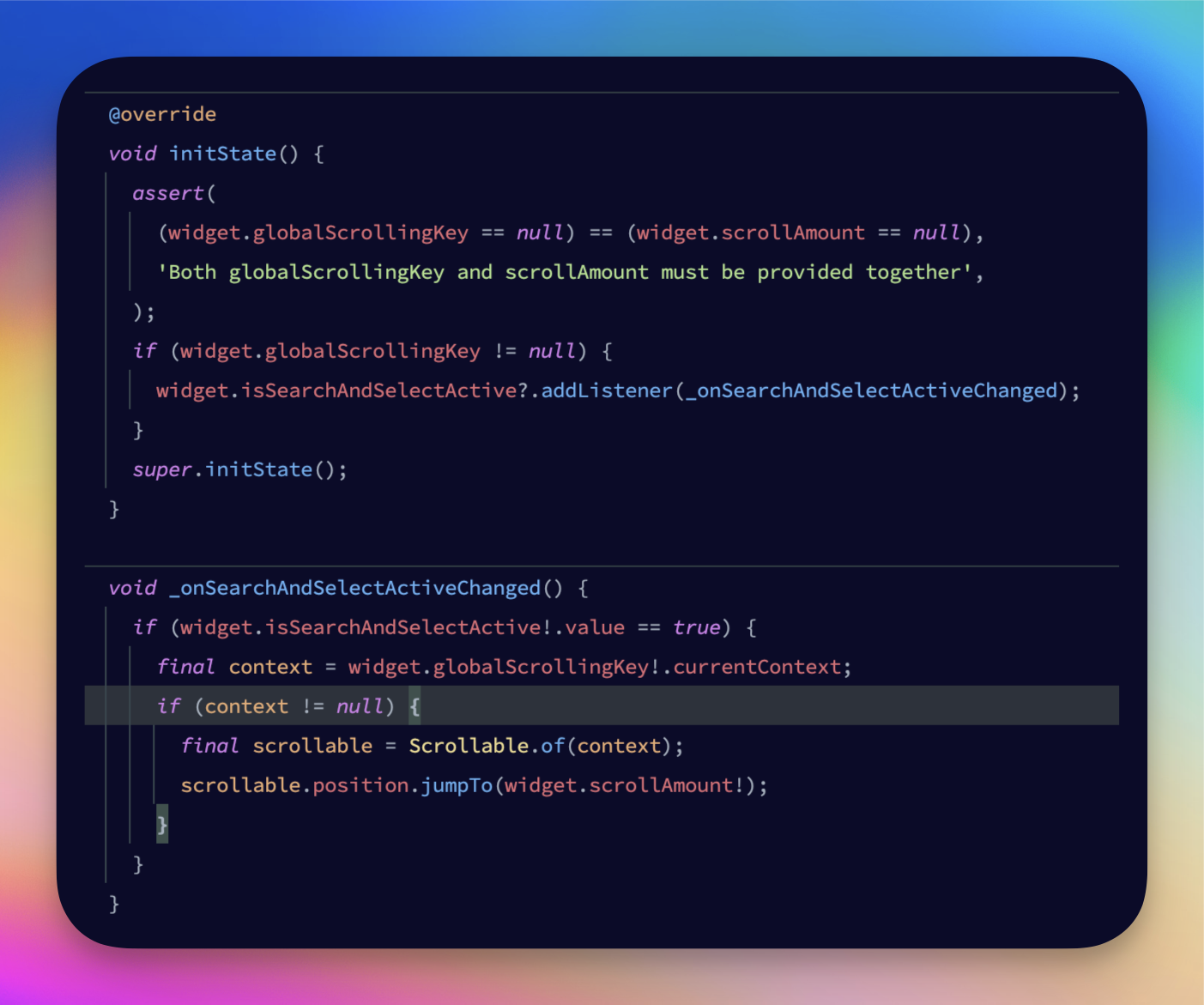
Hm no, I hear what you're saying. I should do that now, because it makes sense. Hard coding such a value is not a good idea, regardless of the single use case right now. So I've done that. I also added an assertion so that both the global key and the scroll quantity must always be specified together. Note that assertions do nothing in production, so this is just a development security measure.
Features In, Bugs Out
Now we just need to see if everything still works. I'll tell you a secret, it doesn't. Somehow I broke off the search in other places. Not very strange with all the booleans and duplicate code I mentioned earlier. It also doesn't help that I don't have any tests for this.
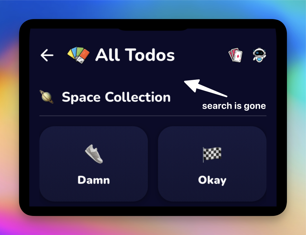
Okay, it wasn't that bad, I purposely zeroed something in all other places so I could work on the Poker and Skuddy view without breaking anything. After fixing it, I had some other problems related to the boolean mess, but I cleaned it up a bit and now everything looks fine.
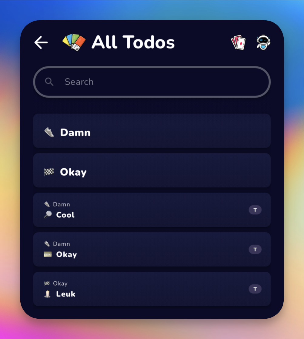
After I also implemented automatic scrolling of the sliver, I noticed that the scrolling behavior is activated even if there is nothing to scroll. To avoid this, we check if it is possible to scroll.
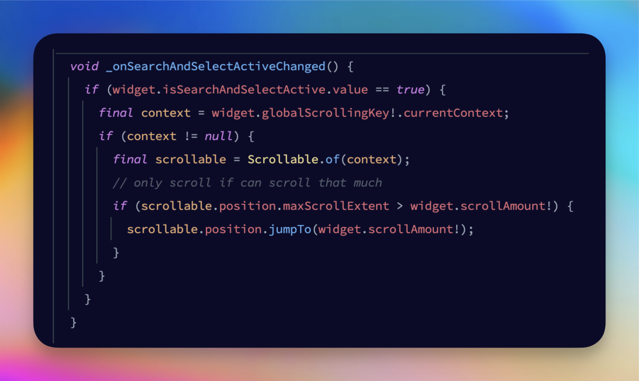
And to give you a little tip on how to figure these things out for yourself. You almost never have to know exactly how to achieve this kind of thing. I knew it was something like that, but I had no idea what exactly to check. So what you can do these days is write a comment with the desired behavior and then hit enter. Your AI suggestions will fill in the rest, which is usually the right way. Keep your logic small, though. Writing large chunks of code is not its specialty (yet). If you don't already have something like GitHub Copilot, get it now! It's a great help with many things. Especially with everyday tasks and figuring out how to do small things like this. Little disclaimer: in this case it actually was not what I was looking for in the end. Due to the widget not having enough information here yet, it did not work. But it got me on the right path.
Paywall Improvements
Now the last part, I want my Paywall to appear when someone logs in for the first time. To ensure that more trial subscriptions are activated and that the user is a little more committed after registering. The plan is to store a boolean in my local storage that defaults to true for showing the Paywall. If the user does not have a subscription, the boolean should be checked. If the user then closes the Paywall, it will no longer be shown.
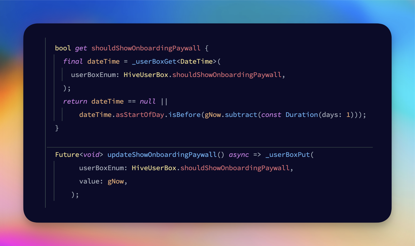
I decided to use a DateTime instead. This way we can show it by X days interval. Now that you mention it, it's also a good idea to configure a setting like this with Firebase Remote Config. That way we can A/B test the interval and see if it makes a difference in the number of trials activated. Let's do that.
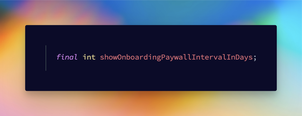
I like to add what the int represents in the name itself so that people configuring this outside the app know exactly what they are changing. This variable is added to the RemoteConfigDto. Now we run the build runner command to update the generated code from the dto and we create a method in the RemoteConfigService to retrieve the value.
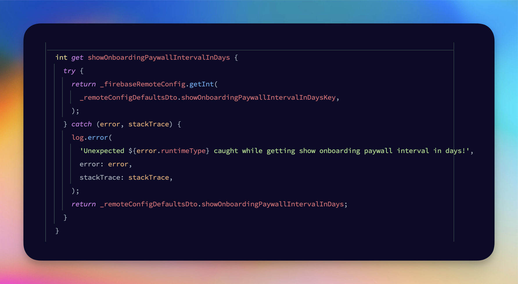
It's that simple. Now let's set it up in Firebase and we're good to go.
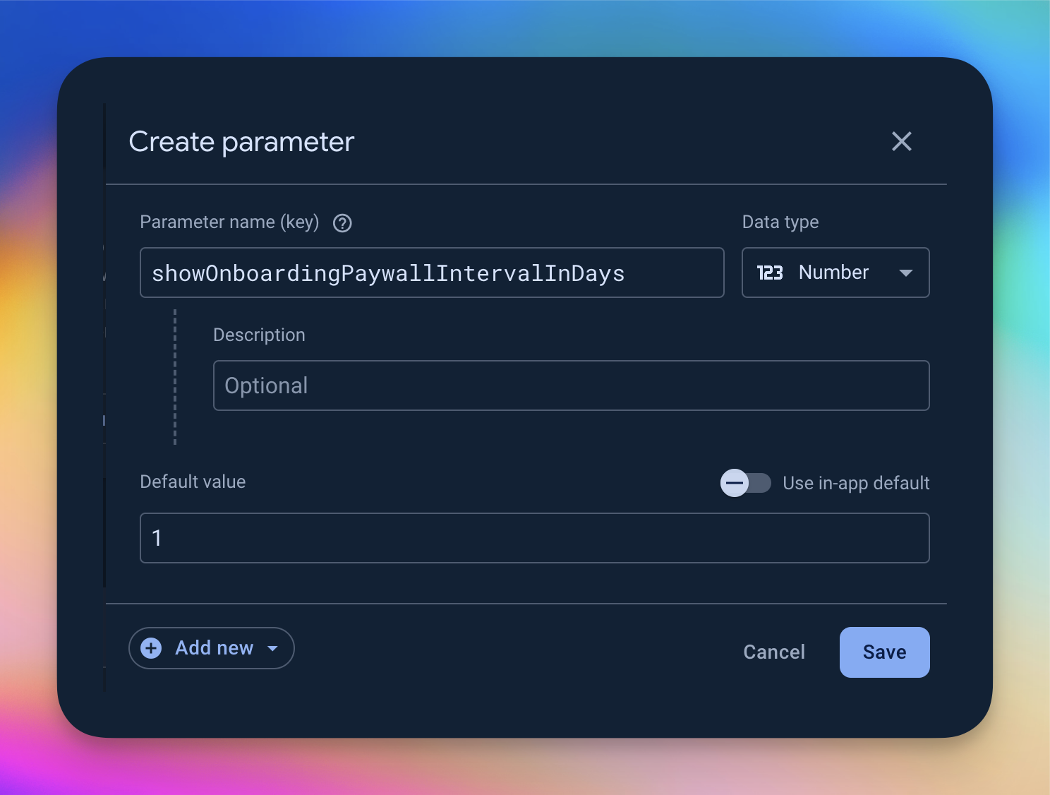
This release is going to be very slick 😁. I almost forgot to call the method. Wouldn't be the first time 😂.

And that was it for today I think. Again, unfortunately, I didn't spend time on the Gemini project, but I'm glad to get this over with. I'll make a release and call it a day. Long day again tomorrow! I hope 😈 Thanks for reading 🤙 see you tomorrow.

Spoiler for tomorrow: I ended up working until 4 am because I noticed a bug, then some more and I couldn't let it go 😭👍.
👋 About me: I am an independent app developer with ADHD and the creator of Float Note. Float Note is an ADHD power tool that helps busy minds live an organized and stress-free life. Features include an AI planning tool, priority poker and a unique mechanism to quickly capture and organize the many thoughts and ideas we have on a daily basis.
🎫 It would mean the world to me if you gave it a try and let me know what you think through one of my socials. You can try it for free for 7 days and when the time comes, use code "DEVLIFEOFBRIAN" to get over 70% off your subscription for life.
📲 Download it here or click the link in my bio (Android/iOS/web) ➡️ floatnote.com/download
Stay focused 🤙
Subscribe to my newsletter
Read articles from Ultra Wide Turbo Devs directly inside your inbox. Subscribe to the newsletter, and don't miss out.
Written by

Ultra Wide Turbo Devs
Ultra Wide Turbo Devs
Tools · Prompts · Templates · Systems · Tutorials · Hacks · Resources