JavaScript Sweeping Area Chart with LightningChart JS
 Omar Urbano | LightningChart
Introduction
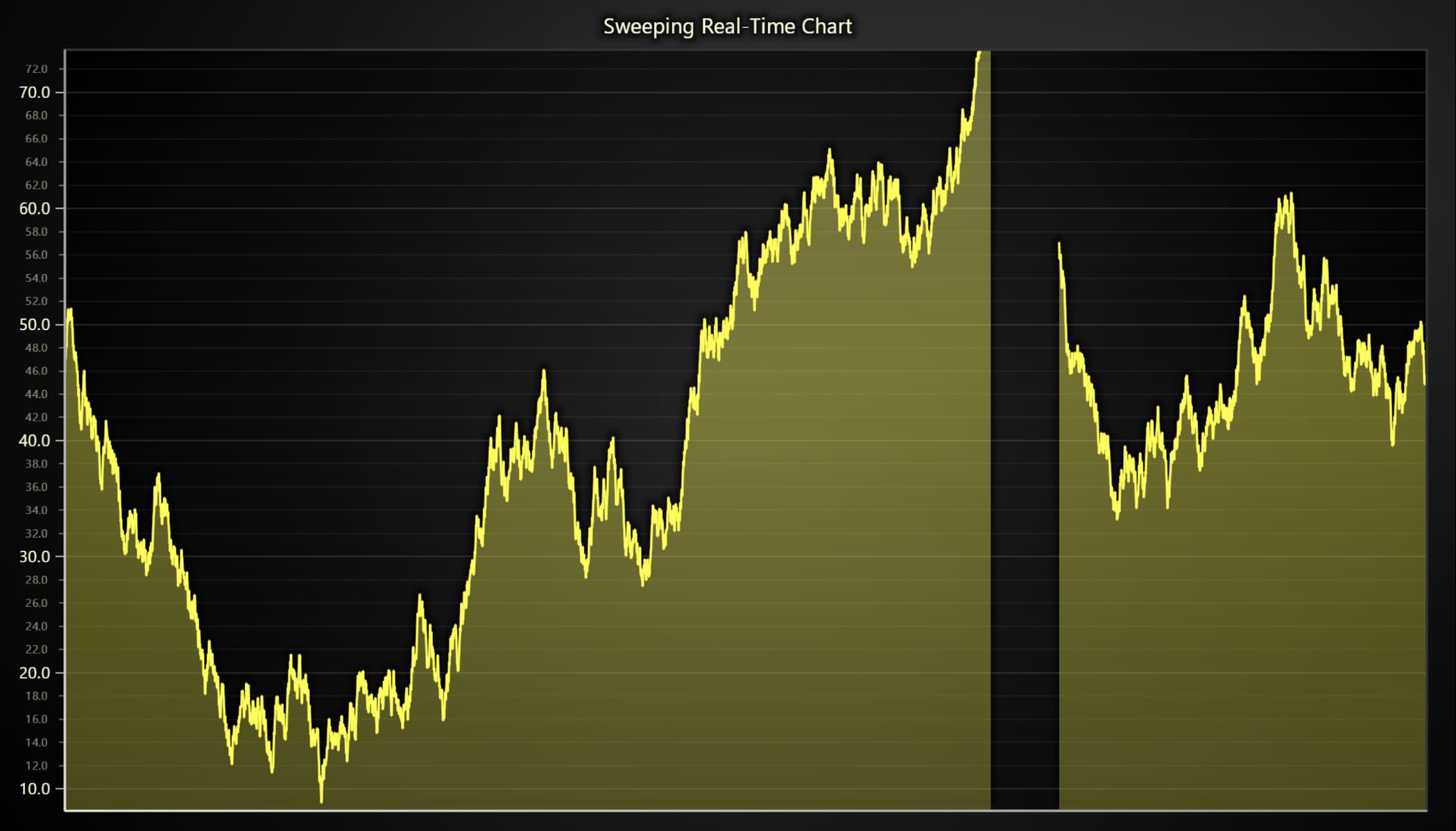
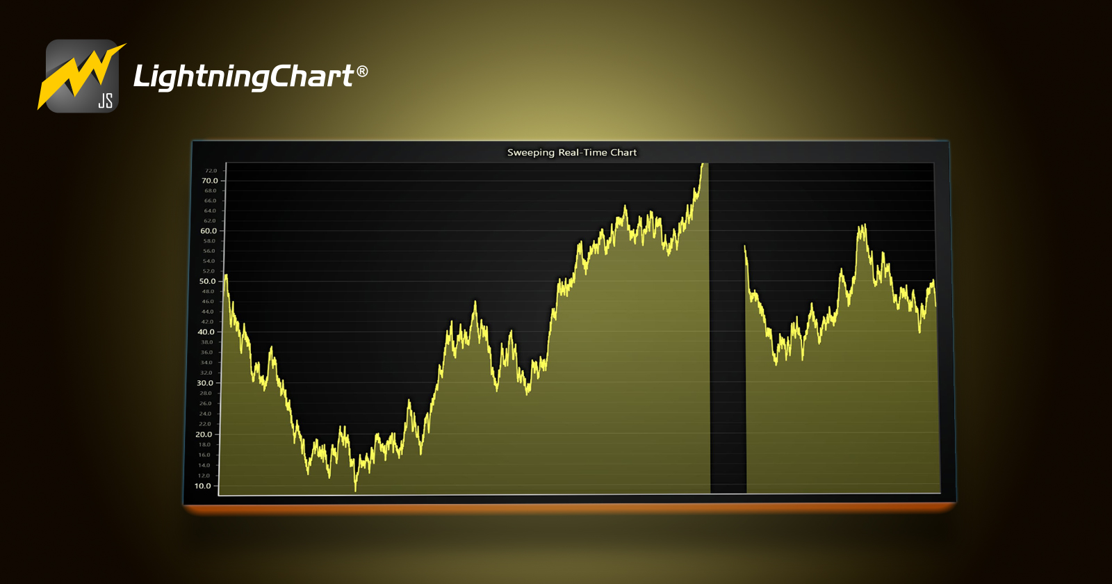
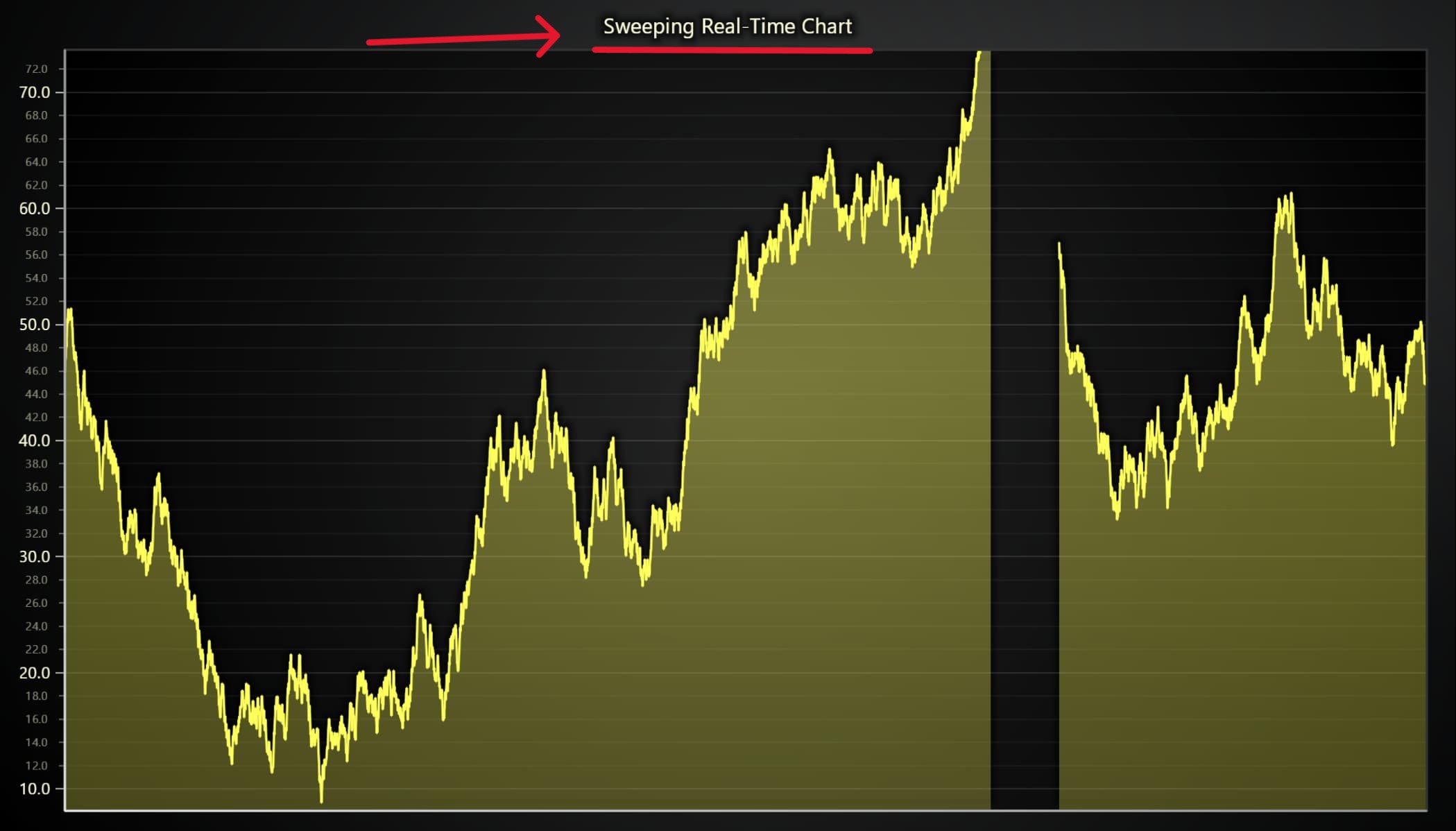
Hello! In this article we will work with an XY chart and create an area chart, but with a sweep effect that will update data in real time. Area charts allow us to identify the trends we have over time.
This chart uses lines and shaded areas, representing the magnitude of the information we display, making it easier to understand relationships, trends, and fluctuations in data.
An area chart can be defined as the combination of a line chart and a bar chart, which generates these areas filled with a color.
These charts are used when you need to see values change over time. One of the features of this area chart is connecting lines through points and filling the area on the X-axis.
As we move forward in the graph, the points go up and down, and the shaded areas expand and contract, in this way we can visualize all the changes that the data set undergoes.
In this chart, we will also add a movement or sweep effect to add dynamism. The sweep is an interval in the form of a strip or gap that moves from left to right.
As it progresses, it updates the data on the left, showing the new groups of data in conjunction with the Y axis, which also updates the margin of the information presented. This description is what we know as an oscilloscope.
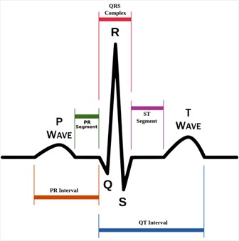
The oscilloscope updates the values as the signal moves to the right. We can also relate it to an ECG, an instrument used in the medical industry, which shows us the behavior of the heart through signals obtained by electrodes.
This data is represented in the form of a signal with waves, intervals, and peaks that help identify drastic changes in the heartbeat.
By combining the sweep and the chart area, we create a very useful tool when the amount of information is very large, and when we have different categories of data.
This new chart replaces the left side scenario, with a new set of data points that were plotted by new lines that have a span.
Although like an ECG or an oscilloscope, an Area Chart allows us to understand the magnitude of each displayed value, due to the volume effect obtained by filling in the entire coordinate up to the location of the point.
Project
This will be a simple project that you can later use freely in your personal (and non-commercial) projects. You can directly edit the JavaScript Sweeping Area chart on LightningChart JS web editor.
Template Setup
To initialize the project, let's set up a working template or you can also download the project template (.ZIP) and follow along the tutorial.
- After downloading the project template, you'll see a file tree like this one:
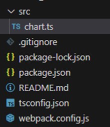
- Then open a new terminal and as usual in a Node JS project, run the
NPM Installcommand. That'd be it, let's code.
Starting with the chart
Today the most recent versions are LightningChart JS 5.2.0 and XYData 1.4.0. I recommend that you review the most recent versions and update them. This is because some LightningChart JS tools do not exist in previous versions.
In the project’s package.json file you can find the LightningChart JS dependencies:
"dependencies": {
"@arction/lcjs": "^5.2.0",
"@arction/xydata": "^1.4.0",
"webgl-obj-loader": "^2.0.8",
}
Importing libraries
We will start by importing the necessary libraries to create our chart.
const lcjs = require('@arction/lcjs')

// Extract required parts from LightningChartJS.
const { lightningChart, Themes, AxisTickStrategies } = lcjs
Add license key (free)
Once the LightningChart JS libraries are installed, we will import them into our chart.ts file. Note you will need a trial license which is FREE (for personal non-commercial projects). We would then add it to a variable that will be used for creating the chart object.
const lc = lightningChart({license: "xxxx-xxxx-xxxx"})
Properties
const chart = lc
 .ChartXY({
     theme: Themes.cyberSpace,
 })
 .setTitle('Sweeping Real-Time Chart')
 .setAutoCursor((cursor) => cursor.setTickMarkerXVisible(false))
Theme: defines the look and feel of your JavaScript stacked bar chart. Note that you must specify the color theme of the chart components beforehand.
setTitle: Sets the name at the top of the chart.
- setTickMarkerXVisible: We can hide the marker of axis X or Y by setting this as false.
Setting up axes
chart.getDefaultAxisX()
.setDefaultInterval({ start: 0, end: CONFIG.timeView })
.setTickStrategy(AxisTickStrategies.Empty)
The getDefaultAxes function allows us to access all the axes of the object. For each axis, we can apply the same properties, or if we need specific properties for each one, we can access each of them using:
Chart3D.getDefaultAxisX()Chart3D.getDefaultAxisY()Chart3D.getDefaultAxisZ()
The setTickStrategy function defines the positioning and formatting logic of Axis ticks as well as the style of the created ticks. In this case, we use the time format for our axes. Within the styles collection, we can use numbers, time, time and date, or void.
The setInterval sets axis scale interval:
start: (Number) Start scale value.
end: (Number) End scale value.
const CONFIG = {
  timeView: 5_000, // milliseconds
  sampleRate: 1_000, // Hz, samples per second
}
At the beginning of the code, we declared a class object with the timeView variable. This time is in milliseconds and is the same that we used as the end interval.
Adding the series
const series = chart
    .addPointLineAreaSeries({
        dataPattern: 'ProgressiveX',
    })
    .setMaxSampleCount(sampleCount)
addPointLineSeries: Method for adding a newPointLineSeriesto the chart. This series type visualizes a list of Points (pair of X and Y coordinates), with a continuous stroke and configurable markers over each coordinate.PointLineSeriesis optimized for massive amounts of data.ProgressiveX: Axis will scroll to show new, progressive data, but will keep its interval constant - leaving older data out of view. In this case, the progression will apply to the X-axis.setMaxSampleCount: This property allows us to make data cleaning (This allocates the required amount of memory). Once the sample count is equal to 1000 (the value of thesampleCountvariable located in the Config class object).
Creating data points
We will now generate data points based on the performancestatus of the chart page. The performance variable allows us to obtain values such as the page performance time.
We will obtain the value for before and after the chart is executed (tNow, tlast), to know the inactivity time of the page. If this inactivity exceeds 2 seconds, the data point will no longer be generated.
The number of data points will be assigned based on the page activity time and the sampleRate value set in the config class.
const streamRandomExampleData = () => {
    const tNow = performance.now()
    const tDelta = Math.min(tNow - tLast, 2000) // if tab is inactive for more than 2 seconds, prevent adding crazy amounts of data in attempt to catch up.
    let pointsToAdd = (tDelta * CONFIG.sampleRate) / 1000 + dModulus
    dModulus = pointsToAdd % 1
    pointsToAdd = Math.floor(pointsToAdd)
    tLast = tNow
    //
    const yValues = new Array(pointsToAdd)
    for (let i = 0; i < pointsToAdd; i += 1) {
        const y = yPrev + (Math.random() * 2 - 1)
        yPrev = y
        yValues[i] = y
    }
    handleIncomingData(yValues)
    //
    requestAnimationFrame(streamRandomExampleData)
}
handleIncomingData: This method helps us reassign the oldest points to the front of the queue. It also generates white space (gap) to generate the sweeping effect. To do this, add empty values to the series:series.alterSamples(lastSampleIndex + 1, { yValues: new Array(gapCount).fill(Number.NaN) })
The requestAnimationFrame: The window.requestAnimationFrame() method tells the browser you wish to perform an animation. It requests the browser to call a user-supplied callback function before the next repaint.
The frequency of calls to the callback function will generally match the display refresh rate. The most common refresh rate is 60hz, (60 cycles/frames per second), though 75hz, 120hz, and 144hz are also widely used.
requestAnimationFrame() calls are paused in most browsers when running in background tabs or hidden <iframe> to improve performance and battery life.
Running the chart
To run the Multiple Areas chart, simply run the NPM START command. In the terminal, you will see a link to your local server where you can visualize the chart application. Local server is usually localhost:8080
Conclusion
The swept area chart offers us very particular characteristics that make users attracted to the type of visualization.
The areas of medicine, communications, reading of terrestrial phenomena, maritime or air navigation instrumentation, are some of the areas where this chart can be used.
This is because the chart area allows us to show thousands of data points, generating the effect of volume or magnitude of an object of study, and thus establish immediate deductions based on that result.
Many companies stream their data live to track an event, and the swept area chart is excellent for displaying the data in real-time, magnifying the result, and giving the user a better understanding.
Some examples are the speed/acceleration of a car in a race, the performance of an athlete in a test exam, the number of users watching a live video, and many more.
The sweeping effect is an effect of updating point data, which are rearranged from left to right based on the time in which they were created.
To generate a sweep, empty Y points are generated, which together generate a gap, which is crossed as the queue of points is readjusted.
The update capacity that LC JS offers is ultimately an excellent tool that allows you to generate all kinds of effects, based on the manipulation of points.
I think using performance values (Performance Interface) is a great idea, especially in cases like this, where the creation of thousands of data points must be controlled, so that performance problems are not generated.
Thank you very much for your attention, bye!
Written by Omar Urbano
Got stuck and need help? Reach out to me on LinkedIn
Subscribe to my newsletter
Read articles from Omar Urbano | LightningChart directly inside your inbox. Subscribe to the newsletter, and don't miss out.
Written by

Omar Urbano | LightningChart
Omar Urbano | LightningChart
Hi! I'm a Software Engineer from Mexico and a data visualization enthusiast. I'm currently writing technical articles about data visualization and high-performance charts.
