Understanding Scroll Driven Animations in CSS
 sathwikreddy GV
Intro
Scroll-driven animations are "animations that are triggered as the user scrolls through a webpage," according to ChatGPT. I always wanted to build a personal website with cool scroll-based animations. I used to be amazed by some websites (like this) with impressive scroll-based animations. But when I started building my personal website, I procrastinated a lot. Then I thought I should write a blog for myself on scroll-driven animations in CSS to get a better idea of how to build my website. So here we go!
We have a default time-based timeline in CSS animations. Below is an example of a typical time-based timeline:
#scroll-icon {
    animation: scroll-icon 1.8s ease infinite;
}
@keyframes scroll-icon {
    0%{
        opacity: 0;
        transform: translate(-0px,-10px);
    }
    50%{
        opacity: 1;
    }
    100%{
        opacity: 0;
        transform: translate(0px,50px);
    }
}
But Scroll based timelines can be of 2 types.
Types of Scroll based timelines
Scroll progress timeline
One can progress this timeline by scrolling an element. The progression starts at 0% and ends at 100%, and the element can be animated within this range.
Let's look at an example to understand this better.
#sticky-parallax-header {
    position: fixed;
    top: 0;
    animation: sticky-parallax-header-move-and-size linear forwards;
    animation-timeline: scroll();
    animation-range: 0vh 90vh;
}

@keyframes sticky-parallax-header-move-and-size {
    from {
        top: 93vh;
        width: 100vw;
        font-size: 20px;
    }
    to {
        top: 4;
        width: 40vw;
        font-size: 14px;
    }
}
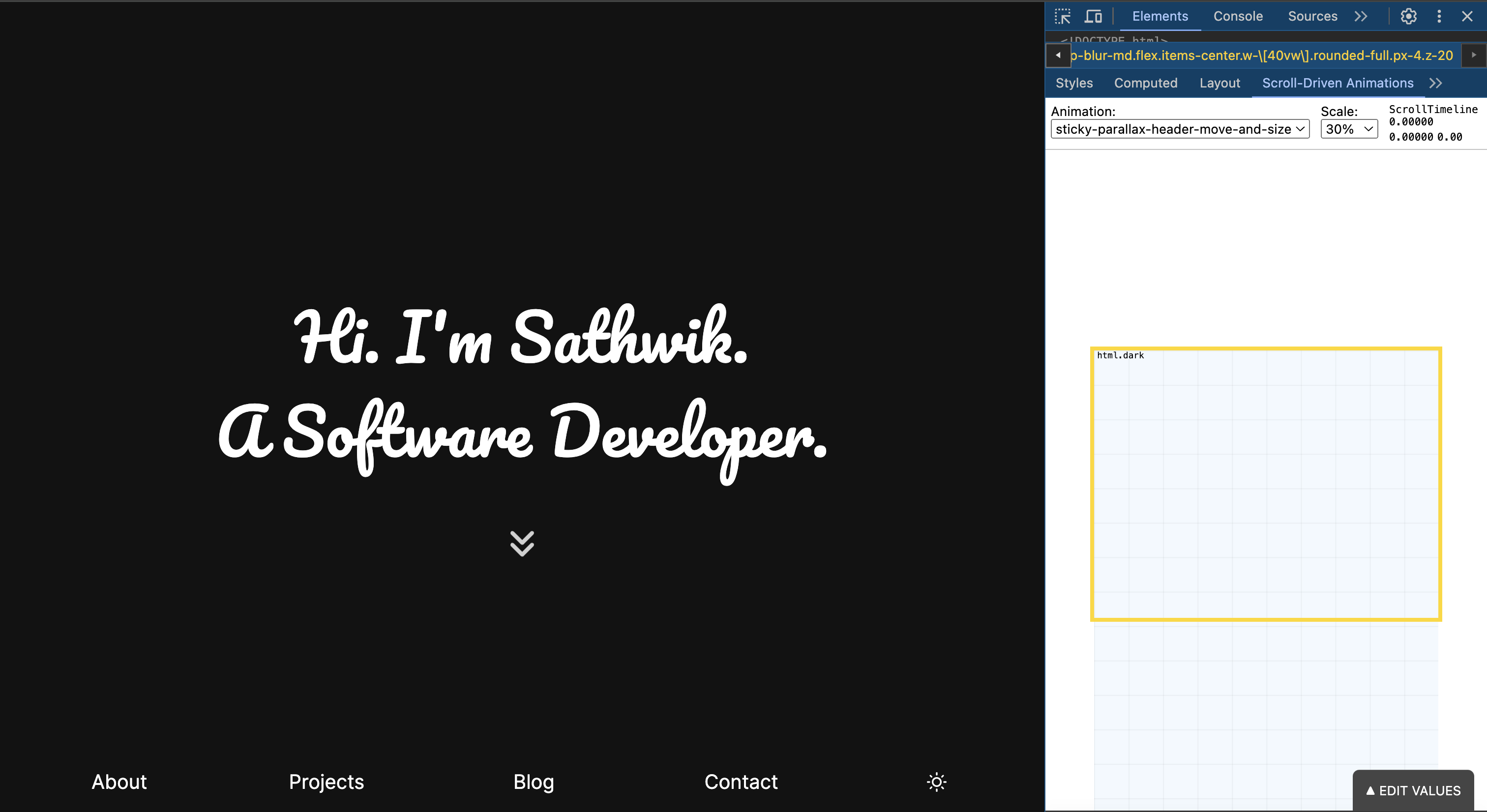
In this above example, there is a line animation-timeline: scroll() which says the animation timeline is scroll based. So when my element is at the bottom of the page, the animation starts as the user scroll the page. The keyframes tell us that the element goes from width: 100vw width to width: 40vw, and similarly top and font-size are also changed. Let's look at how this animation turns out now!
Initial state of the header(at the bottom):

State when the page is half scrolled:

Final state:

You can see that the header moves to the top as you scroll. The width and font size also decrease as specified in the CSS code above. The header stops animating at the top and takes on the final width and font size mentioned in the code.
That's how scroll-progress timeline works!
View progress timeline
You can progress this timeline based on the visibility of an element. The progression is 0% when the element first becomes visible and 100% when the element reaches the edge and is no longer visible.Let's look at an example
.revealing-image {
    /* Create View Timeline */
    view-timeline-name: --revealing-image;
    view-timeline-axis: block;

    /* Attach animation, linked to the  View Timeline */
    animation: linear reveal both;
    animation-timeline: --revealing-image;

    /* Tweak range when effect should run*/
    animation-range: entry 25% cover 50%;
}

@keyframes reveal {
    from {
        opacity: 0;
        clip-path: inset(45% 20% 45% 20%);
    }
    to {
        opacity: 1;
        clip-path: inset(0% 0% 0% 0%);
    }
}
Here, we first create a view-timeline and then assign it using animation-timeline: --revealing-image;. The view-timeline-axis: block; defines that the animation follows the vertical scroll. The line animation-range: entry 25% cover 50%; is crucial as it specifies when the animation starts and ends. As mentioned earlier, the progression in this timeline is based on the visibility of an element. "Entry 25%" means the animation starts when the element is 25% visible, and "cover 50%" means the animation stops when 50% of the scrolling (for that element in the viewport) is done. Let's see how this turns out!
Image 1 (Opacity is less than 1 and the image is clipped):

Image 2 (Opacity is 1 and the image is fully visible):

It is clear in the devtools that the element has been scrolled more than 50%, so the animation has finished. That’s how the view progress timeline works.
Scroll-driven animations Devtools Extension
All the images above had a cool debugger on the right side. This is the DevTools extension for scroll-driven animation. It's very useful when you are learning scroll-driven animations. Get it here!
Conclusion
Scroll-driven animations can make your website look much more beautiful. It is really helpful to understand them. I learned them from https://scroll-driven-animations.style/, and this blog is also heavily inspired by that site. Please check out more scroll-driven animations there. Happy coding!
Subscribe to my newsletter
Read articles from sathwikreddy GV directly inside your inbox. Subscribe to the newsletter, and don't miss out.
Written by

sathwikreddy GV
sathwikreddy GV
Seeking to make an impact in the field of software engineering.