Two Days Indie Dev Life: Mailchimp, Webflow & Zapier - A Love Story
 Dev Life of Brian
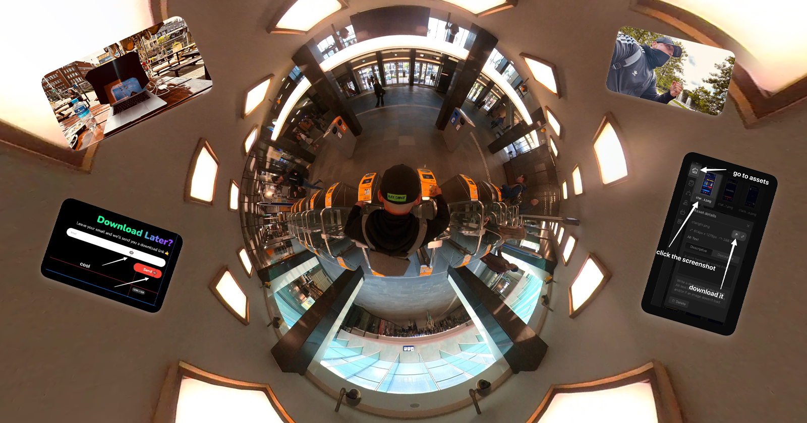
My new landing page is done, I got my email form with download link working and I found a cool new tool for measurements. I also share some nice Webflow templating insights and how I made a very big mistake 😁. Let’s get into it.
Website & Leads
Two days ago I worked the entire day on the new homepage / landing page of the website. This is after I realised that many people reach my app for the first time via desktop web. Currently, my download links are set up to show the web app if they are visited on a desktop. I prefer them to leave their email so they can download the mobile app themselves later, as the mobile app currently has a much better user experience.
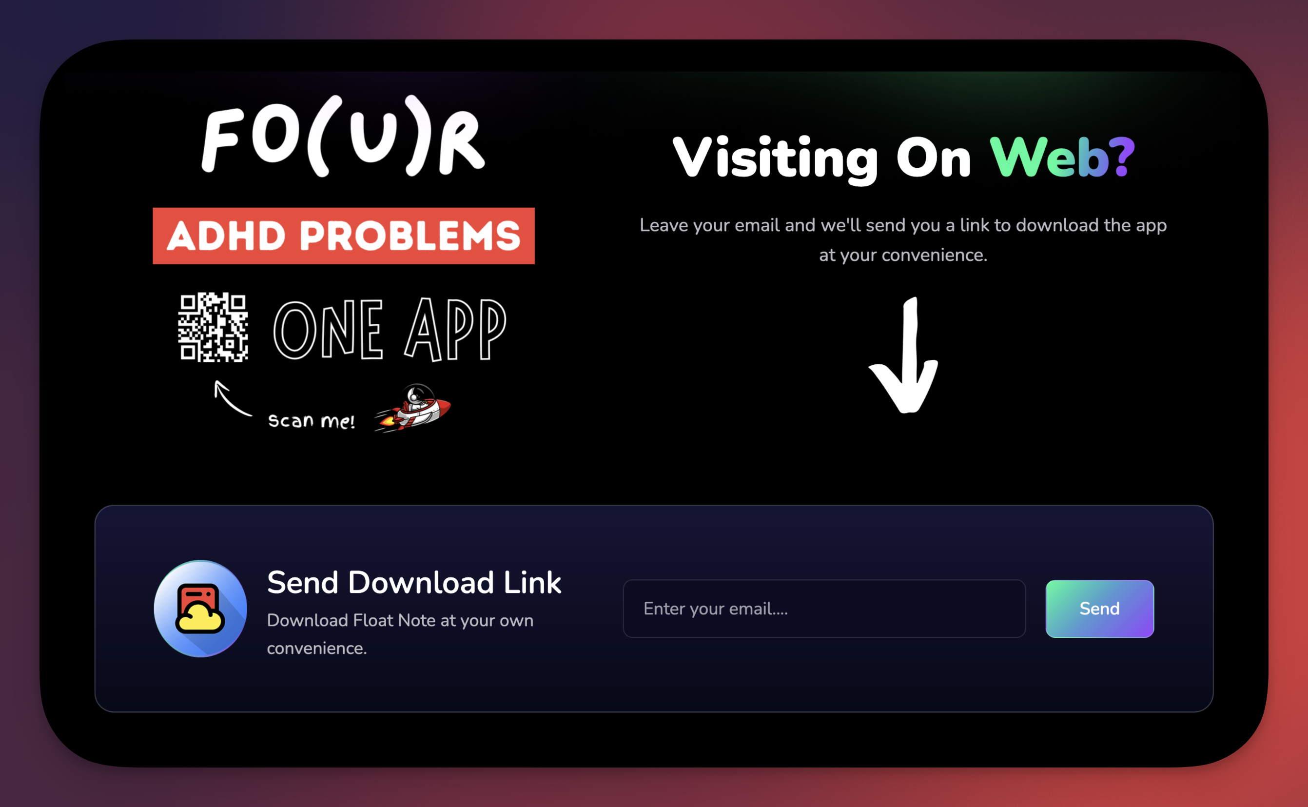
The web version works fine too, don't get me wrong. But some of the UI elements are not yet tuned for the web, which makes some things look out of proportion in certain places. No problem for functionality, but it does look a bit sloppy here and there.
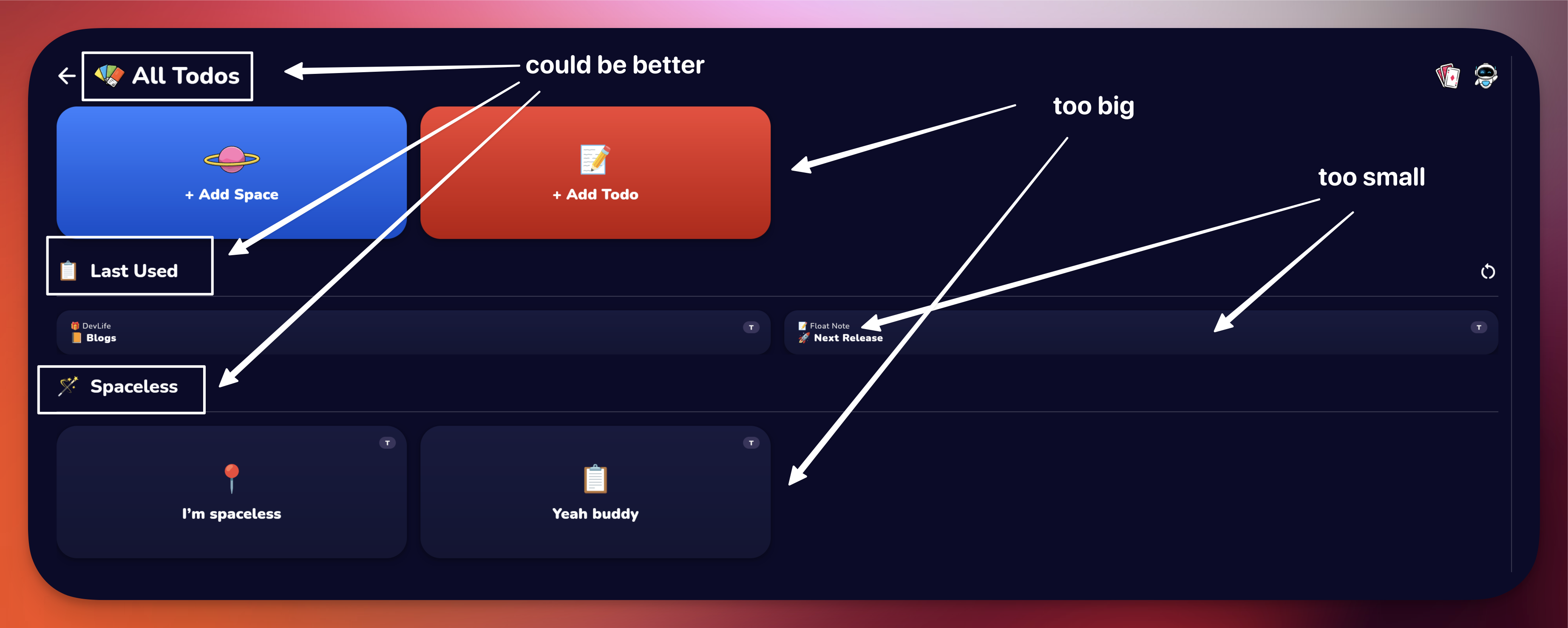
I originally tried to make a download page (in addition to my new landing page) in Mailchimp, but I don't like the templates and the results I get with it. Note from the future, I was using the old builder so that might have to do with it. Either way I decided to go with Webflow. I initially only wanted to create a download page, but then I thought, while I'm at it, I might as well do the whole homepage/landingpage, because I now have a very cool new slogan that I want to reflect. This will improve my SEO and also make sure the website is up to date with all new features. So two days ago, after a good back workout, I went to my favorite place and started working.
Webflow Template
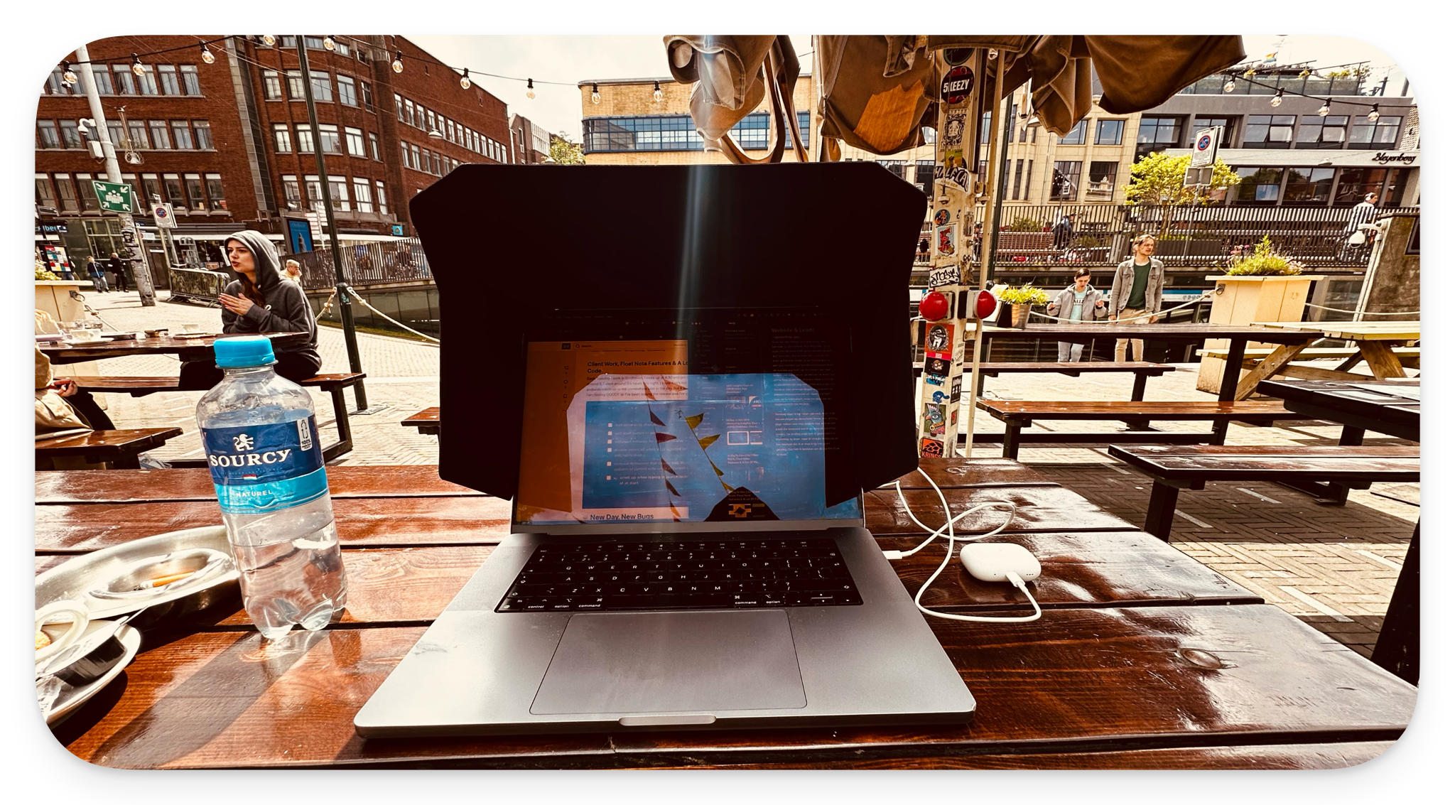
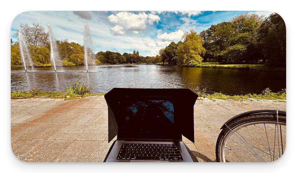
After about two or three hours I had to switch locations to regain my focus. I went to one of my new favorite spots in a park.
Once there I went to look for templates on Webflow. I quickly managed to find a good one that I wanted to use and started implementing it. A lesson I learned from implementing this template and a few templates in webflow before is the following.
Stick To Your Concept
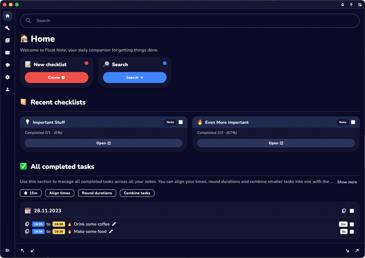
Originally Float Note started out as a desktop application, but once the mobile version got developed mobile became the main app, web was set up and desktop got discontinued. Simply because of time issues, I might continue it one day.
You can save yourself a lot of time by choosing a template that really represents the concept you are selling. In my case now, a mobile app template is better than a desktop SaaS template.
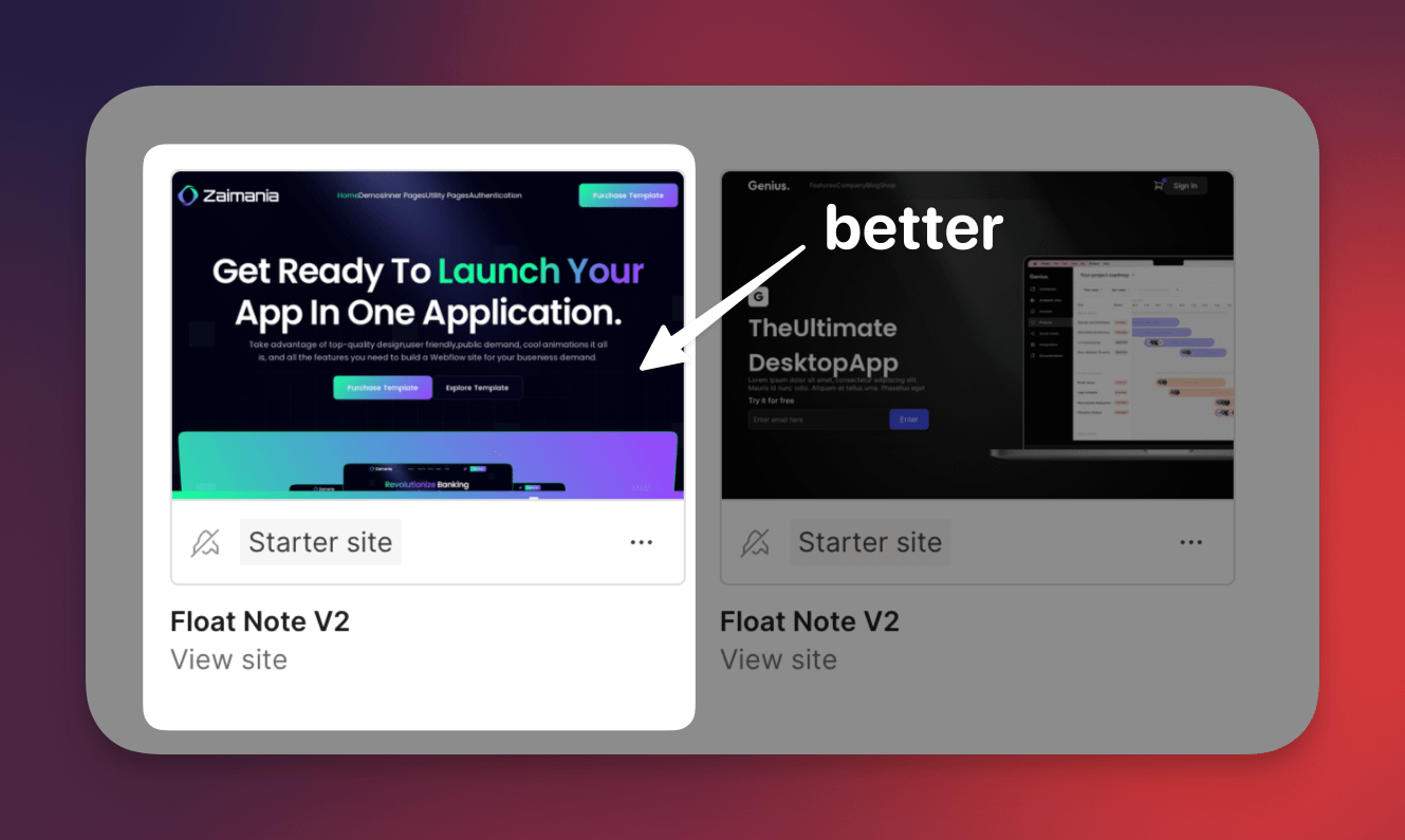
This has to do with the different types of visual elements that are all tailored to mobile app screenshots. To save yourself a lot of time, it is useful if you download these screenshots, adjust them and use the same size (this is important) and then upload them again.
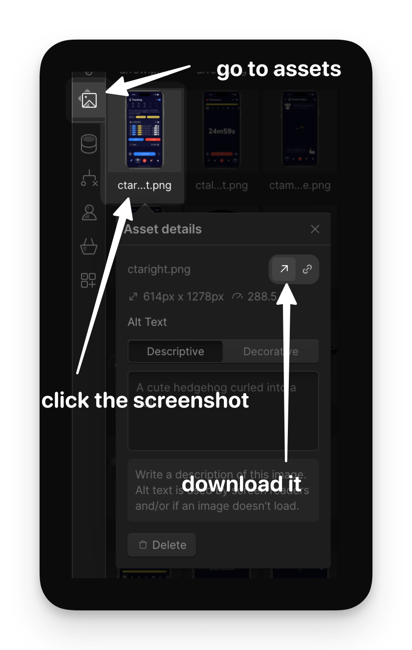
This will keep many animations working properly and most importantly keep proportions looking good. If you don't do this you often spend a lot of time keeping your template nice and responsive because you disturb it because of the different sizes of your screenshots.
Twitter Game
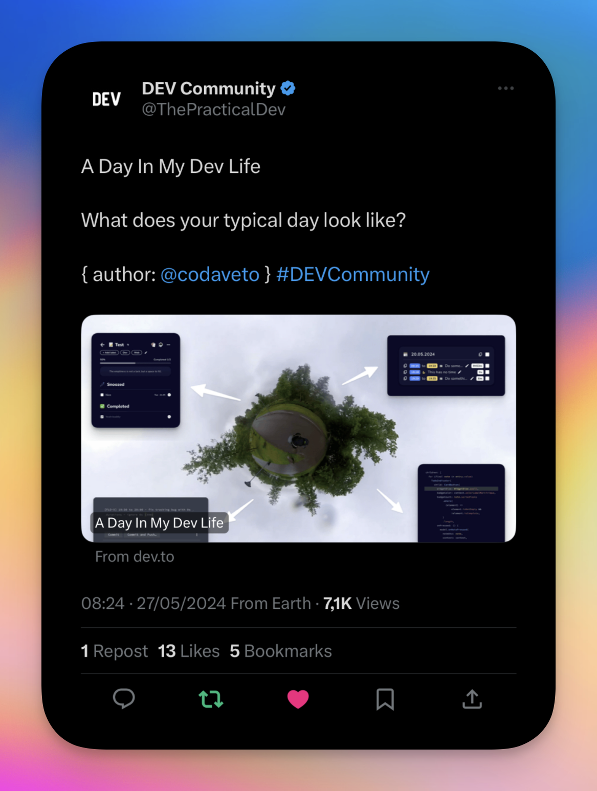
I’ve been active on twitter for about a week now. It’s still kind of new to me but something really cool happened yesterday. DEV.TO put one of my daily blogs in one of their tweets, they have like 300k+ followers, I couldn’t believe it. Very very cool, thanks a lot 🙏.
And while we’re at it I updated my twitter header yesterday. It was still blank and of course I thought this might be the perfect opportunity for me to promote my app. So I made a header, which at first looked great on my laptop but got all messed up on mobile. So I figured out a way to fix this, assuming that most mobiles will have the same kind of dimensions more or less.
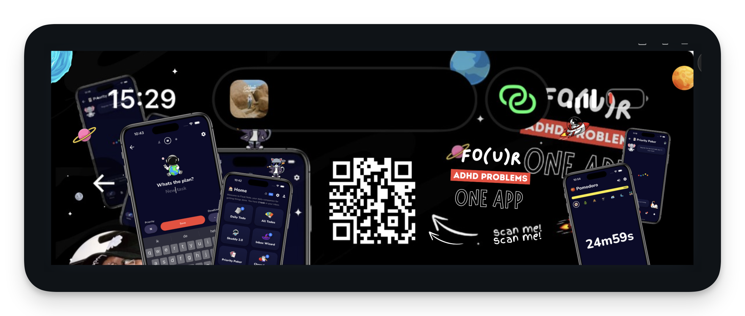
I took a screenshot of my phone and enlarged it on top the design in Canva. This way I could see how my big design would turn out on the big screen and on mobile. By playing around with the opacity of the screenshot. It looks a bit messy but it worked! The challenge was keeping the big design look good. It’s easy to work around the island and battery level etc. But it’s a bit harder to still make it look good when those things are not there. I used some stars and planets to fill up the space where I felt it was too empty.
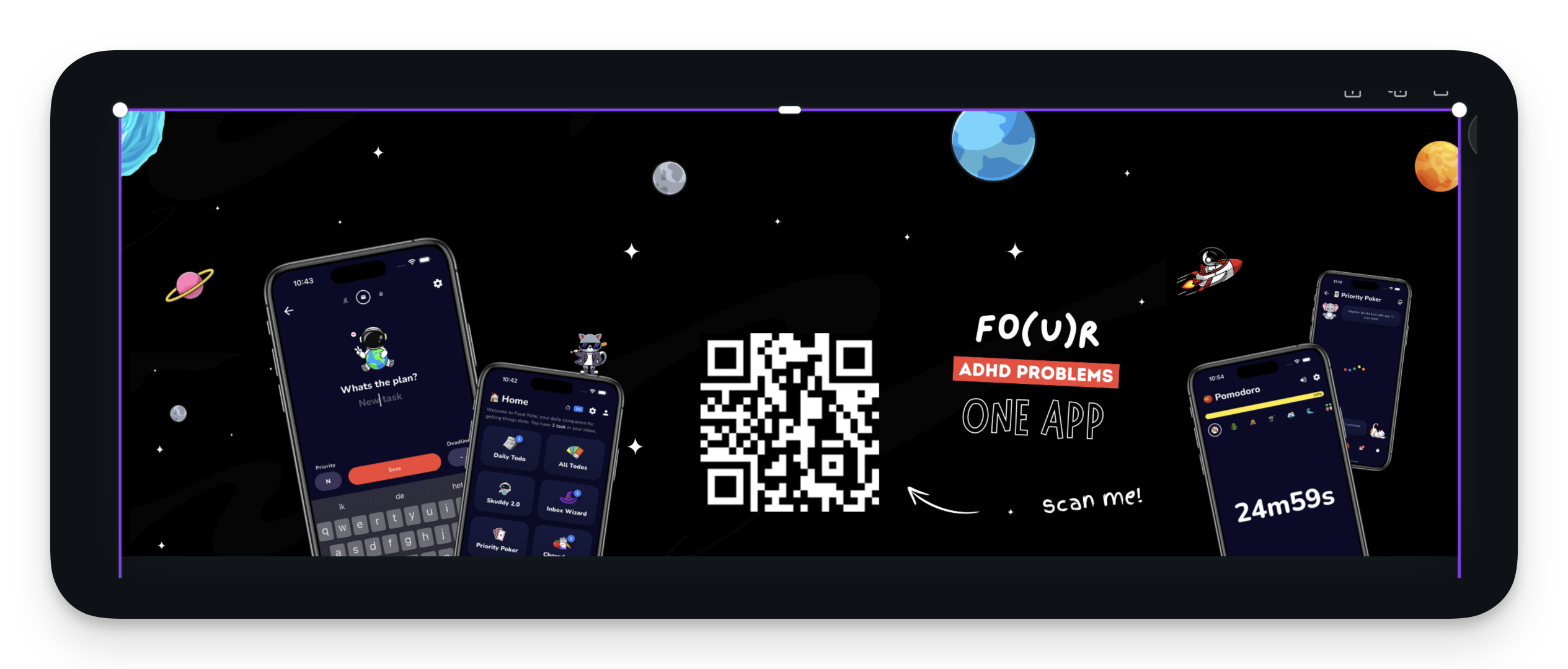
I’m pretty happy with the result for now. I shouldn’t spent too long on these kind of things, I have a tendency to play around with pixels for hours. Luckily I’m aware of this.
Tuesday Trip Day
Per usual I went to Eindhoven tuesday. After a go(o)d workout I moved myself to work at one of my clients.
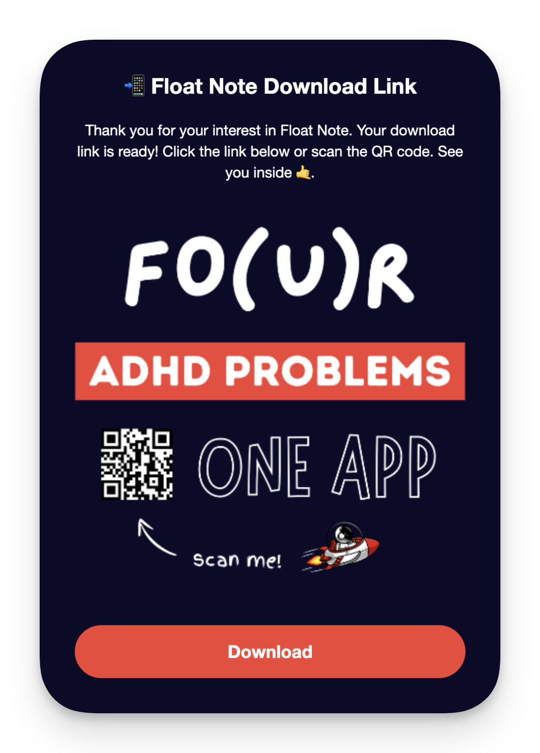
There wasn’t much to do for me so I continued with setting up the landing page. My goal for today is clear. I want a page where users can leave their email and once they do, it should add the user to mailchimp and send a download link. The email should look a bit like this:
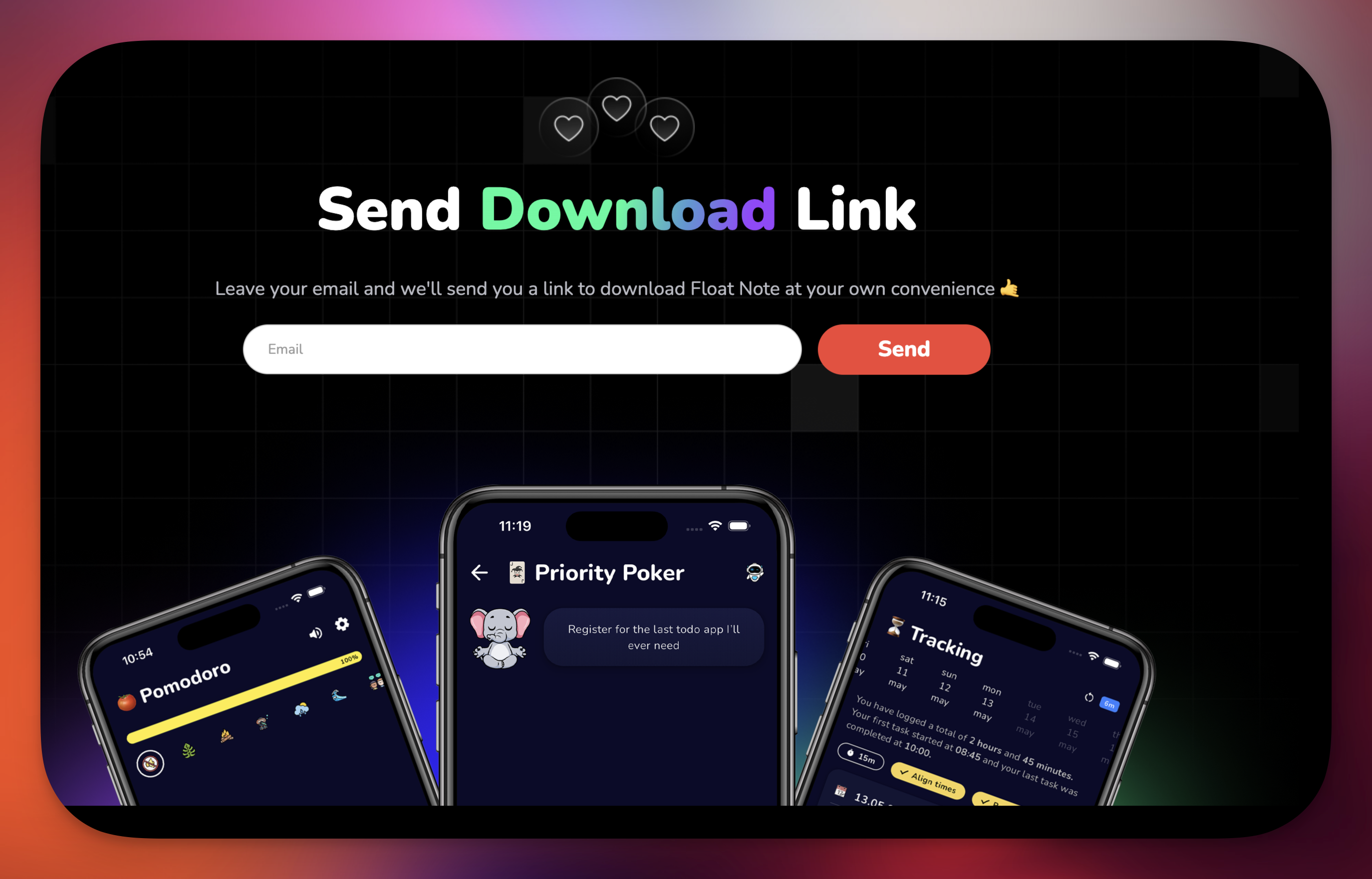
By the end of the day, I got it working. I spent a lot of time trying to build something decent in Webflow and Mailchimp. These tools are great for many things, but I find it difficult (read, not impossible & more important with my skills) to create anything in my head with them. I'm probably spoiled by Flutter and how easy things go and how my brain thinks that way. I pulled a few hairs out of my head today because of these tools.
Webflow & PixelSnap2
Above you see the final result of the download page on web. While working on this page I was going back and forth finetuning the design and I remembered there was this tool that could show you dimensions on the screen with the click of a button. I’m a pixel perfect guy by nature and I do a lot of measuring when I develop my apps, but I’m a bit more loose when I do something like this. However, some things were just too obvious. Like the download button would be bigger than form field. That just looked off. It has to do with the elements being drawn with their fonts + padding as starting point, instead of heights. Anyway what I wanted to tell you about is this tool! It’s so cool. It’s from the same company that build CleanShot X, the tool I use to create my screenshots. It’s called PixelSnap2.
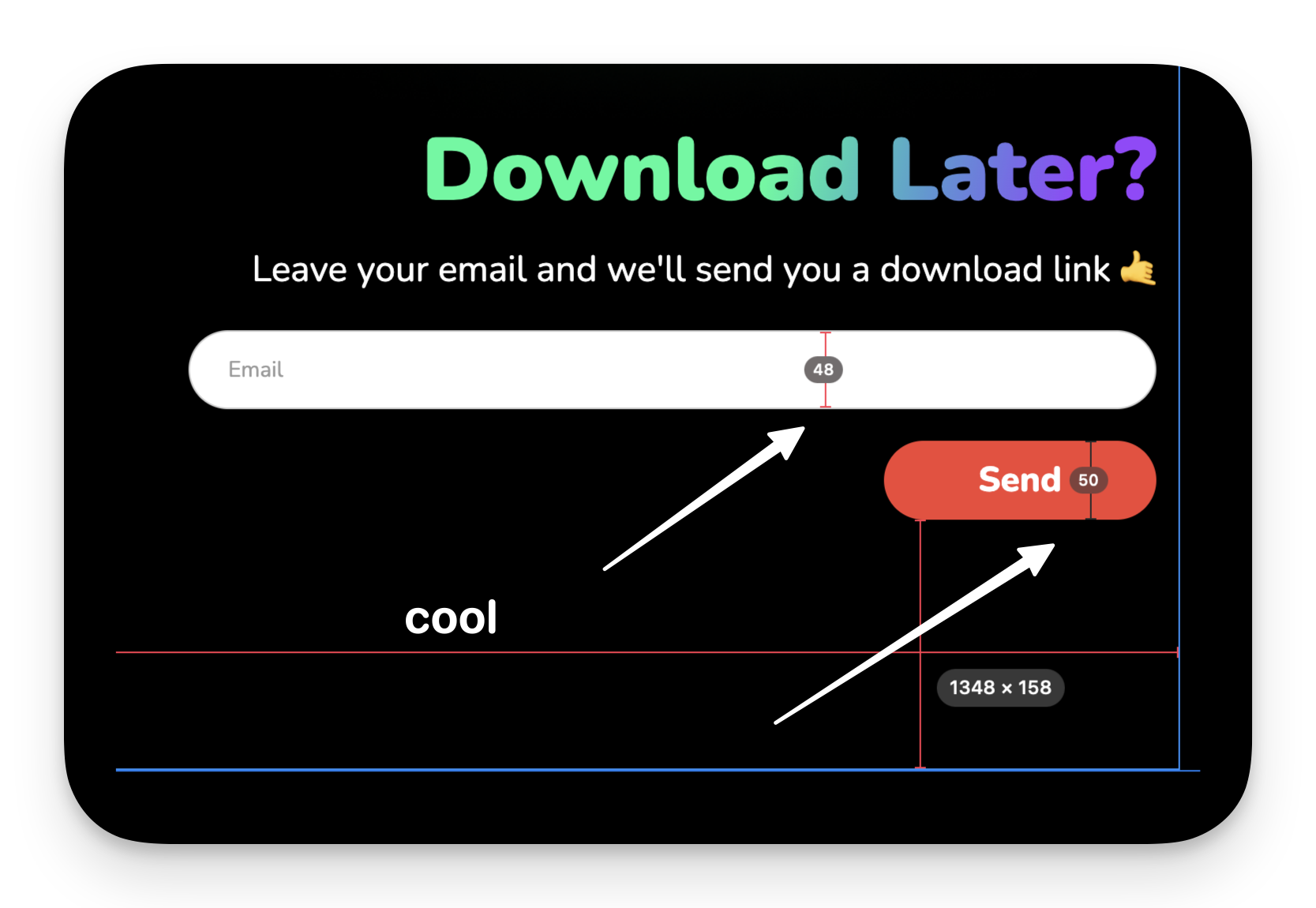
With the press of a button you can put measurements on the screen and keep them there until you remove them. It’s so good for quick measuring! You press a button, you measure stuff, click a bit here and there if you want to and then go about your business. I can’t wait to use this while developing one of my apps.
Mailchimp Journey
After I got the web page working in Webflow I had to set up a Journey in mailchimp.
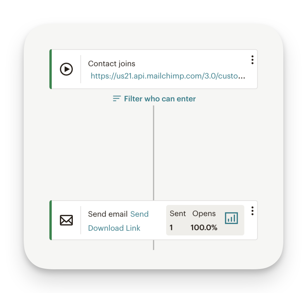
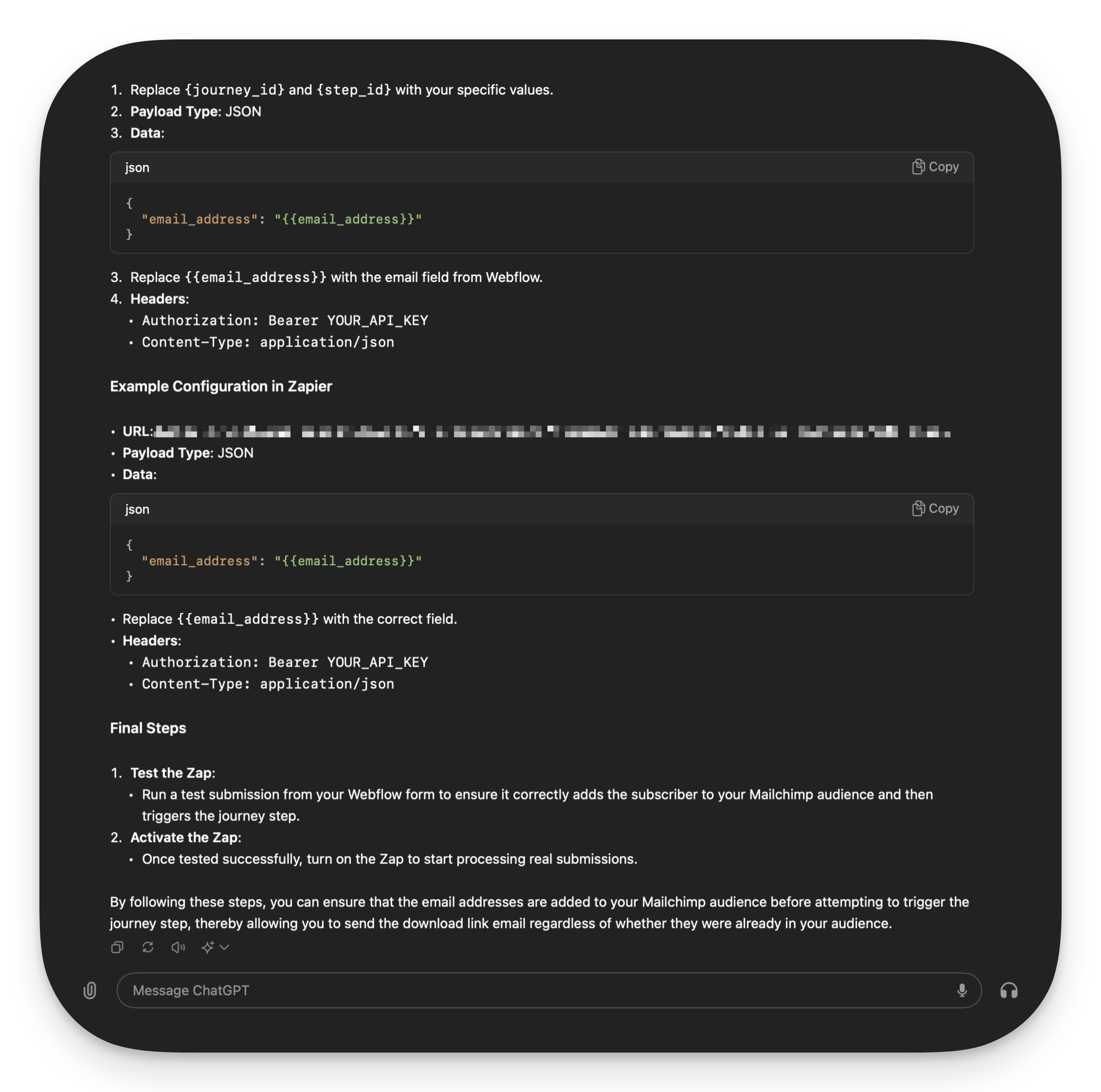
One of the more confusing parts of this was setting up the linking between Webflow and Mailchimp. Somehow I thought they would have a native integration with each other, but they don’t. So naturally I asked ChatGPT how to solve this.
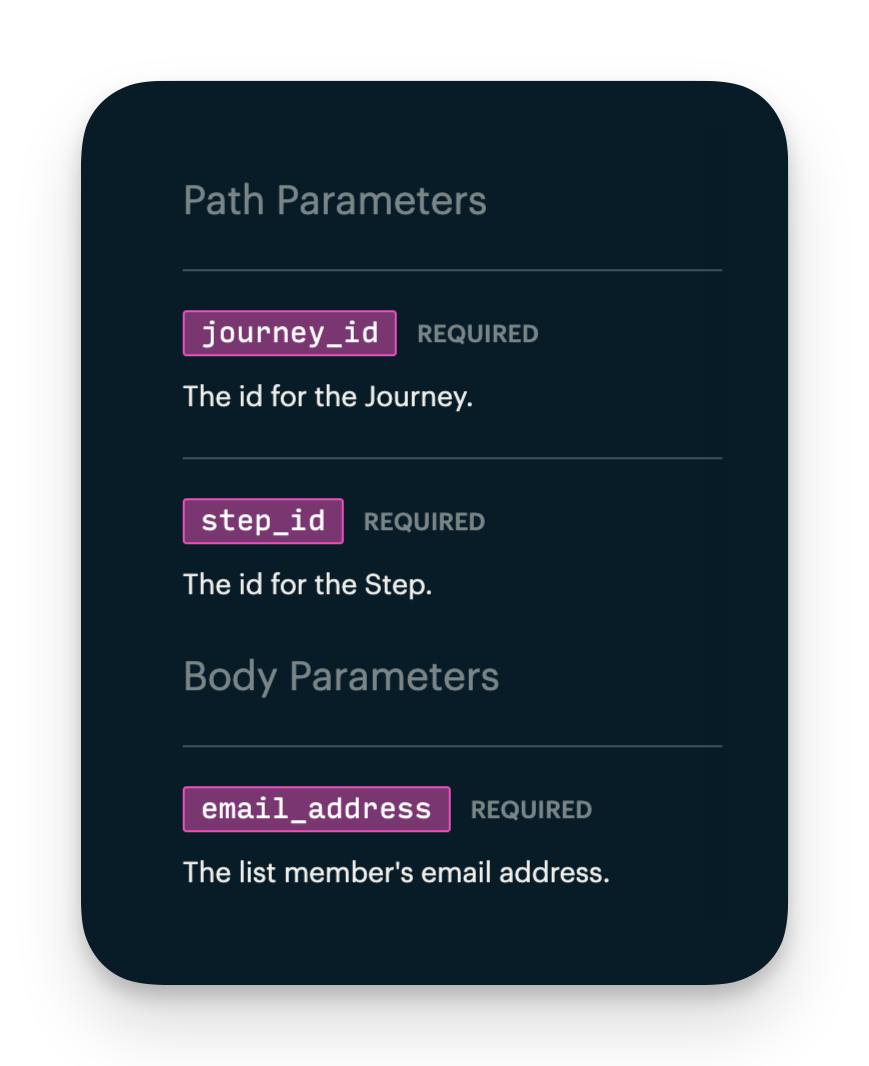
One funny thing, I spent a good time on trying to figure out what the step_id was. It turns out it was part of the url that I had already. That’s what you get for ADHD scanning the documentation instead of reading it.
Once I set up the journey I used Zapier (for now) to link the two together. I’ve heard about Zapier before, I even played around with it but never had a real use case for it. I will replace it once it becomes too expensive but for now it’s a great solution. It worked great too, I could ask it in natural language what I wanted to do, then their AI set up the initial steps for me. One of the few apps where I see AI implemented in a really good way. Kudos to them.
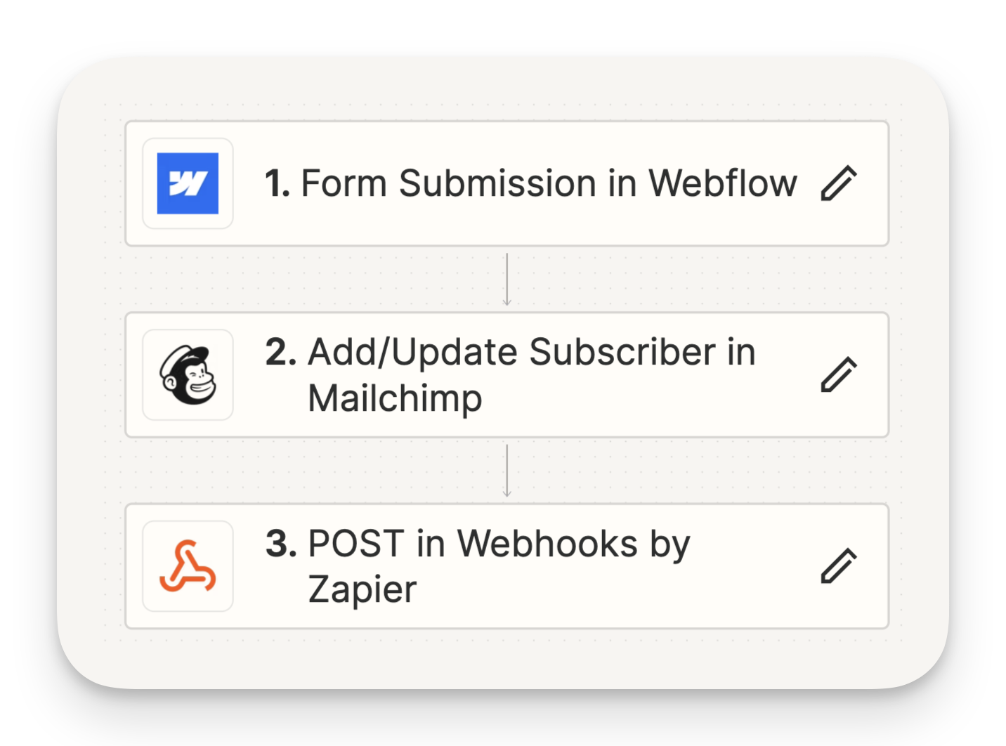
After setting everything up I tested it and it works! Eureuka.
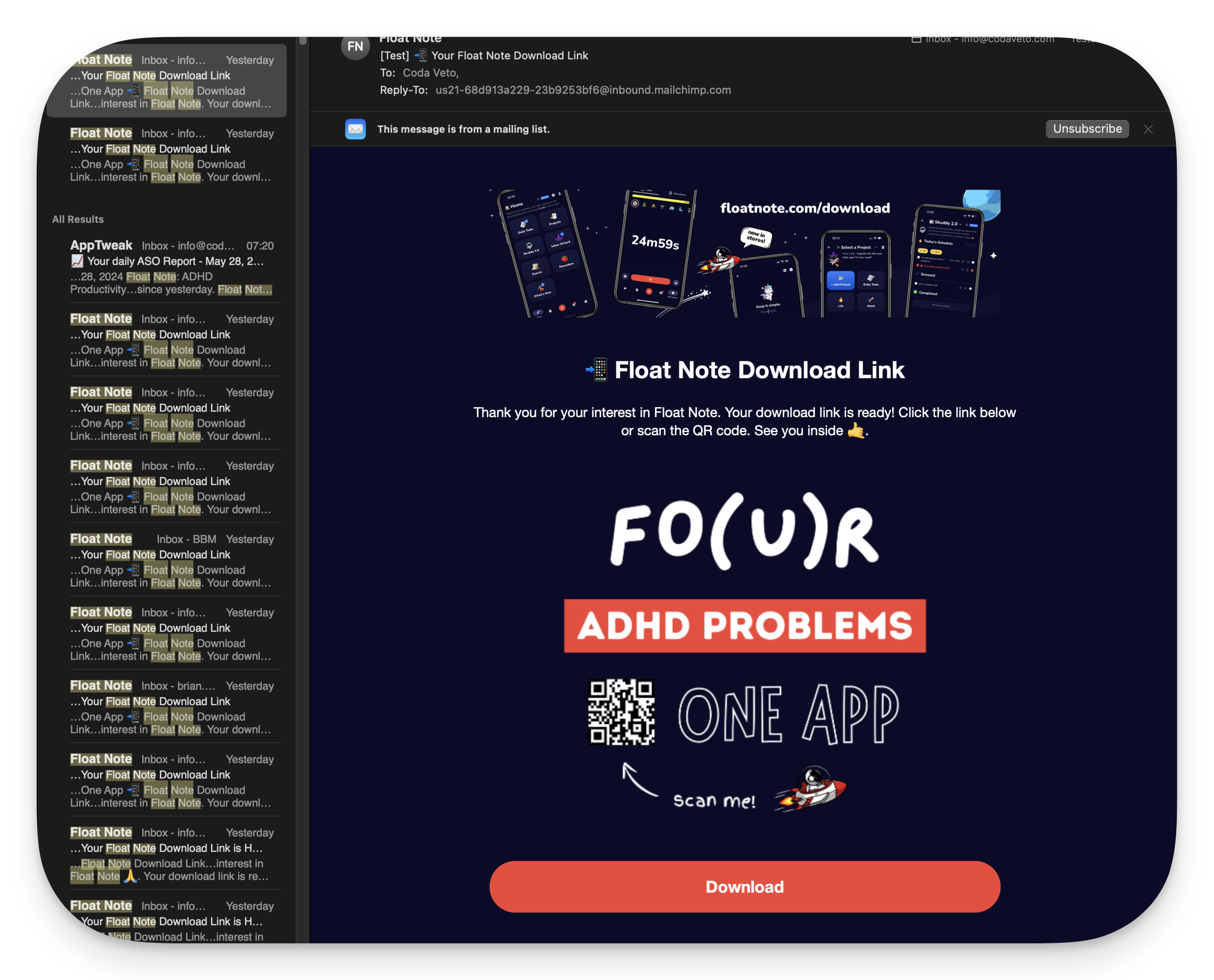
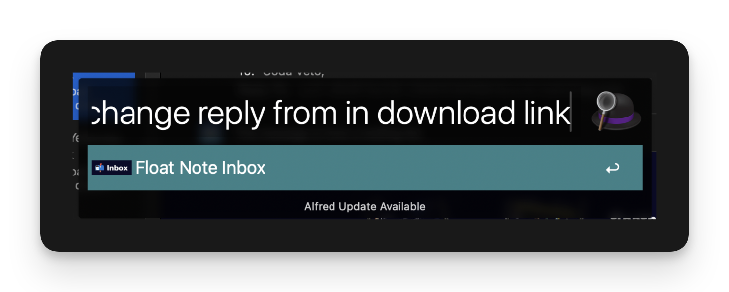
I did notice just now that the sender looks very techy. I thought I fixed that. I’m putting that in my Float Note inbox for later with Alfed and the query option of Float Note.
Big Mailchimp Mistake
So before we end this blog let me tell you about this one big mistake I made yesterday which caused me to accidently mail everyone that ever registered for Float Note to get an email. Before I set everything up correctly with Zapier I was on the wrong path. I get the data from the Webflow form but I selected the wrong campaign. So when I pressed the button to text the integration, it got the data from webflow but selected a campaign that sent my download link email to all current subscribers of Float Note. That’s messy! So everyone got an email yesterday with a download link, no context whatsoever. Really bad 😂. But honest mistake, you live you learn. I’m ‘glad’ it was only 200 people. And I see only two people unsubscribed. Stupid mistake, lesson learned.
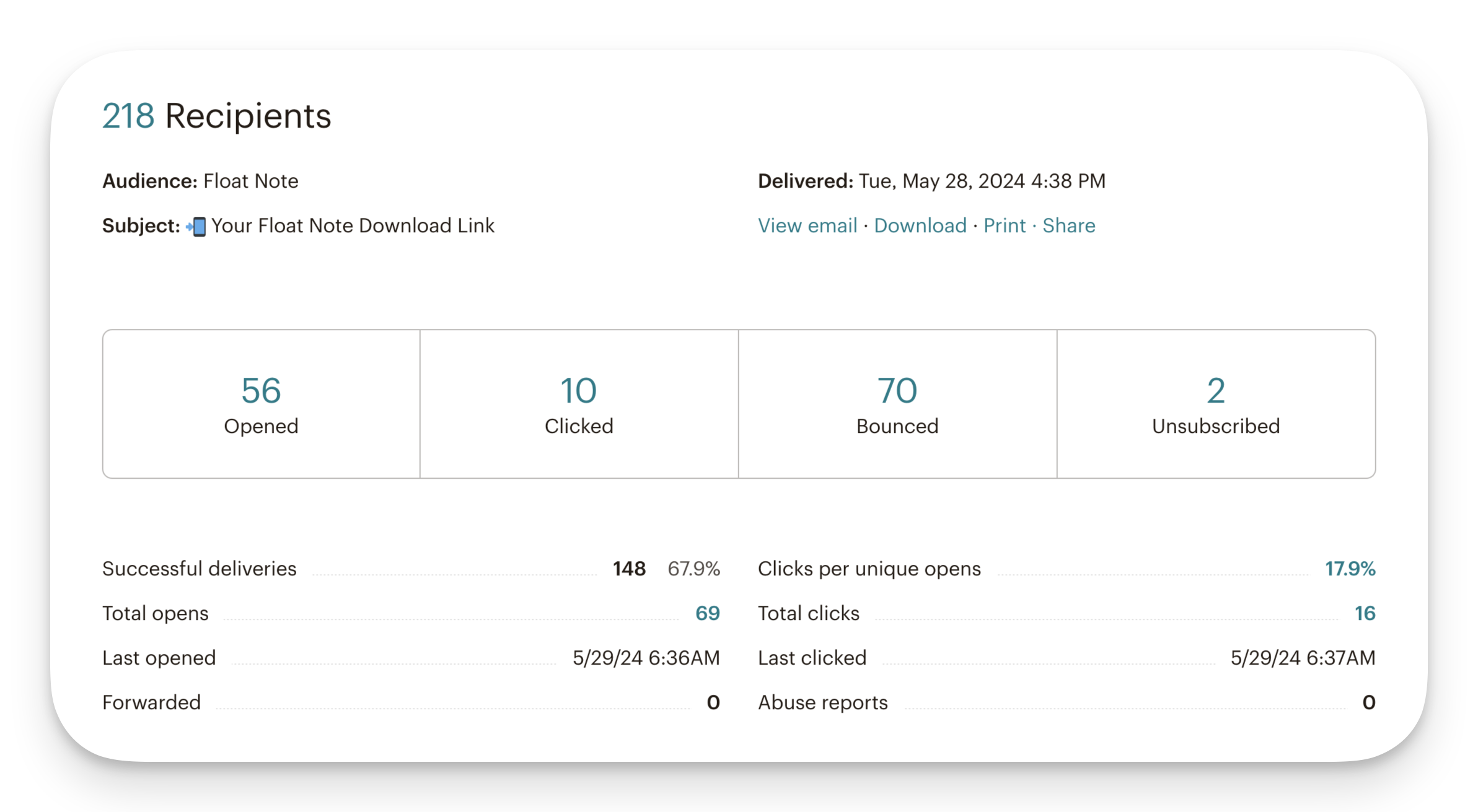
Also I see a lot bounces, this has to do with DMARC I believe. I haven’t looked into it yet. But I will once I get my mail campaign game going. For now, we have more imortant stuff to attend to.
Thank you 🙏
Once again, thank you for reading if you came this far. I really appreciate the support I’m getting. It’s taking up a lot of time sometimes but it’s worth it. I’m still finding my way around building the perfect system for this. See you next time 🤙
About Me
About me: I’m an independent app developer with ADHD and the creator of Float Note, an app that tackles four common ADHD challenges: too many thoughts, trouble organizing, feeling overwhelmed, and staying focused.
Discount Code
It would mean a lot to me if you gave my app a try and let me know what you think through one of my socials. You can try it for free for 7 days and when the time comes, use code 🎫 “DEVLIFEOFBRIAN" to get 70% off your subscription for life. A gift for only a chosen few that read my blog 🙏.
Download
📲 Download it here or click the link in my bio (Android/iOS/web) ➡️ floatnote.com/download
Subscribe to my newsletter
Read articles from Dev Life of Brian directly inside your inbox. Subscribe to the newsletter, and don't miss out.
Written by

Dev Life of Brian
Dev Life of Brian
👋 I’m an independent app developer with ADHD and the creator of Float Note, an app that tackles four common ADHD challenges: too many thoughts, trouble organizing, feeling overwhelmed, and staying focused. 🎫 It would mean the world to me if you gave it a try and let me know what you think through one of my socials. You can try it for free for 7 days and when the time comes, use code "DEVLIFEOFBRIAN" to get over 70% off your subscription for life. 📲 Download it here or click the link in my bio (Android/iOS/web) ➡️ floatnote.com/download