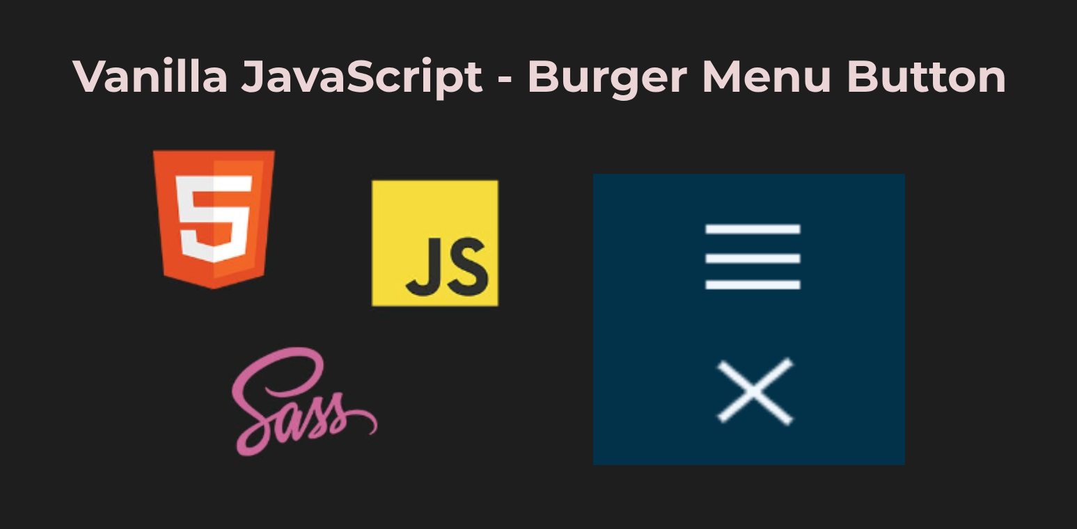
Vanilla JavaScript - Hamburger Menu Button
 Serhat Bek
Creating a hamburger menu is a common task for modern web development, especially for responsive designs. In this tutorial, we'll walk through how to create a hamburger menu component using plain JavaScript, HTML, and SCSS.
Burger Menu HTML Structure
Let's first set up the HTML for our hamburger menu button. This button will have a span element to represent the menu lines. The hamburger-menu class is the main container for our button. The js-menu-toggle-btn class is used for targeting the button in our JavaScript. The hamburger-menu__line class is for the line inside the button.
<body class="container">
  <button
    class="hamburger-menu js-menu-toggle-btn"
    aria-label="Open mobile menu"
  >
    <span class="hamburger-menu__line"></span>
  </button>
</body>
SCSS Styling
Next, we define the styles for our hamburger menu button. The styles include positioning, sizing, and the transitions for the lines. We define the main styles for the hamburger-menu and its lines. The &:before and &:after pseudo-elements create the top and bottom lines of the hamburger. The &--active class defines the transformation for when the menu is active, rotating the lines and hiding the middle line.
// COLORS
$white: aliceblue;
$grayish-blue: #003249;
$burgerTransition: all 300ms ease-in-out;

// RESET
*,
*::before,
*::after {
  box-sizing: border-box;
  margin: 0;
  padding: 0;
}

body {
  background-color: $grayish-blue;
  color: $white;
}

// STYLES
.container {
  width: 100vw;
  height: 100vh;
  display: flex;
  align-items: center;
  justify-content: center;
}

.hamburger-menu {
  $self: &;
  width: 32px;
  height: 32px;
  padding: 0;
  display: flex;
  align-items: center;
  justify-content: center;
  position: relative;
  border: 0;
  outline: 0;
  background: transparent;
  cursor: pointer;

  &__line {
    height: 3px;
    background-color: $white;
    width: 100%;
    display: block;
    transition: $burgerTransition;
  }

  &:before {
    content: '';
    position: absolute;
    width: 100%;
    height: 3px;
    background-color: $white;
    top: 5px;
    left: 0;
    transition: $burgerTransition;
  }

  &:after {
    content: '';
    position: absolute;
    width: 100%;
    height: 3px;
    background-color: $white;
    left: 0;
    bottom: 5px;
    transition: $burgerTransition;
  }

  &--active {
    &:after {
      transform: rotate(-320deg);
      bottom: 13px;
    }

    &:before {
      transform: rotate(320deg);
      top: 15px;
    }

    #{$self}__line {
      opacity: 0;
      width: 0;
    }
  }
}
Adding JavaScript Functionality
Finally, we add the JavaScript to handle the toggle functionality. The script will add or remove the hamburger-menu--active class on button click. The DOMContentLoaded event ensures that the script runs after the DOM is fully loaded. We select the button with the class js-menu-toggle-btn and add a click event listener to it. The toggleMobileMenu function toggles the hamburger-menu--active class, triggering the CSS transitions.
document.addEventListener('DOMContentLoaded', () => {
  const burgerBtn = document.querySelector('.js-menu-toggle-btn');

  const toggleMobileMenu = () => {
    burgerBtn.classList.toggle('hamburger-menu--active');
    /* you can add your mobile menu functionality here */
  };

  if (burgerBtn) {
    burgerBtn.addEventListener('click', toggleMobileMenu);
  }
});
We've just created a simple hamburger menu component using vanilla JavaScript. You can customize it for your project's needs. To see the detailed code check project's Github repo and Codepen for live demo.
Thank you for reading. If you find the article useful, please do not forget to give a star so that others can access it. Happy Coding! 🙃
Subscribe to my newsletter
Read articles from Serhat Bek directly inside your inbox. Subscribe to the newsletter, and don't miss out.
Written by

Serhat Bek
Serhat Bek
Hi! I'm a Frontend Developer from Istanbul. I like 🐈 cats, 🌱 plants, 🎵 music, 🎨 art, 📗 sci-fi and anything that empowers the imagination.