Integrating Storybook and Chromatic to AsyncAPI Website
 Ashmit JaiSarita Gupta
The AsyncAPI website is built using Next.js v14 and TypeScript. Next.js, a powerful framework that leverages React's capabilities, allows us to create feature-rich web applications. In this blog post, I will delve into setting up Storybook v8, a frontend workshop for building UI components and pages in isolation, and Chromatic, a visual testing & review tool that scans every possible UI state across browsers to catch visual and functional bugs, in the AsyncAPI website. I will also be discussing the challenges I encountered and sharing the valuable lessons I learned.
Installing Storybook
To initialize the storybook into an existing Next.js project, Storybook Documentation suggests to use the following command:
# Add Storybook:
$ npx storybook@latest init
However, I encountered a snag while running this command inside my existing clone of the website repo in my WSL environment. The installation process seemed to stall indefinitely. I attempted various solutions, including switching to a Windows environment and verifying network connectivity, but none proved successful. The issue mysteriously resolved after I performed a fresh clone of the repository. While the cause remains unclear, a clean clone might be the solution if you encounter a similar installation freeze during Storybook setup.
Exploring the boilerplate code
The storybook installation adds the following folders to our project: .storybook and stories. The .storybook folder has the following files:
main.ts: This is the storybook configuration file and has the following default code:import type { StorybookConfig } from "@storybook/nextjs"; const config: StorybookConfig = { stories: [ "../stories/**/*.mdx", "../stories/**/*.stories.@(js|jsx|mjs|ts|tsx)", ], addons: [ "@storybook/addon-onboarding", "@storybook/addon-links", "@storybook/addon-essentials", "@chromatic-com/storybook", "@storybook/addon-interactions", ], framework: { name: "@storybook/nextjs", options: {}, }, staticDirs: ["..\\public"], }; export default config;preview.ts: This configuration file allows users to control how the story renders in the UI and has the following default code:import type { Preview } from "@storybook/react"; const preview: Preview = { parameters: { controls: { matchers: { color: /(background|color)$/i, date: /Date$/i, }, }, }, }; export default preview;
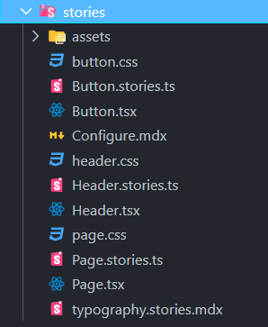
the stories folder contains sample boilerplate components and stories like Button. Here is the list of files it has:

We won't be needing this boilerplate code so I removed it.
Changing the default story location
By default, Storybook stories are present in the stories folder. The main.ts file inside the .storybook folder has settings to find story files inside the stories folder:
stories: [
    "../stories/**/*.mdx",
    "../stories/**/*.stories.@(js|jsx|mjs|ts|tsx)",
  ],
However, codes that change for the same reasons should be kept together. In that sense, the Storybook file for a given component will very likely change when that component changes — so we will be keeping the Storybook File with its component. Also, if the component folder is moved to another place in the project or even to another project, it will be easier to move the Storybook file along.
So we update the above storybook configuration to look for stories in the components folder:
stories: [
    "../components/**/*.stories.mdx",
    "../components/**/*.stories.@(js|jsx|mjs|ts|tsx)",
  ],
Setting up autodocs and custom documentation template
Storybook Autodocs is a powerful tool that can quickly generate comprehensive documentation for UI components. By leveraging Autodocs, we can transform our stories into living documentation. To enable automatic documentation for all stories, I added it to tags in our .storybook/preview.ts file:
const preview: Preview = {
  // ...rest of preview
  //👇 Enables auto-generated documentation for all stories
  tags: ['autodocs'],
};
To enhance the documentation structure, I added a custom documentation template to our Storybook. To replace the default documentation template used by Storybook, I extended the UI configuration file (i.e., .storybook/preview.ts) and introduce a docs parameter. This parameter accepts a page function that returns a React component, which we can use to generate the required template.
import { Title, Subtitle, Description, Primary, Controls, Stories } from '@storybook/blocks';

const preview: Preview = {
  parameters: {
    // ...rest of parameters
    docs: {
      toc: {
        title: 'Table of contents',
      },
      page: () => (
        <>
          <Title />
          <Subtitle />
          <Description />
          <Primary />
          <Controls />
          <Stories />
        </>
      ),
    },
  },
};
This toc property of docs parameter adds a Table of Contents section on the right side of each documentation page.
Changing the font used Storybook
The AsyncAPI Initiative uses Work Sans font overall on its website. So, I decided to update the font used by Storybook. However, this was a tricky part. We can't change the font used by the storybook through its configuration file. After a little research, I found that we can use .storybook/preview-head.html file to add extra elements to the head of the preview iframe, for instance, to load static stylesheets, font files, or similar.
When preview-head.html file is defined in our .storybook directory, it is then treated as the head element of our Storybook. This gives us a place to import our font from Google Fonts CDN and also define a style tag where we can apply the font to the body element. Here is how my preview-head.html file looks like this:
<link rel="preconnect" href="https://fonts.googleapis.com">
<link rel="preconnect" href="https://fonts.gstatic.com" crossorigin>
<link href="https://fonts.googleapis.com/css2?family=Work+Sans:ital,wght@0,100..900;1,100..900&display=swap"
  rel="stylesheet">
<style>
  body {
    font-family: 'Work Sans', sans-serif;
    font-optical-sizing: auto;
    font-style: normal;
  }
</style>
Setting up Chromatic
Chromatic is a visual testing & review tool that scans every possible UI state across browsers to catch visual and functional bugs in our project. It provides a unified workspace for designers, product managers, and other stakeholders to share feedback and sign off on UI. We will be publishing our Storybook using Chromatic as it also allows us to configure CI to run your visual tests whenever you push code and get pull request badges to get notified about the test and review results.
Here is how I installed Chromatic to our project:
$ npx storybook@latest add @chromatic-com/storybook
We need to Sign in to Chromatic to create a new project for our repository. Then we need to grab the CHROMATIC_PROJECT_TOKEN from the project settings. Now whenever we need to publish our storybook we will need to run the following command:
$ npx chromatic --project-token=<CHROMATIC_PROJECT_TOKEN>
Integrating Chromatic into our CI pipeline
We can configure CI to run visual tests whenever we push code and get pull request badges to get notified about the test and review results. We need to add a chromatic script to the package.json to run chromatic:
"scripts": {
  "chromatic": "chromatic --exit-zero-on-changes"
}
To automate Chromatic with GitHub Actions, I created a new file called chromatic.yml in the .github/workflows directory and added the following:
# .github/workflows/chromatic.yml

name: "Chromatic"

on: push

jobs:
  chromatic:
    name: Run Chromatic
    runs-on: ubuntu-latest
    steps:
      - name: Checkout code
        uses: actions/checkout@v4
        with:
          fetch-depth: 0
      - uses: actions/setup-node@v4
        with:
          node-version: 20
      - name: Install dependencies
        # ⚠️ See your package manager's documentation for the correct command to install dependencies in a CI environment.
        run: npm ci
      - name: Run Chromatic
        uses: chromaui/action@latest
        with:
          # ⚠️ Make sure to configure a `CHROMATIC_PROJECT_TOKEN` repository secret
          projectToken: ${{ secrets.CHROMATIC_PROJECT_TOKEN }}
We need to set the CHROMATIC_PROJECT_TOKEN environment variable (sometimes referred to as “secrets”) in our repository's GitHub actions.
Conclusion
The above setup and configurations set a base to add stories. That's it! Now we are ready to write, share, and review stories visually with Storybook and Chromatic for all components in our AsyncAPI Website. In the next blog, I will be delving into writing our first stories and will discuss the challenges I encountered, and share the valuable lessons I learned. Till then make sure to test your codebase with multiple edge cases before pushing it to the main branch.
Subscribe to my newsletter
Read articles from Ashmit JaiSarita Gupta directly inside your inbox. Subscribe to the newsletter, and don't miss out.
Written by

Ashmit JaiSarita Gupta
Ashmit JaiSarita Gupta
I am an engineering physics undergraduate passionate about Quantum Computing, Machine Learning, UI/UX, and Web Development. About two years ago, when I first discovered the field of Web Development and Quantum Computing, it totally amazed me and I have been dedicating my education to them ever since. Over the past two years, I have dedicated a considerable amount of time and effort to learning and developing skills in these fields by taking various online courses, reading different articles, making several projects, and being involved in various research internships and mentorship programs. Fast forward to today, I am currently working on a modern streaming platform and researching QUBO Relaxation Parameter Optimisation using Learning Surrogate Solver (QROSS).