Is Responsive Website a Must-Have ?
 Sakshi Naik
The answer to the above title is definitely yes !
But first of all, let's understand what a responsive website is. Imagine you're a web developer who just built a website all by yourself. You're thrilled with your recent achievement and frequently visit the site on your laptop. But one day, you're without your laptop and decide to check the site on your phone. What happens next? You discover that the layout of your website is completely disrupted and looks unorganized! You feel anxious and disappointed.
This is where the concept of a responsive website comes into play!
Responsive web design means making websites that automatically adjust to look good on any device, whether it's a phone, tablet, or computer. There won't be any weird-looking pictures, hard-to-read text, or parts of the page that don't fit on the screen.
Lets' take a live example of this .
If you ever stumble upon this article, picture this: some of you are cozied up with your laptops, while others are swiping through on your smartphones. A few may even be lounging with your tablets. But let's imagine for a moment that the concept of responsiveness was never born.
The consequences would be very irritating as for a laptop user, you'd struggle with tiny text and images that overflow the screen, making you squint and scroll endlessly. Smartphone users would face a tough time navigating, constantly pinching and zooming to read or see content that's too big for their screens. And for tablet users, it would feel like the website is stuck in the past, leaving you frustrated with a layout that doesn't fit their device properly.
Now you can see why this article starts with a YES !
How can you make a website responsive ?
Now comes a very important question. To which there are three major ways , explained below :
1) Media Queries : These are CSS rules to apply different styles on your website based on the device's characteristics, such as screen width, orientation ,etc. Using these, you can create customized layouts and adjust styling.
body {
        background-color : blue ;
      }
Here the background color for the website is set to blue color.
@media (max-width: 600px) {
             background-color : red ;
           }
Here after applying media query, targeting screens with a maximum width of 600 pixels, the background-color is changed to red when the screen width is narrower than 600 pixels.
There are certain break-points for different screen sizes in widths ie; 600px for phones, 768px for tablets, 992px for laptops and 1200px for desktop and larger screens.
Let's see another example :
.container {
          height: 50px;
          background-color:  black;
         }
Here .container class has height and background-color set to 50px and black color respectively.
@media (orientation: landscape){
      .container {
        height: 80px;
        background-color: green;
     }
After applying media query , targeting screens in landscape orientation, the height and background-color is changed to 80px and green color respectively.
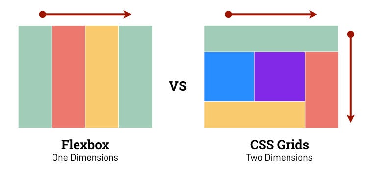
2) Layout with CSS Flexbox and Grid : CSS Flexbox is a tool that helps you organize elements in a row or column. It is like a set of rules that you can use to arrange all the elements neatly in a straight line, either going from left to right or from top to bottom.
CSS Grid is like a blueprint that helps you organize elements into rows and columns, creating a grid like pattern. You can specify how many rows and colums you want and where you want to place elements in it. It's like building a grid-like structure where you can neatly arrange your content, like placing pictures in a photo album.

3) Viewport Meta Tag : The viewport is like the window through which you see a web page on your device. It is the area where you can see the content of your webpage. However the size of this window is not always the same. It can be bigger on a computer screen and smaller on a mobile phone. It is an HTML tag found in the <head> of an HTML document. It is like providing guidance to the web browser on how to show a webpage.
<head>

<meta name="viewport" content="width=device-width, initial-scale=1.0" />

</head>
Here the "width= device-width" sets the width of the content to the width of the device and "initial-scale=1.0" ensures the webpage is initially displayed at its natural size without any zooming.
Examples of Responsive Websites


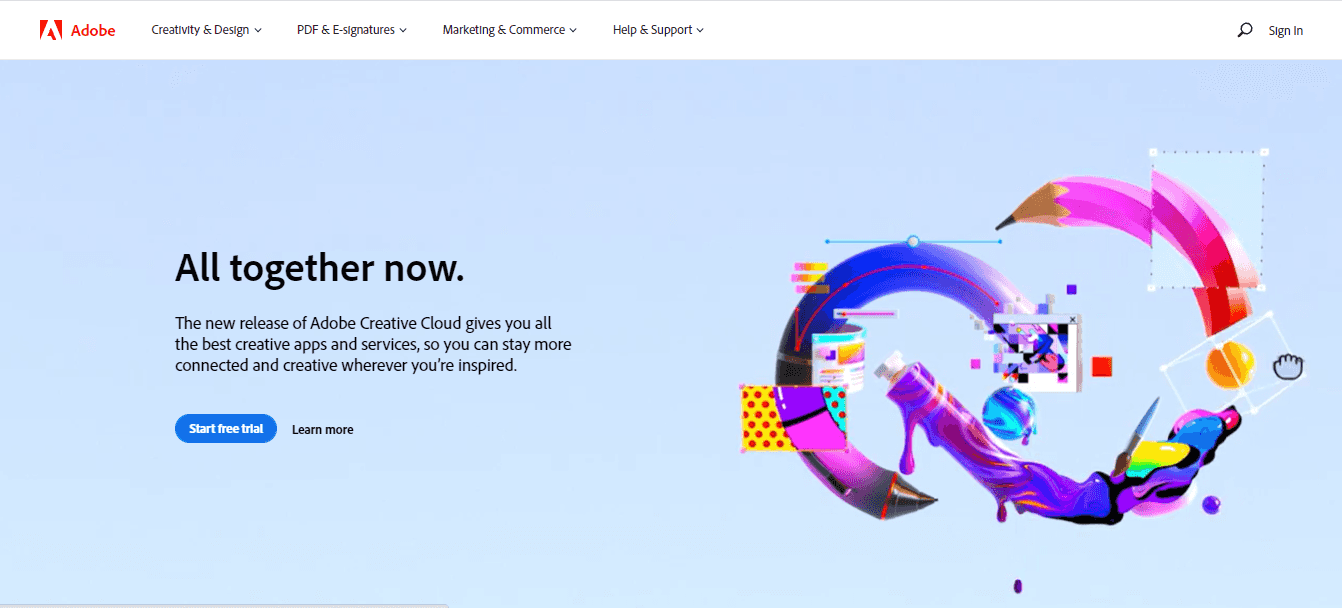
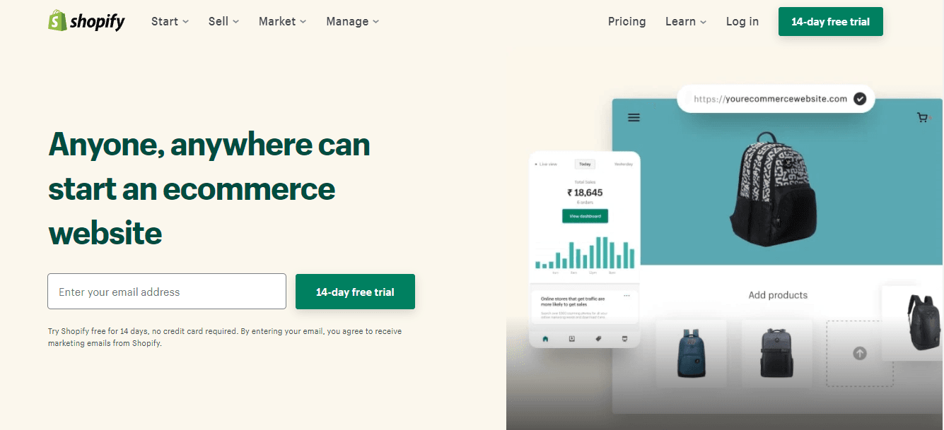
All the above popular platforms have responsive websites which offer a unique user experience no matter what device or browser you are using. Just like these, you can explore the responsiveness of other known web pages too. One thing you will find common in all of them is the easy navigation, smooth user experience, automatic adjustment of layout and content to fit any device or screen.
Now that you understand the importance of making a website responsive, make sure to apply this knowledge the next time you develop a web page :)
Happy Coding !
Subscribe to my newsletter
Read articles from Sakshi Naik directly inside your inbox. Subscribe to the newsletter, and don't miss out.
Written by
