Building a JavaScript Scatter Chart for Analyzing Customer Satisfaction
 Omar Urbano | LightningChart
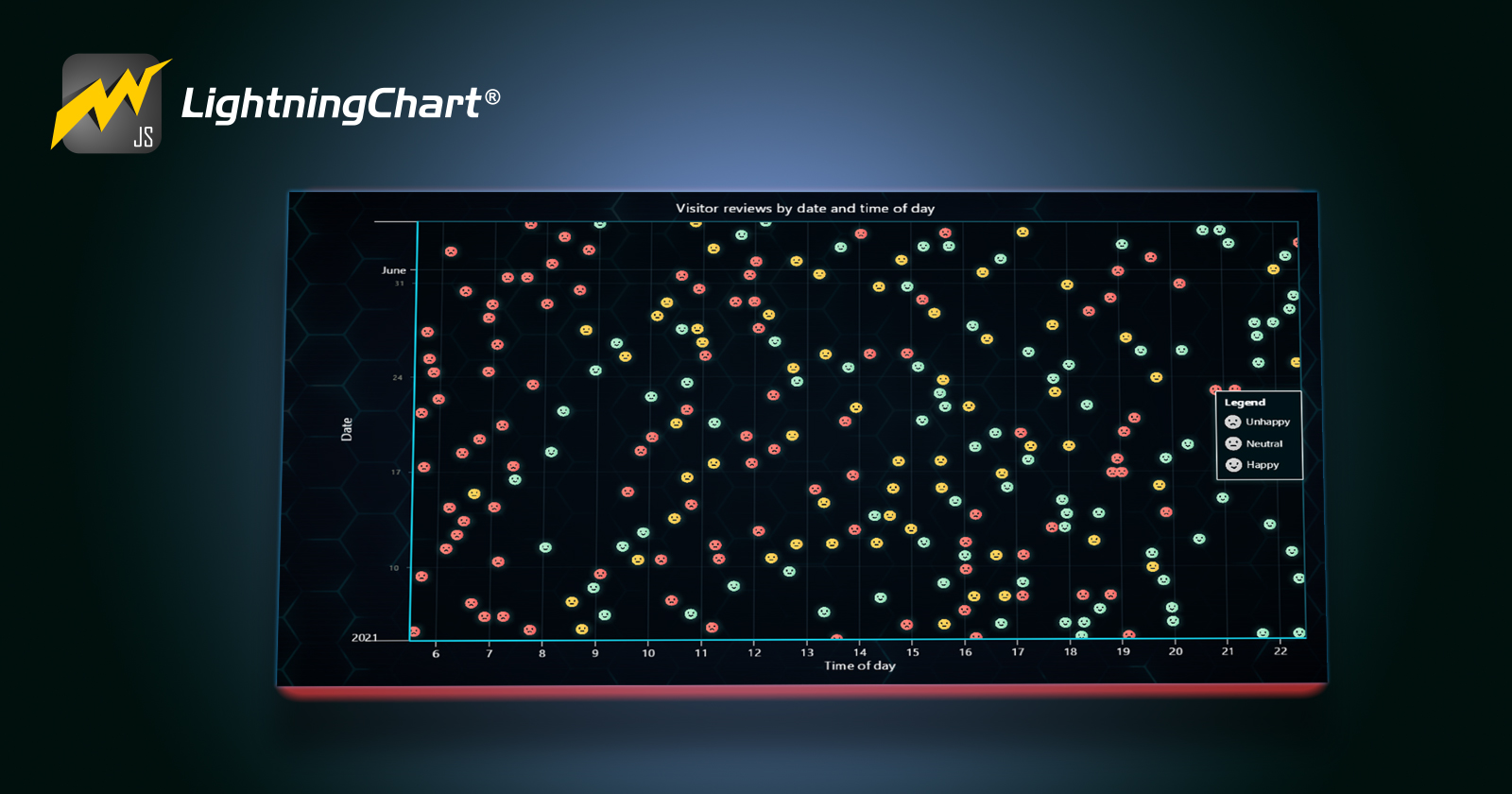
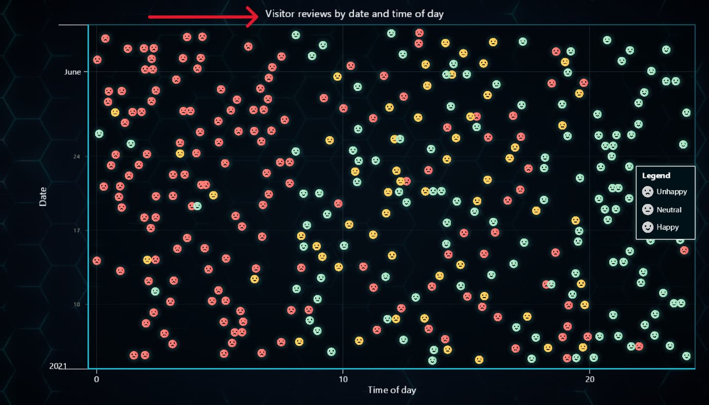
This article will use an XY chart to create a scatter chart with custom images for each data point series for analyzing customer satisfaction using personalized images.
We will assign personalized emojis to help us identify the level of customer satisfaction. This chart will be brief, but I still recommend reviewing the setup part.
LightningChart JS version 5.2.0 has already been released, so you shouldn't overlook getting this version as all the examples and code will use this version.
Before starting with the code, I think it is worth a brief explanation of what scatter charts are.
LightningChart JS Scatter Charts
Scatter charts are based on the XY series type, which indicates that we will work with two axes (X,Y). The strategy used for the axes will be a date-time that will allow us to know the number of happy or angry customers in a specific period.
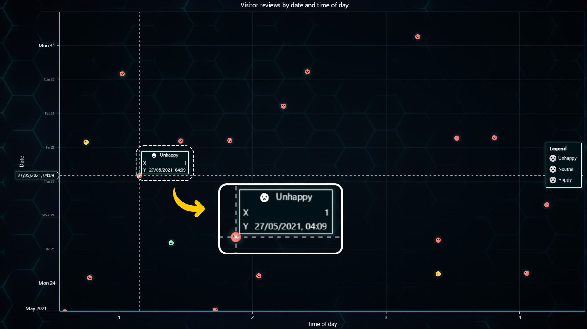
We will use the icon and "Image Formatter" tool to visualize objects for each data point and add a legend box to hide or show the series as needed.
Scatter Chart
A scatter chart allows us to see the relationship between two variables. The values of each variable are shown as points, circles, or bubbles (but in our case, custom images) whose positions are assigned by Cartesian coordinates.
One of the advantages of the scatter chart is that statistical behaviors can be interpreted based on patterns generated by the points.
- Positive: The points seem to have an upward behavior and show an increase in their position in a left-right direction.
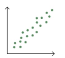
- Negative: The points seem to have a downward behavior and show a decrement position from left to right.
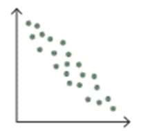
- Null: There is no correlation between the points.
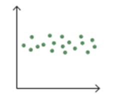
The correlation of the points can be determined by the proximity between each of them. Some points can be shown very far from the main set, and these are called outliers. When there are many outliers, or the correlation is very variable, linear, exponential, or “U”-shaped patterns can be obtained.

Template Setup
To initialize the project, let's set up a working template or you can also download the project template (.ZIP) and follow along the tutorial.
- After downloading the project template, you'll see a file tree like this one:
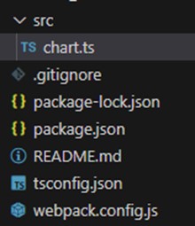
- Then open a new terminal and as usual in a Node JS project, run the
NPM Installcommand. That'd be it, let's code.
Starting with the chart
Today the most recent versions are LightningChart JS 5.2.0 and XYData 1.4.0. I recommend that you review the most recent versions and update them. This is because some LightningChart JS tools do not exist in previous versions.
In the project’s package.json file you can find the LightningChart JS dependencies:
"dependencies": {
"@arction/lcjs": "^5.2.0",
"@arction/xydata": "^1.4.0"
}
Importing libraries
We will start by importing the necessary libraries to create our chart.
const lcjs = require('@arction/lcjs')

// Extract required parts from LightningChartJS.
const { lightningChart, Themes, ImageFill, AxisTickStrategies, emptyLine, emptyTick, emptyFill }
Add license key (free)
Once the LightningChart JS libraries are installed, we will import them into our chart.ts file. Note you will need atrial license which is FREE (for personal non-commercial projects). We would then add it to a variable that will be used for creating the chart object.
let license = undefined
try {
    license = 'xxxxxxxx'
} catch (e) {}

const lc = lightningChart ({
    license: license,
})
Properties
const chart = lc
 .ChartXY({
     theme: Themes.cyberSpace,
 })
 .setTitle('Visitor reviews by date and time of day')
Theme: defines the look and feel of your JavaScript stacked bar chart. Note that you must specify the color theme of the chart components beforehand.
setTitle: Sets the name at the top of the chart.
Setup Series
const reviewTypes = [
    {
        name: 'Unhappy',
        src: 'https://lightningchart.com/js-charts/interactive-examples/examples/assets/0056/review-bad.png',
    },
    {
        name: 'Neutral',
        src: 'https://lightningchart.com/js-charts/interactive-examples/examples/assets/0056/review-neutral.png',
    },
    {
        name: 'Happy',
        src: 'https://lightningchart.com/js-charts/interactive-examples/examples/assets/0056/review-happy.png',
    },
We will create 3 data series, configure their visual properties, and assign an image. In the code, you will find an array called reviewTypes, this array contains 3 images obtained from the LightningChart site (you can change them for your own images), and the name of each series.
].map((item) => {
    const image = new Image()
    image.crossOrigin = ''
    image.src = item.src
    const imageFill = new ImageFill({ source: image })
    const icon = chart.engine.addCustomIcon(image, { height: 32 })
Next, we will use the “map” method to execute code for each object in our array. We will create an image-type object and assign it the path of our object in the process.
addCustomIcon: Register a custom Icon that can be used within the engine (all charts, panels, series, etc. using the same engine).
ImageFill: It allows us to create a fill style for the image, for example, a color or pattern that we want.
Creating new data series
Now we will create a new series, in which we will assign the image fill and the icon obtained.
const series = chart
        .addPointLineAreaSeries({ dataPattern: null })
        .setAreaFillStyle(emptyFill)
        .setStrokeStyle(emptyLine)
        .setPointFillStyle(imageFill)
        .setPointSize(0.1)
        .setName(item.name)
        .setIcon(icon)
    series.onHighlight((_, highlight) => {
        series.setPointSize(Number(highlight) > 0 ? 0.15 : 0.1)
    })
    return { ...item, series }
addPointLineAreaSeries: Add a series that can visualize any combination of Lines, Points, and Area filling. Also supports different preprocessing options (step/spline/disabled). This series is a beta version with severe performance optimizations compared to the old XY series. It is significantly more memory efficient and can handle much more data more efficiently than the older series versions.
setAreaFillStyle: Sets a fill style of the area under the series trend.
setStrokeStyle: Set stroke style of Background.
setPointFillStyle: Set point fill style of Series. Use the
IndividualPointFillobject to enable individual coloring of points.OnHighlight: Highlights an object event. This is called whenever an object is highlighted. The series will update the point size when you have the cursor over it.
Setting up axes
chart
    .getDefaultAxisX()
    .setTitle('Time of day')
    .setInterval({ start: 5.5, end: 22.5 })
    .setTickStrategy(AxisTickStrategies.Numeric, (ticks) =>
        ticks.setMinorTickStyle(emptyTick).setFormattingFunction((hour) => hour.toFixed(0)),
    )
chart.getDefaultAxisY().setTitle('Date').setTickStrategy(AxisTickStrategies.DateTime)
The setTickStrategy function defines the positioning and formatting logic of Axis ticks as well as the style of created ticks.
Since our chart will be based on periods, we will assign the time and date strategy for the Y axis and the numeric for the X axis (since we want to show hours).
The setInterval property requires numerical values, so we will convert the start date and end date to milliseconds, using the getTime() function. There are several strategies that you can use:
| tickStrategy | styler |
| 'Numeric' | ( tickStrategy: NumericTickStrategy ) => tickStrategy |
| 'Time' | ( tickStrategy: TimeTickStrategy ) => tickStrategy |
| 'DateTime' | ( tickStrategy: DateTimeTickStrategy ) => tickStrategy |
| 'Empty' | undefined |
To read more about the strategies, refer to the documentation.
Generating Data
We will generate data points with random values, through a loop, which will be executed while the start date is less than the end date specified in the condition within a while.
// Generate random data set for example purposes
let time = Date.UTC(2021, 4, 4, 12)
let count = 0
do {
    time += 10 * 60 * 1000 + Math.random() * 240 * 60 * 1000
    const date = new Date(time)
    const hour = date.getUTCHours() + date.getUTCMinutes() / 60 + date.getUTCSeconds() / 3600
    const chanceNeutral = 0.05
    const chanceHappy = hour > 20 ? 1.0 : 0.05
    const chanceUnhappy = hour < 8 ? 1.0 : 0.05
    const chanceTotal = chanceNeutral + chanceHappy + chanceUnhappy
    const rand = Math.random() * chanceTotal
    const reviewType = rand <= chanceNeutral ? reviewTypes[1] : rand <= chanceNeutral + chanceHappy ? reviewTypes[2] : reviewTypes[0]
    reviewType.series.appendSample({ y: time, x: hour })
    count += 1
} while (time < Date.UTC(2021, 5, 4, 12))
This method is for demonstration purposes, so you don't need to spend much time on it. If your data already comes from a processed source, you will only need to use the appendSample function with an object with the X-Y values. That function will have to be executed for each data point you have.
Adding LegendBox
const legend = chart
    .addLegendBox()
    .add(chart)
    .setEntries((entry, component) => {
        entry.setButtonSize(20).setPadding(5)
    })
Now, we will add the legend box. This box will have the function of indicating the categories by color and hiding the one we want when we click on it.
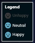
The legend box can be added horizontally and vertically. This legend box can be automatically removed when a condition is met, such as exceeding the maximum width relative to the chart size. This is useful when the chart resolution is too small or to free up memory when the chart is too large.
Conclusion
Finally, to run the chart, you’ll just need to open up a new terminal and run the NPM START command and you’ll be able to visualize the JS treemap chart application on your local server, usually HTTP://localhost:8080/
This scatter chart provides an excellent opportunity to explore the customization options offered by LightningChart JS.
LC JS allows us to customize both series and data points on our chart. We can modify behavior during user interactions, adjust colors, and choose line types for our series.
We’ve also seen a brief example of how to assign images to individual data points, a simple yet valuable feature for interpreting statistical values.
The theme catalog lets us focus on aesthetics, creating visually appealing charts for our applications or clients.
Generating data points may involve complex code, but don’t worry! Our series only requires an object with X-Y values, so you can choose the method or source that suits you best.
Adding a Legend Box to the chart remains straightforward. Recently, we explored independent legend boxes that can be placed within a dashboard and manage multiple charts. I recommend checking out related articles, tutorials, and videos on our website or YouTube channel.
Thank you once again!
Written by Omar Urbano
Got stuck and need help? Reach out to me on LinkedIn
Subscribe to my newsletter
Read articles from Omar Urbano | LightningChart directly inside your inbox. Subscribe to the newsletter, and don't miss out.
Written by

Omar Urbano | LightningChart
Omar Urbano | LightningChart
Hi! I'm a Software Engineer from Mexico and a data visualization enthusiast. I'm currently writing technical articles about data visualization and high-performance charts.
