Optimizing User Experience in Salesforce: Leveraging with Highly Configurable Components
 noKodr
Introduction
As discussed in earlier blog, salesforce is renowned for its robust and customizable platform, allowing businesses to tailor their CRM to fit specific needs. One powerful way to enhance the user experience in Salesforce is through PWR Components’ lightning drag and drop components.
In this blog, we’ll delve into further three specific components namely Net Promoter Score (NPS), Icon Group, and Visual Picker - exploring their functionalities and presenting detailed use cases to illustrate their application in Salesforce standard objects.
Let's unravel these components, one by one.
Net Promoter Score (NPS)
The NPS component is used to ask to add In-App Feedback Question elements. Think of them as mechanisms that you can adapt to meet your own needs.
It measures and visually represents customer satisfaction. It provides a quick and clear way to display Net Promoter Scores on records.
Basically, it presents customers with a simple survey, then feeds their answers into a formula to produce a single figure for benchmarking.
For this we have one question and for response collection we have 3 options namely Detractors which we can say are negative reviews, Passives are neutral reviews while Promoters are Positive reviews.
If a customer chooses Detractor option, we must collect their feedback such that we can analyze and improve ourselves, for that feedback we have added response reason field which question can be set through config.
Its key features are as follows:
- Select Config Variant – Non-record or Record Based:
Choose between non-record or record-based variants to suit your specific use case, ensuring flexibility and compatibility.
- Specific Data Type:
As for now, you can only select fields which have picklist as their data type for record binding or else you can manually input text values for fields.
- Customize UI of component (like Size, Variant, Radius, Padding, etc.):
Fine-tune the appearance of NPS component to match your application's aesthetics and user interface requirements, ensuring a polished and cohesive user experience.
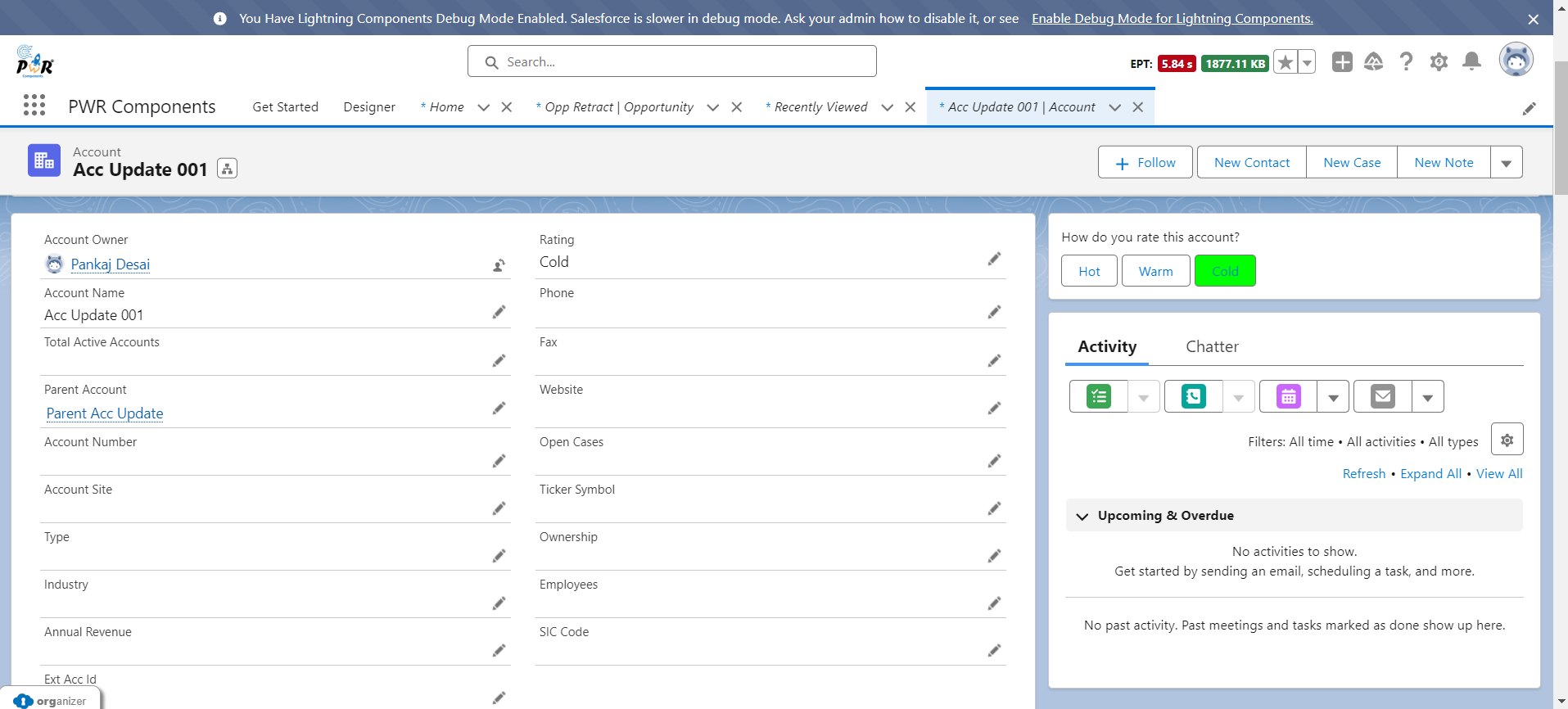
Image: Account Rating field is synced with NPS component.
Icon Group
The Icon Group component allows for the visual representation of various statuses or categories through icons.
This component is particularly useful for quickly conveying information without requiring users to read through text fields.
Its key features are as follows:
- Select Config Variant – Non-record or Record Based:
Choose between non-record or record-based variants to suit your specific use case, ensuring flexibility and compatibility.
- Supports All SLDS Categories & Sizes:
Choose from a vast library of SLDS categories and sizes to find the perfect icon for your needs.
- Customize UI of component (like Alignment, Margin, Padding, etc.):
Fine-tune the appearance of Icon Group component to match your application's aesthetics and user interface requirements, ensuring a polished and cohesive user experience.
- Conditional Visibility:
Provide conditional visibility of component according to filter criteria.
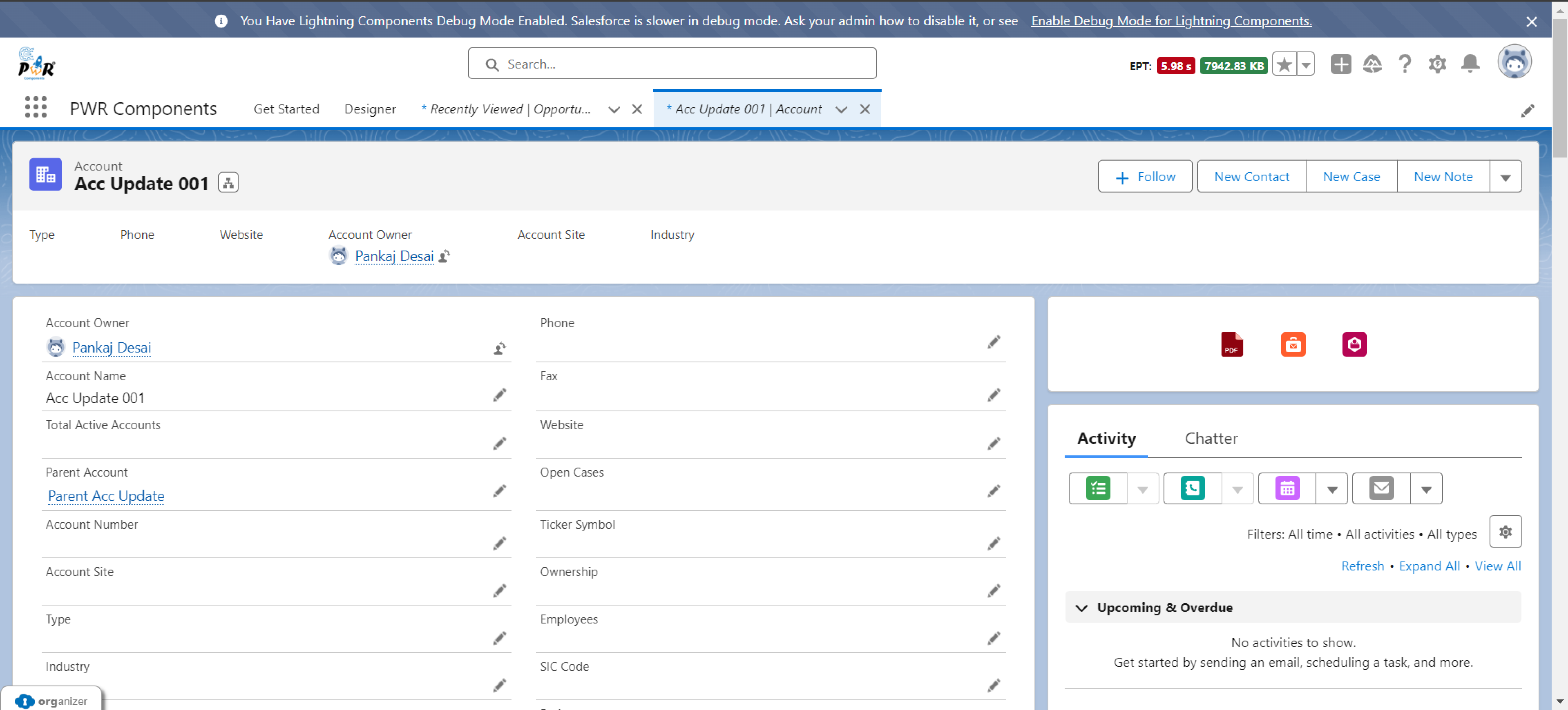
Image: Icon Group Component synced with Account object.
Visual Picker
The Visual Picker component provides an intuitive, visually appealing interface for selecting options.
It enhances user interaction by letting users choose from a range of options presented as images, icons or text.
You can also set visibility criteria for viewing of these visual pickers.
Its key features are as follows:
- Select Config Variant – Record Based:
As visual picker is restricted to taking feedback options, it is related to record, we just can create record page config.
- Specific Data Type:
As for now, you can only select fields which have picklist as their data type for record binding.
- Customize UI of component (like Margin, Padding, etc.):
Fine-tune the appearance of Visual Picker component to match your application's aesthetics and user interface requirements, ensuring a polished and cohesive user experience.
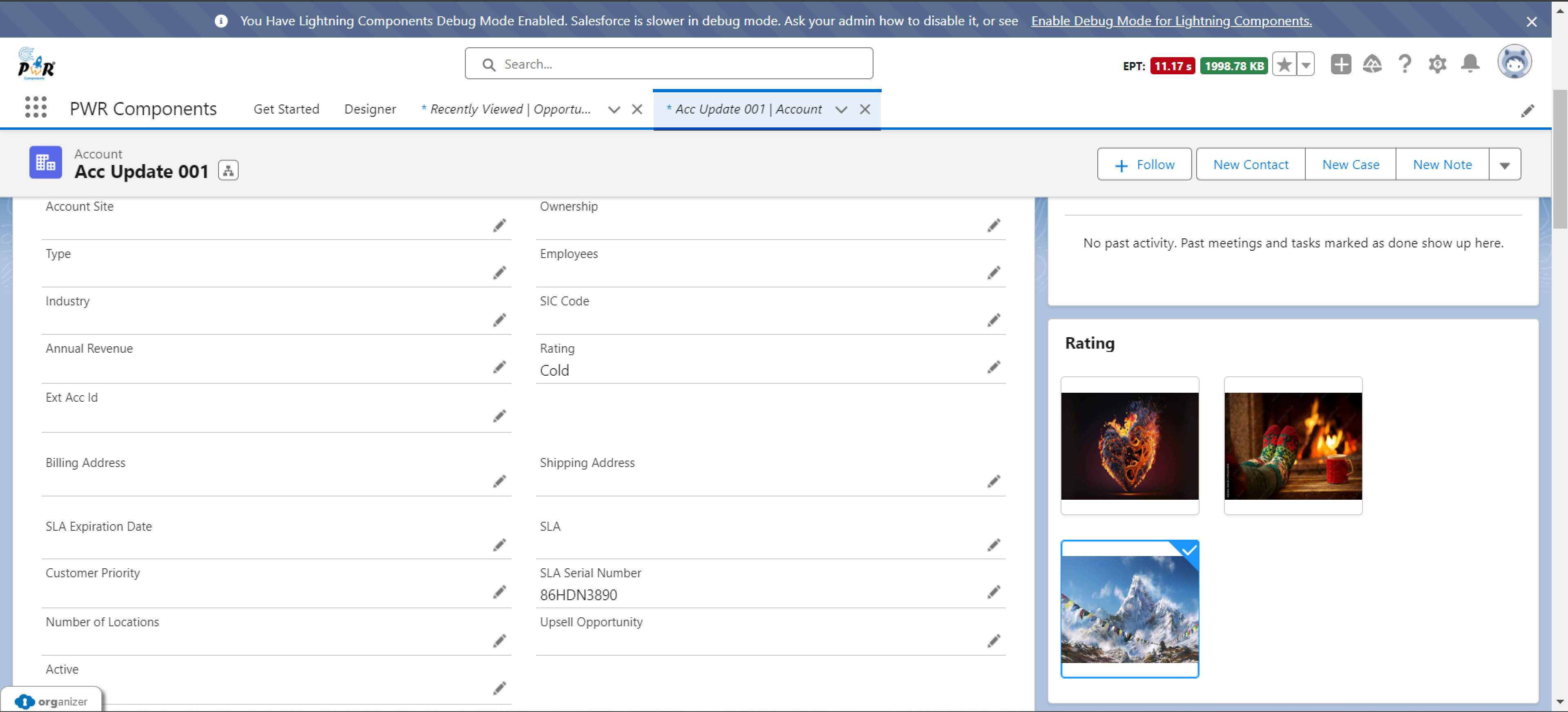
Image: Account Rating is synced with Visual Picker Component.
Conclusion
Leveraging PWR Components’ drag-and-drop functionality in Salesforce not only enhances functionality but also significantly elevates the visual appeal of the platform.
Integrating visually engaging components like NPS, Icon Group, and Visual Picker transforms the user experience into a more intuitive and aesthetically pleasing journey.
The Icon Group component allows for the quick and clear recognition of opportunity statuses with visually distinct icons, making data interpretation effortless. Meanwhile, the Visual Picker enhances product selection with rich, interactive visuals, turning a mundane task into an engaging experience.
By thoughtfully implementing these visually sophisticated components, Salesforce users can create a more dynamic and visually appealing CRM environment. This not only improves data visualization but also makes everyday tasks more enjoyable and efficient. Start exploring the visually stunning possibilities with PWR drag-and-drop components to elevate your Salesforce experience to new heights.
Ready to harness the power of this incredible app? Find it on the AppExchange and unlock its full potential! For additional details, simply click through to ours product website.
Subscribe to my newsletter
Read articles from noKodr directly inside your inbox. Subscribe to the newsletter, and don't miss out.
Written by
