Importance of Visual Aspects in Salesforce: Enhancing with Highly Configurable Components
 noKodr
Table of contents
Introduction
Salesforce is renowned for its prowess in managing customer relationships, and its core lies in lightning web components, the magic behind creating seamless and intuitive interfaces. These components act as building blocks, empowering admins to customize their user experience effortlessly. However, suppose if you created a custom LWC component and you need that particular custom component repeatedly, but each time with little change in its configuration? This is where the salesforce may fall short.
PWR Components, an app listed at AppExchange emerges as a game-changing solution to this very problem. It introduces innovative components like Rating, Slider and Progress Bar, designed to seamlessly integrate into your Salesforce environment and provide an enhanced user experience. But what truly sets PWR Components apart is its emphasis on visual excellence.
With sleek designs and customizable options, PWR Components elevate the aesthetic appeal of your salesforce lightning pages, making them not only intuitive but visually stunning as well. Whether you're designing a sales dashboard or a customer feedback form, PWR Components ensure that your Salesforce experience is as visually engaging as it is intuitive.
Let's unravel these components, one by one.
Progress Bar
A progress bar component communicates to the user the progress of a particular process.
The Progress Bar component is perfect for visualizing completion percentages and progress tracking.
Its key features are as follows:
- Select Config Variant – Non-record or Record Based:
Choose between non-record or record-based variants to suit your specific use case, ensuring flexibility and compatibility.
- Horizontal & Vertical View Options:
Customize the orientation of progress bars to align with your application's layout and design, optimizing space utilization and visual clarity.
- Display Completion Percentage/ Value:
Provide users with a clear understanding of progress and completion status by displaying percentage-based or value-based completion indicators.
- Customize UI of component (like Size, Variant, Radius, Padding, etc.):
Fine-tune the appearance of progress bars to match your application's aesthetics and user interface requirements, ensuring a polished and cohesive user experience.
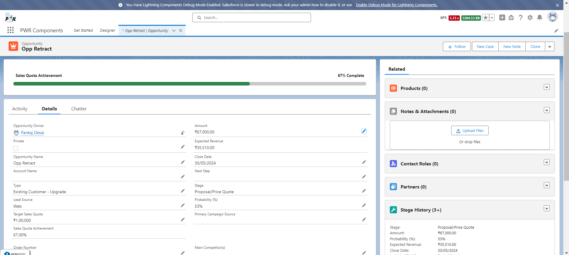
Image: Progress of Sales Quota achievement is synced with Progress Bar.
Slider
The Slider component allows for intuitive adjustments of numerical values.
The slider component is built using input element with the attribute type of "range".
Its key features are as follows:
- Select Config Variant – Non-record or Record Based:
Choose between non-record or record-based variants to suit your specific use case, ensuring flexibility and compatibility.
- Horizontal & Vertical View Options:
Customize the orientation of sliders to align with your application's layout and design, optimizing space utilization and visual clarity.
- Set Range & Step Size:
Provide users a facility to set a range for slider also set step size by which slider value can be shifted.
- Conditional Visibility:
Provide conditional visibility of component according to filter criteria.
- Customize UI of component (like Size, Padding, Margin, etc.):
Fine-tune the appearance of sliders to match your application's aesthetics and user interface requirements, ensuring a polished and cohesive user experience.
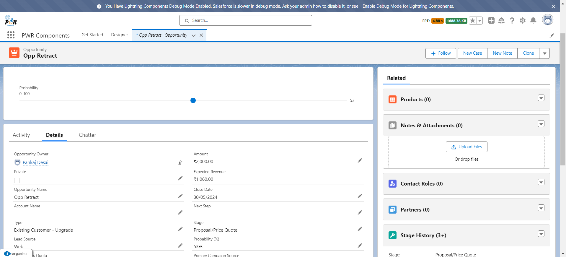
Image: Probability percentage of opportunity record is synced with Slider component.
- You can choose progress bar and slider interchangeably based on visual preference, but slider is mainly for taking end user input while progress bar auto calculated.
Rating
The Rating component is ideal for collecting feedback and ratings.
In PWR Components, you can visualize rating in 3 formats namely, Star, Circle and Smiley.
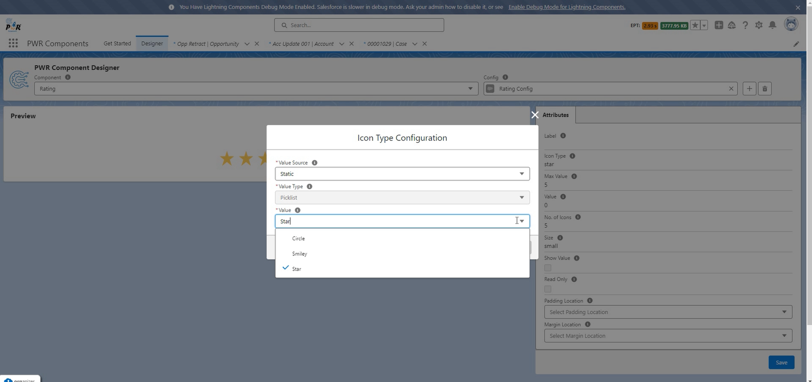
Image: Visualize rating in 3 formats
Its key features are as follows:
- Select Config Variant – Non-record or Record Based:
Choose between non-record or record-based variants to suit your specific use case, ensuring flexibility and compatibility.
- Specific Data Type:
As for now, you can only select fields which have picklist as their data type for record binding.
- Customize UI of component (like Margin, Padding, etc.):
Fine-tune the appearance of ratings component to match your application's aesthetics and user interface requirements, ensuring a polished and cohesive user experience.
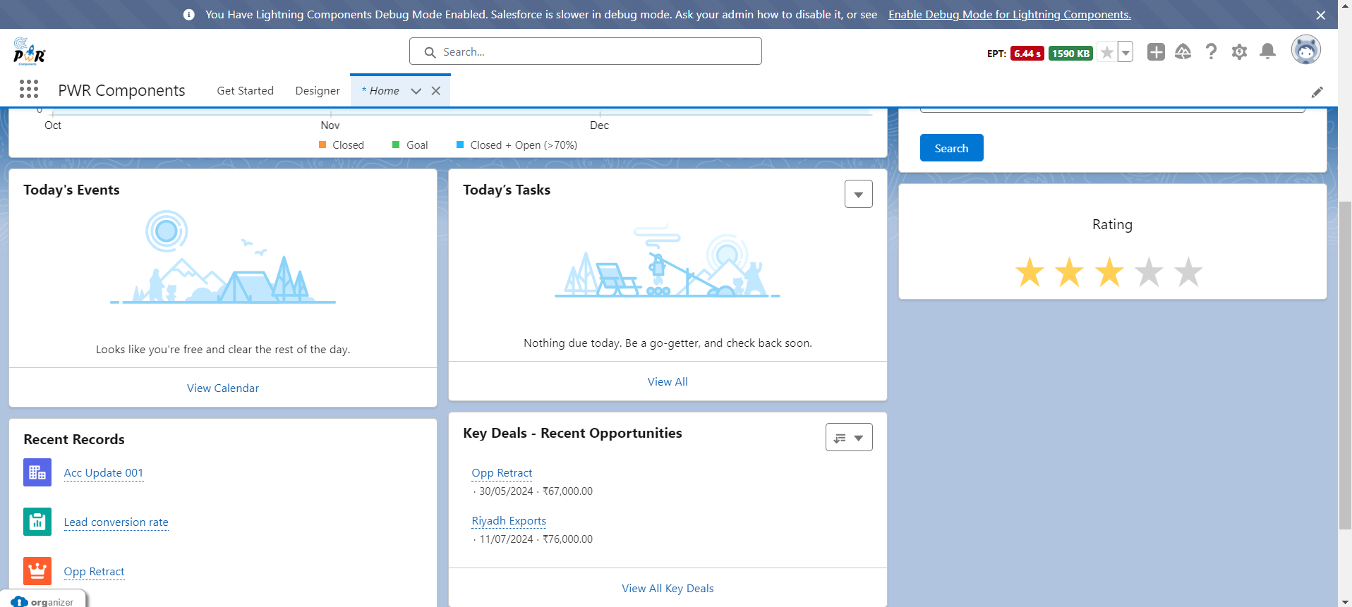
Image: Customer given feedback to service using star styled rating component on Home Page.
Conclusion
Visual aspects play a crucial role in enhancing user experience in Salesforce. By leveraging the capabilities of the Progress Bar, Slider, and Rating components, and incorporating standard fields, you can create more interactive, intuitive, and efficient user interfaces.
Whether tracking sales quotas, managing SLA compliance, or collecting customer feedback and many more, where all these components can be significantly used to improve the user experience in Salesforce.
Additionally, these components can be seamlessly utilized on Experience Cloud, extending their benefits to external users and enhancing the overall engagement and satisfaction across various touchpoints.
Ready to harness the power of this incredible app? Find it on the AppExchange and unlock its full potential! For additional details, simply click through to ours product website.
Subscribe to my newsletter
Read articles from noKodr directly inside your inbox. Subscribe to the newsletter, and don't miss out.
Written by
