A Comprehensive Guide to Machine Learning Algorithms:
 Siddhant Bhattarai
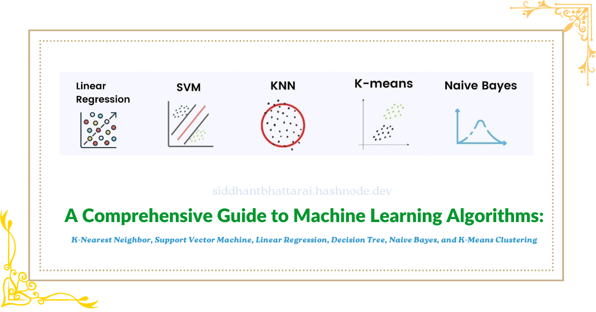
Machine learning algorithms are the backbone of data science and artificial intelligence. Each algorithm has its unique strengths and applications, making it essential to understand how they work and how to implement them. This blog post covers six fundamental machine learning algorithms: K-Nearest Neighbor (KNN), Support Vector Machine (SVM), Linear Regression, Decision Tree, Naive Bayes, and K-Means Clustering. We will explore the theory behind each algorithm and provide hands-on implementation examples using Python's Scikit-Learn library.
Table of Contents
K-Nearest Neighbor (KNN)
Support Vector Machine (SVM)
Linear Regression
Decision Tree
Naive Bayes
K-Means Clustering
1. K-Nearest Neighbor (KNN)
Theory: K-Nearest Neighbor (KNN) is a simple, non-parametric, and lazy learning algorithm used for classification and regression. The algorithm classifies a data point based on how its neighbors are classified. KNN stores all available cases and classifies new cases based on a similarity measure (e.g., distance functions).

The image illustrates the concept of a classification problem using a K-Nearest Neighbors (KNN) algorithm, shown in a two-dimensional feature space with x_1 and x_2 as axes. The classification task is to determine whether a query data point belongs to the class of "positive reviews" or "negative reviews" based on its position relative to labeled data points.
Before Training (Left Side):
Positive Reviews (Blue Squares): These are represented by blue squares clustered together.
Negative Reviews (Pink Squares): These are represented by pink squares clustered together but separated from the blue squares.
Query Datapoint (Yellow Square): This is the point to be classified. Its position indicates it is slightly closer to the cluster of positive reviews but has not yet been assigned a class.
After Training (Right Side):
Positive Reviews (Blue Squares): The blue squares remain in the same position.
Negative Reviews (Pink Squares): The pink squares remain in the same position.
Query Datapoint (Yellow Square with Black Border): After applying the KNN algorithm, this query point is now classified as belonging to the "positive reviews" class. This is indicated by the black border around the yellow square and the note "query datapoint assigned to positive review class."
Explanation:
Initial Position: Initially, the query point is unclassified. We see that it's visually closer to the positive review cluster.
KNN Classification: The KNN algorithm analyzes the nearest neighbors of the query point. If the majority of the nearest neighbors are positive reviews, it assigns the query point to the positive review class.
Result: In this example, after the KNN algorithm is applied, the query point is classified as a positive review.
The key takeaway is that KNN classifies data points based on the majority class of their nearest neighbors in the feature space.
Key Concepts:
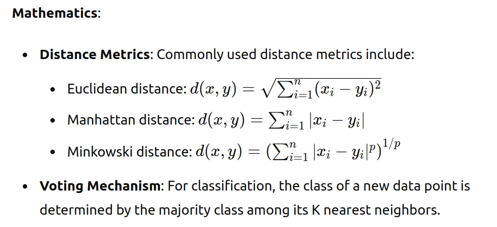
Distance metrics: Euclidean, Manhattan, Minkowski
Number of neighbors (k)
Voting mechanism in classification
Implementation:
from sklearn.datasets import load_iris
from sklearn.model_selection import train_test_split
from sklearn.neighbors import KNeighborsClassifier
from sklearn.metrics import accuracy_score

# Load dataset
iris = load_iris()
X = iris.data
y = iris.target

# Split data into training and testing sets
X_train, X_test, y_train, y_test = train_test_split(X, y, test_size=0.3, random_state=42)

# Initialize and train the KNN classifier
knn = KNeighborsClassifier(n_neighbors=3)
knn.fit(X_train, y_train)

# Make predictions
y_pred = knn.predict(X_test)

# Evaluate the model
accuracy = accuracy_score(y_test, y_pred)
print(f'KNN Accuracy: {accuracy}')
2. Support Vector Machine (SVM)
Theory: Support Vector Machine (SVM) is a powerful and versatile supervised learning algorithm used for both classification and regression. It works by finding the hyperplane that best separates the data into classes. SVM is effective in high-dimensional spaces and is used for both linear and non-linear data.
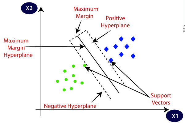
The image illustrates the concept of a Support Vector Machine (SVM) algorithm used for binary classification in a two-dimensional feature space defined by X1 and X2. Here, we have two classes of data points, represented by blue squares and green circles, and the SVM is used to find the optimal hyperplane that separates these two classes with the maximum margin.
Key Components:
Positive Class (Blue Squares): These are the data points belonging to one class, located on the right side of the feature space.
Negative Class (Green Circles): These are the data points belonging to the other class, located on the left side of the feature space.
Hyperplanes:
Positive Hyperplane: A boundary that is parallel to the maximum margin hyperplane but lies on the side of the positive class.
Negative Hyperplane: A boundary that is parallel to the maximum margin hyperplane but lies on the side of the negative class.
Maximum Margin Hyperplane: The central hyperplane that equally separates the positive and negative hyperplanes. This is the optimal separating hyperplane found by the SVM.
Maximum Margin: The distance between the positive and negative hyperplanes. SVM aims to maximize this margin to improve the model's generalization capability.
Support Vectors: These are the data points that lie closest to the maximum margin hyperplane. They are critical in defining the position of the maximum margin hyperplane. The SVM algorithm uses these support vectors to determine the optimal hyperplane.
Explanation:
The goal of SVM is to find the hyperplane that best separates the two classes (blue squares and green circles) while maximizing the margin between them.
The maximum margin hyperplane is positioned such that the distance to the nearest data points (support vectors) from both classes is maximized. This ensures the most robust separation between the classes.
The support vectors are the data points that are closest to this maximum margin hyperplane. These points directly influence the position and orientation of the hyperplane.
By maximizing the margin, SVM aims to achieve better generalization on unseen data, reducing the risk of overfitting.
The diagram effectively shows how the SVM algorithm uses support vectors and hyperplanes to achieve an optimal classification boundary that maximizes the margin between two classes of data.
Key Concepts:
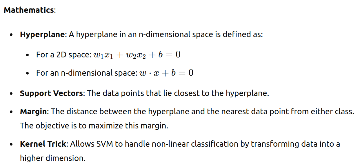
Hyperplane and support vectors
Kernel functions: linear, polynomial, radial basis function (RBF)
Margin maximization
Implementation:
from sklearn.datasets import load_iris
from sklearn.model_selection import train_test_split
from sklearn.svm import SVC
from sklearn.metrics import accuracy_score

# Load dataset
iris = load_iris()
X = iris.data
y = iris.target

# Split data into training and testing sets
X_train, X_test, y_train, y_test = train_test_split(X, y, test_size=0.3, random_state=42)

# Initialize and train the SVM classifier
svm = SVC(kernel='linear')
svm.fit(X_train, y_train)

# Make predictions
y_pred = svm.predict(X_test)

# Evaluate the model
accuracy = accuracy_score(y_test, y_pred)
print(f'SVM Accuracy: {accuracy}')
3. Linear Regression
Theory: Linear Regression is a simple algorithm used for predicting a continuous target variable based on one or more input features. It assumes a linear relationship between the input variables and the target variable.

The image consists of three scatter plots illustrating different types of relationships between two variables, x and y. Each plot shows data points (blue dots) and a line (red) representing the best fit for the relationship between x and y.
Left Plot: Linear Relationship (Positive Slope)
Description: The data points form a pattern where
yincreases asxincreases.Line of Best Fit: The red line has a positive slope, indicating a positive linear relationship.
Interpretation: This suggests that there is a direct and proportional relationship between
xandy. As one variable increases, the other also increases in a linear manner.
Middle Plot: Linear Relationship (Negative Slope)
Description: The data points form a pattern where
ydecreases asxincreases.Line of Best Fit: The red line has a negative slope, indicating a negative linear relationship.
Interpretation: This suggests that there is an inverse and proportional relationship between
xandy. As one variable increases, the other decreases in a linear manner.
Right Plot: Non-Linear Relationship
Description: The data points form a pattern where the relationship between
xandyis not linear.Line of Best Fit: The red curve represents the best fit for a non-linear relationship, showing that
yincreases at an increasing rate asxincreases.Interpretation: This suggests that the relationship between
xandyis more complex and cannot be adequately described by a straight line. Instead, it follows a curved pattern, indicating that changes inxhave a non-constant effect ony.
Summary:
The left and middle plots demonstrate linear relationships, where a straight line is a good fit for the data.
The right plot demonstrates a non-linear relationship, where a curved line better captures the relationship between the variables.
Understanding the type of relationship between variables is crucial for selecting the appropriate model and making accurate predictions in data analysis and machine learning tasks.
Key Concepts:
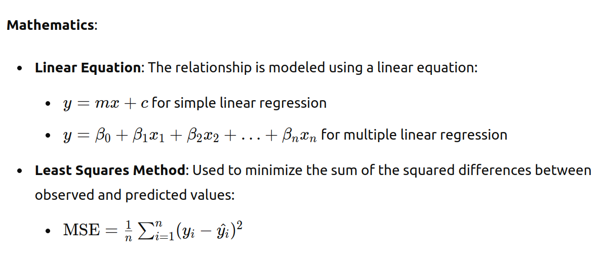
Linear equation: y = mx + c
Coefficients (slope and intercept)
Mean Squared Error (MSE) for evaluation
Implementation:
import numpy as np
import matplotlib.pyplot as plt
from sklearn.datasets import make_regression
from sklearn.model_selection import train_test_split
from sklearn.linear_model import LinearRegression
from sklearn.metrics import mean_squared_error

# Generate synthetic data
X, y = make_regression(n_samples=100, n_features=1, noise=10)
X_train, X_test, y_train, y_test = train_test_split(X, y, test_size=0.3, random_state=42)

# Initialize and train the Linear Regression model
lr = LinearRegression()
lr.fit(X_train, y_train)

# Make predictions
y_pred = lr.predict(X_test)

# Evaluate the model
mse = mean_squared_error(y_test, y_pred)
print(f'Linear Regression MSE: {mse}')

# Plot the results
plt.scatter(X_test, y_test, color='blue')
plt.plot(X_test, y_pred, color='red')
plt.title('Linear Regression')
plt.xlabel('Feature')
plt.ylabel('Target')
plt.show()
4. Decision Tree
Theory: Decision Tree is a supervised learning algorithm used for both classification and regression tasks. It works by splitting the data into subsets based on the value of input features, creating a tree-like model of decisions.
Key Concepts:
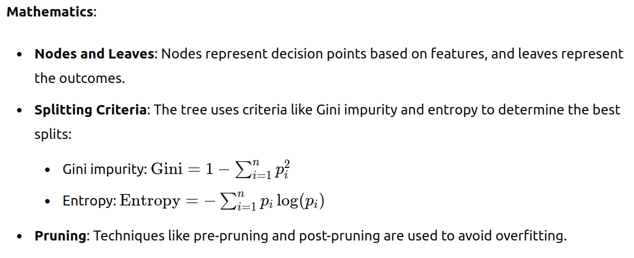
Nodes (decision points) and leaves (outcomes)
Splitting criteria: Gini impurity, entropy
Pruning to prevent overfitting
Implementation:
from sklearn.datasets import load_iris
from sklearn.model_selection import train_test_split
from sklearn.tree import DecisionTreeClassifier
from sklearn.metrics import accuracy_score

# Load dataset
iris = load_iris()
X = iris.data
y = iris.target

# Split data into training and testing sets
X_train, X_test, y_train, y_test = train_test_split(X, y, test_size=0.3, random_state=42)

# Initialize and train the Decision Tree classifier
dt = DecisionTreeClassifier()
dt.fit(X_train, y_train)

# Make predictions
y_pred = dt.predict(X_test)

# Evaluate the model
accuracy = accuracy_score(y_test, y_pred)
print(f'Decision Tree Accuracy: {accuracy}')
5. Naive Bayes
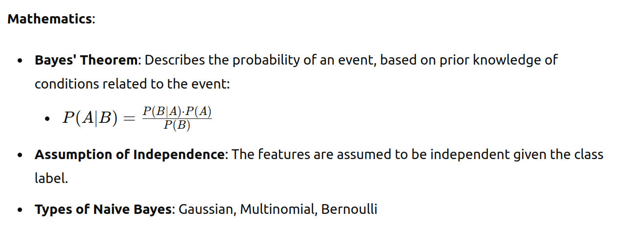
Theory: Naive Bayes is a probabilistic classifier based on Bayes' theorem, assuming independence between features. It is especially useful for text classification problems.
Key Concepts:
Bayes' theorem
Assumption of feature independence
Types: Gaussian, Multinomial, Bernoulli
Implementation:
from sklearn.datasets import load_iris
from sklearn.model_selection import train_test_split
from sklearn.naive_bayes import GaussianNB
from sklearn.metrics import accuracy_score

# Load dataset
iris = load_iris()
X = iris.data
y = iris.target

# Split data into training and testing sets
X_train, X_test, y_train, y_test = train_test_split(X, y, test_size=0.3, random_state=42)

# Initialize and train the Naive Bayes classifier
nb = GaussianNB()
nb.fit(X_train, y_train)

# Make predictions
y_pred = nb.predict(X_test)

# Evaluate the model
accuracy = accuracy_score(y_test, y_pred)
print(f'Naive Bayes Accuracy: {accuracy}')
6. K-Means Clustering
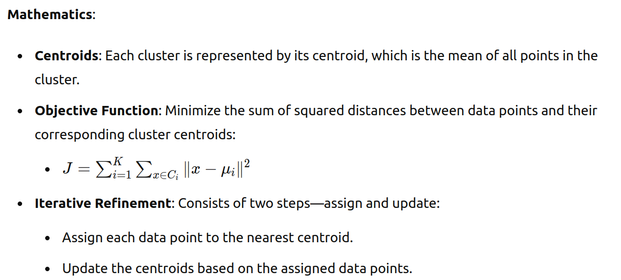
Theory: K-Means is an unsupervised learning algorithm used for clustering data into K groups based on their similarities. It works by minimizing the variance within each cluster.
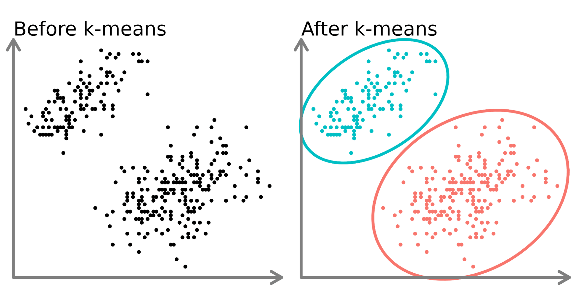
The image illustrates the k-means clustering algorithm, a popular unsupervised machine learning technique used for partitioning data into groups or clusters.
On the left side ("Before k-means"), we see a scatter plot of data points that appear to form two distinct groups. These points are unlabeled and not yet categorized.
On the right side ("After k-means"), we see the same data points after applying the k-means algorithm. The algorithm has:
Identified two clusters in the data (k=2 in this case).
Assigned each data point to one of the two clusters.
Colored the points according to their cluster assignment (cyan and pink).
Drawn ellipses around each cluster to visually separate them.
The k-means algorithm works by:
Initializing k cluster centers (in this case, 2).
Assigning each data point to the nearest cluster center.
Recalculating the cluster centers based on the mean of all points in each cluster.
Repeating steps 2 and 3 until convergence (when assignments no longer change significantly).
This process effectively groups similar data points together, revealing underlying patterns or structures in the data. K-means is commonly used for customer segmentation, image compression, anomaly detection, and other applications where grouping similar items is beneficial.
Key Concepts:
Number of clusters (K)
Centroids
Iterative refinement (assign and update steps)
Implementation:
import numpy as np
import matplotlib.pyplot as plt
from sklearn.datasets import make_blobs
from sklearn.cluster import KMeans

# Generate synthetic data
X, _ = make_blobs(n_samples=300, centers=4, cluster_std=0.60, random_state=42)

# Initialize and train the K-Means model
kmeans = KMeans(n_clusters=4)
kmeans.fit(X)

# Predict the cluster for each data point
labels = kmeans.predict(X)

# Plot the results
plt.scatter(X[:, 0], X[:, 1], c=labels, s=50, cmap='viridis')
centers = kmeans.cluster_centers_
plt.scatter(centers[:, 0], centers[:, 1], c='red', s=200, alpha=0.75)
plt.title('K-Means Clustering')
plt.xlabel('Feature 1')
plt.ylabel('Feature 2')
plt.show()
Conclusion
Understanding and implementing these fundamental machine learning algorithms—K-Nearest Neighbor, Support Vector Machine, Linear Regression, Decision Tree, Naive Bayes, and K-Means Clustering—provides a solid foundation for any aspiring data scientist or machine learning engineer. Each algorithm has its unique strengths and is suited for different types of problems. Practice these implementations, experiment with different parameters, and explore further to deepen your knowledge in machine learning. Happy learning!
Subscribe to my newsletter
Read articles from Siddhant Bhattarai directly inside your inbox. Subscribe to the newsletter, and don't miss out.
Written by

Siddhant Bhattarai
Siddhant Bhattarai
I am a versatile professional with expertise in multiple domains, including DevSecOps, AWS Cloud Solutions, AI/ML, and Cyber Security. With over 5 years of experience in the field, I have honed my skills and dedicated myself to various roles and responsibilities. If you're looking for opportunities for collaboration, insights, or exciting ventures in these domains, I'm open to connecting. Please don't hesitate to reach out – I'm excited to engage with professionals, learners, and enthusiasts who share my passion for these fields!