How to toggle a mobile menu with Tailwind and AlpineJS
 David Carr
Making a mobile and desktop menu is something that is is super simple to do with Tailwind and AlpineJS.
A typical nav bar will contains a series of links styled with Tailwind, its possible to apply different styles depending on the browser size for mobile and desktop but to me its far simpler to have 2 divs in your HTML. A div for mobile and one for desktop.
Here's an HTML snippet for both the menu's
<nav class="bg-blue-700 dark:bg-gray-900 shadow mb-10">

    <div class="flex py-4 max-w-7xl mx-auto px-2 sm:px-4 lg:px-8">
        <button class="lg:hidden text-gray-100 hover:text-gray-300 rounded-md transition duration-150 ease-in-out mr-1" aria-label="Main menu" aria-expanded="false">

            <svg class="block h-6 w-6" fill="none" viewBox="0 0 24 24" stroke="currentColor">
                <path stroke-linecap="round" stroke-linejoin="round" stroke-width="2" d="M4 6h16M4 12h16M4 18h16"/>
            </svg>

        </button>

        <a href='#' class="text-sm text-white hover:text-gray-300">Logo</a>

        <div class="flex flex-grow justify-between">

                <div class="flex flex-grow justify-between">

                    <div class="hidden lg:ml-6 lg:flex">
                        <a href="#" class="ml-8 px-1 text-sm text-white hover:text-gray-300">Blog</a>
                        <a href="#" class="ml-8 px-1 text-sm text-white hover:text-gray-300">About Me</a>
                        <a href="#" class="ml-8 px-1 text-sm text-white hover:text-gray-300">Packages</a>
                        <a href="#" class="ml-8 px-1 text-sm text-white hover:text-gray-300">Books</a>
                        <a href="#" class="ml-8 px-1 text-sm text-white hover:text-gray-300">Contact</a>
                    </div>

                </div>

            </div>
    </div>

    <div>
        <a href="#" class="block pl-3 py-2 font-medium text-white hover:text-gray-700 hover:bg-white">About Me</a>
        <a href="#" class="block pl-3 py-2 font-medium text-white hover:text-gray-700 hover:bg-white">Packages</a>
        <a href="#" class="block pl-3 py-2 font-medium text-white hover:text-gray-700 hover:bg-white">Books</a>
        <a href="#" class="block pl-3 py-2 font-medium text-white hover:text-gray-700 hover:bg-white">Contact</a>
    </div>

</nav>
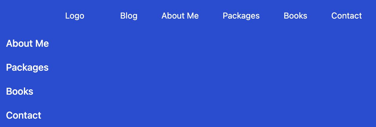
This looks like this:

Both menu's are displayed, as this is is only using HTML with Tailwind styling.
There is a button icon that only shows on screens smaller then Tailwind's LG breakpoint
<button class="lg:hidden text-gray-100 hover:text-gray-300 rounded-md transition duration-150 ease-in-out mr-1" aria-label="Main menu" aria-expanded="false">

    <svg class="block h-6 w-6" fill="none" viewBox="0 0 24 24" stroke="currentColor">
        <path stroke-linecap="round" stroke-linejoin="round" stroke-width="2" d="M4 6h16M4 12h16M4 18h16"/>
    </svg>

</button>
What we want to happen is when on mobile or less then LG breakpoint then show the icon and when clicked show the mobile menu.
Tailwind already takes care of hiding the main menu using hidden lg:flex which tells Tailwind to hide the main nav by default and use flex on LG breakpoints.
Using AlpineJS
To make the menu interactive we can use AlpineJS, first on the root nav element create an aline variable called open with a value of false. By using x-data="{}" alpine can set "state" or "variables"
<nav x-data="{ open: false }"
Now on the icon when it show's thanks to Tailwind we can react to a click event and set open to true.
<svg @click="open = true"
To use a variable defined in Alpine we can use x-show to show only when open is set to true
In addition if a user clicks anywhere else outside of the menu then close the menu
@click.away="open = false"
Apply this to a div.
<div x-cloak x-show="open" @click.away="open = false">
That's all we need.
In summary set a variable called open on the main nav and then x-show on the mobile div and an @click event to the mobile icon to trigger showing/hiding the menu.
Updating the HTML code:
<nav x-data="{ open: false }" class="bg-blue-700 dark:bg-gray-900 shadow mb-10">

    <div class="flex py-4 max-w-7xl mx-auto px-2 sm:px-4 lg:px-8">
        <button class="lg:hidden text-gray-100 hover:text-gray-300 rounded-md transition duration-150 ease-in-out mr-1" aria-label="Main menu" aria-expanded="false">

            <svg @click="open = true" class="block h-6 w-6" fill="none" viewBox="0 0 24 24" stroke="currentColor">
                <path stroke-linecap="round" stroke-linejoin="round" stroke-width="2" d="M4 6h16M4 12h16M4 18h16"/>
            </svg>

        </button>

        <a href='#' class="text-sm text-white hover:text-gray-300">Logo</a>

        <div class="flex flex-grow justify-between">

                <div class="flex flex-grow justify-between">

                    <div class="hidden lg:ml-6 lg:flex">
                        <a href="#" class="ml-8 px-1 text-sm text-white hover:text-gray-300">Blog</a>
                        <a href="#" class="ml-8 px-1 text-sm text-white hover:text-gray-300">About Me</a>
                        <a href="#" class="ml-8 px-1 text-sm text-white hover:text-gray-300">Packages</a>
                        <a href="#" class="ml-8 px-1 text-sm text-white hover:text-gray-300">Books</a>
                        <a href="#" class="ml-8 px-1 text-sm text-white hover:text-gray-300">Contact</a>
                    </div>

                </div>

            </div>
    </div>

    <div x-cloak x-show="open" @click.away="open = false">
        <a href="#" class="block pl-3 py-2 font-medium text-white hover:text-gray-700 hover:bg-white">About Me</a>
        <a href="#" class="block pl-3 py-2 font-medium text-white hover:text-gray-700 hover:bg-white">Packages</a>
        <a href="#" class="block pl-3 py-2 font-medium text-white hover:text-gray-700 hover:bg-white">Books</a>
        <a href="#" class="block pl-3 py-2 font-medium text-white hover:text-gray-700 hover:bg-white">Contact</a>
    </div>

</nav>
This now looks like this:

Source for this demo is available at https://github.com/dcblogdev/tailwind-menu-demo
Subscribe to my newsletter
Read articles from David Carr directly inside your inbox. Subscribe to the newsletter, and don't miss out.
Written by

David Carr
David Carr
Blogger at http://dcblog.dev.