Converting Xamarin.Forms Custom Layouts to MAUI: A Comparative Overview
 Pavlo Datsiuk
Converting Compatibility.Layout<T> to Microsoft.Maui.Controls.Layout
As I embarked on the journey of converting my Xamarin.Forms custom layout to MAUI (Multi-platform App UI), I encountered a wealth of documentation and examples. While these resources are valuable, I found myself yearning for a straightforward comparison that distills the essential differences between the two approaches. In this blog post, I'll share my findings and provide a side-by-side comparison of Xamarin.Forms layouts and their MAUI counterparts.
Essential Resources
Before diving into the comparison, I recommend exploring the following resources:
Custom Layouts in MAUI: The official MAUI documentation covers custom layouts comprehensively. It's a great starting point for understanding how to create your own layouts.
Cross-Platform Layout Design: The MAUI GitHub repository provides insights into the design principles behind MAUI layouts. Understanding these principles will help you make informed decisions during your conversion process.
Custom Layout Examples: For practical examples, check out the CustomLayoutExamples repository. It showcases various custom layouts implemented in MAUI.
The Simple Example
Let's begin by comparing a basic custom layout in Xamarin.Forms with its equivalent in MAUI.
Xamarin.Forms Custom Layout<T>
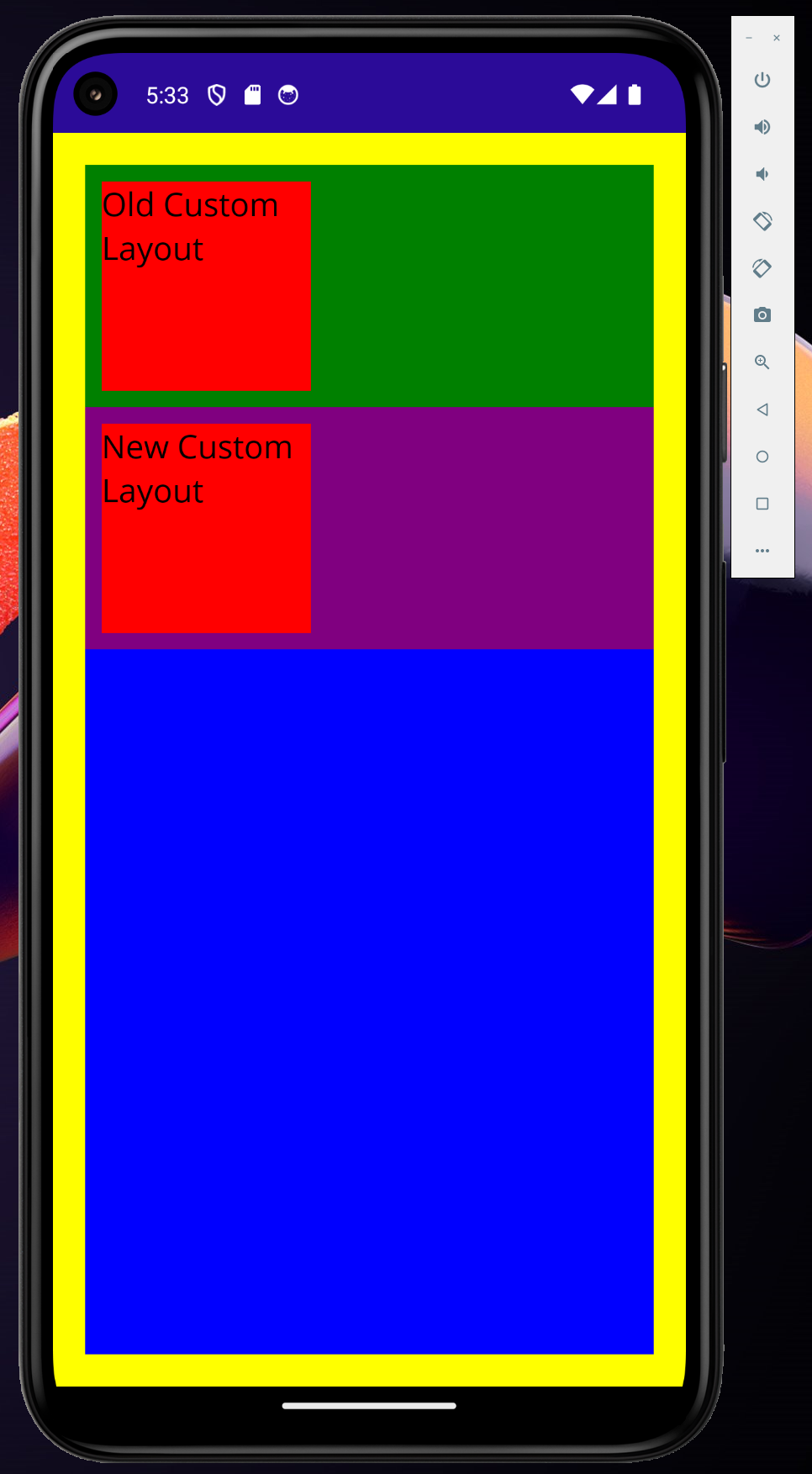
Consider a simple custom layout that displays a red label with the text "Old Custom Layout."
Here's the Xamarin.Forms implementation:
The Measure method calculates the size of the label, determining its dimensions based on the available space. It then returns this calculated size. On the other hand, the LayoutChildren method positions the label within the view, ensuring it fits correctly according to the specified layout. Essentially, Measure prepares the label's size, and LayoutChildren arranges it within the container.
public class CustomXFLayout : Layout<View>
{
    private Label lbl;

    public CustomXFLayout()
    {
        lbl = new Label { Text = "Old Custom Layout", FontSize = 20, BackgroundColor = Colors.Red };
        Children.Add(lbl);
    }

    protected override SizeRequest OnMeasure(double widthConstraint, double heightConstraint)
    {
        var size = lbl.Measure(widthConstraint, heightConstraint);
        return new Size(150, 150);
    }

    protected override void LayoutChildren(double x, double y, double width, double height)
    {
        LayoutChildIntoBoundingRegion(lbl, new Rect(10, 10, 130, 130));
    }
}
MAUI Custom Layout
Now let's create the equivalent MAUI custom layout. Note that I've combined the Layout and ILayoutManager interfaces for simplicity, although the MAUI team recommends implementing them separately for better reusability.
Here's the MAUI version:
In the context of MAUI, the Measure method calculates the overall size of the layout, similar to how it works in Xamarin.Forms. On the other hand, the ArrangeChildren method is responsible for positioning and arranging each visible child within the layout. It’s analogous to what the LayoutChildIntoBoundingRegion method does in Xamarin.Forms. Essentially, Measure determines the space required, and ArrangeChildren organizes the views within that space.
- Keep in mind #1 that both old and new layouts in MAUI require calling
Measureon each child; otherwise, they won't render correctly even if you know their sizes. - Keep in mind #2 that you can’t use the default
Arrange()method. However, you need to call the hiddenIView.Arrange()method. So, if your child view is converted to anIView, you’re good to go. In practice, you can’t simply useLabel.Arrange(). Just convert yourLabelto anIView, and then you can use it like this:(IView(Label)).Arrange().
public class CustomMauiLayout : Microsoft.Maui.Controls.Layout, ILayoutManager
{
    private Label lbl;

    public CustomMauiLayout()
    {
        lbl = new Label { Text = "New Custom Layout", FontSize = 20, BackgroundColor = Colors.Red };
        Add(lbl);
    }

    protected override ILayoutManager CreateLayoutManager()
    {
        return this;
    }

    public Size ArrangeChildren(Rect bounds)
    {
        foreach (var item in Children)
        {
            item.Arrange(new Rect(10, 10, 130, 130)); // the `item` is IView here
        }

        return new Size(150, 150);
    }

    public Size Measure(double widthConstraint, double heightConstraint)
    {
        foreach (var item in Children)
        {
            item.Measure(widthConstraint, heightConstraint);
        }

        return new Size(150, 150);
    }
}
Bringing It All Together
To demonstrate both layouts together, create the following XAML in your MAUI project:
<?xml version="1.0" encoding="utf-8" ?>
<ContentPage xmlns="http://schemas.microsoft.com/dotnet/2021/maui"
             xmlns:x="http://schemas.microsoft.com/winfx/2009/xaml"
             x:Class="MauiApp2.MainPage"
             xmlns:c="clr-namespace:MauiApp"
             BackgroundColor="Yellow"
             Padding="20">

    <VerticalStackLayout BackgroundColor="Blue">
        <c:CustomXFLayout BackgroundColor="Green" />
        <c:CustomMauiLayout BackgroundColor="Purple" />
    </VerticalStackLayout>

</ContentPage>
The Result
When you run your MAUI app, you'll see something like this:

Happy coding! 😊
Subscribe to my newsletter
Read articles from Pavlo Datsiuk directly inside your inbox. Subscribe to the newsletter, and don't miss out.
Written by

Pavlo Datsiuk
Pavlo Datsiuk
🚀