A Guide to Creating Stunning Visual Demonstrations in Figma
 Prayer Bright-Okocha
Introduction
As a designer or a creative, when working on a design project, there are certain times when you’d need to show a video demonstration of how your application works to guide users when they interact with the interface. In this article, I will guide us to create a visual demonstration of our product to be used in our design frame, so that when prototyped developers and the rest of the time will understand the design the way we intend it to work.
Note that Figma allows adding of videos into our design frame but this feature is only accessed by users of the premium package. This article is aimed at giving Figma-free users a way to add visual demonstrations (video) into their design frame.
Tips
This guidelines if understood and followed properly can be used to create visual demonstrations of both web and mobile designs. Before going into details here are some things you should have in mind to be done while creating the demonstration to help you work better and help users better understand the visuals when viewing it.
Always name your frames as it helps prevent naming convention errors when creating component variants.
While adding your design frames to the mockup frames before rendering the frame, add a sort of cursor indicator on the elements users are to interact with in real-time to bring about the next screen (do it for every other frame).
Always test and confirm that you are okay with the delay time of the mockups.
Remember to duplicate your mockup after every render before rendering a new design.
Note, that scaling and resizing the copy of your mockup from the asset doesn't spoil the rest of the design. But in cases where rescaling and resizing don't affect the rest of the screen, you can solve this by resizing all the devices at once from the main component.
Setting up your Figma Workspace and File
Setting up the Figma file and board is one of the easiest things to do regardless of your familiarity with the tool.
First-time users start by accessing the workspace either via the desktop app or by downloading the web app.
Creating the Initial Design
Create UI design on any project of your choice or use an existing design project from your previous work that requires visual demonstration. Before working on your design, you should have the layout planned and know the section of your design you want to be demonstrated in the design.
For this article, I’ll be using the NextGen Ticket web application design I worked on where I needed to show a visual demonstration on the “Feature page” of what using the application is like.
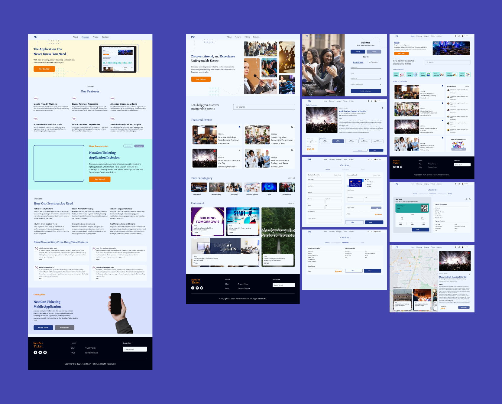
The image above is a display of the NextGen Ticket application screens I used for the creation of the visual demonstration, as well as the screen where the visuals will be displayed.
I resized all the screens to fit the mockup except the main screen where the visual demonstration is to be displayed.
Now that we have gotten our designs ready, let’s dive right into the main purpose of this article.
Adding Mockups to the Design
You have prepared all needed UI designs, now select the screens and flow you want to use in the presentation, and duplicate them. Once duplicated, select a mockup plugin of your choice, I used the Artboard mockup plugin. Turn the designs into a mockup design focusing on the area in each screen where the interaction is to take place.
There are two ways to access the plugin either from saved plugin collections if you already have it downloaded or from plugins in the community.
To Get it From the Community (Manage Plugin)
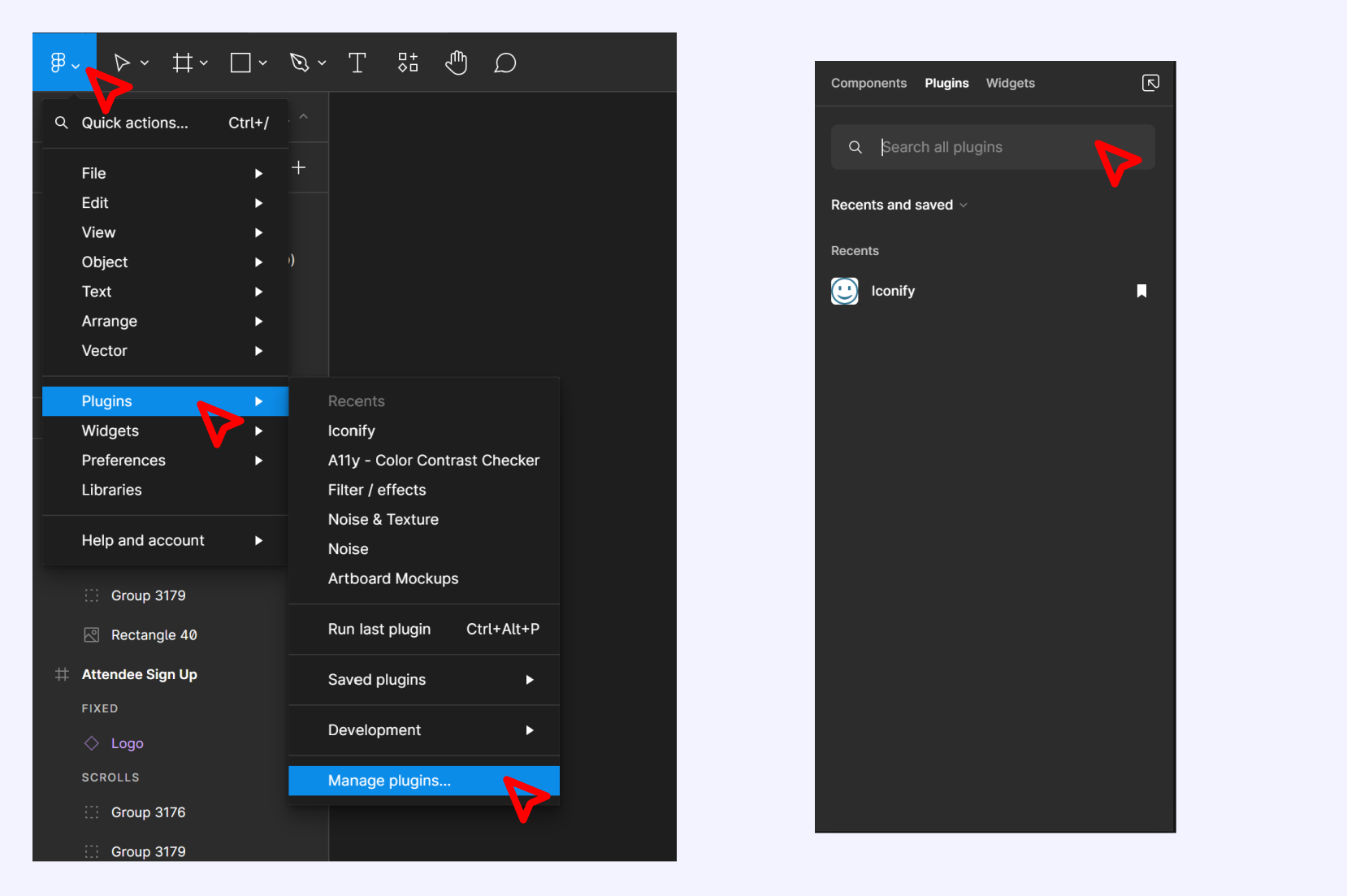
Go to the Figma icon on the Figma app and click to review the dropdown, click on Plugins to release options, and move down to manage plugin. On clicking on this an overlay will appear on the Figma board making the rest of the modals close. On this new modal, use the search bar to type “Artboard Mockup” and install it into your Figma.
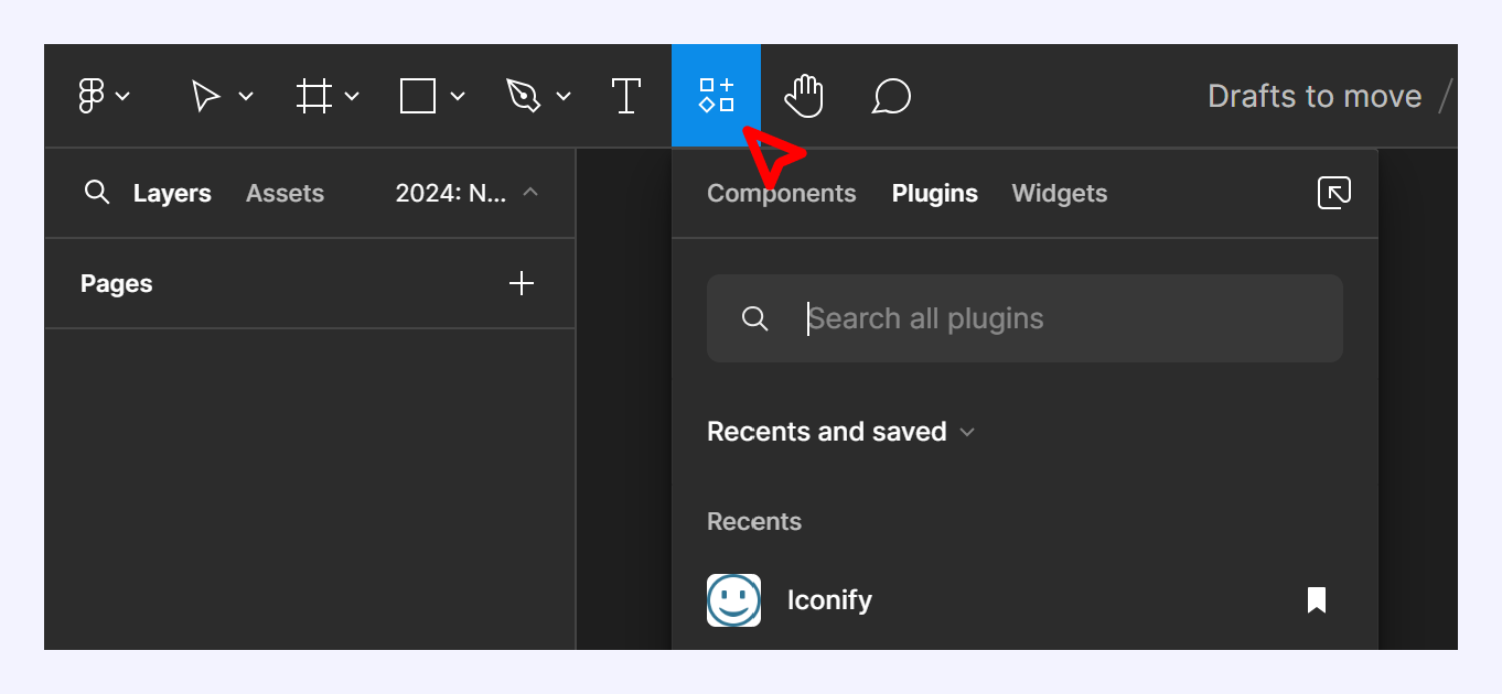
You can easily access this modal by clicking on the “Resource” icon close to the Text and Hand Icons on the toolbar or by using the shortcut “Shift I” on your keyboard.
To Get it From the Saved Plugin
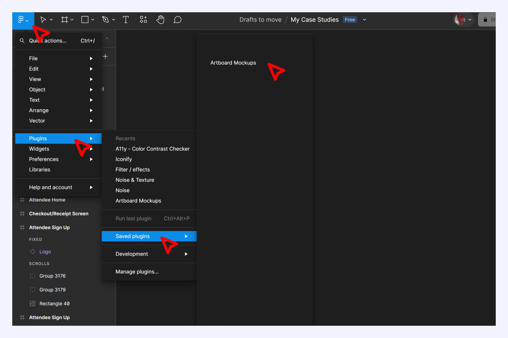
Using the Figma icon on the top left side of the app, click on it to bring down its content, click on plugins, and go to save plugins to access all of your saved icons.
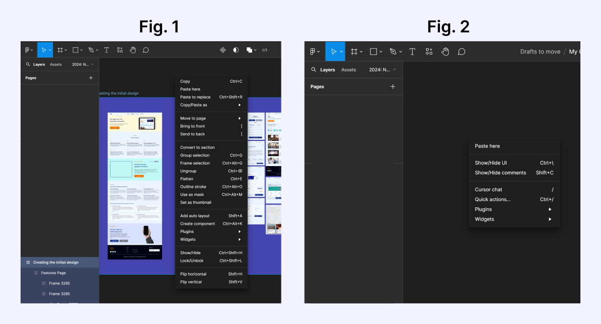
Another way to access it is to right-click with your cursor on any area of your canvas board to bring out a modal. Depending on the position of your cursor when you right click the content of the modal will vary.
Fig. 1, is with the cursor placed anywhere around content in the canvas board, while Fig. 2, is with the cursor placed anywhere around the blank canvas board.
Adding the Design Frame Into a Mockup
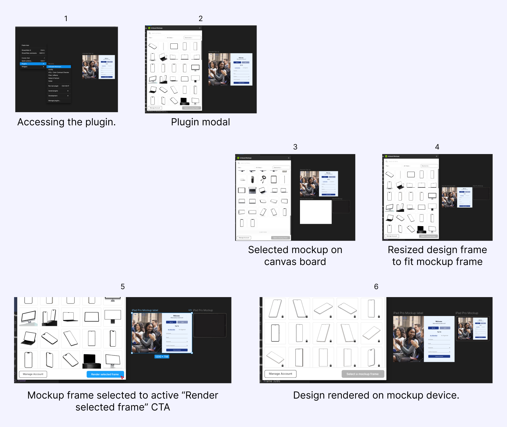
Using any of the formats to access Plugins, open the Artboard mockup plugin, and select your desired mockup type (I used iPad Pro mockup), once selected it is displayed on your Figma canvas. Drag your design frame into the mockup frame, and resize your frame to fit the mockup frame. When both frames are properly aligned, select the mockup frame where you placed your design frame to activate the CTA “Render selected frame” at the button right of the plugin modal, click on the “Render selected frame” to render your design on the mockup device. Repeat the resizing and rendering for your remaining design frames till all frames are presented in a mockup device.
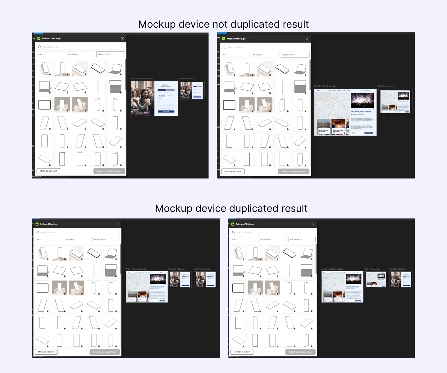
Note, for every new frame you render, duplicate the mockup device where it is displayed to have a copy for yourself because every new design frame added to the mockup frame when rendered replaces whatever design is on the mockup device.
Utilizing Components and Variants
Having rendered all your design frames into the mockup device, rename each mockup device appropriately to prevent complications when creating component variants.
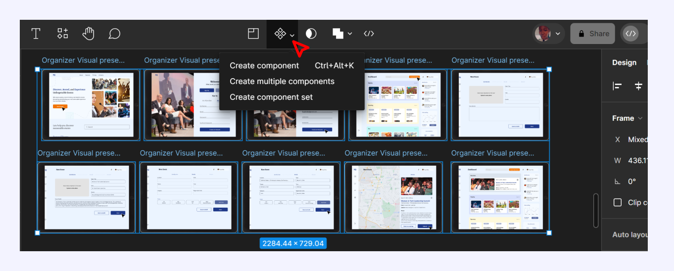
Select all the mockup devices to access the component feature on the toolbar center along with some other feature icons. You can either “create multiple components” or “create component sets”, they both do the same thing in the end.
Creating Multiple Component
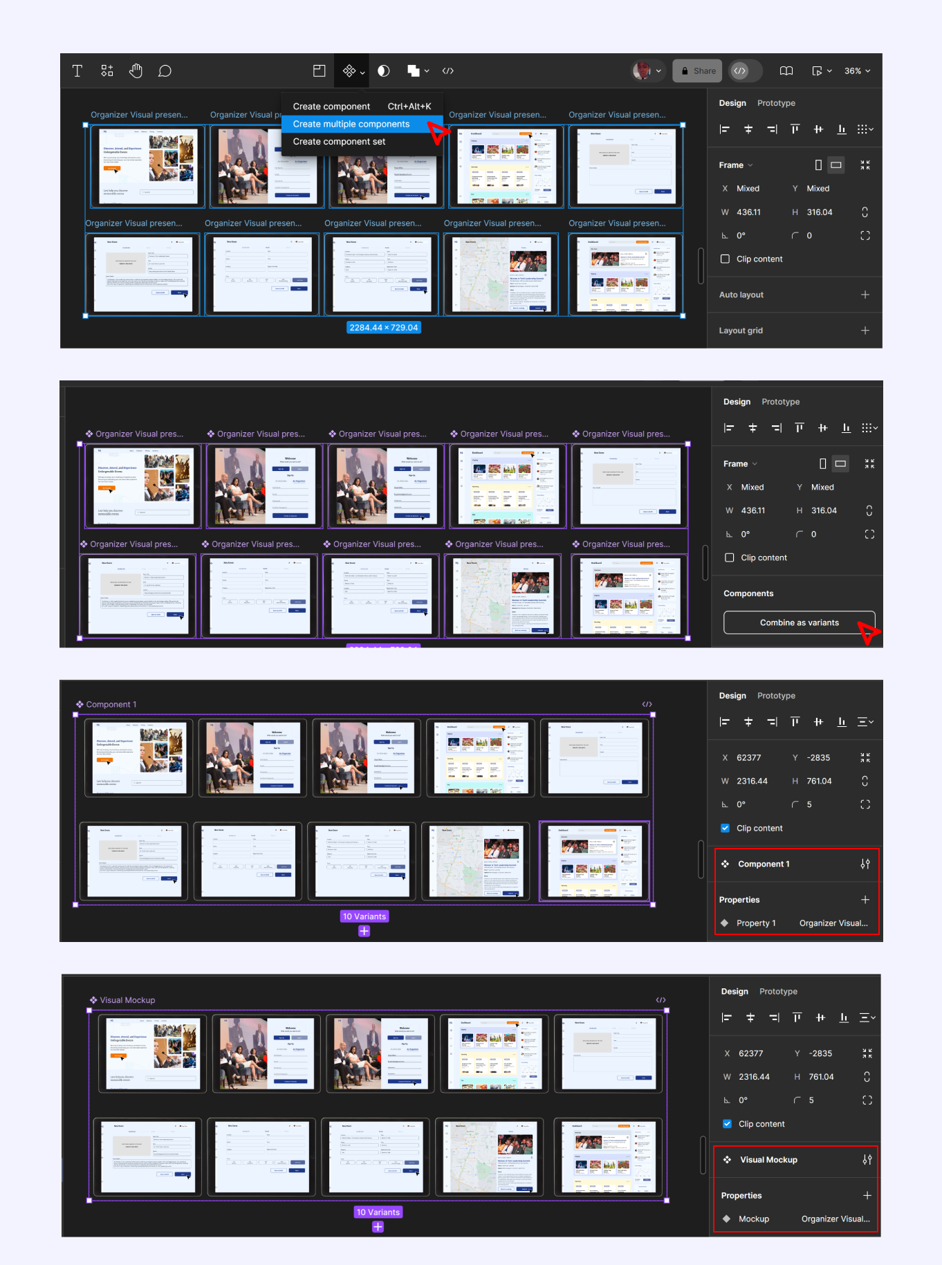
Select all mockup devices, click on the “create component” icon to review the dropdown, and choose “create multiple component”, once selected all mockup devices will be turned into individual components. On the right-hand side of Figma click on “combine as variants”. This creates a parent frame around them making them child components.
Once combined as variants check for any naming error and name the parent frame and child components for easy identification when linking the devices in prototype view.
Creating Component Set
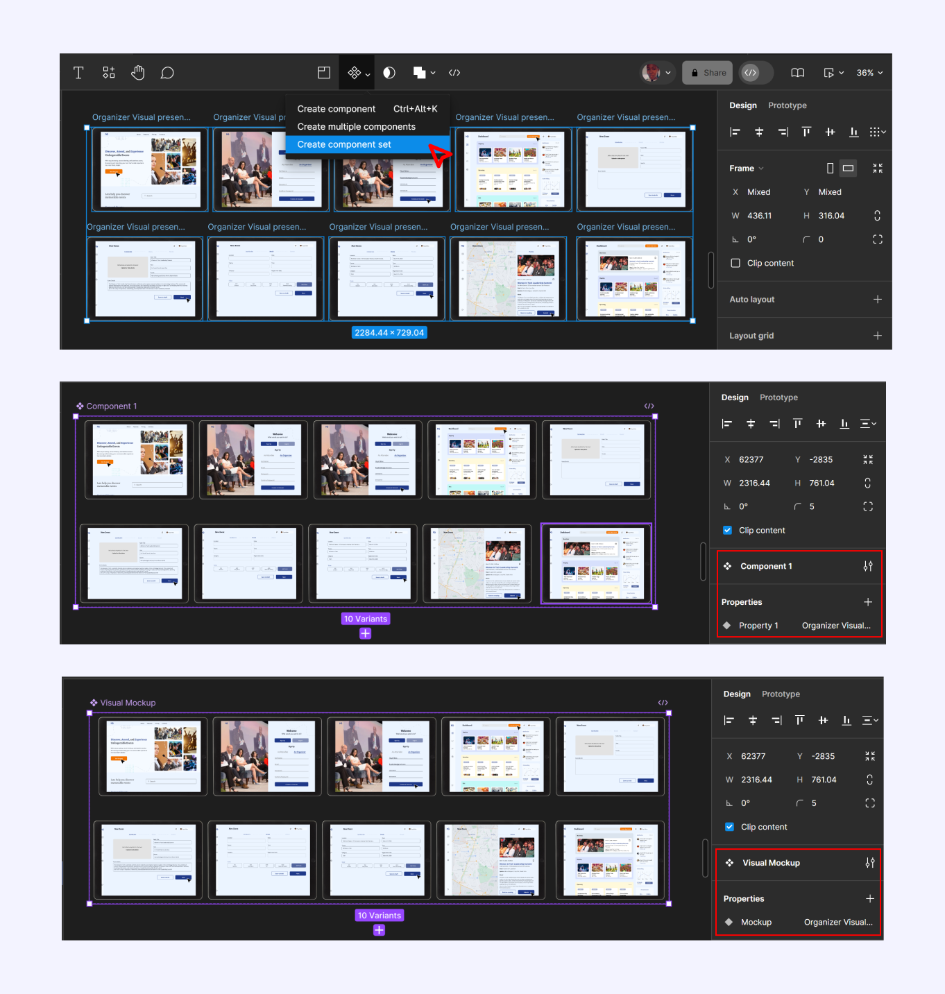
With your mockups all selected, click on the component icon to review its properties and select “Create component set”. Once selected it automatically creates a parent frame, leaving the individual mockup device as the child components. In this case, all you will need to do is check for errors in naming conventions and rename necessary frames for easy identification.
Creating Interactive Prototype
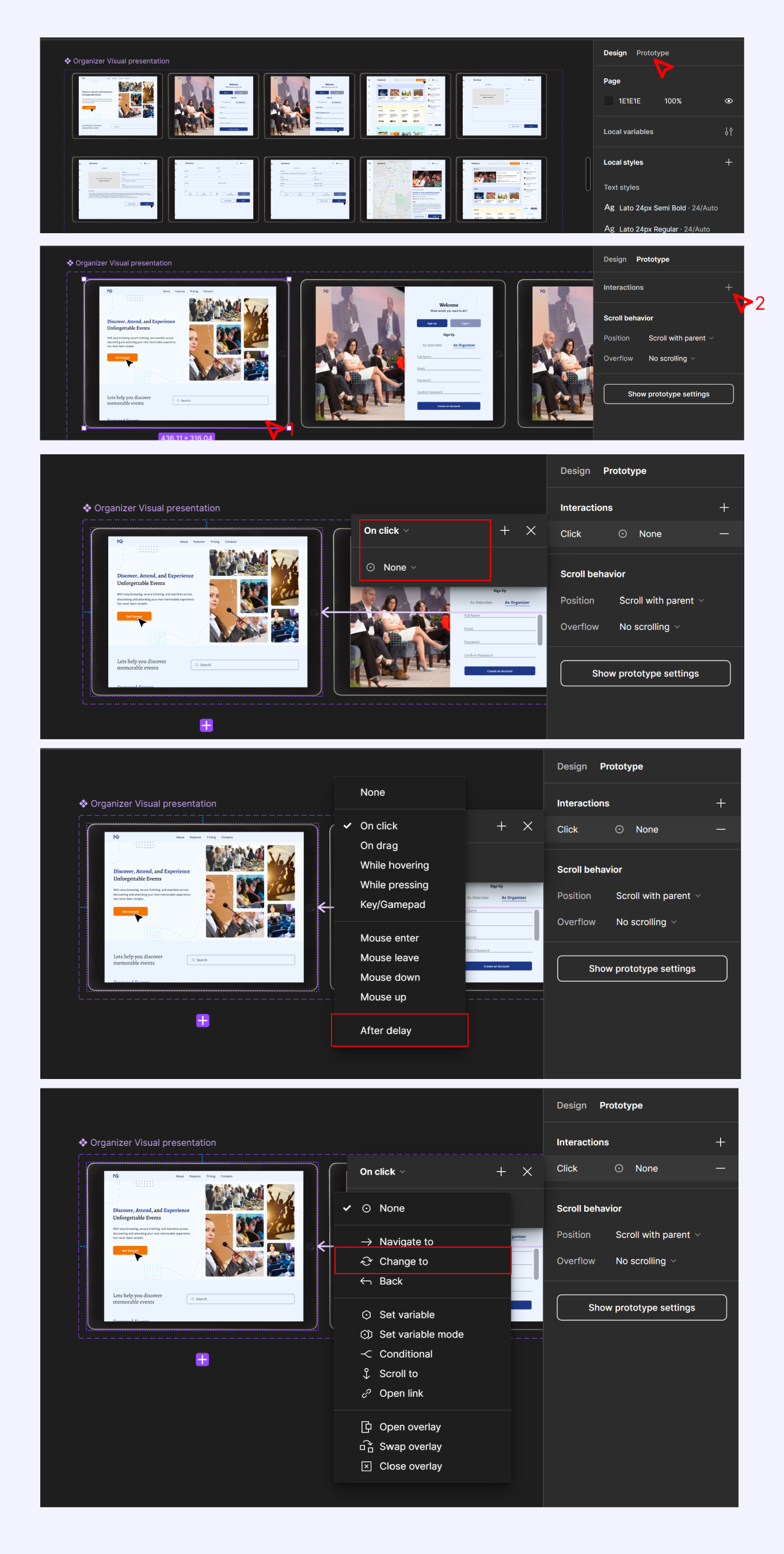
When satisfied with the components created and naming conventions, go to the top right corner of Figma to change to prototype from design. Click on the first mockup design to activate it, then on the right-hand side of the Figma interface click on the plus (+) icon to add an interaction. Once added set up the behavior or interaction to "after delay", then add a transition type of "change to" to link the first mockup with the next one. Repeat the process of activating a mockup device and adding an interaction till the last mockup which will be linked back to the first to create a looping interaction.
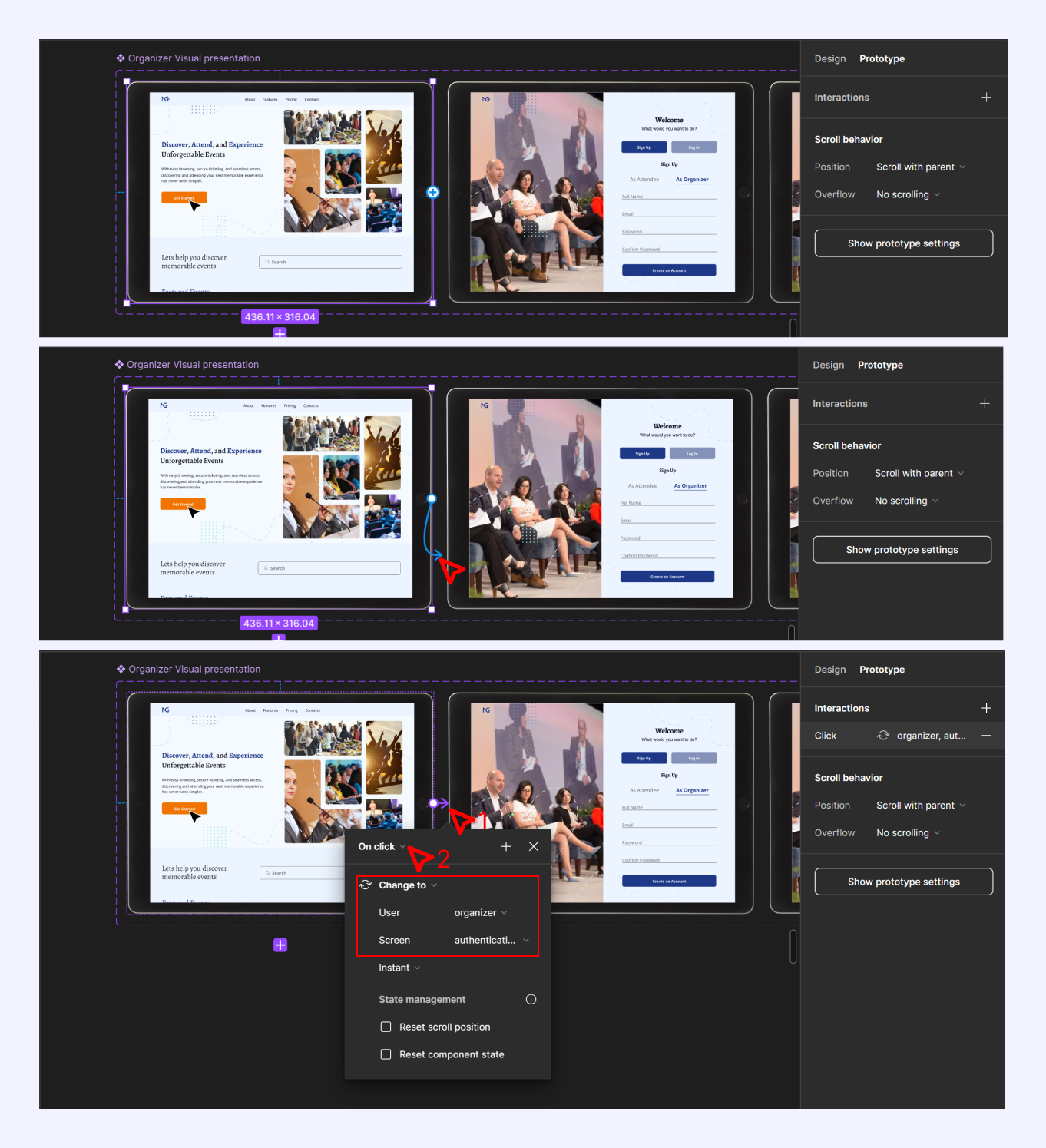
Another way to create a prototype interaction is by simply clicking on the first mockup device to active it, you’ll notice a “+” icon by the side of the frame (it shows on all four sides depending on where your cursor is placed) hold and drag it to the next mockup device and the first connection is made. All you’ll have to do is to change the behavior to "after delay". Notice how the transition type and path have been added already using this drag-and-drop method.
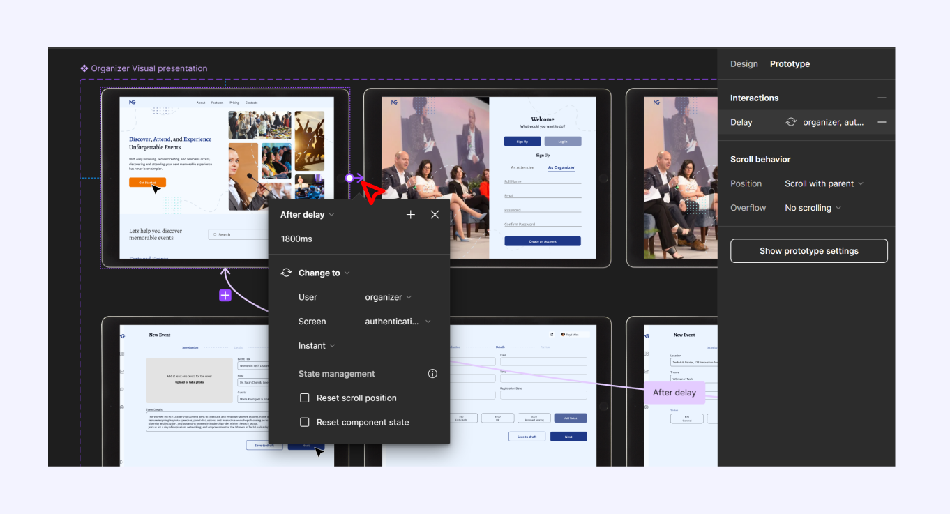
In creating the prototype connection and interaction for the visual presentation I used “after delay” with the transition type of “change to”, I played around with the after delay timing of between 400ms to 1800ms.
You can make changes to your connection by clicking on the linking line to bring out the drop-down modal showing properties of the interaction.
Including Visual Demonstration to Design
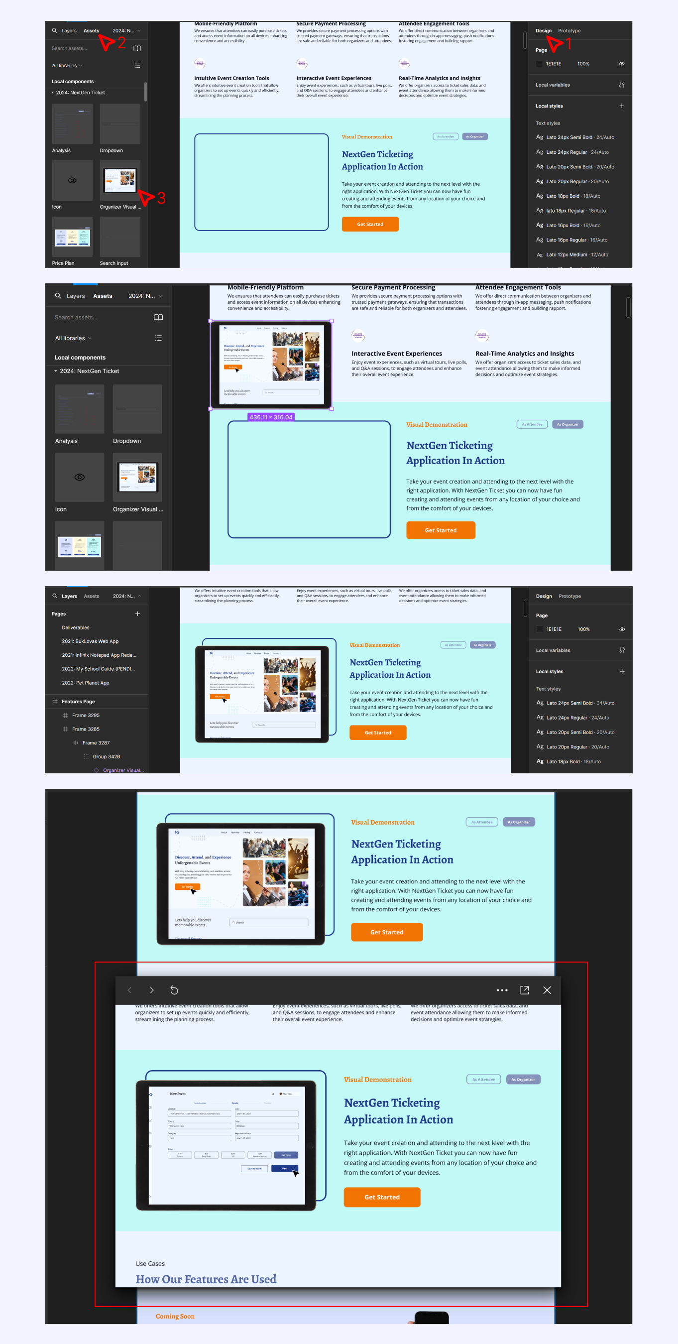
To add the visual demonstration to your design frame, first, change your workspace from “prototype” to “design” on the top corner of the right-hand sidebar in the Figma interface. On the left sidebar change the view from “layers” to “assets” to access created components, and hold and drag the mockup device asset into your canvas board over your design frame. Scale and resize the mockup device to fit the needed size in the design frame, when satisfied preview using Figma mirror or prototype preview to ensure it works as expected.
If you read till this point of the article, you have successfully created a visual demonstration of your UI design in Figma to be used in your Figma design as a Figma-free plan user.
Conclusion
Creating a visual demonstration of your UI design in Figma not only enhances the appearance of your design but also improves communication with your audience. By following the steps outlined in this guide, you can accurately create a visual demonstration of your designs both in web and mobile view to be used in your design project creation.
Did you like this article? Here’s how you can support me:
👏 Please give me a clap, comment & follow me!
👨💻 Connect with me on LinkedIn
Subscribe to my newsletter
Read articles from Prayer Bright-Okocha directly inside your inbox. Subscribe to the newsletter, and don't miss out.
Written by
Prayer Bright-Okocha
Prayer Bright-Okocha
I am an interactive, informative and creative designer who is motivated by the desire to solve both the users' problems and the business problems and design a thoughtful, engaging, simple but interactive product with the sole intention of solving the users' needs while also positively impacting company growth.