Crafting NextGen Ticket: A 30-Day Design Voyage
 Prayer Bright-Okocha
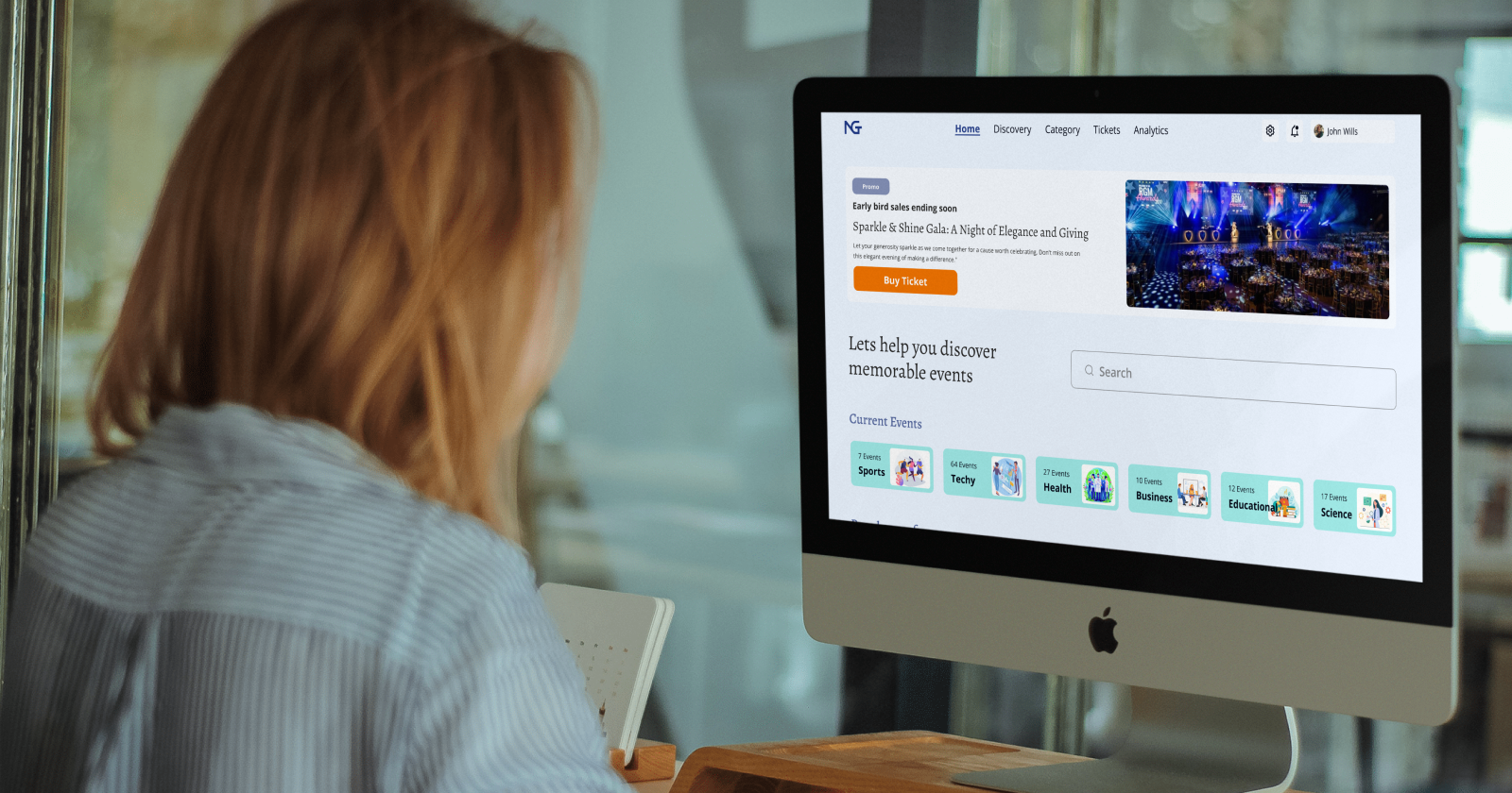
This article dives deep into my journey in creating the NextGen Ticket project, highlighting the challenges I faced, the innovative solutions I came up with, and valuable lessons learned along the way of my intense journey of creating the innovative ticketing application that redefines the event experience.
Introduction
Attending events should be a breeze, not a hassle, that’s why the improvements in event organization begin with the creation of the NextGen Ticket application. With its cutting-edge technology and user-centric design, NextGen Ticket aims to upgrade how events are planned, promoted, and experienced. From a simplified and seamless ticket purchase process to personalized event recommendations, and an enhanced overall event experience for organizers and attendees alike. It redefines the event landscape, making it more accessible and engaging for everyone involved.
Inspiration

What inspired this project was growth and commitment. I am still growing as a product designer so I give myself every opportunity possible to work on something new and awesome, and I knew that one of the ways I could stay committed to this project was by posting my daily progress on social media. To be sincere most times even posting on social platforms can be discouraging as it is almost as if you are invisible to some persons. In my case, if I were to continue the project based on the likes I got then trust me I wouldn't have even continued as the most likes I got from LinkedIn was 10, from Twitter was 2, and from Instagram was 3, except on the last day of the challenge were my post got up to 25 likes on LinkedIn.
So, what kept me inspired to continue the project was my drive for growth and improvement as a product designer. And I'm glad I didn't let numbers from social media stop me from finishing the project.
The Project
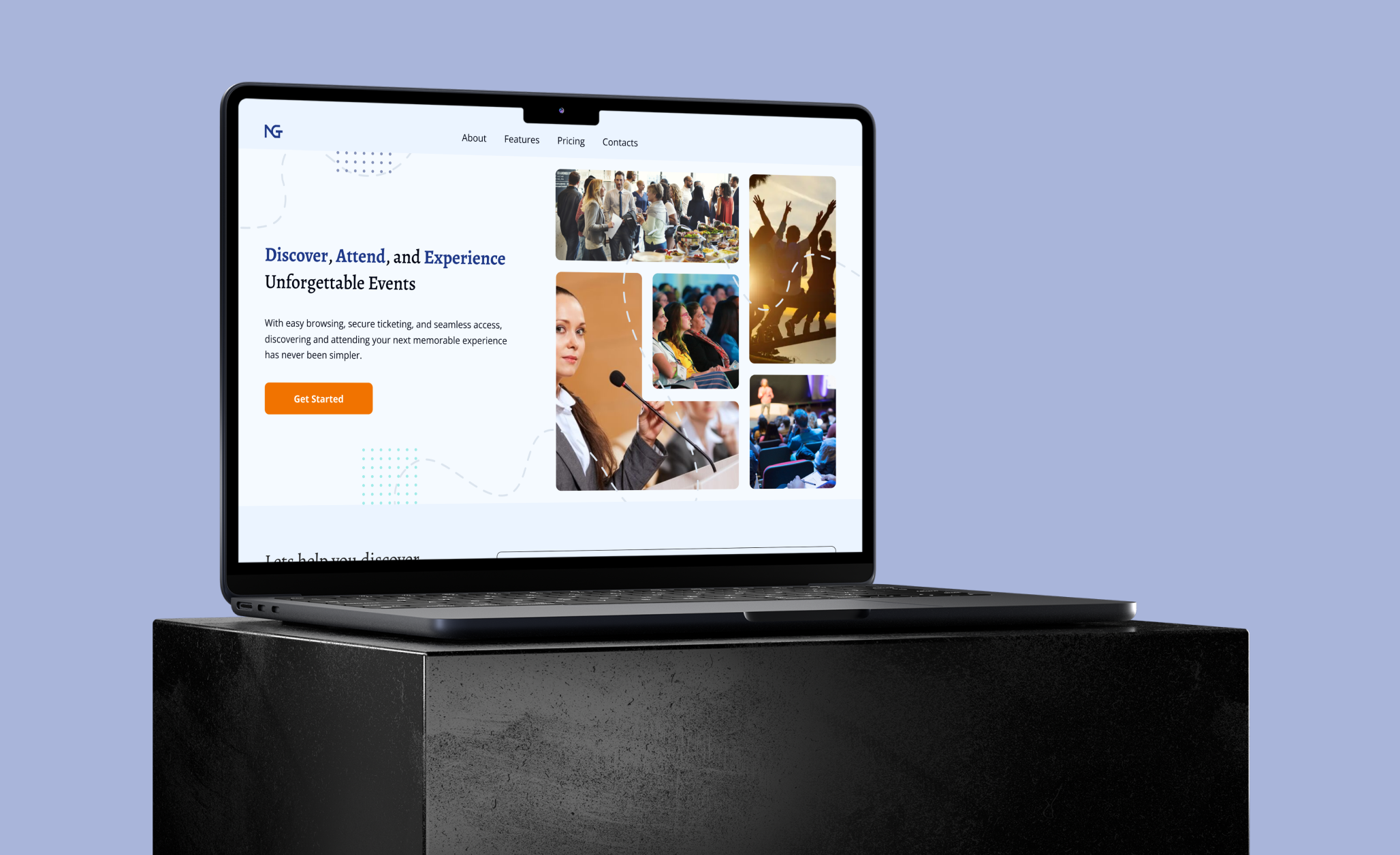
NextGen Ticket is an innovative ticketing application I designed to streamline the event management and booking process and enhance the overall experience for both event organizers and attendees. The application is aimed at transforming the way events are organized, promoted, and attended by offering different features and tools tailored to meet the diverse needs of the users.
The designing of this application was for 30 days which I broke down into 4 phases, which helped me have milestones to meet up with for each week making up the 30 days.
The Process
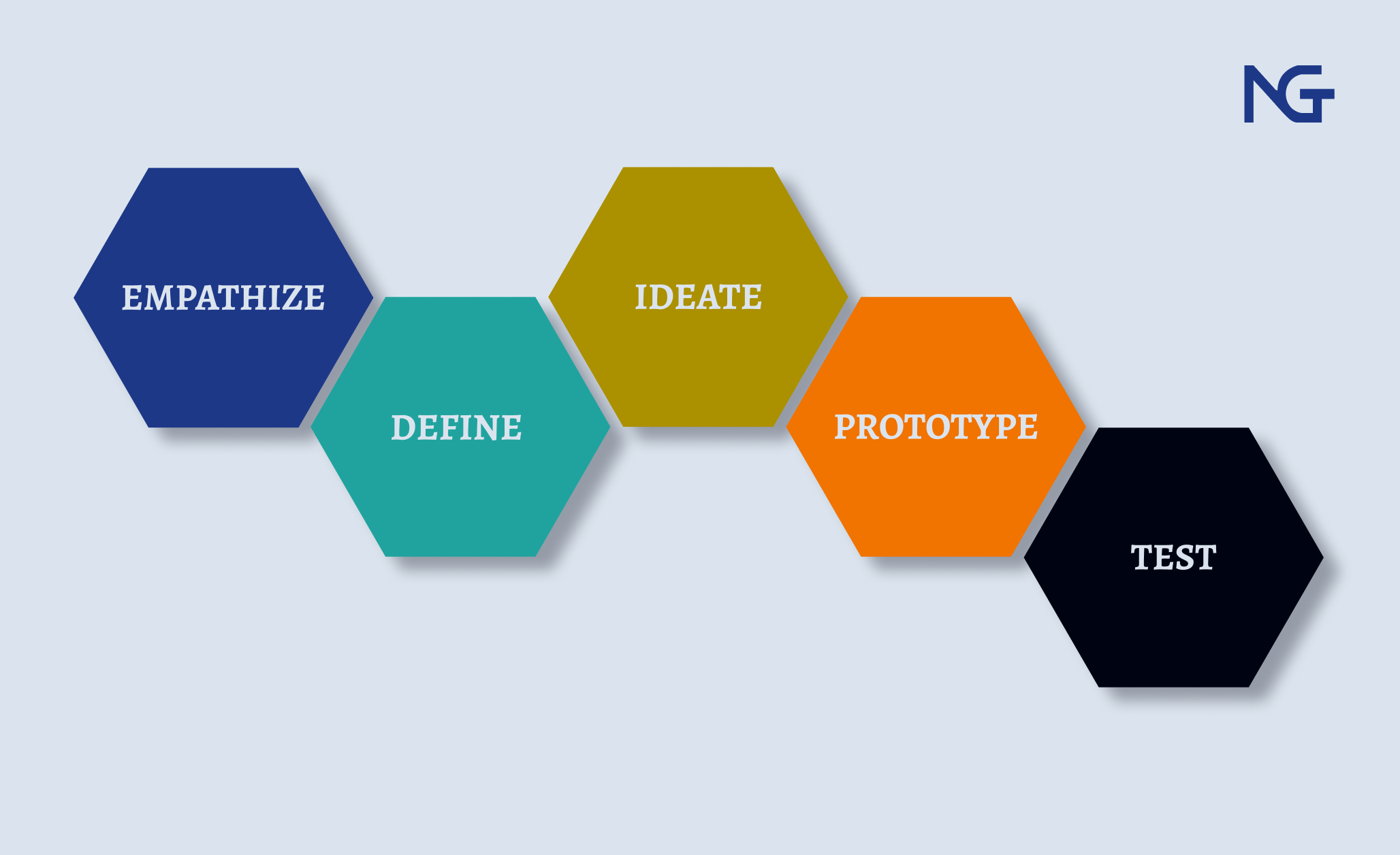
Breaking down the design process into bits made it easy for me as I was able to focus on what was needed at the moment and not worry about the bulk of work needed to be done for the design to be finalized.
Discovery and Planning
Every project regardless of the type or aspect always begins with this step and so did my designing of the NextGen Ticket.
This week, I gathered all the requirements needed for the project, understanding the goals of the project, target audience, and feature requirements. Once I got ahead on this aspect of the project, I carried out market research and used insight to create user personas to guide design decisions based on potential users. Establishing design principles and objectives based on research helped me stay on course with the aim of the application. At the end of this week, I created a competitor audit, personas, and a moodboard that guided the next week of the project.
Information Architecture and Wireframing
I started this week with creating the user flows for both organizers and attendees, this helped me understand the direction and route users were going to take and important screens they’ll come in contact with. Once I was done I created an information architecture map to structure the application as well as lay emphasis on key screens needed. Once satisfied with the user flows and information architecture, I began creating wireframes with started with initial ideation on paper and then upgraded to digital wireframes in Figma. I started with the key screen and interactions for both organisers and attendees not leaving aside the application landing page.
High-Fidelity Prototyping
The project became more interesting as I began to add visual elements such as colors, imagery, font style, and brand style to the design. This week, I ensured that I had a cohesive design across all screens, and started creating prototypes by connecting the screens to create the flow for both organizers and attendees. While I was creating the design I was testing each interaction to ensure that it worked the way I expected and the interaction would easily be understood by users at any point.
Refinement and Finalization
With the finish line in sight, I had gotten major screens and interactions ready. While the design wasn't finalized I went on to improve on the screens that I felt needed improvements and made little changes to interactions that didn't seem to be flowing as expected. I started putting all the materials needed for the documentation of the project, preparing assets, and looking forward to finalizing the design. Finally, as the clock ticked down, NextGen Ticket emerged as a completed project design with an astonishing visual design and prototype.
Challenges Faced

From day one, I encountered a series of challenges that tested my creativity, commitment, resourcefulness, and design knowledge. The most prominent challenges included:
Posting on social media: I had decided to post my progress on all my social media accounts with the hopes that doing it will keep me accountable to the project plus the response I’ll get will also be a form of encouragement to me. Trust me it doesn’t always happen as we imagine it in our head and yes I never got the kind of encouragement I imagined in my head. I thought of either not continuing with posting on my social media account or not continuing the project. But I did none cos I remembered why I started in the first place, it was for growth and improvement of my skills.
Tight deadline: 30 days, seriously what was I thinking? At first, it was looking very doable and achievable, the time frame wasn’t looking all that short compared to the project. But at some point I got frustrated cos I still had a long way to way mostly when I started working on the wireframes and visual design.
Inability to create an interactive keyboard prototype: Since the initial design is a web design I needed to create keyboard interaction for search and that was when the major frustration came. Searching online and not finding anything on web design was really annoying but then my creativity set in.
Unable to show a visual demonstration of the application on the design as required: Designing is fun, and doing it on Figma is even more fun. I had gotten to a particular screen in the design where I needed to include a video demonstrating how the application works but that was impossible, not that Figma doesn’t have that feature but I am not on the paid plan to enjoy that feature. And there again my creativity kicked in.
Solutions
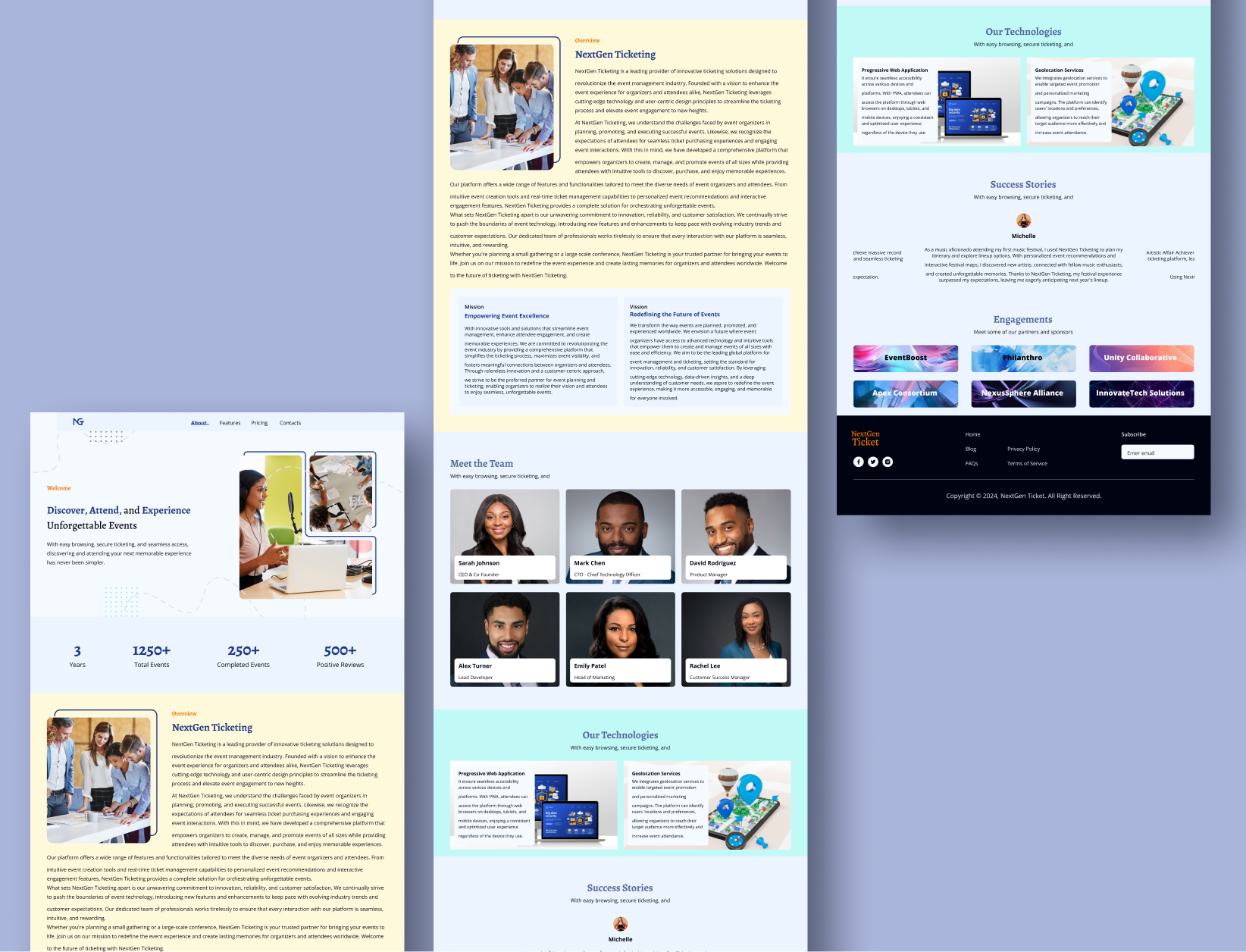
Despite the challenges, I stayed focused, keeping at the back of my mind the reason I started this project in the first place, coming up with innovative solutions to overcome the obstacles and stay on track was a better option than quitting on the project.
I came up with many solutions to keep me going with the project but the ones that stood out were the technical solutions I came up with.
The idea for the solution to creating an interactive keyboard came up because I already knew how to make a keypad interaction. So I expanded that knowledge and I did a great job. I have written an article on Creating an Interactive Keyboard for Web Design in Figma, you can check it out.
Showing the visual demonstration of the project in the design would have been a reason I didn’t continue with the project. But then again I played around with prototype interactions and the result was exactly what I wanted. I wrote an article on how it was done, you can find it in A Guide to Creating Stunning Visual Demonstration In Figma.
Lessons Learned
Throughout the 30-day journey, I learned valuable lessons that will shape my approach to future projects:
Prioritize and iterate, start with what’s important and continue from there, always go back to iterate and make changes cos there’s always room for change. Don’t try to do it all at once cos you’d get burnt out and lose interest so start with what’s important and the rest will fall into place
Simplicity is key and trust me it is. You don’t need to create complex or jam-packed UI screens for you to know you’re doing good work. Keep it simple and go straight to the deals you need users to interact with in a screen and move on to the next. Keeping it simple and understandable is far better than making it complex and confusing for users.
Embrace challenges, in every area of one’s life or career you are bound to encounter one or more challenges, and how you accept them tells how you’d react to them. Having an open mind when faced with challenges makes it easier to handle or deal with.
Continuous improvement is one thing that there’s always room for. Being open to new challenges makes room for improvement and growth. In every career, improvement is needed for growth.
Conclusion
Designing NextGen Ticket in 30 days was an exhilarating and transformative experience that pushed me to new heights of creativity, determination, and dedication. As I reflect on the challenges I faced, the solutions I implemented, and the lessons I learned, I emerge with a sense of pride and accomplishment in bringing this vision to life. The journey may have been brief, but the impact of NextGen Ticket on me is boundless.
Check out the Design Case Study.
Thank You for reading, please remember to like, leave a comment and share.
Subscribe to my newsletter
Read articles from Prayer Bright-Okocha directly inside your inbox. Subscribe to the newsletter, and don't miss out.
Written by
Prayer Bright-Okocha
Prayer Bright-Okocha
I am an interactive, informative and creative designer who is motivated by the desire to solve both the users' problems and the business problems and design a thoughtful, engaging, simple but interactive product with the sole intention of solving the users' needs while also positively impacting company growth.