Write Your first React Native App with me (Part 2)
 Jyoti Maurya
In this blog, we will do the installation and run the sample react native app which is provided by default. Then we will create our own app called ShowHello which is a lot more than just displaying Hello World on screen but easy enough to be your first app.
One thing you must finalize before writing your first app is the Tech stack which we have already done in the previous blog. (Part 1)
Also, we will be using React Native CLI and a windows laptop in this article.
Installation
To setup your environment you need to install following things into your windows system. For this article you will run your app in the emulator (which is basically a virtual mobile phone device on your computer).
Chocolatey
Chocolatey is a universal package manager for Windows. Install the latest version of chocolatey using this link.
Ensure that you are using PowerShell as an admin. Install with powershell.exe.
Set the bypass execution policy using following command in PowerShell as admin.
Set-ExecutionPolicy Bypass -Scope Process -Force; [System.Net.ServicePointManager]::SecurityProtocol = [System.Net.ServicePointManager]::SecurityProtocol -bor 3072; iex ((New-Object System.Net.WebClient).DownloadString('https://community.chocolatey.org/install.ps1'))
NodeJS
NodeJS is a JavaScript runtime environment that allows you to execute javascipt code outside of a browser.
You can install Node.js 18 or newer using chocolatey or from this link. Always use LTS version of Node.
To install using chocolatey, run the following command in PowerShell as administrator.
choco install -y nodejs-lts
Java OpenJDK
React Native also requires Java SE Development Kit (JDK). We will be using java OpenJDK. OpenJDK (Open Java Development Kit) is an open source java implementation of the Java Standard Edition Platform. It is free to use.
Run following command in PowerShell as administrator to install java.
choco install -y microsoft-openjdk17
Android Studio
Android Studio is official IDE for developing android applications.
Download and install Android studio using this link.
During installation, a wizard will popup. Make sure to select - Android SDK, Android SDK Platform, Android Virtual Device, Hyper-V: Performance (Intel ® HAXM).
Also install following from Resource Manager in Android studio:
Android SDK Platform 34
Intel x86 Atom_64 System Image or Google APIs Intel x86 Atom System Image
Set environment variable and path variables.
Visual Studio Code
Visual Studio Code, or VS Code, is a free, open-source code editor from Microsoft that's popular across platforms for its wide language support, intelligent features like code completion, and extensibility through a vast marketplace of plugins.
Basically, this is the IDE you will be using all the time.
Download and install VS Code from this link.
Trust me the plugins make life so much easier. Install following VS Code plugins
vscode-styled-components v1.7.8 by styled-component.com
React Native Tools v1.13.0 by microsoft.com
ES7+ React/Redux/React-Native snippets v4.4.3 by dsznajder
Gradle for Java v3.14.0 by microsoft.com
Run following commands to see if everything is working properly
node -v # Shows the node version
npm -v # Shows the node package manager version
java -version # Check java version
adb devices # irrespective of output, if this command doesn't work, check Android studio installation.
Running React Native default app
Create a folder named "RN" to keep all your react native projects inside it.
To create a react native project called "ShowHello" type the following command in the Terminal when you are inside RN folder.
npx react-native init ShowHello
The output will look like this, if the project has been created successfully.

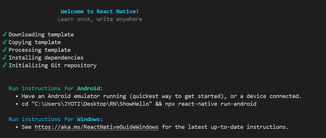
You will notice that a folder named "ShowHello" has been created inside RN.
Go inside that folder and run the following command to run the project on the emulator.
npx react-native run-android
Node terminal will open automatically along with emulator. Press a in the node terminal to start the app to start running on android emulator.
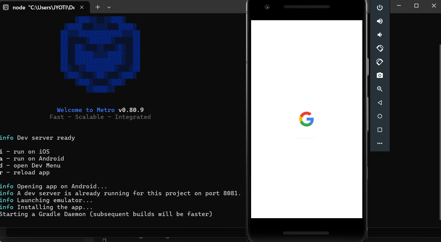
If you get "java.io.UncheckedIOException: Could not move temporary workspace" error message then change the gradle version from 8.6 to 8.5 in gradle-wrapper.properties avaible inside ShowHello > android > gradle > wrapper > gradle-wrapper.properties. Make sure to save the changes.
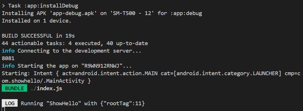
Now go the node terminal and press "a". The new output would look like below image.
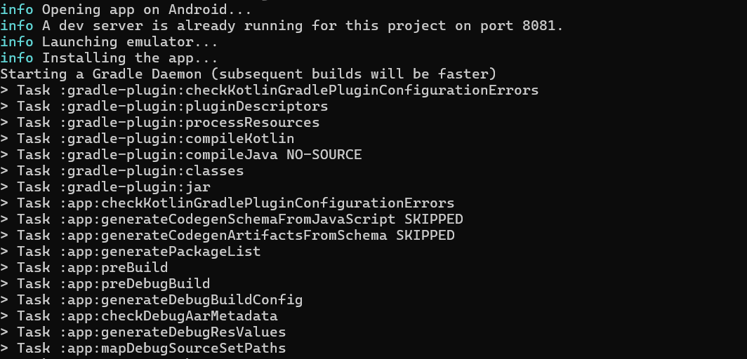
On the Android emulator, you should be able to see following react native sample app.
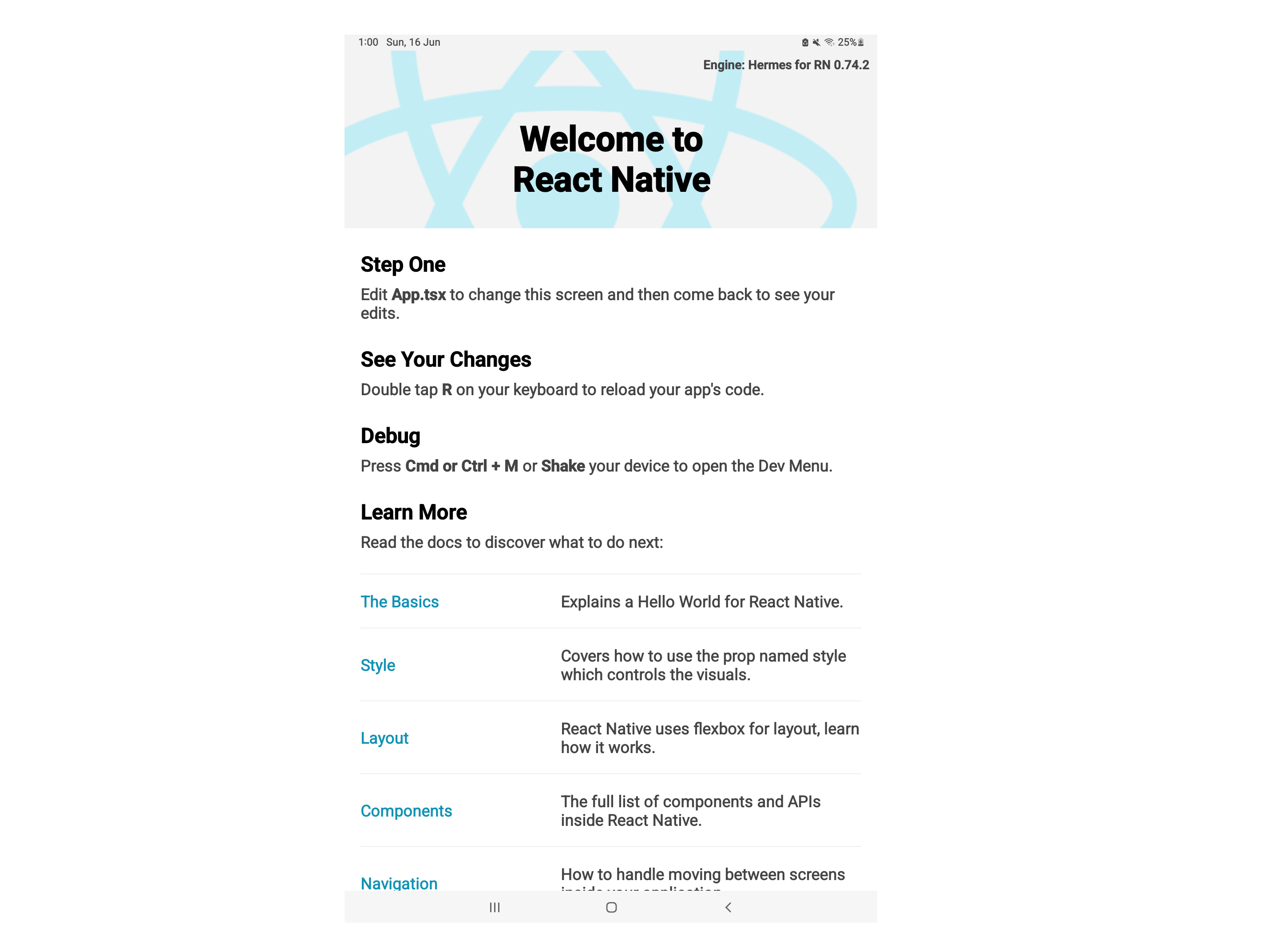
Congratulations, you have just created and successfully ran your first react native sample app.
App Creation
Now let's create our first app which contains just one screen. It will have a button which will show and hide our text message i.e. "Congratulations, you have created your first app".
Delete everything in App.tsx and write the following code in it.
import { SafeAreaView, StyleSheet, Text, TouchableOpacity, View } from 'react-native'
import React, { useState } from 'react'

// Interface to define the application state structure.
interface AppState {
  isHidden: boolean;
}

const App = () => {

  // State variable to control the visibility of hidden text. Initially set to true, hiding the text.
  const [isHidden, setIsHidden] = useState<boolean>(true);

  // Function to handle button click. Toggles the `isHidden` state.
  const handleButtonClick = (): void => {
    setIsHidden(!isHidden);
  };

  return (
    <SafeAreaView style={styles.mainContainer}>
      <View style={styles.hdnContainer}>
        {/** Conditionally render text based on `isHidden` state */}
        <Text style={styles.txtLine1}>{isHidden ? "" : 'Congratulations'}</Text>
        <Text style={styles.txtLine2}>{isHidden ? "Want to see the hidden text?" : 'You have created your first app.'}</Text>
      </View>
      <Text>Click on the button to {isHidden ? 'view' : 'hide'} the hidden text</Text>
      <TouchableOpacity style={styles.btn} onPress={handleButtonClick}>
        <Text>{isHidden ? 'SHOW' : 'HIDE'}</Text>
      </TouchableOpacity>
    </SafeAreaView>
  );
};

export default App;

const styles = StyleSheet.create({
  mainContainer: {
    flex: 1,
    padding: 32,
    alignItems: 'center',
    justifyContent: 'center',
    backgroundColor: 'pink'
  },
  hdnContainer: {
    alignItems: 'center',
    backgroundColor: 'white',
    borderRadius: 16,
    height: 400,
    justifyContent: 'center',
    marginBottom: 32,
    marginHorizontal: 16,
    width: 400,
  },
  txtLine1: {
    color: 'purple',
    fontSize: 24,
  },
  txtLine2 : {
    fontSize: 16,
    fontStyle: 'italic',
    fontWeight: 'bold',
  },
  btn: {
    backgroundColor: 'yellow',
    borderRadius: 32,
    margin: 32,
    paddingVertical: 4,
    paddingHorizontal: 32,
  }
})
The output should look something like this
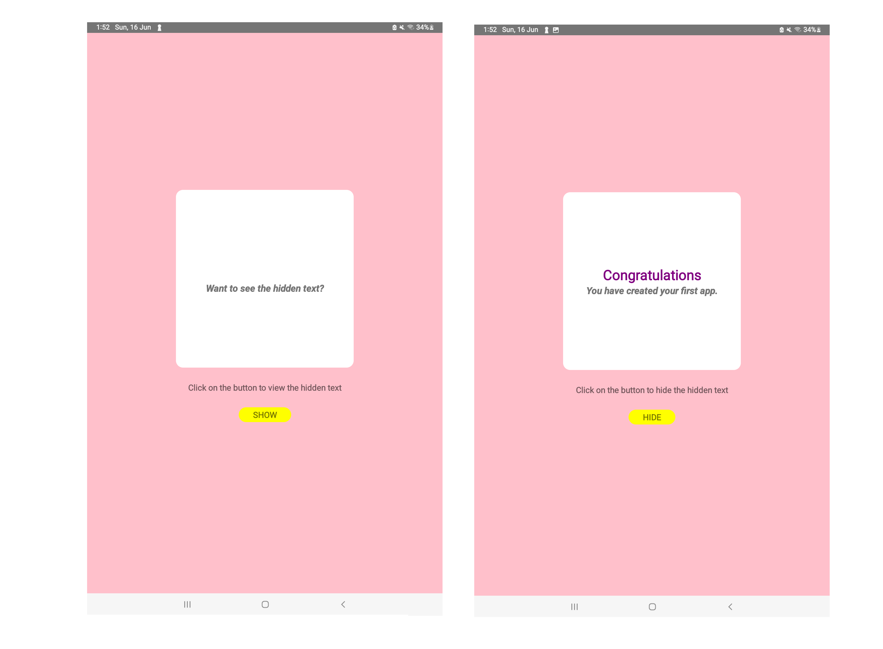
Now let me explain what we just did. As you might noticed if you were able to run the code successfully that we created a simple interactive app that allows users to hide and reveal hidden text. You will find line by line explanation after the below overview.
Imports
The code imports necessary components from the react-native library.
SafeAreaView: Provides a view that is safe for placing content within the viewport, avoiding conflicts with system bars.
StyleSheet: Used to define styles for the UI elements.
Text: Renders textual content.
TouchableOpacity: Creates a button-like component that responds to user touch.
View: A generic container for laying out subviews.
State Management
An interface named AppState is defined to specify the structure of the application state. It has a single property called isHidden of type boolean. The 'useState' hook is used to create a state variable named isHidden with an initial value of true. This variable controls the visibility of the hidden text.
Button Click Handler
A function named handleButtonClick is defined. This function is called whenever the user clicks the button. Inside the function, the setIsHidden function (provided by useState) is used to toggle the value of the isHidden state variable. The ! operator inverts the current value, essentially switching between true and false.
UI Rendering
The App component returns a SafeAreaView that holds the entire UI.
Inside the SafeAreaView, a View with the style hdnContainer holds the hidden text.
Two Text components are conditionally rendered based on the isHidden state. If isHidden is true, an empty string is displayed. If isHidden is false, "Congratulations" is shown.
Another Text component with the style txtLine2 displays a message depending on the state. If isHidden is true, "Want to see the hidden text?" is shown. If isHidden is false, "You have created your first app." is displayed.
A Text element prompts the user to interact with the button. The text dynamically changes based on the isHidden state ("view" or "hide").
An TouchableOpacity component with the style btn creates the button. The button's text also changes based on the isHidden state ("SHOW" or "HIDE"). When clicked, it triggers the handleButtonClick function.
Styles
The styles object defined using StyleSheet.create stores styles for various UI elements.
mainContainer: Styles the main container with pink background, padding, and centered alignment.
hdnContainer: Styles the hidden text container with white background, rounded corners, specific height as 400, margin, and centered alignment.
txtLine1: Styles the first text line with purple color and a larger font size.
txtLine2: Styles the second text line with bold font, italics, and a smaller font size.
btn: Styles the button with yellow background, rounded corners, margin, and padding.
Line by line explanation

We need to import certain things to be able to use them in the rest of the program. If we don't import any component that we use in the program then we would get an error.
We import SafeAreaView, StyleSheet, Text, TouchableOpacity, View from 'react-native' whereas we import React and useState from 'react' package. useState is a hook, which is basically a react function that allows you to add state to functional components. State represents data that can change over time within your component. The useState hook returns an array with two elements - state value and state setter function.
You can find the react and react native package in the node modules folder, if you are interested to see their code.
You might have noticed that we use {} sometimes but not always while importing. We use curly braces when we want to import specific named elements from a module. We don't use curly braces when we are importing the default export of a module. A module can only have one default export.

This line defines an interface named AppState. Interfaces are used to specify the structure of objects in TypeScript. They act like contracts that specify the properties and methods an object must have, ensuring type safety and improving code clarity. The AppState interface has a single property called isHidden of type boolean. This property will be used to store the state of whether the hidden text is currently visible (false) or hidden (true).

This line defines a functional component named App using an arrow function syntax. This component will be the main building block of our React Native application.

Anything starting with // in JavaScript of typescript is taken as a comment i.e. it is ignored by the compiler. It is just for human readability.

This line uses the useState hook to create a state variable named isHidden with an initial value of true. This variable will control the visibility of the hidden text. useState<boolean> defines that the data type of this state variable as boolean.

Another comment. It is a good practice to add comments to explain your code.

This defines a function named handleButtonClick. This function will be called whenever the user clicks the button. The (): void part specifies that the function doesn't return any value (void).

Inside the function, we use the setIsHidden function (provided by useState) to toggle the value of the isHidden state variable. The ! operator inverts the current value, essentially switching between true and false.

Never forget to close the function or trust me you will regret it.

App functional component needs to return a JSX (JavaScript XML) element that represents the UI of the application. Inside return we will write JSX.

We use a SafeAreaView to wrap the entire UI content so that our UI is displayed in the visible region of the devices without ebing affected by status bar, navigation buttons, etc. SafeAreaView uses the mainContainer style that we have defined in the stylesheet.

A View with the style hdnContainer.

This is a JSX comment.

Conditionally rendered Text component based on the isHidden state. Conditional rendering is a fundamental concept in React that allows you to dynamically control which JSX elements are displayed based on certain conditions. This way, your UI can adapt and change depending on the state of your application. These curly braces enclose a JavaScript expression that evaluates to JSX. In this case, the expression determines what content gets rendered.
Conditional Operator (? :): This operator is used for conditional logic within JSX. It has three parts:
Condition: The expression before the question mark (?). In this case, it's isHidden.
Value if True: The expression after the question mark if the condition evaluates to true. Here, it's an empty string ("").
Value if False: The expression after the colon (:) if the condition evaluates to false. Here, it's the text "Congratulations".

Another conditionally rendered Text component with the style txtLine2 to display a message.

This closes the View container

This line creates another Text element with no specific style applied. It displays a message prompting the user to click the button to either "view" or "hide" the hidden text, depending on the current state (isHidden). The conditional operator is used again for this dynamic text change.

This creates an TouchableOpacity component, which acts like a button that responds to user touch. The style prop references the btn style defined in the stylesheet. The onPress prop points to the handleButtonClick function, which will be called when the button is pressed.

This line creates a Text element within the button. The content dynamically changes between "SHOW" and "HIDE" based on the isHidden state using the conditional operator. This reflects whether the hidden text is currently hidden or visible.

This closes the TouchableOpacity component representing the button.

This closes the SafeAreaView component that wraps the entire UI content.

These closing parenthesis marks the end of the return statement for the App component.

This line exports the App component as the default export of the file. This allows other parts of your React application to import and use the App component without needing to specify the export name.

This line creates a constant named styles and assigns it the result of calling StyleSheet.create. The StyleSheet.create function takes an object as input, where each property defines styles for a specific UI element.

define styles for the mainContainer

Makes the container take up the entire available space along its flex axis (usually the vertical axis in React Native).
Flexbox in React Native, inspired by CSS, lets you arrange UI elements using a shorthand flex property. This value determines how an element grows or shrinks within its container. flex: 1 is common, making elements fill remaining space proportionally. Higher values (e.g., 2, 3) take up more space, while decimals offer precise control. flex: 0 disables growth. Flexbox is popular because it simplifies layout creation, promotes responsiveness across devices, and offers flexibility in arranging elements, ultimately leading to more maintainable and adaptable user interfaces.

Adds padding of 32 pixels around the content within the container.
In stylesheets, padding adds space between an element's content and its border. This creates a buffer zone around the content, giving you control over the element's overall size and visual presentation.

Aligns the child elements horizontally within the container to the center.
Align items controls how elements within a container are positioned along the axis perpendicular to the main layout direction.

Aligns the child elements vertically within the container to the center.
justifyContent controls how child elements are distributed along the main axis of their container. You can have the value: stretch, flex-start, flex-end, center and baseline.

Sets the background color of the container to pink.
BackgroundColor can accept various values: Hexadecimal color codes (e.g., #FF0000 for red), Named colors (e.g., 'red', 'blue'), RGBA values (e.g., rgba(255, 0, 0, 0.5))

Closes the mainContainer object.

Another object hdnContainer

Similar to mainContainer, aligns child elements horizontally to the center.

Sets the background color to white.

Applies a rounded corner style with a radius of 16 pixels.
borderRadius is used to round the corners of an element's outer border. This creates a softer and more visually appealing look compared to sharp corners

Sets the height of the container to 400 pixels.
A component's height and width determine its size on the screen. In React Native, setting fixed pixel values (e.g., 100px height) offers consistency but can cause responsiveness issues. Opting for percentages (%) for elements to scale with their parent container's size ensures a more responsive layout. Alternatively, you use 'auto' to let the element's content determine its size, ideal for flexible layouts adapting to varying content dimensions.

Similar to mainContainer, aligns child elements vertically to the center.

Adds a bottom margin of 32 pixels.

Adds a horizontal margin of 16 pixels on both sides.

Sets the width of the container to 400 pixels.

Closes the hdnContainer object.

Another object txtLine1.

Sets the text color to purple.

Sets the font size to 24 pixels.

Closes the txtLine1 object.

Another object txtLine2

Sets the font size to 16 pixels.
fontSize is a style property that controls the size of the text displayed within an element. It's essential for creating a visually appealing and readable user interface. By adjusting fontSize, you can ensure your text is appropriately sized for different elements (headings, body text, buttons) and screen sizes, leading to a more accessible and user-friendly experience.

Sets the font style to italic. You can set two values: 'normal' and 'italic'.

Sets the font weight to bold. fontWeight can have values: 'normal', 'bold', '100', '200', '300', '400', '500', '600', '700', '800', '900'.

Closes the txtLine2 object.

Another object btn

Sets the button's background color to yellow.

Applies a rounded corner style with a radius of 32 pixels.
The ideal borderRadius value depends on our design goals. For subtle softening of corners, use small values (e.g., 5px). Larger values (e.g., 50px) create more dramatic circles.

Adds a margin of 32 pixels around the button.

Adds vertical padding of 4 pixels within the button.

Adds horizontal padding of 32 pixels within the button.

Closes the btn object.

Closes the stylesheet creation function.
What's next?
So, now that you have successfully created your first app that is not just "hello world" written on screen, I hope that you feel good about it. You have just been introduced to a lot of topics like state, state management, stylesheet, UI components. Now it's time for you to go and study about each of them individually over the next few days. Don't wait too long to read about each of these things because chances are that you might forget how you created this app. Be proactive and make your life easier. Also don't be afraid to recreate this app from scratch again. I suggest you do this at least 5 times. Why? Because I want you to be able to create the app without looking at my code. And also, each time you recreate it, there is a chance that you might run into a different error. Debugging the errors during the development process is bread and butter for the developers in their development journey.
Some Links to refer:
Subscribe to my newsletter
Read articles from Jyoti Maurya directly inside your inbox. Subscribe to the newsletter, and don't miss out.
Written by

Jyoti Maurya
Jyoti Maurya
I create cross platform mobile apps with AI functionalities. Currently a PhD Scholar at Indira Gandhi Delhi Technical University for Women, Delhi. M.Tech in Artificial Intelligence (AI).