Oracle Analytics Workout: Customer Lifetime Value (CLV) Matrix
 Federico Venturin
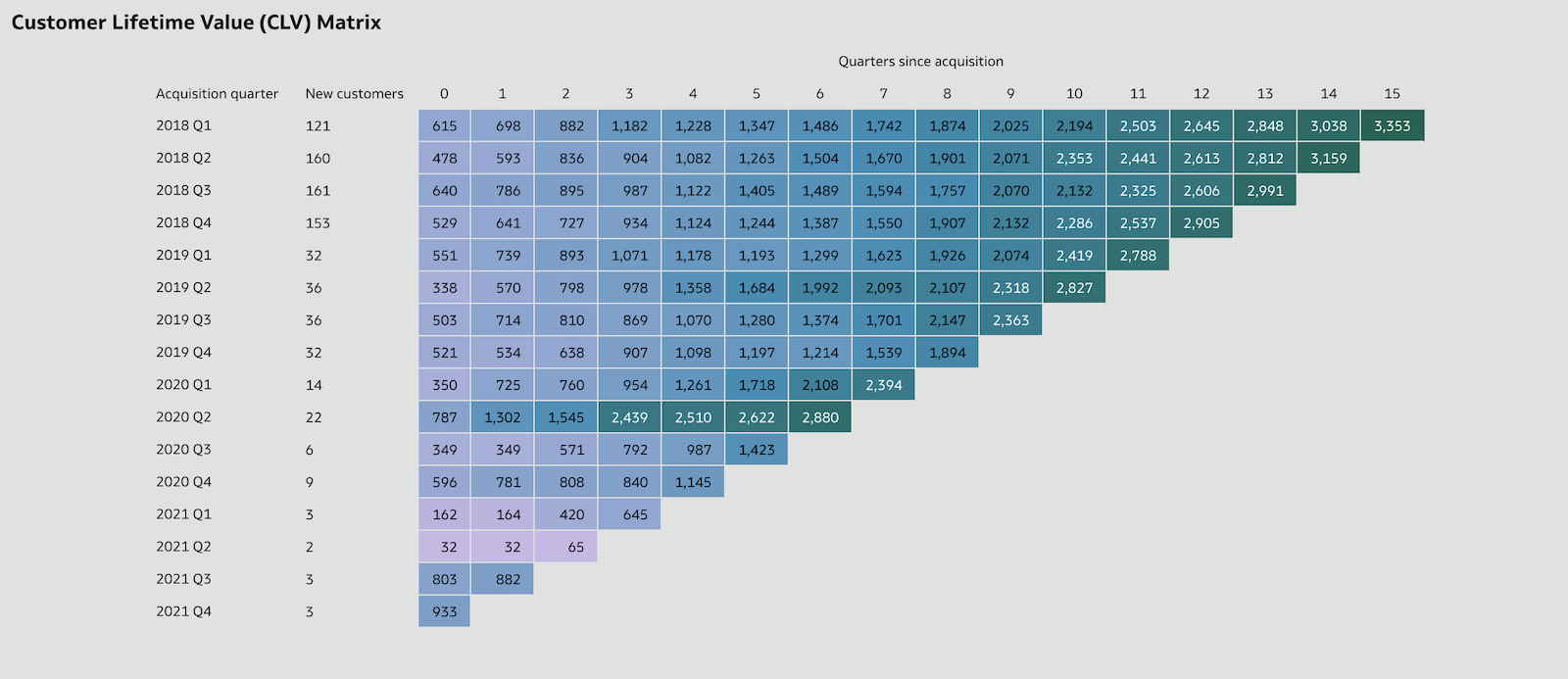
Workout Wednesday is a weekly challenge aimed at enhancing skills in Tableau and Power BI through re-creating data-driven visualisations. Every Wednesday, a new challenge is released, encouraging participants to replicate the given visualisation as accurately as possible, fostering personal development in data visualisation techniques.
I decided to tackle these challenges in my free time using the tool I'm familiar with. I'll address them in no particular order and showcase that Oracle Analytics can be just as powerful and impressive!
The Challenge
The goal is to create a Customer Lifetime Value (CLV) Matrix, a tool used by marketers to segment customers according to their value and loyalty to the business. This helps optimise the allocation of resources and efforts. Specifically, valuable insights emerge when analysing the matrix vertically, as it reveals whether your initiatives are successful by showing that customers of the same relative age are increasing their spending.
The following requirements must be satisfied:
Categorise customers by their acquisition quarter (first quarter of purchase)
Calculate the Customer Lifetime Value (defined as the total sales divided by the number of new customers) for number of quarters since acquisition
Create a matrix with acquisition quarter on the rows, quarters since acquisition on the columns, and the CLV measure as the values
Conditionally format the column background using the Color Brewer Purple/Blue/Green palette
(Optional) Fill in the gaps in the matrix
Initial Solution
I uploaded the Superstore dataset to Oracle Analytics, opened it in a new workbook, and started defining the required calculations.
I used the Min function on the Order Date column to get the acquisition date of each customer, and then concatenated the extracted year and quarter bits in the Acquisition Quarter column (changing the acquisition date format to YYYY Q directly in a Pivot visualisation didn't work as expected):
CAST(YEAR(MIN(Order Date BY Customer ID)) as CHAR(4)) || ' Q' || CAST(QUARTER_OF_YEAR(MIN(Order Date BY Customer ID)) as CHAR(1))
I used the TimestampDiff function to get the number of quarters between the acquisition date and order date for each customer order:
TIMESTAMPDIFF(SQL_TSI_QUARTER, MIN(Order Date BY Customer ID), Order Date)
Then I used the CountDistinct function to get the number of new customers for each acquisition quarter:
COUNT(DISTINCT Customer ID BY (CAST(YEAR(MIN(Order Date BY Customer ID)) as CHAR(4)) || ' Q' || CAST(QUARTER_OF_YEAR(MIN(Order Date BY Customer ID)) as CHAR(1))))
Finally, I calculated the customer lifetime value (CLV) as the total sales divided by the number of new customers for each acquisition quarter:
RSUM(Sales BY (CAST(YEAR(MIN(Order Date BY Customer ID)) as CHAR(4)) || ' Q' || CAST(QUARTER_OF_YEAR(MIN(Order Date BY Customer ID)) as CHAR(1)))) / (COUNT(DISTINCT Customer ID BY (CAST(YEAR(MIN(Order Date BY Customer ID)) as CHAR(4)) || ' Q' || CAST(QUARTER_OF_YEAR(MIN(Order Date BY Customer ID)) as CHAR(1)))))
I was ready to create the CLV matrix using a Pivot visualisation, but I noticed that Oracle Analytics wasn't aggregating values correctly. The numbers appeared significantly larger than expected (Figure 1).
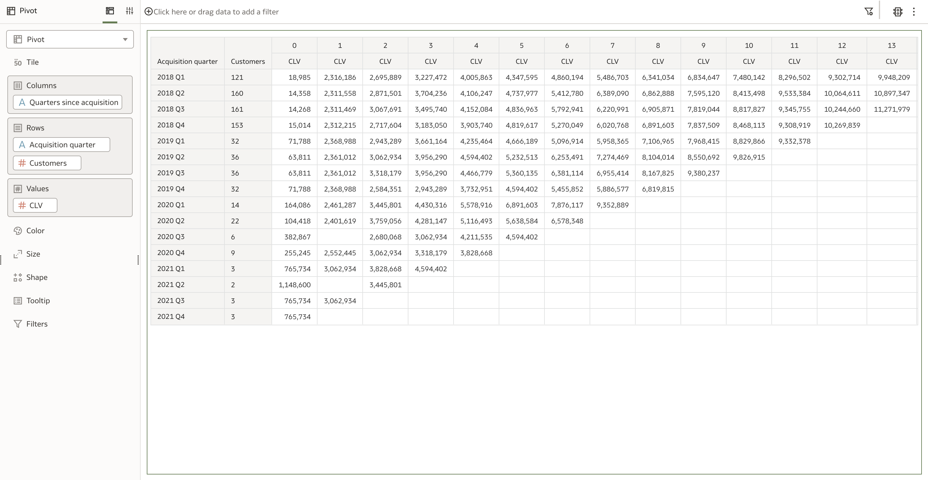 Figure 1. CLV values appear significantly larger than expected
The solution was straightforward: I changed the Aggregate By property to use the Row ID column instead of the default Auto value (Figure 2).
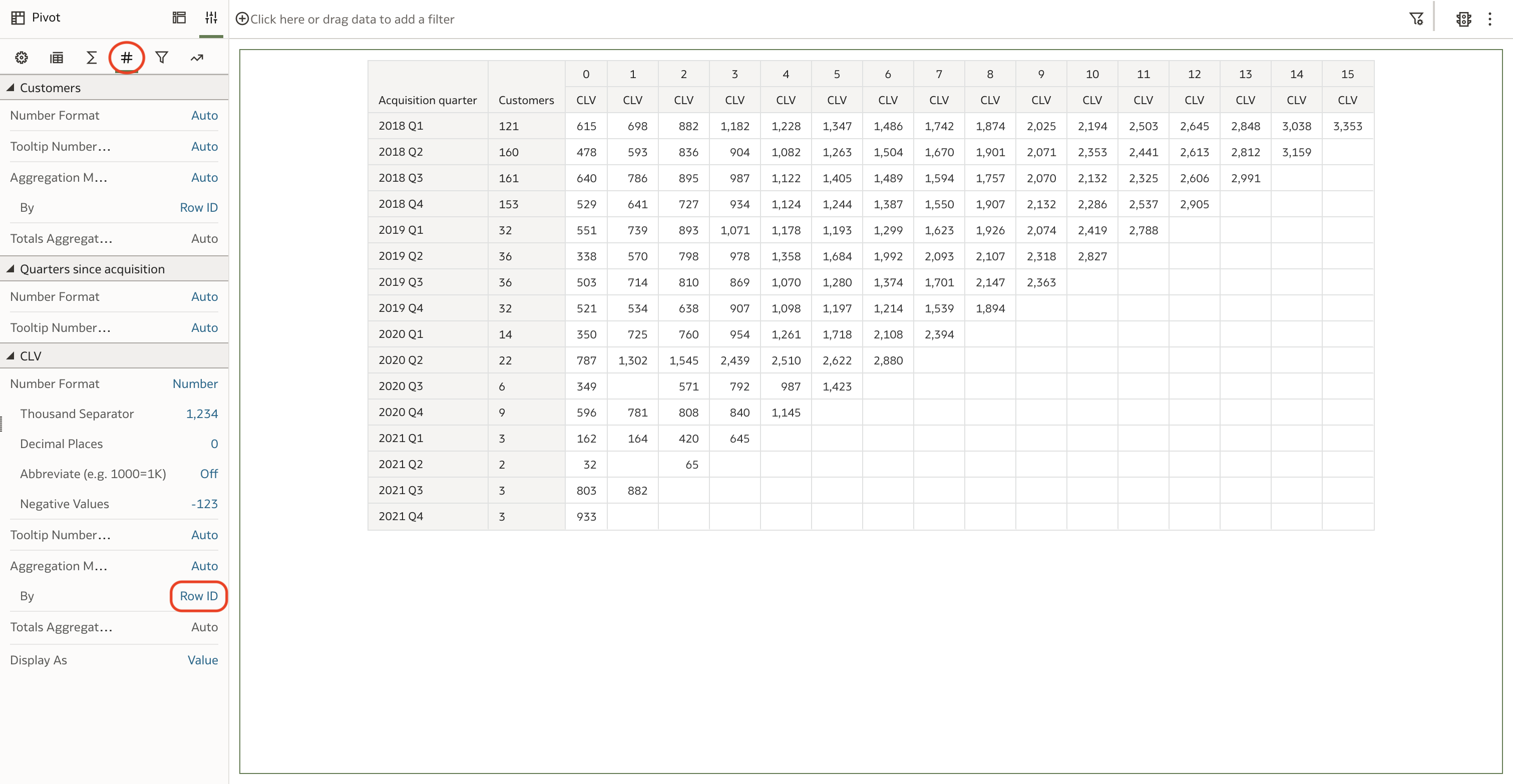 Figure 2. CLV values are correct after updating the Aggregate By property
This initial solution provides the correct figures, but you might have noticed a couple of gaps in the matrix. Additionally, the required calculations are somewhat complex and difficult to maintain.
Revised Solution
To fill in the gaps in the matrix, I created an ad hoc CSV file with a few dummy sales orders and uploaded it into Oracle Analytics:
Acquisition quarter,Quarters since acquisition,Order Date,Sales
2020 Q3,1,2020-10-01,0
2021 Q2,1,2021-07-01,0
I used a data flow to merge the new data with the original dataset and pre-calculate the Acquisition quarter and Quarters since acquisition columns. This allowed me to reduce the number of calculations in the workbook to just one—CLV—which can now be rewritten in a more concise and clear manner, also eliminating the need to overwrite the Aggregate By property in the pivot table:
RSUM(Sales BY Acquisition quarter) / COUNT(DISTINCT Customer ID BY Acquisition quarter)
I updated the Pivot visualisation accordingly. The CLV matrix no longer presented any gaps, and all the values appeared to be correct (Figure 3).
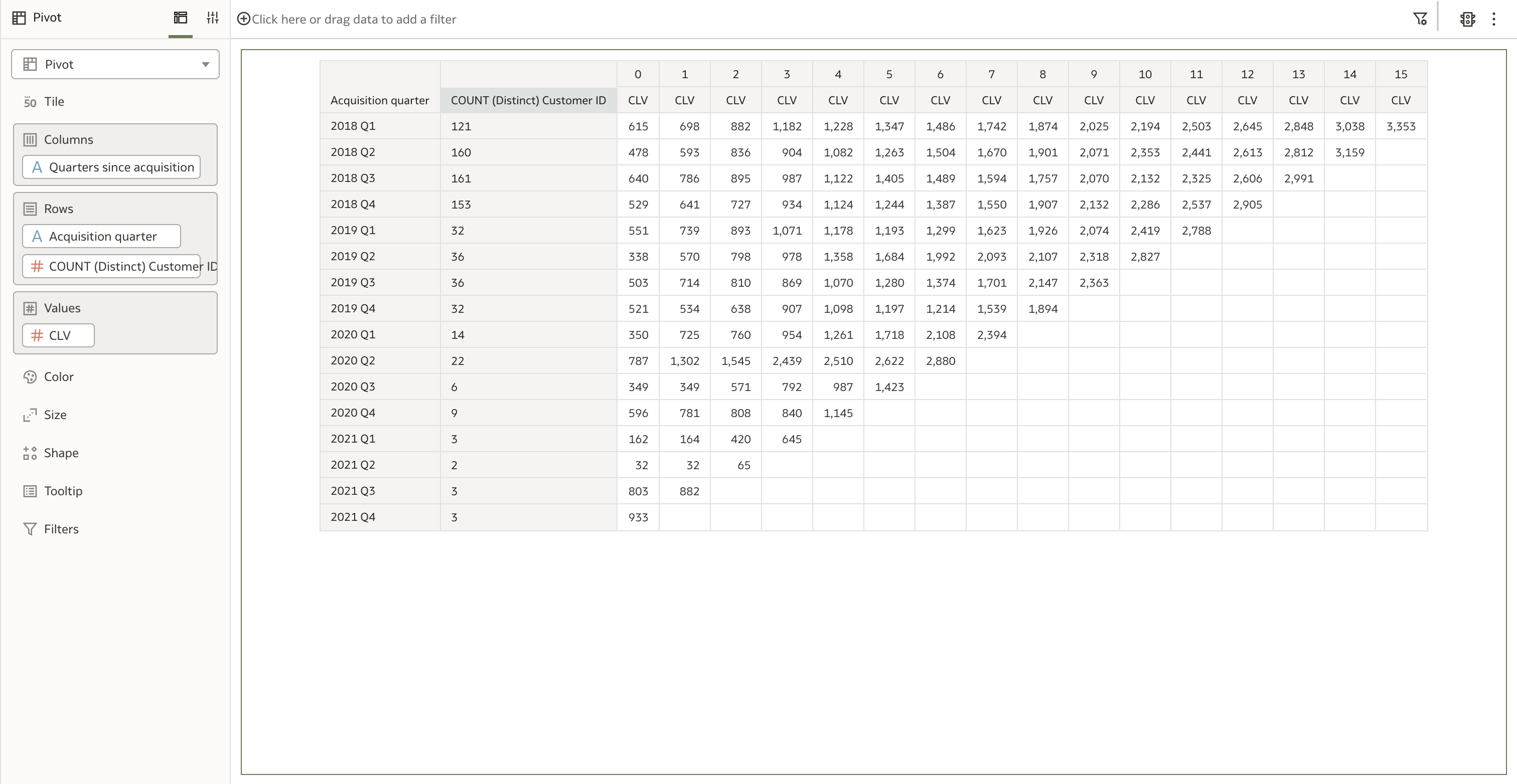 Figure 3. The Pivot visualisation based on the revised dataset
To format the column background using the Color Brewer Purple/Blue/Green palette, I added the CLV column also to the Color drop target and defined a custom three-color gradient using the following hexadecimal colors: #c7b8e7 (purple), #2c8db5 (blue) and #016351 (green) (Figure 4).
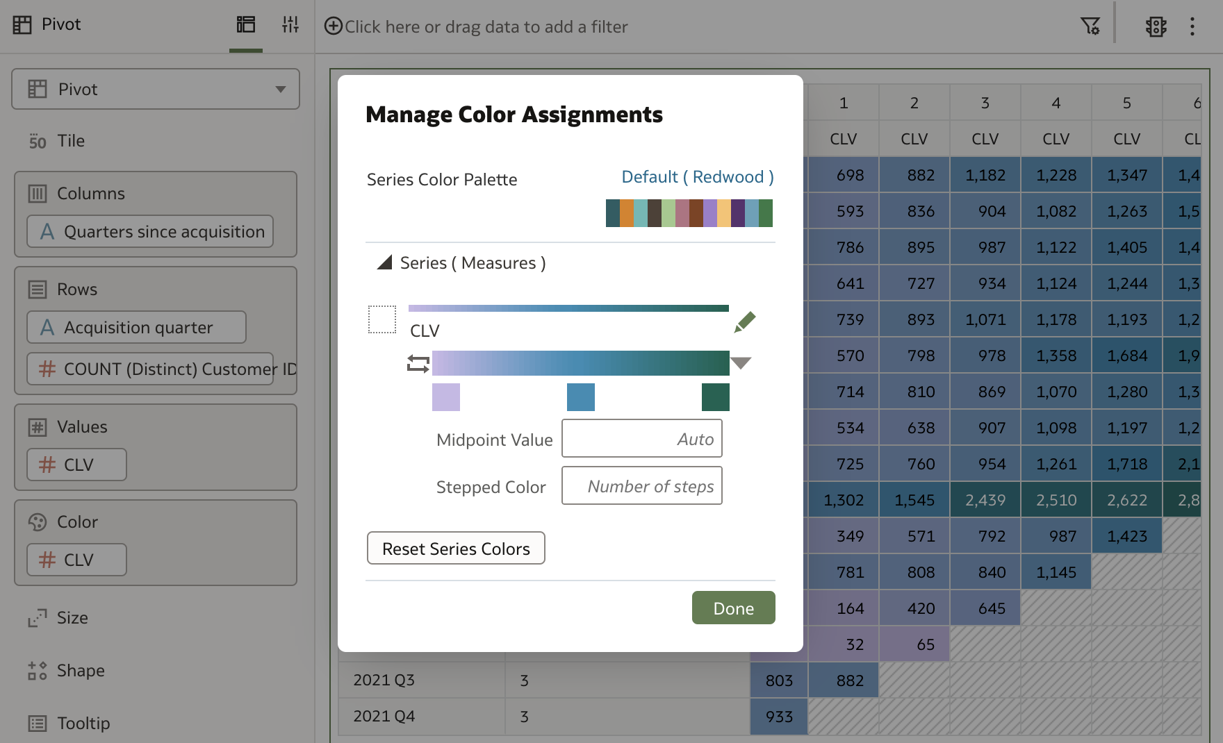 Figure 4. Formatting the colum background using the Color Brewer Purple/Blue/Green palette
To hide all the blank cells in the matrix, I had to be a bit more creative. Since Oracle Analytics does not allow me to change the default border color in workbooks, I applied a conditional formatting rule to change the background color of the blank cells to match the default border color #e0e1e1 (Figure 5).
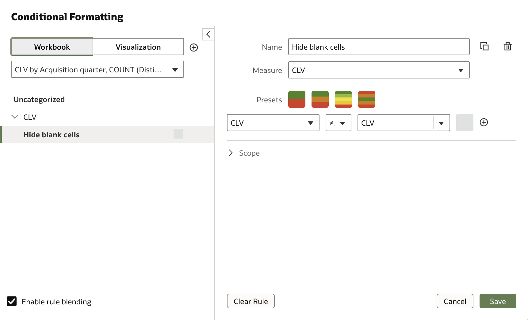 Figure 5. Using conditional formatting to hide all the blank cells in the matrix
A couple of property adjustments, and the CLV matrix was completed (Figure 6).
 Figure 6. The final CLV matrix
The solution file (including data) in DVA format is available for download.
Conclusion
With this article, I demonstrated that Oracle Analytics can effectively be used to create a Customer Lifetime Value (CLV) Matrix.
While achieving the desired solution was not difficult, the challenge also highlighted that some key capabilities are still missing in Oracle Analytics (which I hope will be implemented soon):
The ability to merge different result sets in a visualisation using set operations, as in Classic Analytics. This could eliminate the need for manually building dummy datasets and use data flows to fill in the gaps in the matrix.
The ability to change the default cell border color in workbooks. This would eliminate the need for creative workarounds to hide blank cells in tables.
The ability to set the same width for all columns in a table to improve readibility.
If you are looking into Oracle Analytics and want to find out more, please feel free to get in touch or DM me on X @barretbse.
Subscribe to my newsletter
Read articles from Federico Venturin directly inside your inbox. Subscribe to the newsletter, and don't miss out.
Written by

Federico Venturin
Federico Venturin
Federico Venturin is an Oracle ACE Associate and a seasoned Oracle Analytics enthusiast with over 14 years of experience. He has been speaking at major Oracle conferences (OUG Ireland, UKOUG, RMOUG, ODTUG Kscope), sharing insights and best practices. He maintains a technical blog with regular articles about Oracle Analytics, and actively contributes to Oracle community forums, providing solutions and guidance. Outside of work, Federico likes to play videogames, travel all around the world and taste local food.