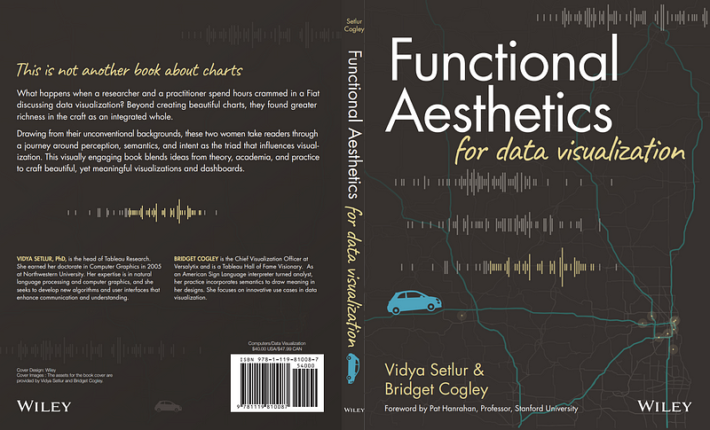
Functional Aesthetics for Data Visualization
 Nicole Mark
Bridget Cogley & Vidya Setlur, Wiley (2022)
It is January here in Tampa, Florida, and–in January in Tampa, anyway– it could be 🥶45 degrees🥶 or it could be 🔥85 degrees🔥on any given day. It has been both this year. 2022 was the warmest on record and this upcoming second weekend of 2023 will be remarkably cold for us.
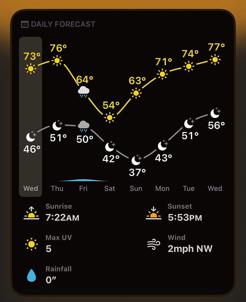
Each morning, I open up a weather app which displays a 📈line chart showing the expected temperature over the course of the day and a 📊bar chart showing the percentage chance of rain. I do not do this because I love charts (though I do 💖love 💖charts). I do this in order to determine the appropriate 👖clothing to wear. My intent is to dress comfortably in an unpredictable climate, and consulting the weather app is the most efficient and reliable way of fulfilling that intent (or meeting my goal, if you prefer). I’ve done this nearly daily for years, along with countless other people around the world. Data visualization and meteorology have gone together like peanut butter and jelly for my entire life. The medium has just changed. I used to see weather charts on television exclusively, now I have a plethora of choices of where to view them.

Screenshot from Mercury Weather.
Just a few years ago, certain charts were only of particular interest to people like me, a data visualization practitioner and co-author of a manuscript titled Developing Sustainable Workflows for Community Pharmacy-Based SARS-CoV-2 Testing (Journal of the American Pharmacists Association, January 2022. Shut up, it’s riveting!) Now, those same charts are of interest to the general public, too. My intent might be to find out the proportion of Omicron sublineage XBB.1.5 cases in the U.S. relative to other Omicron subvariants. A non-data-practitioner might go to another page on the same CDC website with the goal of ascertaining the community levels of COVID-19 in their county. What we, the users of CDC data visualizations, have in common is the desire to know more about COVID-19 activity, not our interest in charts. And neither of us much cares what the chart creator’s process was, or what they wanted us to take away from their visualizations. Yet many data visualization books are written as though we do care about those things.
Show me a process-focused data visualization book without extraordinary emphasis on the visualization creator’s goals for their work and I’ll give you $100 (when I am employed again). When I say “process-focused” I mean how-to manuals and other texts intended for, and marketed to, chart creators. (For the purposes of this piece, going forward I will call those people “data visualization practitioners” or “practitioners”.) This emphasis on the practitioner’s goals is not wrong and doesn’t mean that the user, viewer, or audience (henceforth called “user” in this piece) is excluded. They’re very much top of mind–as a consumer of what the practitioner wants to serve up, in terms of both graphs and insights. Considerations about the user’s 🎯goals with respect to interaction with data visualizations are mostly limited to cases where the user is a business person consuming a business data visualization, or “dashboard” (a term I very much despise for its connotations of boring boxes of more boxes of charts and filters and more filters 🥱).
Business stakeholders occupy little space in Bridget Cogley and Vidya Setlur’s new book Functional Aesthetics for Data Visualization, except as users of visualizations like any other user–a reader of The New York Times, an Instagram doomscroller, a healthcare clinician, a child viewing their first pie chart in math class. We now live in a world where we all look at charts and graphs for a variety of reasons. Functional Aesthetics is very much a book for chart creators, professional “chart-looker-atters” (hat tip to Steve Wexler for that excellent job title), and everyone else who is curious about how charts work, and what considerations should be weighed when they’re created.
At its core, the book is a conversation between data visualization researcher and practitioner, academic and developer. Let me save some of you some time. 🚫 You’re not getting any freebies from Bridget Cogley and Vidya Setlur. No new “best” practices, no “nevers” or “always”, no five easy steps to the perfect dashboard. This book makes no assumptions about your profession, your industry, or your opinion about pie charts. In fact, the only assumption it makes is that you’re a human who can read or be read to.
For those of us who are practitioners, Functional Aesthetics challenges us to not only follow the conversation contained within, but to continue it. It subtly nudges us to engage in a conversation with and among ourselves as creators of data visualizations, about our established processes, our assumptions, and our workflows. It took me a long time to read, not because of the length (about 300 pages, with lots of pictures!) or even because of the ongoing Adderall shortage. It was that each section left me wanting time to integrate and experiment with some of the ideas in my own visualizations and to re-examine my long-held notions of the “right” ways to approach dataviz and where I got those notions in the first place.
The material presented, particularly in later chapters, is complex, but the method and order of presentation makes it easily consumable. Terms appear that I’ve never heard applied to data visualization, like semantics, register, and intent. (The authors are referring to the branch of the field of lingustics called semantics here, not semantic data or the semantic layer of the modern data stack.) These semantics refer to the meaning expressed by the visualization itself. I am getting a little ahead of myself, though.
Since it is, in fact, a book about visual communication, it’s unsurprising that there are visual cues in the book. What’s remarkable is the effectiveness of the choices of subtle visual cues. They gently guide you through the material, making sure you’re following the conversation. The bottom of each page is bordered with one of four colors each mapped to one of the four parts of the text–Perception, Semantics, Intent, and Putting It All Together. Next to each important concept, there’s a simple, effective graphic: a rounded rectangle with some explanatory text and an accompanying triangle with the word “research” at one point, and “practice” and “theory” at the other two points, respectively. There is a circle inside the triangle, placed to orient the reader to where the concept is currently situated in the landscape of the field of data visualization. On the topic of chart selection, for instance, the circle is quite close to practice with a little lean toward research. If you’re a practitioner, you can likely guess what the research part is–the Gestalt Prin–NO! The Gestalt Principles are mentioned, of course, or else we’d have to eject Bridget from the Tableau Visionary Hall of Fame. The research they’re referring to in my example is related to the Gestalt Principles, except it’s a more recent refinement and expansion of research into human perception and cognition from Cleveland and McGill. Oh, you’ve never heard of them? I hadn’t either. We’re still being taught the Gestalt Principles, many times without the context of newer research. Did I mention the Gestalt Principles were developed in 1912? 🕰️Time for some new thinking, eh?
Functional Aesthetics is chock full of new thinking and definitely new connections that other books about data visualization have not made, or at least have not made explicit. Likely, this stems from the dance between Bridget Cogley the American Sign Languager interpreter turned data practitioner, and Vidya Setlur, the researcher with a background in natural language processing (NLP). (If you use Tableau, NLP is what’s behind features like Ask Data.) The data visualization canon, if we truly have such a thing in our comparatively young field, already contains many books authored by and geared toward practitioners. Many good books. But this is the first I’ve read that combines theory, research, and practice into its singular vision of data visualization as a medium.
If you’re new to data visualization, I can’t think of a better book to start with. If you’re a long-time practitioner, Functional Aesthetics will freshen your perspective, leaving you excited to approach your next viz with a beginner’s mind (1). Everyone’s needs are considered here, and all are invited to the conversation.
(1) PagingRon Desantis: this Floridian is trying to turn people into Buddhists!!! She probably went toNew College! (I didn’t) We need another lawto codify bigotry, STAT!
Disclaimer*: I know Bridget Cogley personally. Her company,* Versalytix, provides consulting services to my former employer, Cart.com.
Subscribe to my newsletter
Read articles from Nicole Mark directly inside your inbox. Subscribe to the newsletter, and don't miss out.
Written by

Nicole Mark
Nicole Mark
Data visualization engineer learning smart contract development.