Styling Revit UI
 Moustafa Khalil
Required Assemblies
To implement the customizations discussed in this article, ensure you have the following assemblies:
UIFramework.dllThis is already part of Autodesk Revit installationXceed.Wpf.AvalonDock.dllThis is already part of Autodesk Revit installationVisualBasicUtilities.dll(optional)
Introduction
This article is based on my personal experiments and findings, as there is no official documentation supporting these methods. I have found these techniques useful for enhancing the design flow and making the user interface more intuitive and visually appealing. By customizing the view tabs in Autodesk Revit, users can easily identify and manage open views, improving overall efficiency.
Understanding Revit's User Interface
The Revit user interface (UI) is designed using Windows Presentation Foundation (WPF). Styling a WPF control involves changing properties like background color or other style values, which then apply to the connected control. Changing these styles is fun but might come with a risk of instability.
Styling the Revit UI
The main challenge was to find a way to style the tabs or even the entire Revit UI. After exploring the UI structure, I discovered the key to customizing the UI: the ApplicationTheme class in the UIFramework assembly. This class holds most of the themes used by Revit.
ApplicationTheme Properties
The ApplicationTheme class contains numerous properties that control the appearance of various UI elements. Here are a few relevant properties for styling view tabs:
CanvasActiveTabNormalBackgroundColorCanvasActiveTabHoverBackgroundColorCanvasUnactiveTabNormalBackgroundColorCanvasSelectedTabNormalBackgroundColorCanvasSelectedTabHoverBackgroundColor
While there isn't detailed documentation specifying the purpose of each property, their names and experimentation provide sufficient guidance. I have detailed some of what I could find, we will come to this point later below.
Customizing View Tab Colors
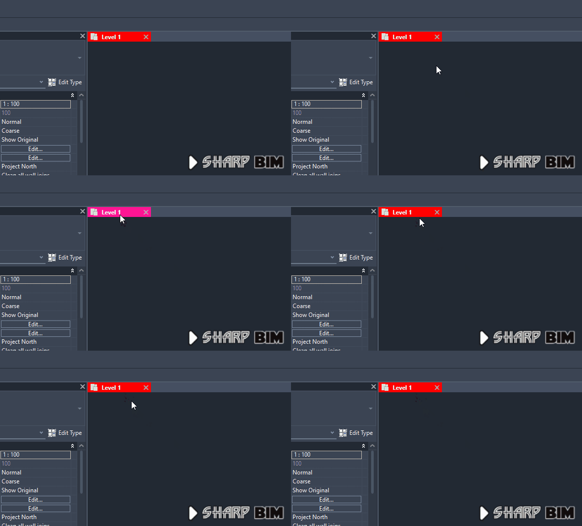
To change the color of the View tabs, you can modify properties like CanvasActiveTabNormalBackgroundColor and CanvasActiveTabHoverBackgroundColor. Below is an example of how to set these colors:
var appTheme = UIFramework.ApplicationTheme.CurrentTheme;
appTheme.CanvasActiveTabNormalBackgroundColor = Colors.DarkRed;
appTheme.CanvasActiveTabHoverBackgroundColor = Colors.DeepPink;
These changes will affect the background color of the active tab and the hover color when the mouse is over the tab.
Handling the Canvas Border
One issue that arises is the border around the canvas, which is linked to the same style as the tab background.
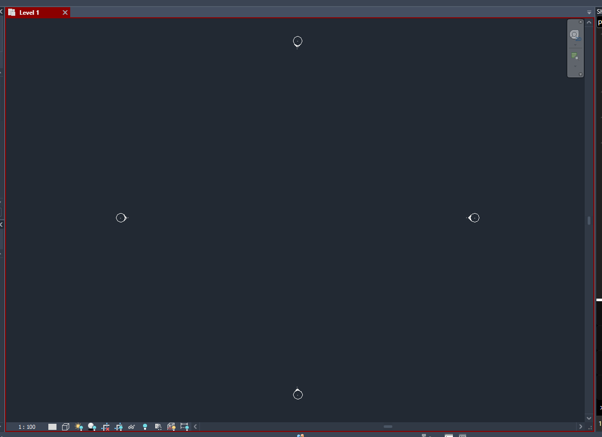
To avoid displaying the border, you can set its thickness to zero. The LayoutDocumentPaneControl class from the Xceed.Wpf.AvalonDock.Controls assembly wraps the canvas and view tab area. Here's how you can set the border thickness to zero:
var docPanes = MainWindow.getMainWnd().FindDescendants<LayoutDocumentPaneControl>();
foreach (var pane in docPanes)
{
    var contents = pane.FindDescendants<Border>();
    foreach (var content in contents)
    {
        if (content.Name == "ContentPanel")
        {
            content.BorderThickness = new Thickness(0);
        }
    }
}
In this code, FindDescendants is a static function from VisualStudioUtilities that helps find child UI components by type. You can also write your own functions to achieve this.
It worth noting, Tab View has a trigger that resets the style to its default color. This means upon switching to another view Tap the colors are rest. we can over come this case by using the ViewActivated and apply the colors again to the default theme.
Customizing Ribbon Tab Colors
If we look through the ApplicationTheme properties we can find Theme for Ribbon called RibbonTheme. Changing the selected tab color is only by finding the right property.
Here is the implementation
appTheme.RibbonTheme.Ribbon.MainTab.SelectedTabHeaderBackground =
                        new SolidColorBrush(Colors.Green);

Resetting to Default
To revert any changes and reset the UI to its original state, you can assign the default theme values stored in the ApplicationTheme class. The following code snippet demonstrates how to reset the theme based on the current theme setting:
PS: don't forget to restore the border thickness to 2 as it was originally designed, using the same method explained above.
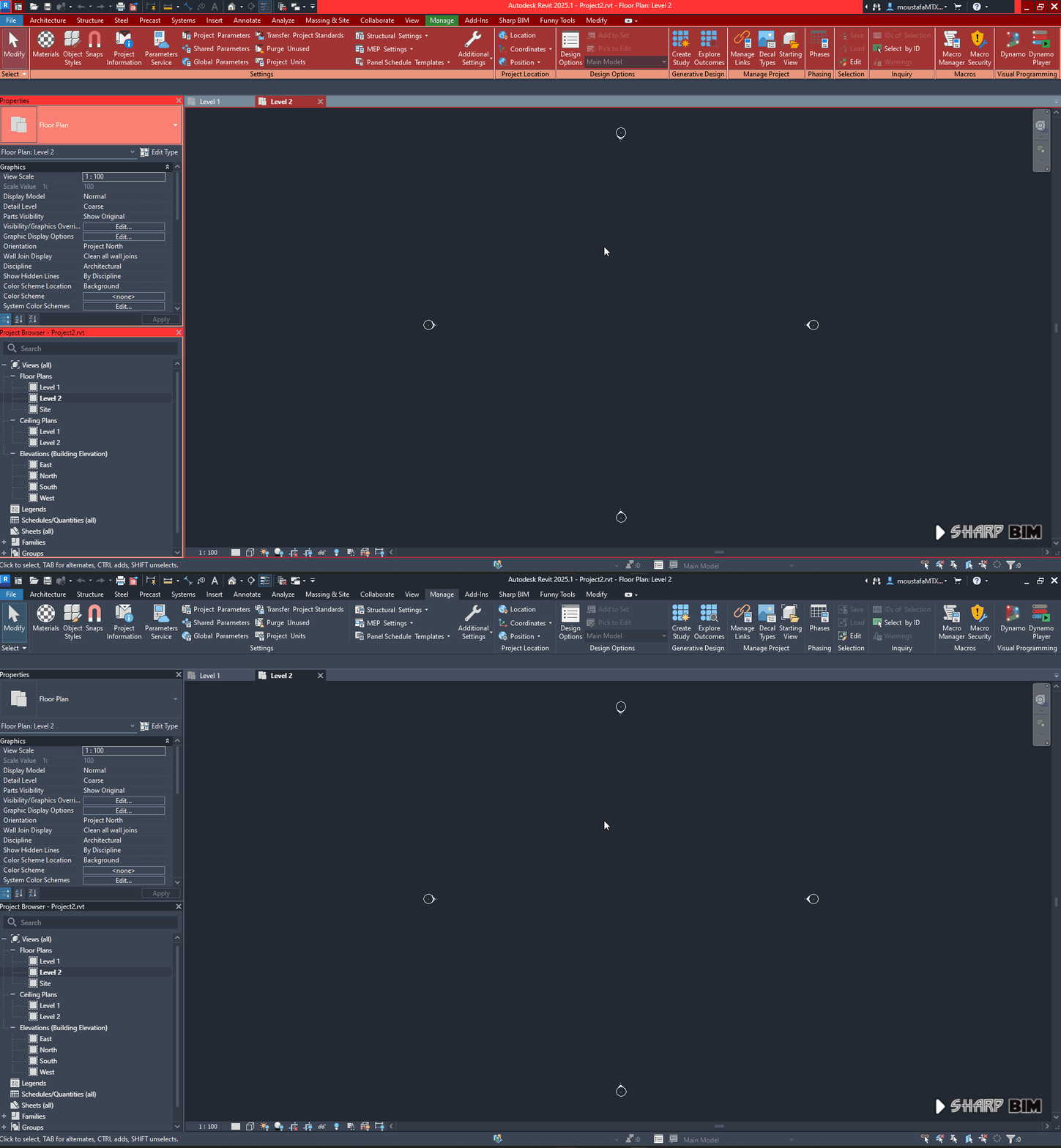
Although such reset will reset some of the customized colors such as the Tab View colors, but has no effect on the Ribbon Tab, possible further investigation is required. Meanwhile, we can store the values of these colors that about to be customized and roll them back upon resetting.
switch (UIThemeManager.CurrentTheme)
{
    case UITheme.Dark:
        Autodesk.Revit.UI.UIThemeManager.CurrentTheme = UITheme.Dark;
        var appTheme = UIFramework.ApplicationTheme.CurrentTheme;

        // Ribbon Section
        appTheme.RibbonTheme.Ribbon.TabBarBackground = StoredSelectedBack.FromHexMedia().ToSolidColorBrush();
        appTheme.RibbonTheme.Ribbon.MainTab.RolloverTabHeaderBackground = StoredTabHover.FromHexMedia().ToSolidColorBrush();
        appTheme.RibbonTheme.Ribbon.MainTab.PanelSeparatorBrush = StoredLightGray.FromHexMedia().ToSolidColorBrush();

        // White
        appTheme.RibbonTheme.Ribbon.MainTab.RolloverTabHeaderForeground =
        appTheme.RibbonTheme.Ribbon.MainTab.PanelTitleForeground =
        Colors.White.ToSolidColorBrush();

        //Default Background
        appTheme.RibbonTheme.Ribbon.MainTab.PanelTitleBackground =
        appTheme.RibbonTheme.Ribbon.MainTab.SelectedTabHeaderBackground =
        appTheme.RibbonTheme.Ribbon.MainTab.PanelBackground =
        appTheme.RibbonTheme.Ribbon.MainTab.PanelContentBackground =
        StoredPanelBack.FromHexMedia().ToSolidColorBrush();

        break;
    case UITheme.Light:
        Autodesk.Revit.UI.UIThemeManager.CurrentTheme = UITheme.Light;
        // restore the same, or may be we create a restore color
        // method shared for both conditions
        break;
    default:
        break;
}
Do not bother much about the extension functions FromHexMedia and ToSolidColorBrush they are just a wrapper to new SolidColorBrush(your preferd color)
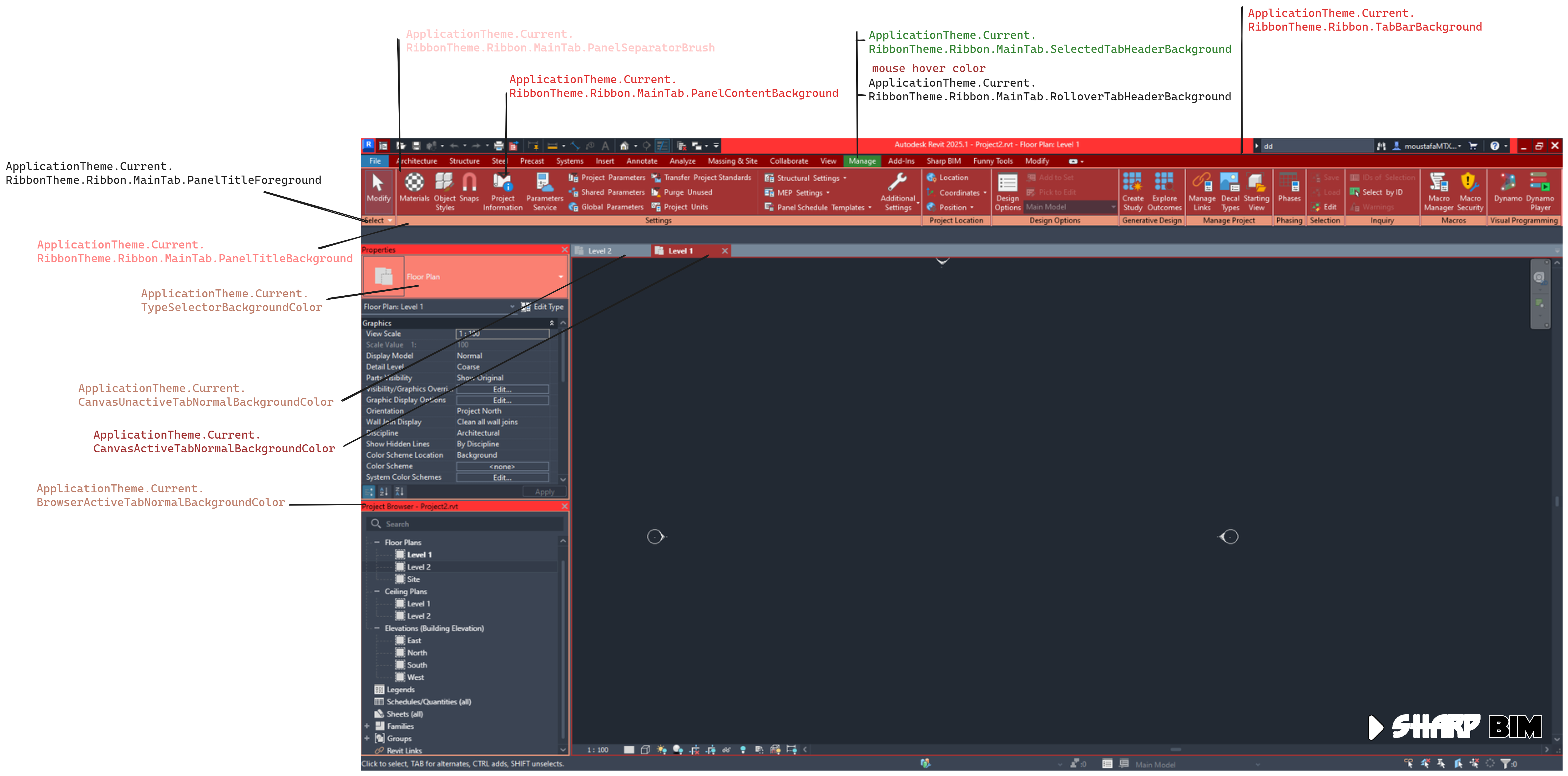
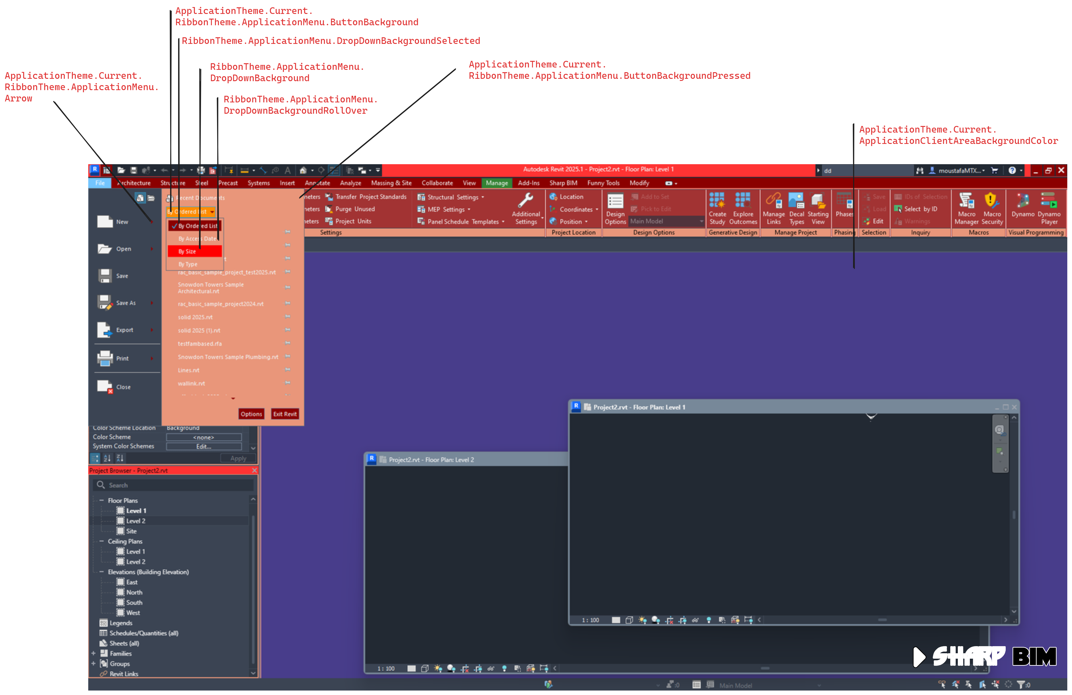
Here is some visual break down
The code below is what colors I used to present the above
var appTheme = UIFramework.ApplicationTheme.CurrentTheme;

// Tab View Styling
appTheme.CanvasActiveTabNormalBackgroundColor = Colors.DarkRed;
appTheme.CanvasUnactiveTabNormalBackgroundColor = Colors.DarkSlateBlue;
appTheme.CanvasActiveTabHoverBackgroundColor = Colors.DeepPink;

// File Menu Panel
appTheme.RibbonTheme.ApplicationMenu.DocumentBackground = Colors.DarkSalmon.ToSolidColorBrush(); // background of recent opened
appTheme.RibbonTheme.ApplicationMenu.DocumentItemBackgroundSelected = Colors.Red.ToSolidColorBrush(); // mouse hover
appTheme.RibbonTheme.ApplicationMenu.MainButtonBackground = Colors.DarkRed.ToSolidColorBrush(); // options and exit buttons

// ordered List
appTheme.RibbonTheme.ApplicationMenu.Arrow = Colors.DarkRed.ToSolidColorBrush();
appTheme.RibbonTheme.ApplicationMenu.ButtonBackground = Colors.DarkRed.ToPastelBrush(); // shown on order list
appTheme.RibbonTheme.ApplicationMenu.ButtonBackgroundPressed= Colors.DarkOrange.ToSolidColorBrush(); // Panel Background
appTheme.RibbonTheme.ApplicationMenu.DropDownBackground = Colors.DarkSalmon.ToSolidColorBrush(); // Panel Background
appTheme.RibbonTheme.ApplicationMenu.DropDownBackgroundSelected = Colors.DarkRed.ToSolidColorBrush(); // Selected condition
appTheme.RibbonTheme.ApplicationMenu.DropDownBackgroundRollOver = Colors.Red.ToSolidColorBrush(); // options and exit buttons

// Main Window
appTheme.BrowserActiveTabNormalBackgroundColor = Colors.DarkSalmon;
appTheme.CanvasActiveTabNormalBackgroundColor = Colors.DarkRed.ToPastelColor();
appTheme.CanvasUnactiveTabNormalBackgroundColor = Colors.LightSlateGray;
appTheme.CheckMarkColor = Colors.Magenta;
appTheme.ChromeBackgroundBrush = Colors.Red.ToPastelBrush();
appTheme.ChromeForegroundBrush = Colors.WhiteSmoke.ToPastelBrush();
appTheme.WindowButtonBackgroundColor = Colors.DarkRed;

// the background of the Drawing Area when there is no docked View
appTheme.ApplicationClientAreaBackgroundColor = Colors.DarkSlateBlue;

// Type Selector
appTheme.RibbonArrowColor = Colors.White;
appTheme.TypeSelectorPressedBackgroundColor = Colors.LightSalmon;
appTheme.TypeSelectorInnerBackgroundColor = Colors.DarkSalmon;
appTheme.TypeSelectorHeadTextColor = Colors.Blue;
appTheme.TypeSelectorBackgroundColor = Colors.Salmon;
appTheme.TypeSelectorHowerBackgroundColor = Colors.LightSalmon;
appTheme.RibbonButtonBackgroundBrushRollover = Colors.DarkRed.ToPastelColor();

//?? not able observe what do they affect
appTheme.RibbonTheme.ApplicationMenu.DocumentGroupBackgroundRollOver = Colors.LightSeaGreen.ToSolidColorBrush(); // shown on orderlist
appTheme.DocumentPaneBackgorundColor = Colors.DarkRed;
appTheme.DropDownItemBackgroundColor = Colors.Magenta;
appTheme.BlueTabHeaderBackgroundColor = Colors.DarkOliveGreen;
appTheme.YellowTabHeaderBackgroundColor = Colors.Magenta;
appTheme.ListHeadTextColor = Colors.Yellow;
appTheme.SearchFilterTextColor = Colors.Blue;

// Ribbon Theme
appTheme.RibbonTheme.Ribbon.MainTab.PanelContentBackground = Colors.DarkRed.ToPastelBrush();
appTheme.RibbonTheme.Ribbon.MainTab.PanelBackground = Colors.LightCoral.ToPastelBrush();
appTheme.RibbonTheme.Ribbon.MainTab.PanelSeparatorBrush = Colors.White.ToPastelBrush();
appTheme.RibbonTheme.Ribbon.MainTab.PanelTitleBackground = Colors.DarkSalmon.ToSolidColorBrush();
appTheme.RibbonTheme.Ribbon.MainTab.PanelTitleForeground = Colors.Black.ToSolidColorBrush();

// I couldn't set this value
// '#FF0000FF' is not a valid value for property 'PanelDialogBoxLauncherBrush'.
//appTheme.RibbonTheme.Ribbon.MainTab.PanelDialogBoxLauncherBrush = Colors.Blue.ToSolidColorBrush();

//?? not able observe what do they affect, I better have my eyes checked :)
appTheme.RibbonTheme.Ribbon.MainTab.PanelBackgroundVerticalLeft = Colors.Blue.ToPastelBrush();
appTheme.RibbonTheme.Ribbon.MainTab.PanelBackgroundVerticalRight = Colors.Blue.ToPastelBrush();
appTheme.RibbonTheme.Ribbon.MainTab.OverflowTabPanelBackground = Colors.Blue.ToSolidColorBrush();
appTheme.RibbonTheme.Ribbon.MainTab.SlideoutPanelSeparatorColor = Colors.Blue.ToSolidColorBrush();

appTheme.RibbonTheme.Ribbon.TabBarBackground = Colors.DarkRed.ToSolidColorBrush();
appTheme.RibbonTheme.Ribbon.MainTab.SelectedTabHeaderBackground = Colors.DarkGreen.ToPastelBrush();
appTheme.RibbonTheme.Ribbon.MainTab.RolloverTabHeaderBackground = Colors.Wheat.ToPastelBrush();
appTheme.RibbonTheme.Ribbon.MainTab.RolloverTabHeaderForeground = Colors.DarkRed.ToPastelBrush();
How can you specify each Project by its own colors
To assign unique colors to each project, you can create a system that involves a few key components. First, set up a dictionary where each document path is a key, and the value is a theme class containing all your color preferences. When a view is activated, determine which document is currently active. Retrieve the corresponding custom theme from the dictionary and apply it using a method designed to update the theme.
To distinguish between tabs for different documents, you can't rely on the ApplicationTheme anymore. Instead, manage the colors through the Tab Control itself. Once you identify the active tab, change its color based on its tooltip. The tooltip should follow this pattern: "{Document Name} - {View Title}". This way, each project can have its own distinct colors, and the correct theme is applied whenever a view is activated, making it easy to differentiate between tabs.
var docPanes = MainWindow.getMainWnd().FindDescendants<LayoutDocumentPaneControl>();
foreach (var pane in docPanes)
{
    var tabs = pane.FindDescendants<TabItem>();
    foreach (var tab in tabs)
    {
        // $"{Document Name} - {View Title}"
        if(tab.ToolTip.ToString()== $"Project2.rvt - Floor Plan: Level 1")
        {
            // do something to this tab color
            tab.Background = Colors.Red.ToSolidColorBrush();
        }

    }
}
However, changing the TabItem Background will disconnect the binding of how Revit styles its tabs. This means you will need to manually update the colors of both active and inactive tabs each time the view changes. By doing so, each project can have its own distinct colors, and the correct theme will be applied whenever a view is activated, making it easy to differentiate between tabs.
Conclusion
Customizing the Revit UI, particularly the view tabs, can greatly enhance user experience by making it easier to manage open views and navigate the interface. By understanding and utilizing the properties within the ApplicationTheme class, users can tailor the Revit environment to better suit their workflow preferences. Experiment with different styles and themes to find what works best for you.
Additionally, since we already have access to Revit UI controls (albeit unofficially), you can change the content of the TabItem to any design shape or even add other controls. This flexibility allows you to create a more personalized and efficient design workflow. By integrating custom controls and designs, you can further enhance the usability and aesthetics of the Revit interface, making your design process smoother and more enjoyable.
One more thing to note is that the demonstrated code above has no effect on the document itself, so there is no need to open or commit transactions. The changes to the UI style are not permanent, meaning that each time you open Revit, you will need to reinitialize your customized values. This ensures that your changes are session-specific and can be easily reset by restarting the application.
Finally, while the application has been quite stable in my various uses, I cannot guarantee it is 100% safe or that Autodesk will continue designing the UI in the same way it is now. This means that in the future, the code we used to style and customize the UI might become invalid, potentially requiring rewrites or adjustments, or it might not work at all. It’s essential to be prepared for these potential changes and stay flexible with your customization approach.
I encourage you to explore the other properties available in the ApplicationTheme class and see how they can reflect on your Revit UI. Enjoy creating your own unique Revit UI style and enhance your design workflow with personalized visual elements!
Subscribe to my newsletter
Read articles from Moustafa Khalil directly inside your inbox. Subscribe to the newsletter, and don't miss out.
Written by

Moustafa Khalil
Moustafa Khalil
I'm Moustafa Khalil El-Sayed, an Egyptian native with a passion for architecture and technology. After completing high school in 1999, I embarked on my journey into architecture, earning my Bachelor's degree in Architecture in 2004. My academic pursuits continued, and I later acquired my Master's degree in Architecture from Wings University. However, my thirst for knowledge extended beyond architectural design, leading me to pursue a degree in Computer Science as well. Driven by a desire to innovate, I began self-teaching computer science, which later empowered me to achieve my Associate degree in Computer Science from the University of the People more easily. Armed with dual expertise in architecture and computer science, I've cultivated a unique skill set that blends creativity with technical acumen. My career has taken me across borders, from Egypt to Oman and the UAE, where I've honed my skills as an architect. As a graduate architect and a proficient .NET BIM Solution Developer, I specialize in translating unique visions into tangible realities. My role extends beyond conventional architectural practices; I leverage technology to streamline processes and enhance project outcomes. My journey into programming began with developing script-based Excel tools to augment project management efforts, notably during the Sharm El Sheikh development. Over time, I expanded my programming prowess to address practical challenges encountered in bridging Revit and AutoCAD within my professional sphere. Several of my applications, born from this evolution, have gained recognition, with some even being featured on the Autodesk website. I am committed to pushing boundaries and continually enriching the intersection of architecture and technology, ensuring that my clients benefit from cutting-edge solutions tailored to their needs.
