Advancing Frontend Skills: Exploring Advanced CSS
 Musthafa N A
Day 6 of my frontend development journey has been an exciting dive into the world of advanced CSS. Today, I explored different CSS values and units, learned how to size items effectively, and worked with images, media, and form elements to create responsive and visually appealing web pages.
Exploring CSS Values and Units
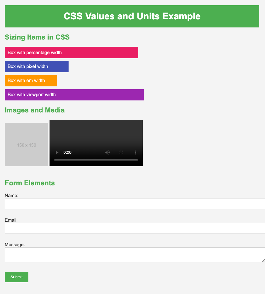
Percentage (%): Utilized for creating fluid layouts. For example, setting the width of a div to 50% allows it to adapt to the parent container's size, making it responsive.

Pixels (px): Used for fixed dimensions where precision is required. For instance, an image set to 300px width maintains its size across different viewports.

em: Applied for scalable typography and spacing. An element with font-size: 2em will have twice the font size of its parent, maintaining relative scaling.

Viewport Units (vw, vh): Employed for responsive designs based on the viewport dimensions. Setting a width of 50vw adjusts the element to 50% of the viewport's width.

Responsive Images and Videos
Responsive Images: Ensured images scale proportionally within their container using
max-width: 100%andheight: auto.
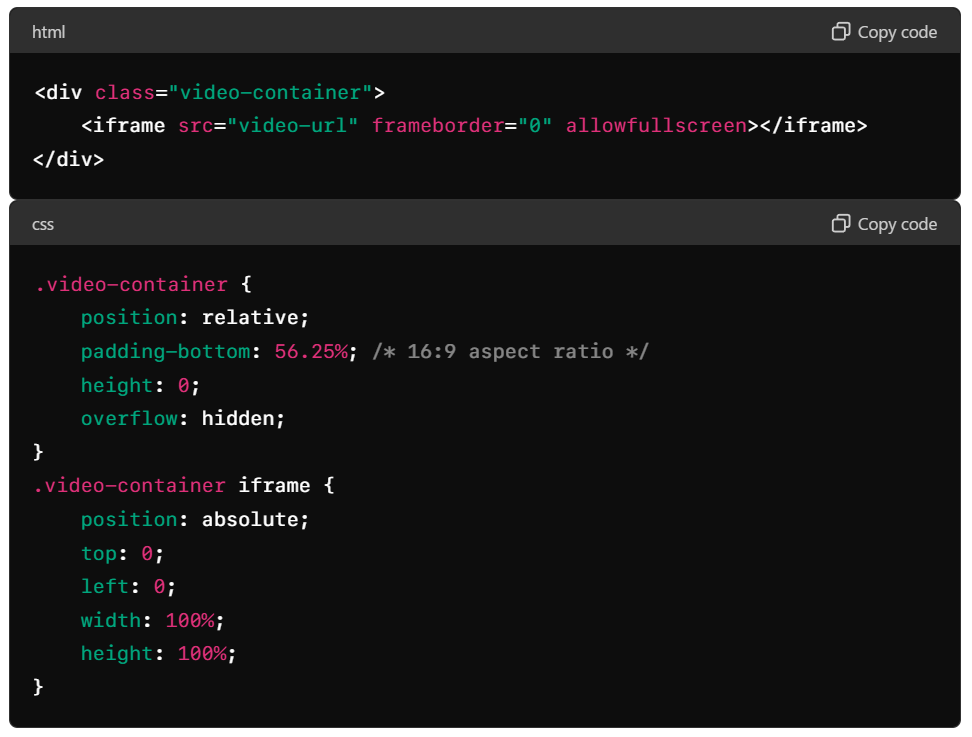
Responsive Videos: Maintained aspect ratios by using a container with a padding-bottom value derived from the desired aspect ratio.

Styled Form Elements
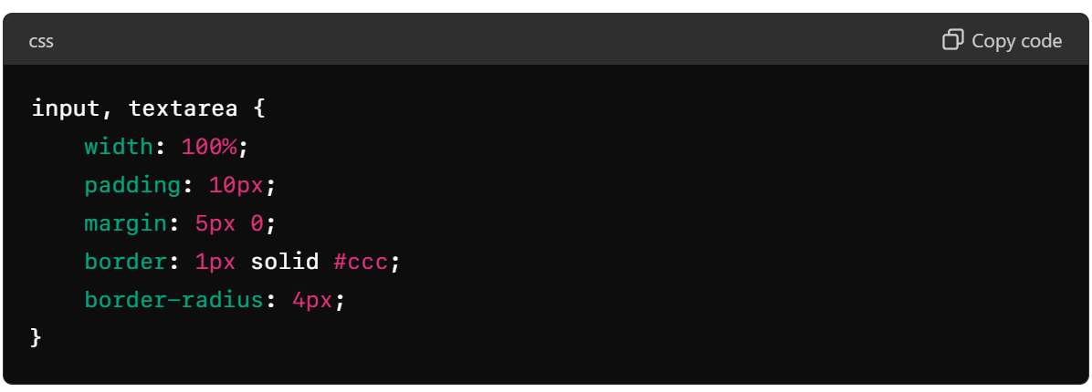
Input and Textarea: Styled for improved user experience with better padding, borders, and responsive widths.

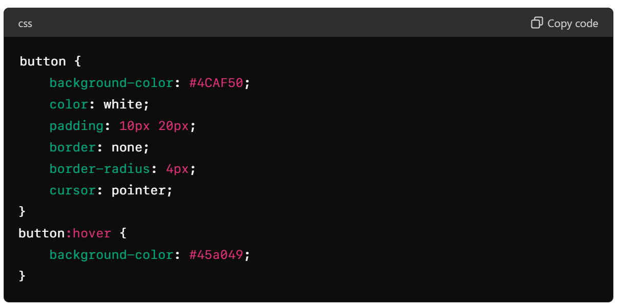
Buttons: Enhanced with background colors, padding, and hover effects for better interaction.

Assignment Project:

Today, I took on the challenge of creating a school application form based on my own concept, integrating the tasks learned during today's session. While I encountered some typical doubts along the way, the process was smooth overall. However, the project demanded significant time and attention to detail to ensure its completion. You can check out the school application form project here.
LinkedIn Update
I've also shared my learning journey on LinkedIn. Feel free to read about my progress and connect with me here: LinkedIn Post
Reflecting on today's journey, I'm amazed at how far I've come in just a few days. Each challenge has been a stepping stone, honing my skills and deepening my understanding of frontend development. As I look forward to the days ahead, I'm eager to continue learning, growing, and pushing the boundaries of what I can achieve in this dynamic field. Stay tuned for more updates as I embark on this exciting journey!
Subscribe to my newsletter
Read articles from Musthafa N A directly inside your inbox. Subscribe to the newsletter, and don't miss out.
Written by

Musthafa N A
Musthafa N A
Dynamic graphic designer with a passion for creativity and problem-solving. Proven track record of managing diverse projects and pushing design boundaries to create resonant digital and print designs. Dedicated to tackling new challenges, I specialize in crafting intuitive, impactful designs that enhance customer experiences. Design is not just my job—it’s my craft and joy.