Let's play with Opacity in CSS
 Jalaj Singhal
Table of contents

CSS Opacity
The CSS opacity property is used to specify the transparency of an element. In simple words, you can say that it specifies the clarity of the image.
In technical terms, Opacity is defined as the degree to which light is allowed to travel through an object.
How to apply CSS opacity setting
The opacity setting is applied uniformly across the entire object and the opacity value is defined in terms of digital value less than 1. The lesser opacity value displays the greater opacity. Opacity is not inherited.
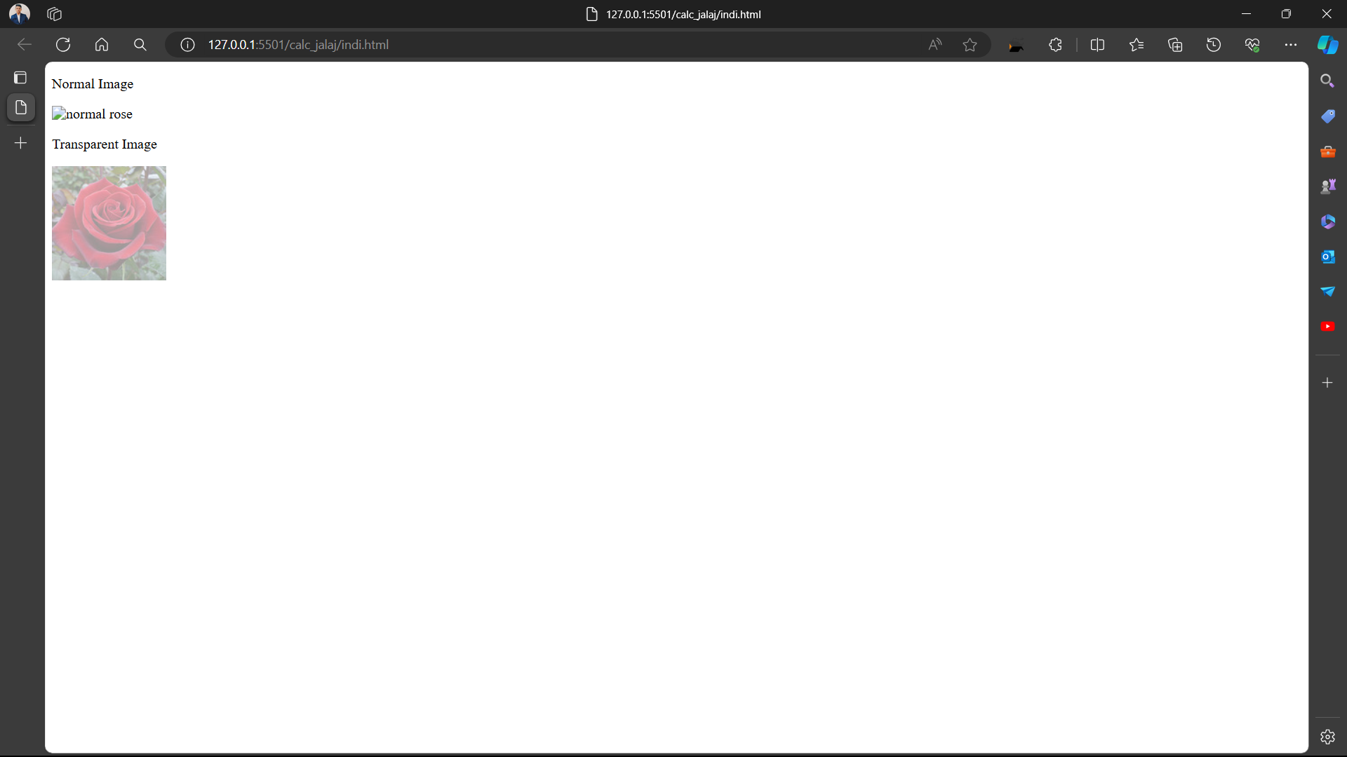
CSS Opacity Example: transparent image
Let's see a simple CSS opacity example of image transparency.
<!DOCTYPE html>
<html>
<head>
<style>
img.trans {
    opacity: 0.4;
    filter: alpha(opacity=40); /* For IE8 and earlier */
}
</style>
</head>
<body>
<p>Normal Image</p>
<img src="https://static.javatpoint.com/csspages/images/rose.jpg" alt="normal rose">
<p>Transparent Image</p>
<img class="trans" src="https://static.javatpoint.com/csspages/images/rose.jpg" alt="transparent rose">
</body>
</html>
<!DOCTYPE html>
<html>
<head>
    <title>Opacity property</title>
    <style>
        .forest {
            opacity: 0.5;
            height: 200px;
            width: 200px;
        }
        .forest1 {
            height: 200px;
            width: 200px;
        }
        p {
            font-size: 25px;
            font-weight: bold;
            margin-bottom: 5px;
        }
        .opacity {
            text-align: center;
        }
    </style>
</head>

<body>
    <div class="opacity">
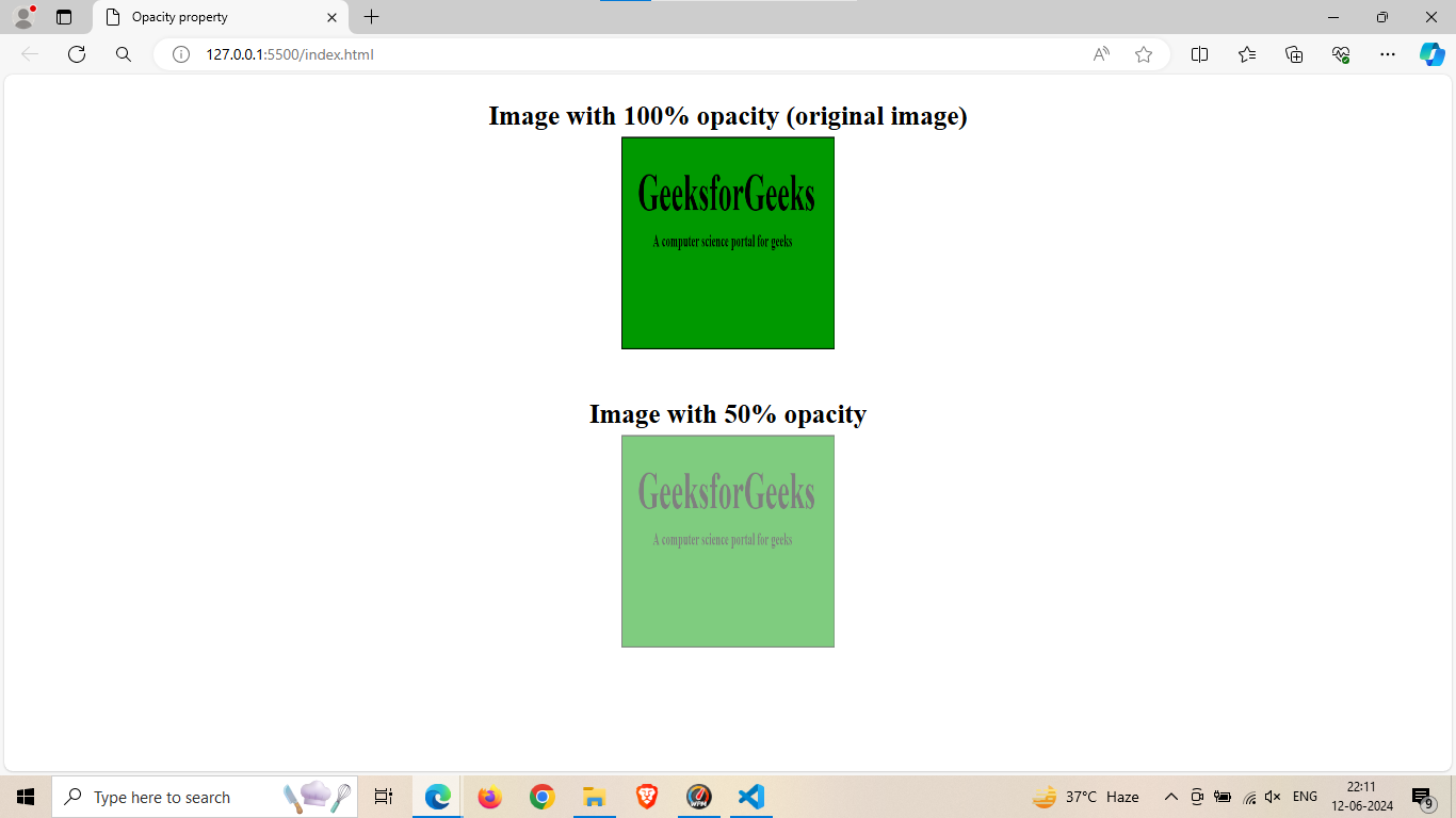
        <p>Image with 100% opacity (original image)</p>
        <img src="https://media.geeksforgeeks.org/wp-content/uploads/geeksforgeeks-10.png" class="forest1">
        <br>
        <br>
        <p>Image with 50% opacity</p>
        <img src="https://media.geeksforgeeks.org/wp-content/uploads/geeksforgeeks-10.png" class="forest">
    </div>
</body>
</html>
OUTPUT:
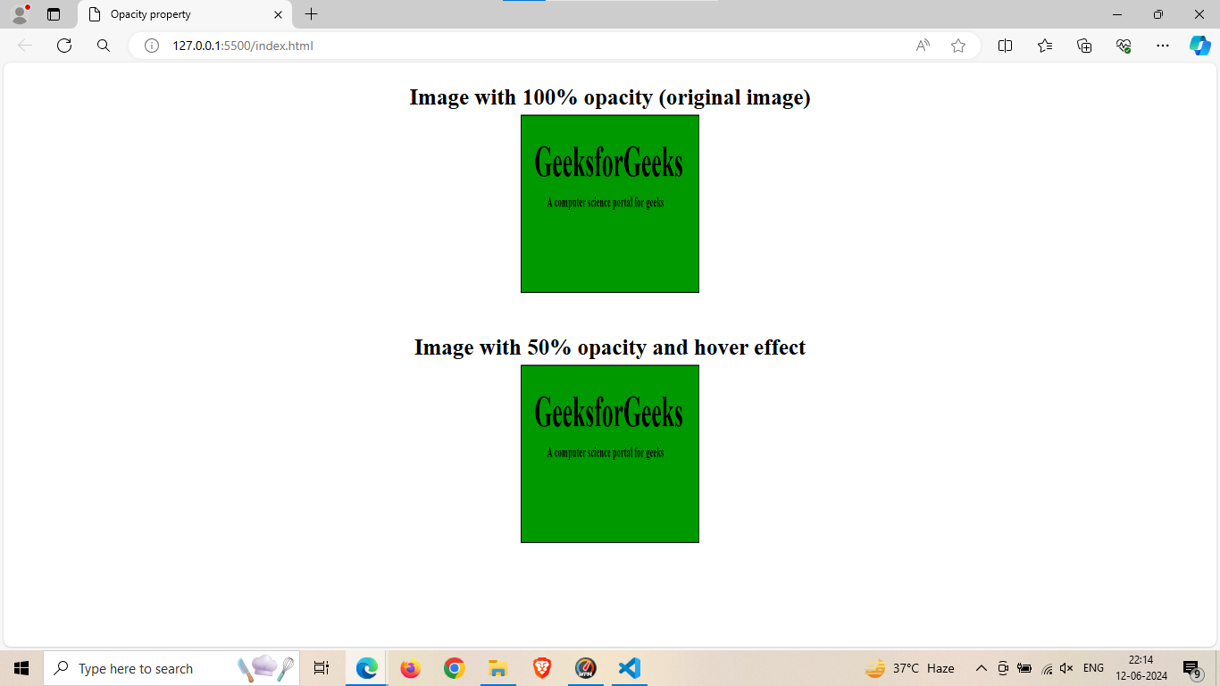
Lets see hover effect with different opacity
<!DOCTYPE html>
<html>
<head>
    <title>Opacity property</title>
    <style>
        .forest {
            opacity: 0.5;
            height: 200px;
            width: 200px;
        }
        .forest:hover{
          opacity: 1;
        }
        .forest1 {
            height: 200px;
            width: 200px;
        }
        p {
            font-size: 25px;
            font-weight: bold;
            margin-bottom: 5px;
        }
        .opacity {
            text-align: center;
        }
    </style>
</head>

<body>
    <div class="opacity">
        <p>Image with 100% opacity (original image)</p>
        <img src="https://media.geeksforgeeks.org/wp-content/uploads/geeksforgeeks-10.png" class="forest1">
        <br>
        <br>
        <p>Image with 50% opacity and hover effect</p>
        <img src="https://media.geeksforgeeks.org/wp-content/uploads/geeksforgeeks-10.png" class="forest">
    </div>
</body>
</html>
OUTPUT:
BEFORE:

AFTER:
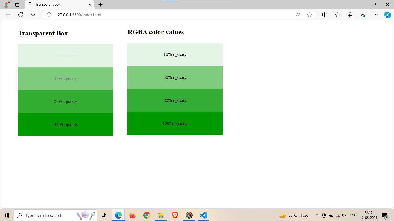
Lets see some more work:
<!DOCTYPE html>
<html>

<head>
    <title>Transparent box</title>
    <style>
        .blogs {
            background: rgb(0, 153, 0);
            padding: 15px;
            text-align: center;
            width: 300px;
        }
        #blog {
            padding: 15px;
            text-align: center;
            width: 300px;
        }
        .rgba1 {
            background: rgba(0, 153, 0, 0.1);
        }
        .rgba2 {
            background: rgba(0, 153, 0, 0.5);
        }
        .rgba3 {
            background: rgba(0, 153, 0, 0.8);
        }
        .rgba4 {
            background: rgba(0, 153, 0, 1.0);
        }
        .g1 {
            float: left;
            margin-left: 50px;
        }
        .g2 {
            margin-top: -40px;
            margin-left: 50px;
            float: left;
        }
    </style>
</head>

<body>
    <div class="g1">
        <p style="font-size:24px;font-weight:bold;">
            Transparent Box
        </p>
        <div class="blogs" style="opacity:0.1;">
            <p>10% opacity</p>
        </div>
        <div class="blogs" style="opacity:0.5;">
            <p>50% opacity</p>
        </div>
        <div class="blogs" style="opacity:0.8;">
            <p>80% opacity</p>
        </div>
        <div class="blogs">
            <p>100% opacity</p>
        </div>
    </div>
    <br>
    <br>
    <div class="g2">
        <p style="font-size:24px;font-weight:bold;">
            RGBA color values
        </p>
        <div class="rgba1" id="blog">
            <p>10% opacity</p>
        </div>
        <div class="rgba2" id="blog">
            <p>50% opacity</p>
        </div>
        <div class="rgba3" id="blog">
            <p>80% opacity</p>
        </div>
        <div class="rgba4" id="blog">
            <p>100% opacity</p>
        </div>
    </div>
</body>
</html>
OUTPUT:
Subscribe to my newsletter
Read articles from Jalaj Singhal directly inside your inbox. Subscribe to the newsletter, and don't miss out.
Written by

Jalaj Singhal
Jalaj Singhal
👋 Greetings, Jalaj Singhal here! 🚀 I'm an enthusiastic blogger who enjoys delving into the world of technology and imparting my knowledge to the community. 📃 Having experience in HTML and CSS, I enjoy creating interesting and educational content that demystifies difficult ideas and gives readers the tools they need to advance their knowledge. 🌐 I try to contribute to the active tech community and encourage relevant discussions on Hash Node, where you can find my writings on the subject of web development. 💡 Together, let's connect and go out on this fascinating path of invention and learning!