Craft a Captivating Newsletter Signup Section (with Code!)
 Shamso Osman
A Killer CTA Section You Can Build Yourself!
PROJECT
Ever wanted to bring a stunning Figma design to life with code? That was the challenge I recently took on: building a responsive newsletter signup section inspired by a beautiful Figma design on Techstarta.
The project has a Figma Design serving as our inspiration.
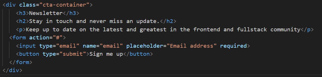
First things first, let's talk structure. I used basic HTML elements like headings, paragraphs, and a form to create the core layout. Think of it like building the skeleton of your CTA section.
Next, came the fun part - styling! With the power of CSS, I transformed that basic layout into a visually appealing section. that mirrored the design elements from the Figma design.
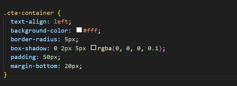
Let’s break it down. We're defining a style for a container, which acts like a box on your webpage. This box will hold the content of your call to action.
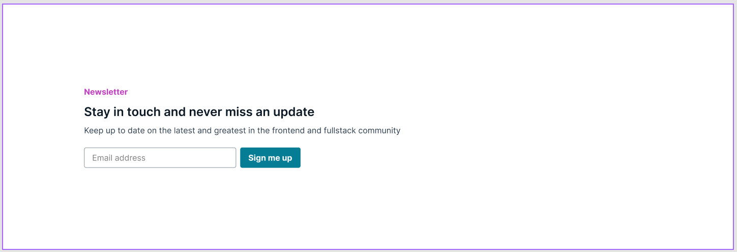
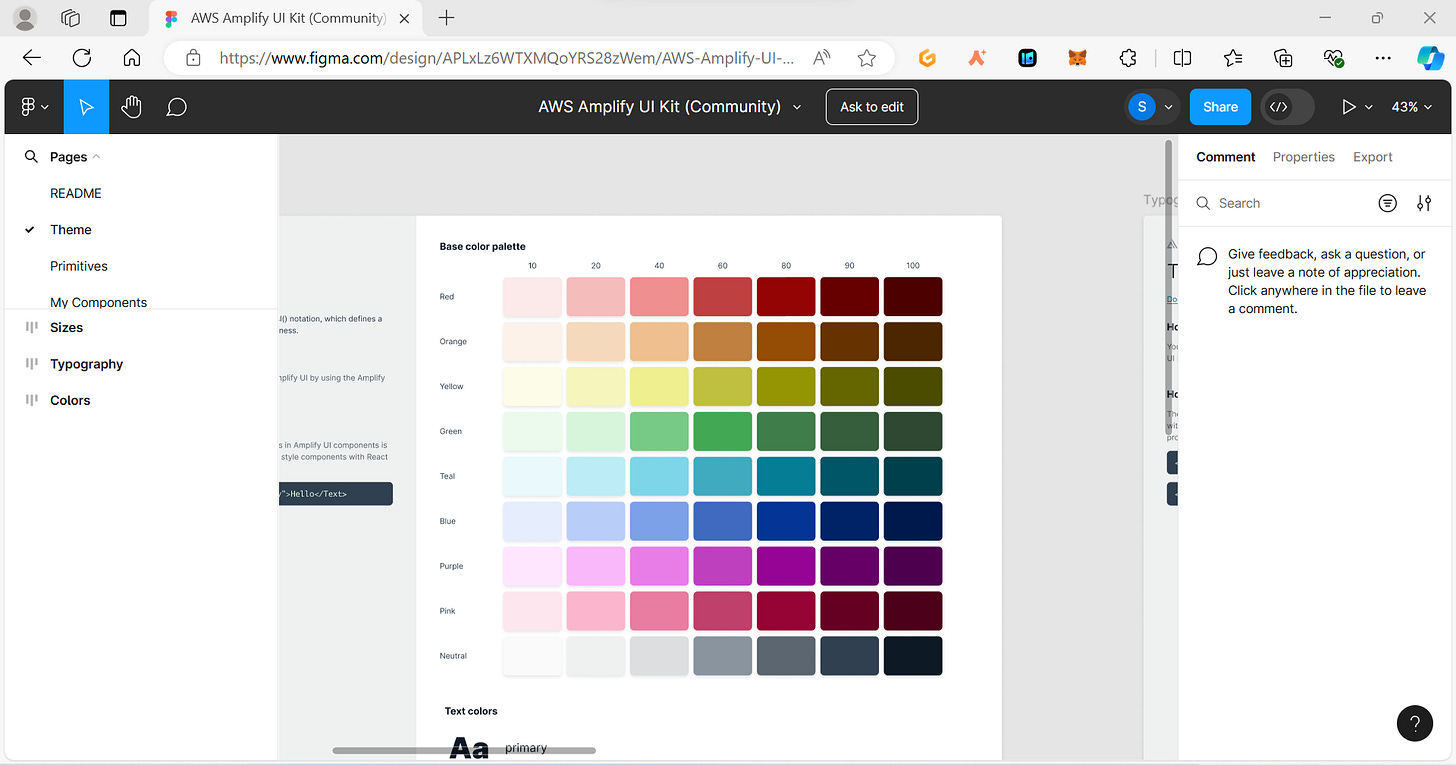
Moving on, we customize the heading style to match the one provided. You can easily access the colors used on your right. This is what it should like.
The code snippet below builds upon the previous one, focusing on how to style the heading (<h3>) element specifically within the .cta-container

Similarly, the heading (<h2>) looks like
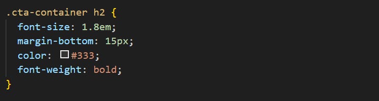
Now what exactly do these mean:
The
font-size: 1em;line controls the size of the font used for the heading.margin-bottom: 10px;adds some space (margin) below the heading. This creates a bit of breathing room between the heading and the content that follows within the CTA section.The
color: #be2ed6;line defines the color of the heading text. Here, it's set to a light purple color (#be2ed6) forh3.
Now that we've established the overall look and feel of the CTA section, let's delve into the code and see how we styled the individual elements. This next section will break down the code used for the signup form within the CTA section.
Don't worry if code seems intimidating – we'll be taking a step-by-step approach to understand its functionality!
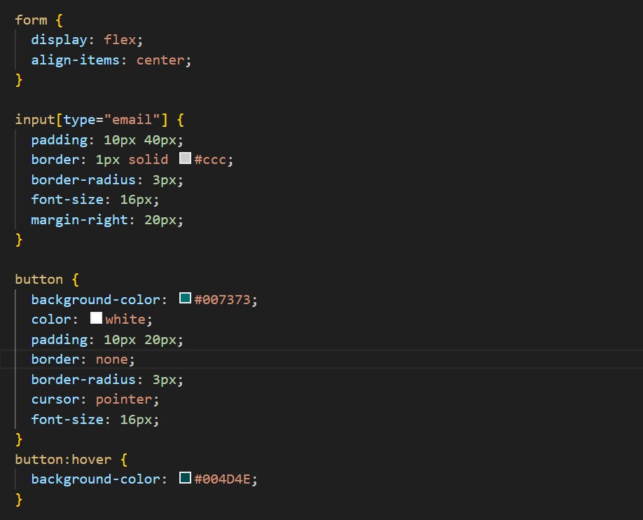
Arranging the Form Elements: The
form { display: flex; }line controls the layout of the form elements. Here,display: flex;arranges the elements (like the email input and submit button) horizontally next to each other.Aligning the Content: The
align-items: center;line ensures the content inside the form elements (like the text in the email input) is vertically centered within the form container. This creates a more visually balanced layout.
Styling the Email Input Field:
Space for Comfort:
padding: 10px 40px;adds padding around the text inside the email input field. This provides some breathing room for users typing their email address.Border and Roundness: The
border: 1px solid #ccc;line adds a thin gray border around the input field. Theborder-radius: 3px;line creates slightly rounded corners for the border, making it appear softer.Clear Text:
font-size: 16px;sets the font size of the text within the input field to 16 pixels, ensuring it's easily readable.Spacing for the Button:
margin-right: 20px;adds some space (margin) to the right side of the email input field, creating a gap between it and the submit button.
Styling the Submit Button:
A Bold Color:
background-color: #007373;defines a dark blue background color for the submit button, making it visually distinct from the rest of the form.Contrasting Text:
color: white;sets the text color of the button to white, ensuring it's clearly visible against the dark blue background.Making It Clickable:
padding: 10px 20px;adds padding to the button, similar to the input field.border: none;removes the default border around the button, creating a cleaner look. Theborder-radius: 3px;line adds rounded corners to the button, mirroring the input field. Finally,cursor: pointer;changes the cursor appearance to a pointing hand when hovering over the button, indicating it's clickable.
What’s Next - Sprinkling Responsiveness with Media Queries
A little challenge, try to make your web page responsive to ensure it adapts seamlessly to different screen sizes.
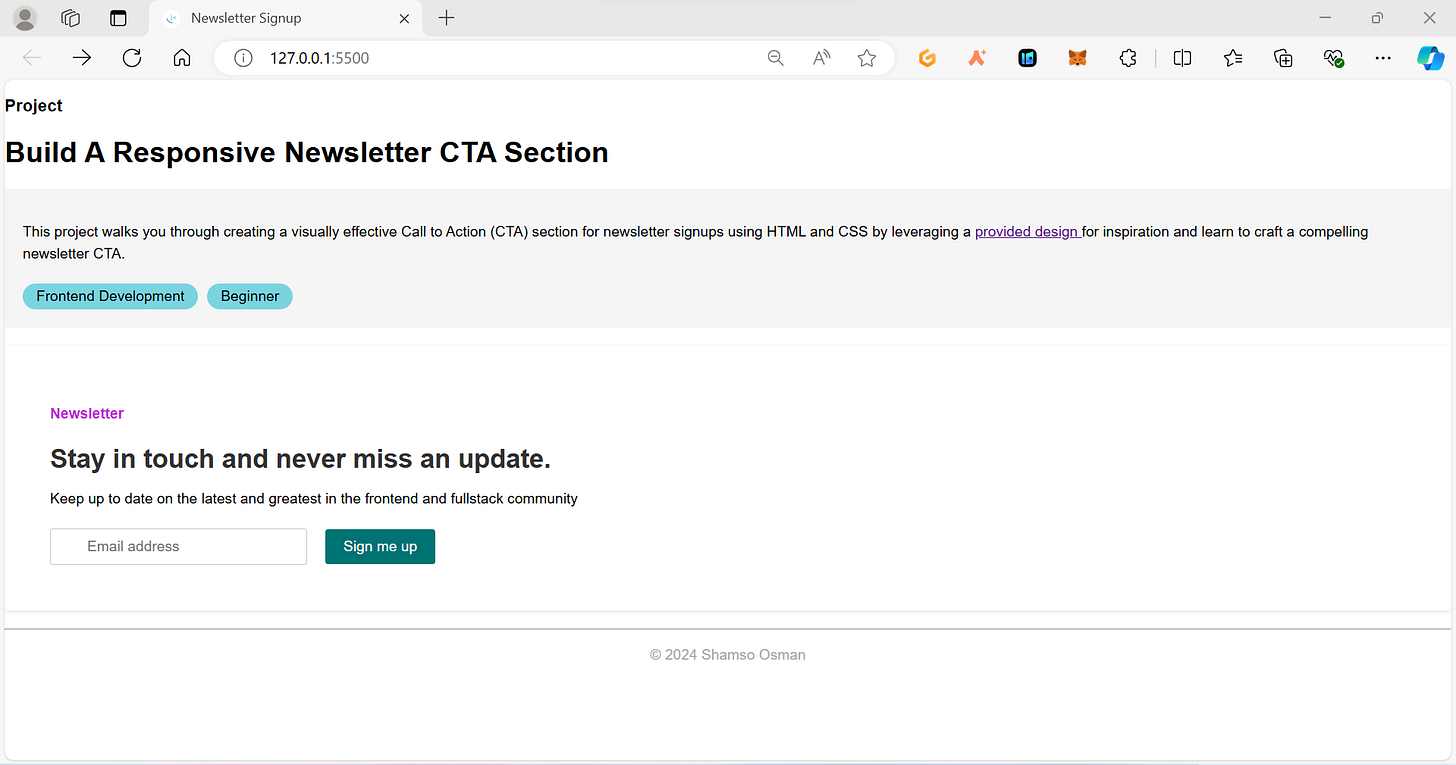
PS. I added a few intro to my web page to give a general idea of what i was building. So here is what my final project looked like:
Want to see the finished product and explore the full code? Head over to my GitHub repository
I’d like to hear what you think so feel free to comment and share your design inspirations or any challenges you faced!
Enjoying so far? Support me by ⬇️ or subscribe to my substack

Subscribe to my newsletter
Read articles from Shamso Osman directly inside your inbox. Subscribe to the newsletter, and don't miss out.
Written by
Shamso Osman
Shamso Osman
Aspiring fullstack developer. Currently studying frontend development. Enthusiastic about open source and making projects.