Anomaly Detection Using Linear Model
 Suraj Karki

Before I start, let's have some motivation:
"Cry. Forgive. Learn. Move on. Let your tears water the seeds of your future happiness."
- Steve Maraboli
This is the third lesson of the Anomaly Detection lecture series. In this lesson, we will see how can we use linear models like Linear Regression, and SVM to implement anomaly detection, so stay with me.

By the end of the blog, you will be able to:
Describe linear methods for anomaly detection
Apply linear regression models
Apply principal component analysis (PCA)
Apply one-class support vector machines (SVM)
Use Python to perform anomaly detection data with these methods
Prerequisites
Basic Python knowledge
Probability and Statistics
Linear Algebra
Basic Understanding of Linear Regression, PCA, and SVM
It would be better if you would watch my previous lesson on this series
1. What are linear models?
Linear models are a class of statistical models that assume a linear relationship between the input variables (or features) and the output variable. In other words, they assume that the response variable can be expressed as a linear combination of the input variables, possibly with some error term.
Some examples of linear models are:
Linear regression models
Principal component analysis
Support vector machines
The above linear models can do anomaly detection, The general form of a linear model can be represented as:
$$Y = \beta_0 + \beta_1 X_1 + \beta_2 X_2 + \ldots + \beta_n X_n + \epsilon$$
Where:
Y is the dependent variable (or response variable).
X1, X2,..., Xn are the independent variables (or predictor variables).
β0, β1, β2,..., βn are the coefficients of the model, representing the weights of the respective independent variables.
ϵ is the error term, representing the difference between the observed and predicted values.
2. Why are these linear models?
Let's see the example of a linear function.
$$y = mx+c$$
Such functions are the foundation for both linear regression models and SVM. It provides the score for the anomaly detection. Generally, linear functions are simple, if the original problem is non-linear, it is usually advantageous to transform it into a linear problem.
$$y = x + x^2 \Rightarrow y = x +z$$
Another use of linear is a linear map.
Formal definition:
$$f(x+y) = f(x) + f(y)$$
$$f(cx) = cf(x)$$
It is a transformation between two vector spaces (x and y) that preserves vector addition and multiplication by a scalar (c). Linear maps are an essential part of PCA as they transform original data into principal components.
3. Linear Regression Models
Linear regression models look for a relationship between dependent variables and independent variables. To understand it simply, we will start with just one dependent and one independent variable.
Simple linear regression
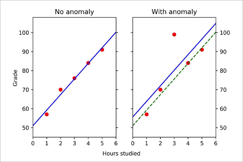
2D data: y vs. x
Look for a straight line that best fits the data
Example
Data on exam grades and hours studied
One set of normal data
One with an anomaly (that replaces a normal point)
Plot data as grade (y) vs. hours studied (x)
Fit a straight line to the data
Generally, to perform anomaly detection using linear regression, we perform the following.
Ideally, split the data into train and test datasets.
Use the train data
to get the parameters of the St. line fit
determines the distance threshold for anomalies
Apply the results to test data to detect anomalies
Scoring Anomalies
Often the square of the residuals is taken as an anomaly score.
- Large values(either above or below the fit) are anomalies.
Another approach is to use the z-score
Calculate the standard deviation of the residuals
The z-score is given by
$$z = \frac{e} {\sigma}$$
Now, implement the above technique to detect anomalies in the data.
a. Data
Here we will generate the data that have one input feature: hours studied and an output: exam grade.
# Approximately linear data
exam_data1 = np.array([[1, 2, 3, 4, 5],
                    [57, 70, 76, 84, 91]]).T
print(exam_data1)
Output:
[[ 1 57]
 [ 2 70]
 [ 3 76]
 [ 4 84]
 [ 5 91]]
Now, add an anomaly point by replacing 76 with 99.
exam_data2 = np.array([[1, 2, 3, 4, 5],
                      [57, 70, 99, 84, 91]]).T # [3, 99] is anomalous data
print(exam_data2)
Output:
[[ 1 57]
 [ 2 70]
 [ 3 99]
 [ 4 84]
 [ 5 91]]
To simplify our work, we will introduce a helper function that plots a straight line given the slope, intercept, axes (to create the figure), and the style of the line (to plot multiple lines on the same graph).
def plot_mb(m, b, ax, style):
    'plot a line y=mx+b on a matplotlib axis'
    xs = ax.get_xlim()
    ax.plot(xs, m*xs + b, style) #style is type of line
b. Analysis
Plot the two datasets together so we can easily compare them.
fig, axes = plt.subplots(1,2,sharex=True)

# Modify axes so they look nice
axes[0].set_xlim([0, 6.01])
start_x, end_x = axes[0].get_xlim()
stepsize_x = 1
axes[0].xaxis.set_ticks(np.arange(start_x, end_x, stepsize_x))
axes[0].yaxis.set_ticks_position('both')
axes[0].set_ylim([45, 108])
axes[1].set_ylim(axes[0].get_ylim())
axes[1].yaxis.tick_right() # Display tick values on the right for clarity
axes[1].yaxis.set_ticks_position('both')

# Fit a straight straight line to the linear data
lr = linear_model.LinearRegression().fit(exam_data1[:,0:1],
                                         exam_data1[:,1])
axes[0].plot(*exam_data1.T, 'ro')
plot_mb(lr.coef_, lr.intercept_, axes[0], 'b-' )

# Fit a straight straight line to data with anomaly
lr2 = linear_model.LinearRegression().fit(exam_data2[:,0:1],
                                         exam_data2[:,1])
axes[1].plot(*exam_data2.T, 'ro')

# Plot two linear fits: from data with anomaly and from normal data
plot_mb(lr2.coef_, lr2.intercept_, axes[1], 'b-')
plot_mb(lr.coef_, lr.intercept_, axes[1], 'g--')

axes[0].set_title('No anomaly')
axes[1].set_title('With anomaly')
fig.text(0.5, 0.02, 'Hours studied', ha='center', va='center')
fig.text(0.05, 0.5, 'Grade', ha='center', va='center', rotation='vertical')
plt.show()
Output:
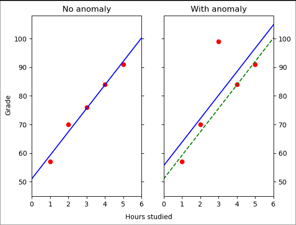
As we can see, all of the data on the left lies close to the regression model (blue line), while for the data on the right we can see that there is a point that is far from the line. This point (3, 99) is the anomaly.
Note: There are two lines in the panel on the right: the regression model for the data with the anomaly (solid blue line) and the one found from the normal data from the left panel (dashed green line). The difference between these two lines is due to the anomaly itself (all other points are unchanged). That is, anomalies affect the regression model.
It is because anomalies affect the regression model that we do the train/test split to ensure that the linear fit reflects only the normal data. Of course, such an approach presumes that we can have (or can create) a training set with only normal data.
We will now treat 'exam_data1' (no anomaly) as the training dataset and 'exame_data2' (with anomaly) as the test dataset.
x, y = exam_data1[:,0:1], exam_data1[:,1]
lr_train = linear_model.LinearRegression().fit(x, y)
print(f'Slope: {lr_train.coef_}')
print(f'Intercept: {lr_train.intercept_:.{3}}')
train_scores = (y - lr_train.predict(x))**2
print(train_scores)
Output:
Slope: [8.2]
Intercept: 51.0
[4.84 6.76 0.16 0.04 1.  ]
Let's set the threshold for anomaly detection to be just above the maximum score from the training dataset.
margin = 0.01
threshold = max(train_scores) + margin
print(f'Threshold: {threshold:.{3}}')
Output:
Threshold: 6.77
Now let's calculate the anomaly scores for the test data.
def do_linreg_anomaly_scores(train, test):
    ftrs, tgt = train[:,0:1], train[:,1]
    lr_train = linear_model.LinearRegression().fit(ftrs, tgt)
    anom_score = (test[:,1] - lr_train.predict(test[:,0:1]))**2
    return anom_score

print(do_linreg_anomaly_scores(exam_data1, exam_data2))
Output:
[ 4.84 6.76 547.56 0.04 1. ]
We see that the middle point (index=2) exceeds the threshold. It is the anomaly we introduced into the data. As a check, we can compare the anomaly score above with those of the training data.
print(train_scores)
Output:
[4.84 6.76 0.16 0.04 1. ]
Let's use this technique on a real-world dataset. The dataset used in this experiment can be obtained from here.
The ionosphere dataset from the UCI Machine Learning Database repository consists of radar returns from the ionosphere and was originally used to classify the returns as good (suitable for further research) or bad. For this notebook, we have adapted the dataset for anomaly detection. We removed two columns: one with the class labels (good or bad) and another which was a constant (0) for all data instances.
We read the data in as a pandas data frame and then place it in a numpy array for compatibility with our existing functions.
ion_df = pd.read_csv('ionosphere_data.csv', header=None)
ion_data = np.array(ion_df.values)
ion_data
Output:
array([[ 1.    ,  0.9954, -0.0589, ..., -0.5449,  0.1864, -0.453 ],
       [ 1.    ,  1.    , -0.1883, ..., -0.0629, -0.1374, -0.0245],
       [ 1.    ,  1.    , -0.0336, ..., -0.2418,  0.5605, -0.3824],
       ...,
       [ 1.    ,  0.947 , -0.0003, ...,  0.0044,  0.927 , -0.0058],
       [ 1.    ,  0.9061, -0.0166, ..., -0.0376,  0.874 , -0.1624],
       [ 1.    ,  0.8471,  0.1353, ..., -0.0668,  0.8576, -0.0615]])
For the ionosphere dataset, there isn't a natural dependent variable, so we have to choose one. Create a function linreg_anomaly_scores that returns the anomaly scores of a linear regression model where two inputs are provided: the data and the index of the feature that is the dependent variable. We will use this function to analyze the ionosphere data.
Note 1: Note that since we don't have separate training data, for simplicity you should score the anomalies on all of the data.
Note 2: You may wish to use the following helper function. For data with n features, it returns an array of length n with all entries False except for a single True values at a specified index (_idx_).
def idx_to_boolean(n, idx):
    select = np.zeros(n,dtype=np.bool)
    select[idx] = True
    return select
def linreg_anomaly_scores(data, dep_var_index):
    # Extract the dependent variable column
    y = data[:, dep_var_index]
    # Extract independent variables (all other columns)
    X = np.delete(data, dep_var_index, axis=1)

    lr_train = linear_model.LinearRegression().fit(X, y)
    anom_score = (y - lr_train.predict(X))**2
    return anom_score

linreg_scores = linreg_anomaly_scores(ion_data, 0)
Let's find out the Top 5 anomalies from the above dataset.
def find_top_anomalies(scores, k=5):
    # Find the indices of the top k anomalies
    top_anomalies_indices = np.argsort(scores)[-k:][::-1]
    return top_anomalies_indices

top_linreg_anomalies = find_top_anomalies(linreg_scores)
print("Indices of Top 5 anomalies:")
print(top_linreg_anomalies)
Output:
Indices of Top 5 anomalies:
[204 200  75  19 228]
4. Principal Component Analysis
PCA analyzes data of correlated variables to extract important information. This information is expressed as a set of uncorrelated variables called principal components.
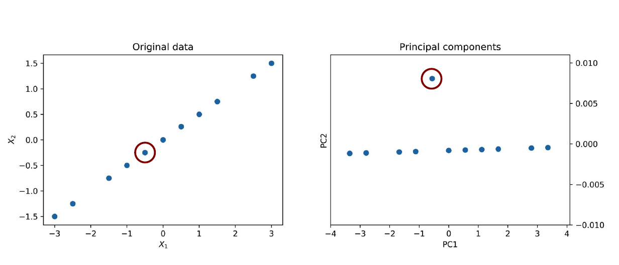
Example: 2D data: X1, X2
What are the Principal Components?
- Principal Components are linear combinations of original features.
How PC is calculated?
Make data mean centering
Calculate the covariance matrix
Find the eigenvectors and the eigenvalues
Project the data points along selected eigenvectors
Refer: https://youtu.be/7qpzFOMUeA0
PCA and Anomaly detection
Underlying Idea?
In many cases, only a few principal components (PCs) are significant, as most of the data points tend to align along a lower-dimensional feature space. This subspace captures the majority of the data's variance. Anomalies are identified as points that do not align with this subspace. The distance of these anomalies from the aligned data can be used as an anomaly score, indicating how far they deviate from the expected pattern.
How to calculate PCA-based anomaly scores:
Preprocess the data (if needed)
Compute the principal components (PCs) of the centered data
Project our examples onto the PCs
Calculate the distance between the original and the projected examples
Use the distance to score the anomalies
a. Data
pca_example = np.array([[-3, -1.5], [-2.5, -1.25], [-1.5, -0.75],
                        [-1, -0.5], [-0.5, -0.25], [0, 0], [0.5, 0.26],
                        [1, 0.5],  [1.5, 0.75], [2.5, 1.25], [3, 1.5]])
Calculate the mean of the data
# Mean of the data
mean_pca_example = np.mean(pca_example, axis=0, keepdims=True)
mean_pca_example
Out: array([[0. , 0.0009]])
Calculate the variance of the data
# Variance of the data
var_pca_example = np.var(pca_example, axis=0, keepdims=True)
var_pca_example
Out: array([[3.4091, 0.8527]])
Since the mean of this data is (practically) zero, we don't need to do mean subtraction. We should correct for the different variances, however. The typical approach is to divide each component by its standard deviation, enforcing the variance in each direction is 1.
scaled_pca_example = pca_example/np.sqrt(var_pca_example)

# show the variances are equal
scaled_pca_example.var(axis=0)
Out: array([1., 1.])
Let's plot the original data:
#Let's plot the original (i.e. unscaled) data
fig, ax = plt.subplots()
ax.scatter(pca_example[:,0], pca_example[:,1])
ax.set_ylabel('$X_2$')
ax.set_xlabel('$X_1$')
ax.set_title('Original data')
plt.show()
Output:
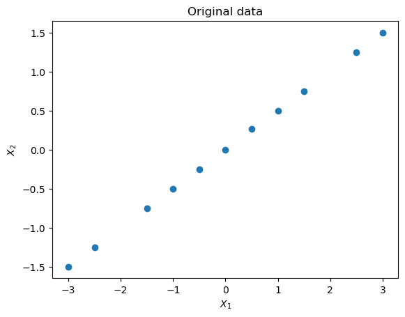
To show what PCA can do, we will apply it to our dataset and take a sneak peek at the results (using PCA from sklearn). We expect the first principal component to lie along the $X_2 = X_1/2$ line because that is the direction along which the data varies the most. And given the way we constructed the dataset, there will be almost no variation along the second principal component except for the anomaly.
pca = decomp.PCA(n_components=2)
pca.fit(scaled_pca_example)
Now, let's plot the principal components.
pca_example_trf = pca.transform(scaled_pca_example)
fig2, ax2 = plt.subplots()
ax2.scatter(pca_example_trf[:,0], pca_example_trf[:,1])
ax2.set_ylabel('$PC2$')
ax2.set_xlabel('$PC1$')
ax2.set_title('Principal components')
plt.show()
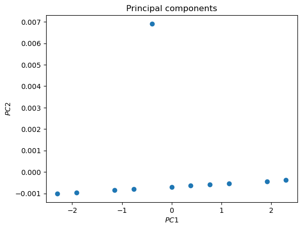
The anomaly is evident
b. Analysis
Now we'll proceed more formally. We create a function to carry out PCA on 2D data following the five steps we outlined at the beginning of this section. Instead of doing the centering and mean normalization ourselves, we will use the [StandardScaler](https://scikit-learn.org/stable/modules/generated/sklearn.preprocessing.StandardScaler.html) built into scikit-learn.
def get_1d_projected_vectors(obs, pca_object):
    # Note: The projection of vector a (data) along vector b (PC1)
    # is given by  [b / len(b)]* (len (a) cos (theta))
    # where theta is the angle between and b and the term in
    # square parenthesis is a unit vector in the b direction
    #
    # Since cos (theta) = dot(a,b)/(len(a)len(b))
    # the projection can be written as
    # projs = b*[dot(a,b)/len(b)^2]
    #
    # The term in square parethenses is y_lengths
    # The projs is calculated adding back the mean
    # subtracted previously to center the data
    #
    # This is a very explicit way of handling the calculation.
    # See notes in "higher dimension" to see a way of generalizing
    # this to higher dimensions, while encapsulating the vector math.
    ssX = StandardScaler()
    centered_data = ssX.fit_transform(obs)
    pca_dirs = pca_object.components_

    y_lengths = centered_data.dot(pca_dirs.T) / pca_dirs.dot(pca_dirs.T)
    centered_projs = y_lengths*(pca_dirs)

    # Return the data to its original uncentered (and unscaled) positions
    return ssX.inverse_transform(centered_projs)
def do_1d_pca_anomaly_scores(obs):
    fig, ax = plt.subplots(figsize=(6,6))
    ax.set_ylabel('$X_2$')
    ax.set_xlabel('$X_1$')
    ax.set_title('Original data with PCA')

    # draw data
    ax.scatter(*obs.T, label='data')

    # Step 1: center and scale the data
    ssX = StandardScaler()
    centered_data = ssX.fit_transform(obs)
    mean = ssX.mean_

    #for completeness, show mean on plot
    ax.scatter(*mean.T, c='k', marker='^', label='mean')

    # Step 2: compute prinicpal components
    # Here we focus on first PC  (greatest proportion of variance)
    pca = decomp.PCA(n_components=1)
    pca.fit_transform(centered_data)
    pca_dirs = pca.components_

    # draw principal components
    pca_endpoints = np.r_[-3.5*ssX.inverse_transform(pca_dirs),
                           3.5*ssX.inverse_transform(pca_dirs)]
    ax.plot(*pca_endpoints.T, 'y', label='PC1')

    # Step 3: Project our examples onto the PCs
    #
    projs = get_1d_projected_vectors(obs, pca)
    ax.plot(*projs.T, 'r.', label='projected data')
    ax.legend(loc='best')

    # Step 4: Calculate distance between original and projected examples
    # Step 5: Use the distance to score the anomalies
    # The distance is the Euclidean norm and
    # we use it as the anomaly score
    return nla.norm(obs-projs, axis=1)
pca_example_scores = do_1d_pca_anomaly_scores(pca_example)
Output:
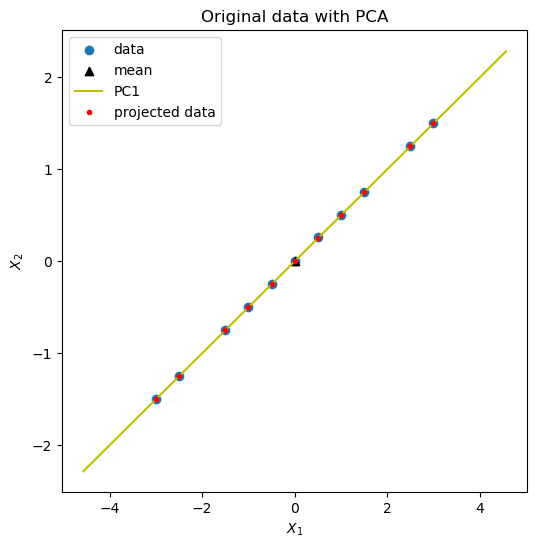
Because the data lies very close to PC1, it is hard to see the anomaly. Therefore, we look at the anomaly scores.
print(pca_example_scores)
Output: [0.0006 0.0006 0.0008 0.0009 0.0009 0.001 0.0101 0.0012 0.0012 0.0014 0.0015]
We see one score (0.0101) which is much larger than the others. To what point does it correspond?
print(pca_example[np.argmax(pca_example_scores)])
Output: [0.5 0.26]
It is the anomaly in the data. PCA worked!
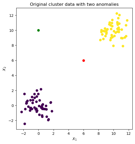
We repeat the analysis with noisier data: two Gaussian clusters seeded with two anomalies at (6.0, 6.0) and (0.0, 10.0).
blobs_X, y = sk_data.make_blobs(centers=[[0,0], [10,10]])
figure, axes = plt.subplots(figsize=(6,6))
axes.scatter(*blobs_X.T, c=y)

spike_1 = np.array([[6.0,6.0]]) # Anomaly 1
spike_2 = np.array([[0.0,10]])  # Anomaly 2
axes.scatter(*spike_1.T, c='r')
axes.scatter(*spike_2.T, c='g')
axes.set_aspect('equal')
axes.set_ylabel('$X_2$')
axes.set_xlabel('$X_1$')
axes.set_title('Original cluster data with two anomalies')

# Combine the data so that the last two points are the anomalies
cluster_data = np.concatenate([blobs_X, spike_1, spike_2])
Output:
cluster_data_scores = do_1d_pca_anomaly_scores(cluster_data)
Output:
print(cluster_data_scores)
print(cluster_data_scores.shape)
Output:
[0.6456 0.2266 0.9287 0.5814 0.9001 1.3005 0.565  0.4515 1.3206 0.8299
 1.5635 0.6027 0.2898 1.1001 0.7533 0.6241 0.137  0.8333 0.2863 0.502
 0.8871 1.2573 0.7749 0.254  2.406  0.6949 0.3452 1.0928 0.4034 1.0078
 0.6717 0.3432 1.9445 0.5918 1.4296 1.2279 1.7924 0.6055 0.6889 0.5454
 2.4338 0.6864 1.0358 0.9413 0.1853 0.3973 0.3298 1.9792 0.4995 0.7107
 0.3438 0.9774 0.4571 1.1882 0.2515 1.1072 0.684  0.0328 0.648  2.2563
 0.8597 0.9087 0.7597 0.6049 0.2546 1.5199 0.554  0.0752 1.1581 1.0778
 0.5317 1.1871 1.3058 0.3985 1.4192 0.4683 0.7969 0.3635 1.0156 0.069
 2.4411 0.2949 1.7956 0.0311 0.5547 0.6943 0.4761 0.9603 1.5184 0.1928
 0.824  0.1526 0.2846 0.1629 0.8792 1.2577 0.2657 1.0305 1.6422 0.7506
 0.0895 6.9743]
(102,)
# The point with the highest scored is one of our seeded anomalies.
print(max(cluster_data_scores))
print(cluster_data[np.argmax(cluster_data_scores)])
Output:
6.974255405908584
[ 0. 10.]
Because of the way we constructed our dataset, we know that the last two points are anomalies.
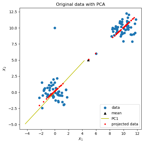
The one at (0.0, 10.0), which has index=101, is the one we found above. The other one (6.0, 6.0), with index=100, has an anomaly score of 0.0886, which is very low. This is because it lies very close to PC1. This example shows the limitations of PCA for anomaly detection with clustered data. For such data, proximity methods should also be tried.
c. Caution
- As with linear regression, anomalies can affect the modeling.
Ideally, find PCs with only normal data.
If this is not possible, after detecting anomalies, remove them from the data and repeat analysis to check PCs haven't changed significantly.
Preprocessing of data may be needed.
Also, not all data patterns are suitable for PCA.
5. Support Vector Machines
SVMs are supervised learning models used for classification. Typically used to classify data in two classes. It finds the hyperplane with the largest separation(margin) between the two classes.
Next Steps
- What if you can't neatly separate the classes?
- Not linearly separable (No suitable hyperplane)
- Transform data to high dimensional space where data is linearly separable.
- This transformation is called kernel trick.
- Use kernel function to efficiently calculate decision boundary.
- The choice of the kernel will depend on the type of data.
SVM and Anomaly Detection
Two Approaches
Have labeled normal data and anomalies
- Use SVM as a supervised learning model.
Have unlabeled data
Use one class SVMs.
Since data is unlabeled require assumptions to proceed.
One Class SVM
Two key assumptions
The data provided all belong to the normal class
- Since data may contain anomalies this results in a noisy model.
The origin belongs to the anomaly class
- Origin is the kernel-based transformed data.
One-class SVM typically returns anomalies (-1) or normal points (+1). We, however, are interested in scoring our points and then ranking them by score. Therefore, we will use the decision_function provided which returns the signed distance to the separating hyperplane (negative distances are anomalies). To be consistent without the previous convention, where larger positive scores reflect more anomalous points, we need to take the negative of the decision_function .
def do_svm_anomaly_scores(obs):
    oc_svm = svm.OneClassSVM(gamma='auto').fit(obs)
    scores = oc_svm.decision_function(obs).flatten()

    # Find the largest score and use it to normalize the scores
    max_score = np.max(np.abs(scores))

    # scores from oc_svm use "negative is anomaly"
    # To follow our previous convention
    # we multiply by -1 and divide by the maximum score to get scores
    # in the range [-1, 1] with positive values indicating anomalies
    return - scores / max_score
Apply the one-class SVM to the cluster dataset of the previous section. Look at both the raw scores and the top five points (by score).
print(do_svm_anomaly_scores(cluster_data))
print (do_svm_anomaly_scores(cluster_data).argsort()[-5:])
[ 0.0945 -0.      0.0798 -0.0711  0.0264  0.013   0.018   0.      0.
  0.2802  0.0482  0.0213 -0.0535 -0.0631  0.268  -0.0563  0.     -0.0672
 -0.0143 -0.0117  0.0313 -0.0058 -0.     -0.0446  0.256  -0.0468 -0.0243
 -0.0483 -0.0598  0.3446 -0.0522 -0.0209  0.2611  0.8517  0.      0.3635
  0.2024 -0.0025 -0.0231 -0.0123  0.4898 -0.0188  0.0725 -0.0418 -0.0296
  0.4273 -0.0115  0.0634 -0.0001 -0.0066 -0.0377 -0.0622 -0.0396  0.
 -0.0297  0.0405 -0.0091  0.0001 -0.0918  0.4571  0.      0.0066  0.044
 -0.0591  0.32    0.0451 -0.0001 -0.0257  0.4282  0.11   -0.0487  0.0126
  0.075  -0.0897  0.2638 -0.0207 -0.0153 -0.0131  0.3245  0.1185  0.2848
 -0.0885  0.1482 -0.0398  0.0109  0.0867 -0.0181  0.1021  0.4206 -0.0282
  0.4633 -0.0467 -0.0072  0.0793 -0.0781 -0.0184 -0.0138  0.0814  0.074
  0.1525  0.9995  1.    ]
[ 90  40  33 100 101]
The two seeded anomalies (index=100 and 101) are the two highest ranked points. The performance is better than PCA, but the process of anomaly detection is less transparent.
If you still have questions, please contact me at suraj.karki500@gmail.com or in the comments section below!
If you want to learn more about this topic, please check the references below.
An Introduction to Linear Regression Analysis by D.C. Montogomery, E.A. Peck, C.G. Vining (Wiley 2013)
Principal Component Analysis by H. Abdi, L. J. Williams (2010)
A User’s Guide to Support Vector Machines by A. Ben-Hur, J. Weston (2007)
This much for today; see you in the next blog. Take care! Cheers!

Subscribe to my newsletter
Read articles from Suraj Karki directly inside your inbox. Subscribe to the newsletter, and don't miss out.
Written by

Suraj Karki
Suraj Karki
I am a Computer Engineer who has a passion for exploring, learning, and teaching technological stuff. I have a keen interest in Artificial Intelligence and I am learning it.