CSS Flexbox vs Grid: Which Layout Method to Use?
 Kirsty
Introduction
In this article, I will teach you how to create a layout commonly used when creating layouts using first CSS Grid and then CSS Flexbox.
You will learn the differences between the two methods and have a better understanding of how to use them in your projects.
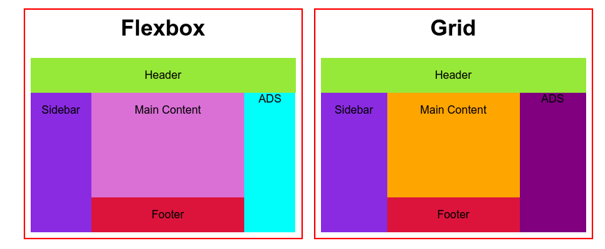
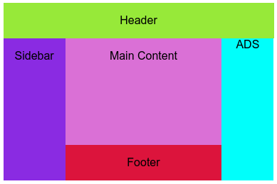
This is a common web design pattern, with a header, right and left sidebar, main content section and a footer.
By the end of this article, you will have learned how to create this layout in both CSS Grid and Flexbox.
Prerequisites
Basic understanding of HTML
Basic understanding of CSS
CSS Grid Approach
To create the layout we need we need most simply, we need to become familiar with the numbering of our grid. This is referred to as the grid track. We can place items according to their position within the grid track. We do this using either the grid-row or the grid-column properties.
Below is an example of the grid track. Using this track you will be able to position elements within your Grid container where you would like them to be.
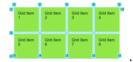
This view is available through the Chrome Developer Tools.
Inspect > Elements > Layout > Grid Overlaysif you need to check your grid at any time, it is always valuable to know this information.
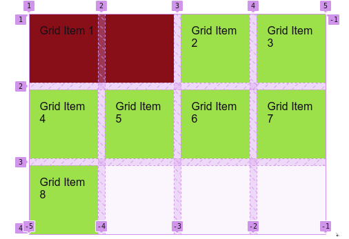
Continuing with our example, moving the Grid Item 1 square in the above example encompasses the region of the second grid item we achieve that with the grid-column property and a value of 1/3. This takes the square and spans it to the third grid column track.
.one {
    grid-column: 1/3;
    width: 100%;
    background-color: maroon;
}
This is the result of spanning the grid item using grid-column: 1/3.
Grid layout CSS
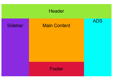
You will build this layout.
CSS Grid - Set-up HTML
<div class="wrapper grid">
    <div class="header">Header</div>
    <div class="sidebar">Sidebar</div>
    <div class="main-content">Main Content</div>
    <div class="ad-content">ADS</div>
    <div class="footer">Footer</div>
</div>
CSS Grid - Building the layout
The first thing you need to do is to declare your container as a grid by providing a display: grid. This turns all items inside your grid container into grid child items.
.grid {
    display: grid;
    grid-template-columns: repeat(4, 1fr);
    grid-template-rows: repeat(4, 1fr);
}
To create the header that takes the whole width of the page you need to provide a start/end value to the grid-column property.
This tells your .header element to begin at the first column track, and continue to the very last column track.
.grid > .header {
    grid-column: 1/-1;
    grid-row: 1/1;
}
You can now see your layout taking shape, you have a header that spans the entire width of the page with two CSS declarations.
To continue, you now need to create your sidebar.
Your sidebar runs down the left side of the page, beginning just below your header. Where your header ends at the first track. Your sidebar begins at the second track on the grid. Using the grid-row property we can assign the value to be 2/-1. This starts the sidebar at the second track and ends it at the last track. Using a negative one value means the end of the track.
Your sidebar also only takes a small fraction of space from the width of the page. You can use the grid-column: 1/2 declaration to have your sidebar start at the first column track and then end at the second column track.
.grid > .sidebar {
    grid-row: 2/-1;
    grid-column: 1/2;
}
Onto the main content element.
We need to ensure it spans more than one row in height, and we also need to ensure it spans double the space to leave room for the second sidebar to the right. This can be achieved with this CSS:
.grid > .main-content {
    grid-row: 2/-1;
    grid-column: 2/4;
}
This CSS makes certain that the main-content height does not reach the end of the page, you still need to add the footer. However, it does span the space in the middle.
You now need to add the CSS for your secondary sidebar.
.grid > .ad-content {
    grid-row: 2/-1;
}
Because you want the secondary sidebar to span the remaining space after your main content using a negative value as the endpoint in your grid-row works.
Finally, we have our footer.
For this section, we use a grid-row property which defines the starting point as 2 making sure that the column runs from the end of the sidebar to the beginning of the secondary sidebar.
.grid > .footer {
    grid-row: -2/-1;
    grid-column: 2/4;
}
You have now completed a layout in CSS Grid. 🎉🎉
We have one more option to create this common layout: Flexbox ✨
Flexibility with CSS Flexbox
Before getting into the layout with Flexbox there are a few key things you need to understand about the difference between Flexbox and Grid. The first is, Flexbox is is either a row or a column.
It is two-dimensional, whereas Grid is three-dimensional and allows for greater control.
Remember this. CSS Grid can be anywhere on the Grid you define. Flexbox is either a row or a column. Nothing more.
Both are excellent for responsive design, but, both are fundamentally different tools and understanding that is important.
Flexbox layout CSS and Markup
This layout cannot be achieved without some manipulation of the HTML structure.
Flexbox - Set-up HTML
<div class="wrapper flex">
    <!-- Header containing element -->
    <div class="header-content--flex">
        <div class="header">Header</div>
    </div>
    <!--Sidebar containing element-->
    <div class="sidebar-content--flex">
        <!--Sidebar element as first child-->
        <div class="sidebar">Sidebar</div>
        <!--Main content containing element-->
    <div class="main-content--flex">
        <!--Main content and footer as child elements-->
        <div class="main-content">Main Content</div>
        <div class="footer">Footer</div>
    </div>
    <!--Secondary sidebar element-->
    <div class="ad-content--flex">ADS</div>

    </div>

</div>
Because Flexbox can only be turned into a row or a column, you need to nest folders and then apply the display: flex property to achieve your desired layout. The HTML above achieves that.
Let us go through the HTML to understand better.
wrapperdiv contains all children which will make up the layout.header-content--flexcontains the single.headerelement. This will be a full-width element..sidebar-content--flexhas three children:One is the
.sidebarelement.Second is the
.main-content--flexcontainer with two children:One is the
.main-contentelementSecond is the
.footerelement
Third is the
.ad-contentelement.
.main-content--flex {
    width: 100%;
}

.main-content--flex > .main-content {
    background-color: orchid;
    height: 150px;
}

.sidebar-content--flex {
    display: flex;
}
The nature of Flexbox being either a row or a column means to create your layout you only need to display: flex on container. Doing this will align all the items in the flexed parent container into the default of a row of elements.
In this layout, when you add the display flex property to the .sidebar-content--flex container all the elements in it are aligned side by side.
With one property on one containing element, you have completed a layout using CSS Flexbox. 😀
Conclusion
In this article, you learned how to create a common layout using CSS Grid or Flexbox. 👏👏
Along the way, you learned how Grid items are aligned when a parent container is declared a grid container. You also learned how Flexbox aligns items in a parent container with the display: flex property.
If you ever want to challenge yourself consider signing up to HNG it is a great way to learn and build projects, they have an internship and a network that finalists can be added to if their performance is good during the internship.
I hope this was a helpful and informative read. 😀
Subscribe to my newsletter
Read articles from Kirsty directly inside your inbox. Subscribe to the newsletter, and don't miss out.
Written by

Kirsty
Kirsty
Hi, I’m Kirsten, a passionate web developer. I’m using JavaScript, React, and more to build impactful projects. After 2 years of learning through trial and error, I’m ready to share my journey and create work that solves problems. 📬 Connect with me: Twitter: twitter.com/km_fsdev Blog: kirsty.hashnode.dev GitHub: github.com/ofthewildire