HNG Stage 0 Task - Data Analysis
 Rhoda Oduro-Nyarko
Table of contents

Technical Report
Introduction
In this article, I will be exploring the Titanic dataset to analyze the survival rate of passengers that were on the ship when it sunk. The dataset can be found on Kaggle using this link. The review is meant to present observations I made through a quick analysis of the dataset to highlight key trends I observe at first glance.
Observation
Initial Analysis
Import
pandasand load datasetI started off by importing the pandas library for data manipulation and analysis and loaded the
train_datadataset, saving it as a data frame.import pandas as pd train_data = pd.read_csv("train.csv")Then using the
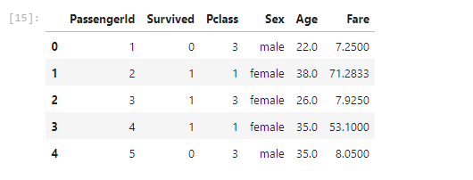
.head()method, I displayed the first 10 rows of the dataset for a first glance.train_data.head(10)
From the result, it is observed that the dataset has 12 columns namely,
PassengerId,Survived,Pclass,Name,Sex,Age,SibSp,Parch,Ticket,Fare,Cabin,Embarked.Drop columns not needed
Columns that would not be needed for this task were then dropped from the data. The columns that were dropped were
Name,SibSp,Parch,Ticket,CabinandEmbarked. View first few rows of the data to see the changes made.columns_to_drop = ['Name', 'Ticket', 'Cabin', 'Embarked', 'SibSp', 'Parch'] clean_train_data = train_data.drop(columns = columns_to_drop) clean_train_data.head()
Find missing values
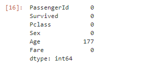
I searched for missing values in the data and replaced them. Of all the column left, I observed there were missing values in the
Agecolumn. What I did was to find the average of theAgecolumn and replace all missing values with that average.clean_train_data.isnull().sum()
  median_age = clean_train_data['Age'].median()
  median_age
  clean_train_data['Age'].fillna(median_age, inplace=True)
  clean_train_data.head()
Check for missing values again to see changes take effect.
clean_train_data.isnull().sum()
Further Analysis and Survival Rate
Find total number of
maleson board per the dataset.total_males = clean_train_data['Sex'].value_counts()['male'] total_males
There was a total of
577 maleson the Titanic.Find total number of
femaleson board per the dataset.total_females = clean_train_data['Sex'].value_counts()['female'] total_females
There was a total of
314 femaleson the Titanic.Find total number of Survivors.
From this point, I decided to find out the total number of people who survived the unfortunate sinking of the Titanic.
  total_survivors = clean_train_data['Survived'].sum()
  total_survivors
Out of the
891people, only342people survived. This shows that the survival rate was lower than the death rateSurvivors by Gender
I also tried to analyze the
SurvivedandSexcolumns to see which portion of those who survived weremaleand which werefemalesurvivors = clean_train_data[clean_train_data['Survived'] == 1] survivors_by_gender = survivors['Sex'].value_counts() survivors_by_gender
From the above code snippet and output, we observe that of the
342people that survived,233were female and109were male. The larger number of females surviving shows thatfemaleshad a higher chance of survival as compared tomales.Survival Rate by Gender
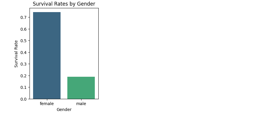
Now it would be interesting to see how a passenger's gender affected their rate of survival using visualizations. I'll start by importing
seabornandmatplotlib.pyplotlibraries assnsandpltrespectivelyimport seaborn as sns import matplotlib.pyplot as pltCalculate survival rate by
Gendersurvival_by_gender = train_data.groupby('Sex')['Survived'].mean() survival_by_gender
Plot graph to visualize the rate of a Passenger surviving based on their
Genderplt.figure(figsize=(3, 4)) sns.barplot(x=survival_by_gender.index, y=survival_by_gender.values, palette='viridis') plt.title('Survival Rates by Gender') plt.xlabel('Gender') plt.ylabel('Survival Rate') plt.show()
Survival Rate by Passenger Class
Now, I will also visualize the Passenger's rate of survival based on their Class on the Titanic.
Calculate survival rate by
Classsurvival_by_class = clean_train_data.groupby('Pclass')['Survived'].mean() survival_by_class
Plot the graph to visualize the rate of a Passenger's survival based on their Class.
  plt.figure(figsize=(3, 3))
  sns.barplot(x=survival_by_class.index, y=survival_by_class.values, palette='viridis')
  plt.title('Survival Rates by Passenger Class')
  plt.xlabel('Passenger Class')
  plt.ylabel('Survival Rate')
  plt.show()
Conclusion
The observation and simple analysis of the Titanic dataset provides insight into patterns of a Passenger's survival based on their Sex and Class. It can be observed that the economic standing of passengers has an impact on their rate of survival as majority of those that survived were in first class. Also, I observed that the gender of a passenger played a huge role in their survival as majority of the survivors were female.
This article was assigned as an onboarding task in the HNG 11 Internship. I would recommend joining the internship using this link. If you want a certificate at the end, use this link instead.
Subscribe to my newsletter
Read articles from Rhoda Oduro-Nyarko directly inside your inbox. Subscribe to the newsletter, and don't miss out.
Written by
