First Glance at Retail Sales Data: A Technical Report
 Carlson Oranu
Introduction
Greetings, data enthusiasts, welcome to the exciting world of retail sales data! Today, we are diving into a dataset from Kaggle that gives us a peek into the bustling world of retail transactions. This dataset, provided by Kyanyoga, includes sales data across various regions and product lines useful for Sales Simulation training.
Our objective? To get a feel for the data, like browsing a new store. We'll identify initial trends, patterns, and anything that piques our curiosity. this is just the first peek, but it will pave the way for a deeper later analysis.
So, What's in the dataset?
A quick dataset review reveals a treasure trove of information on individual sales transactions. We've got product IDs, quantities sold, customer IDs, and timestamps - everything to understand what buying trends across various geographical locations or abnormalities are hiding in our data set.
Observations
Early Glimmers: A Visual Shopping Spree
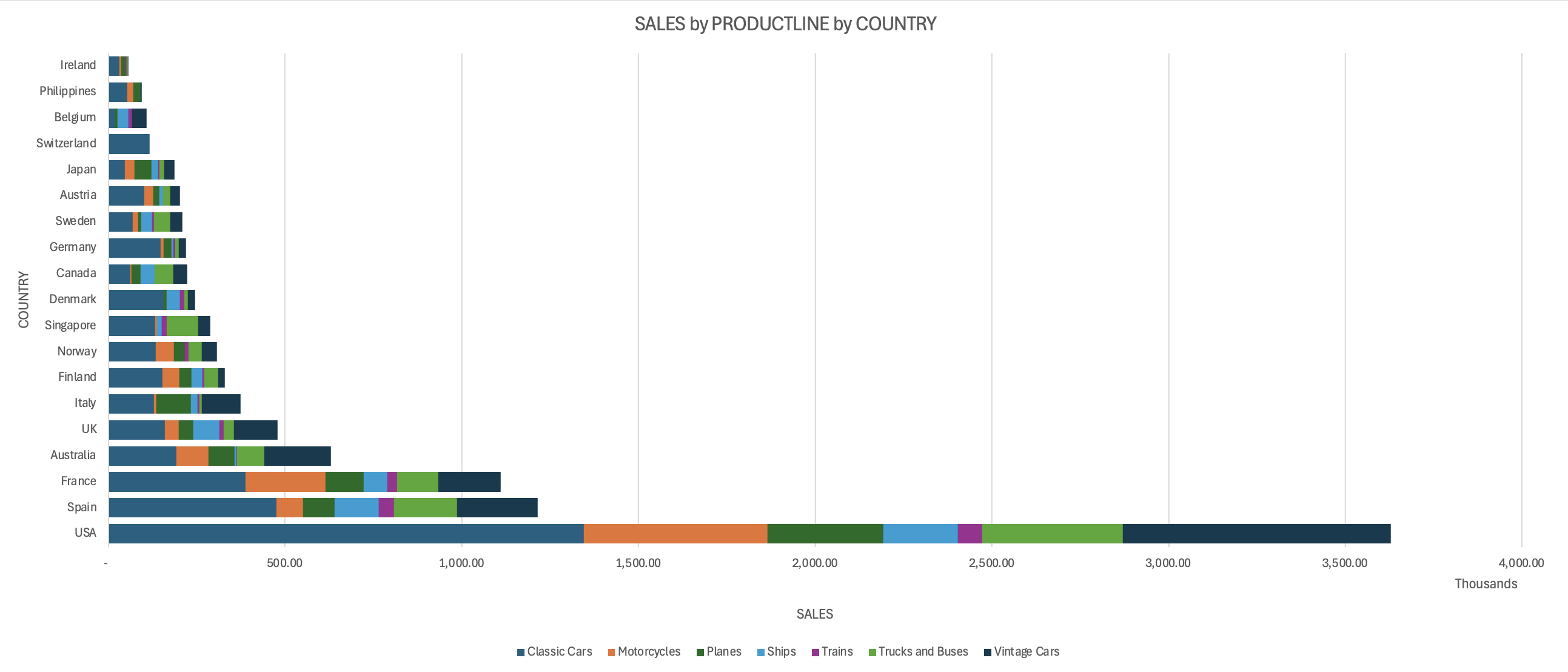
Let's paint a picture with some basic data visualizations. We can whip up a pivot chart to see which countries have the most sales – is it a scenario where sales are evenly distributed across all countries or a complete sales monopoly? We can also peek at the product line and see what is responsible for most of these sales. Are there more motorcycle sales, classic car sales, ships, planes, trains, or truck sales that are driving the revenue?

From the pivot stacked bar chart we did above, we can now get a visual glimpse of what our data looks like. we can easily see that the USA has the most sales by a wide margin, and this large number of sales is driven by its sales of classic cars. While Ireland has the least sales.
We can also see that classic cars are the most sold product line generally, this is followed by the vintage cars product line. while the least sold product line is the train.
Spotting the Intriguing Aisle
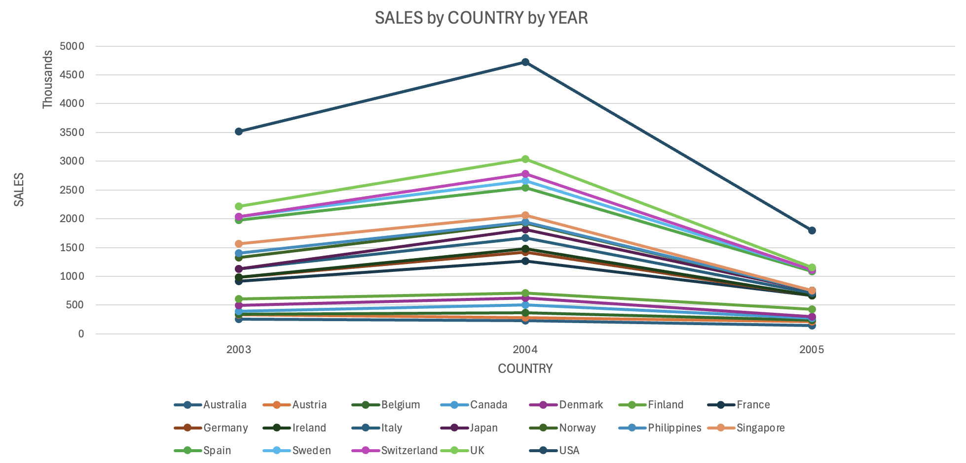
One initial question that also pops to mind: How did each country's sales perform over time? We can use simple summary statistics to identify the top-years (by quantity or country), unearthing the sales trends over the years.

From our line chart visualization, we can see that the grand total sales have consistently increased across all the countries from 2003 to 2004. After 2003, there was a significant drop in sales across all the countries, recording sales lower than in 2003. The USA and the UK have consistently been the highest contributor to sales, with a significant increase from 2003 to 2004 suggesting a strong market presence in these countries.
Conclusion and Next Steps
This initial exploration has been like browsing the first few aisles of a store. We've seen some interesting product lines (top sellers!), noticed best-performing countries (USA), and identified areas for further investigation.
Now that we have seen the trends, the next relatable questions will be - Why did the overall sales significantly drop in 2005? Why did the drop affect most of the countries simultaneously? Was the drop consistent across all product lines? These are all questions that can be answered with further analysis.
The next step? We'll delve deeper, analyzing customer behaviour, identifying deeper sales trends, and maybe even predicting what you'll toss in your shopping cart next! Stay tuned for a more in-depth analysis, where we'll truly understand what drives the most revenue and the factors that are responsible for the sales trends
Author's Note
This analysis was done as an introductory task for the HNG Internship. You can register for the HNG Internship here, or you can find and hire the best talent for your projects here.
You can find the data used for this analysis here.
Subscribe to my newsletter
Read articles from Carlson Oranu directly inside your inbox. Subscribe to the newsletter, and don't miss out.
Written by
