🎨 Unleashing the Power of MUI: Transform Your React App with Material-UI 💎
 Aditya Dhaygude
🌟 Introduction
Picture this: you’re crafting a stunning React application, but something is missing. You want it to be sleek, modern, and user-friendly. Enter MUI (Material-UI), the knight in shining armor for React developers. MUI brings the elegance of Google's Material Design to your React app, making it both beautiful and functional. Join us on this journey as we delve into the magic of MUI and how it can elevate your projects to new heights. 🌠
🔍 What is MUI?
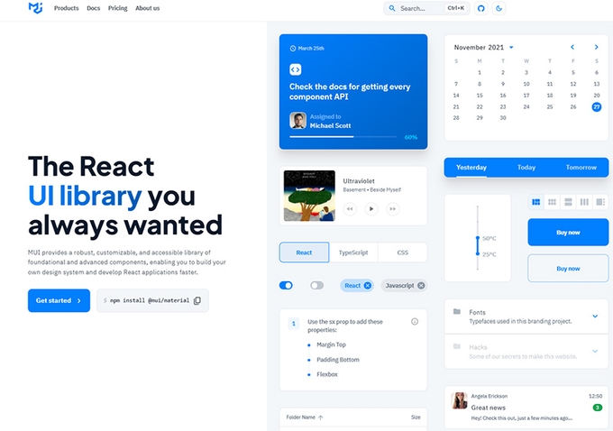
MUI, formerly known as Material-UI, is a popular React component library that implements Google's Material Design. It offers a comprehensive suite of components, styles, and tools that enable developers to create visually appealing and responsive web applications with ease. Think of MUI as your toolkit for designing delightful user experiences. 🎨
🤔 Why Choose MUI?
1. Consistency and Aesthetics 🎨
MUI ensures that your application follows Material Design guidelines, providing a consistent and polished look across all components.
2. Comprehensive Component Library 🧰
With a vast collection of pre-built components, MUI reduces the need to build common UI elements from scratch, speeding up your development process.
3. Customizability 🔧
MUI offers extensive theming capabilities, allowing you to tailor the design to match your brand's identity.
4. Responsive Design 📱
MUI's components are designed to be responsive out of the box, ensuring a great user experience on any device.
5. Active Community and Support 🌍
MUI boasts a large and active community, with excellent documentation and support to help you along the way.
🚀 Getting Started with MUI
Step 1: Install MUI
To get started, install the core MUI package and the icons package:
npm install @mui/material @emotion/react @emotion/styled @mui/icons-material
Step 2: Import MUI Components
In your App.js file, import and use MUI components:
import React from 'react';
import { Button, Typography } from '@mui/material';

function App() {
  return (
    <div>
      <Typography variant="h1">Welcome to My MUI App</Typography>
      <Button variant="contained" color="primary">
        Get Started
      </Button>
    </div>
  );
}

export default App;
🌟 Core Components of MUI
1. Buttons 🖲️
Buttons are essential in any application. MUI offers a variety of button types with different styles and functionalities:
<Button variant="contained" color="secondary">Click Me</Button>
<Button variant="outlined">Outlined Button</Button>
<Button variant="text" color="primary">Text Button</Button>
2. Typography ✍️
Typography is key to making your content readable and attractive. MUI provides a range of typography components:
<Typography variant="h2">Heading 2</Typography>
<Typography variant="body1">This is body text.</Typography>
3. Grids 🌐
MUI’s grid system helps you create responsive layouts with ease:
import { Grid } from '@mui/material';

<Grid container spacing={3}>
  <Grid item xs={12} md={6}>
    <Typography variant="h6">Left Column</Typography>
  </Grid>
  <Grid item xs={12} md={6}>
    <Typography variant="h6">Right Column</Typography>
  </Grid>
</Grid>
4. Cards 💳
Cards are perfect for displaying information in a concise and visually appealing way:
import { Card, CardContent, CardActions } from '@mui/material';

<Card>
  <CardContent>
    <Typography variant="h5">Card Title</Typography>
    <Typography variant="body2">Card content goes here.</Typography>
  </CardContent>
  <CardActions>
    <Button size="small">Learn More</Button>
  </CardActions>
</Card>
🎨 Customizing Your Theme
One of MUI’s standout features is its powerful theming capabilities. You can create a custom theme to match your brand's identity:
import { createTheme, ThemeProvider } from '@mui/material/styles';

const theme = createTheme({
  palette: {
    primary: {
      main: '#1976d2',
    },
    secondary: {
      main: '#dc004e',
    },
  },
  typography: {
    fontFamily: 'Roboto, sans-serif',
  },
});

function App() {
  return (
    <ThemeProvider theme={theme}>
      <YourComponent />
    </ThemeProvider>
  );
}
🔧 Advanced Features
1. Custom Components 🔍
Create custom components that follow Material Design principles by extending MUI components:
import { styled } from '@mui/material/styles';
import { Button } from '@mui/material';

const CustomButton = styled(Button)({
  backgroundColor: 'purple',
  color: 'white',
  '&:hover': {
    backgroundColor: 'darkpurple',
  },
});

<CustomButton>Custom Styled Button</CustomButton>
2. Server-Side Rendering 🌐
MUI supports server-side rendering, making it a great choice for SEO-friendly applications:
import { ServerStyleSheets } from '@mui/styles';

const sheets = new ServerStyleSheets();
const html = renderToString(sheets.collect(<App />));
const css = sheets.toString();
3. Accessibility ♿
MUI components are built with accessibility in mind, ensuring your app is usable by everyone:
<Button aria-label="Add" onClick={handleClick}>Add</Button>
🌟 Real-World Applications
1. Netflix 🎥
Netflix uses MUI to create a seamless and engaging user experience, showcasing its vast library of content beautifully.
2. Spotify 🎵
Spotify leverages MUI for its sleek and responsive design, ensuring users can easily navigate through their favorite tunes.
3. Medium 📝
Medium uses MUI to deliver a clean and intuitive reading experience, making it easy for users to discover and enjoy articles.
🎉 Conclusion
In the dynamic world of web development, MUI stands out as a beacon of style and functionality. Its comprehensive component library, coupled with powerful customization options, makes it an indispensable tool for React developers. Whether you're building a small personal project or a large-scale application, MUI will help you create interfaces that are not only beautiful but also highly functional. So, grab your palette and start painting your masterpiece with MUI! 🎨✨🚀
Subscribe to my newsletter
Read articles from Aditya Dhaygude directly inside your inbox. Subscribe to the newsletter, and don't miss out.
Written by

Aditya Dhaygude
Aditya Dhaygude
i Build Stuff