Shadows in CSS
 Jalaj Singhal
Shadow is something that can be seen in bright light, but the shadow on a website can be created anywhere we feel that it might look good.
Generally, we see that shadows have a particular shape and size, but while building a website, we can see the shadows of multiple things from different angles.
Here, we can even change the color of the shadow as per our will.
SYNTAX
Box-shadow: [horizontal-offset] [vertical-offset] [blur-radius] [spread-radius] [color];
Terms:
Horizontal Offset (required): This specifies how far away from the element the shadow is supposed to offset horizontally. The shadow is moved to the right by a positive value and to the left by a negative number.
Vertical Offset (required): The height at which the shadow should be displaced from the element. The shadow is moved up or down by a positive or negative number.
Blur Radius (optional): This parameter controls how blurry the shadow will be. The shadow will be more hazy the higher the value. The shadow will display a sharp edge if the value is zero.
Spread Radius (optional): The spread radius modifies the shadow's size. A positive value makes the size larger, while a negative value makes it smaller. If left out, the blur radius automatically calculates the shadow size.
Color (optional): The shadow's color, if applicable. You may represent colors using various methods, including named colors, RGB, HEX, or HSL values.
Example:
<!DOCTYPE html>
<html lang="en">
<head>
    <meta charset="UTF-8">
    <meta name="viewport" content="width=device-width, initial-scale=1.0">
    <title>Document</title>
    <style>
        *{
            margin: 0;
            padding: 0;
            background-color: black;
        }
        .element {
            color: coral;
            font-size: 100px;
            background-color: aqua;
            text-shadow: -1px 0 black, 0 1px black, 1px 0 black, 0 -1px black;
        }
    </style>
</head>
<body>
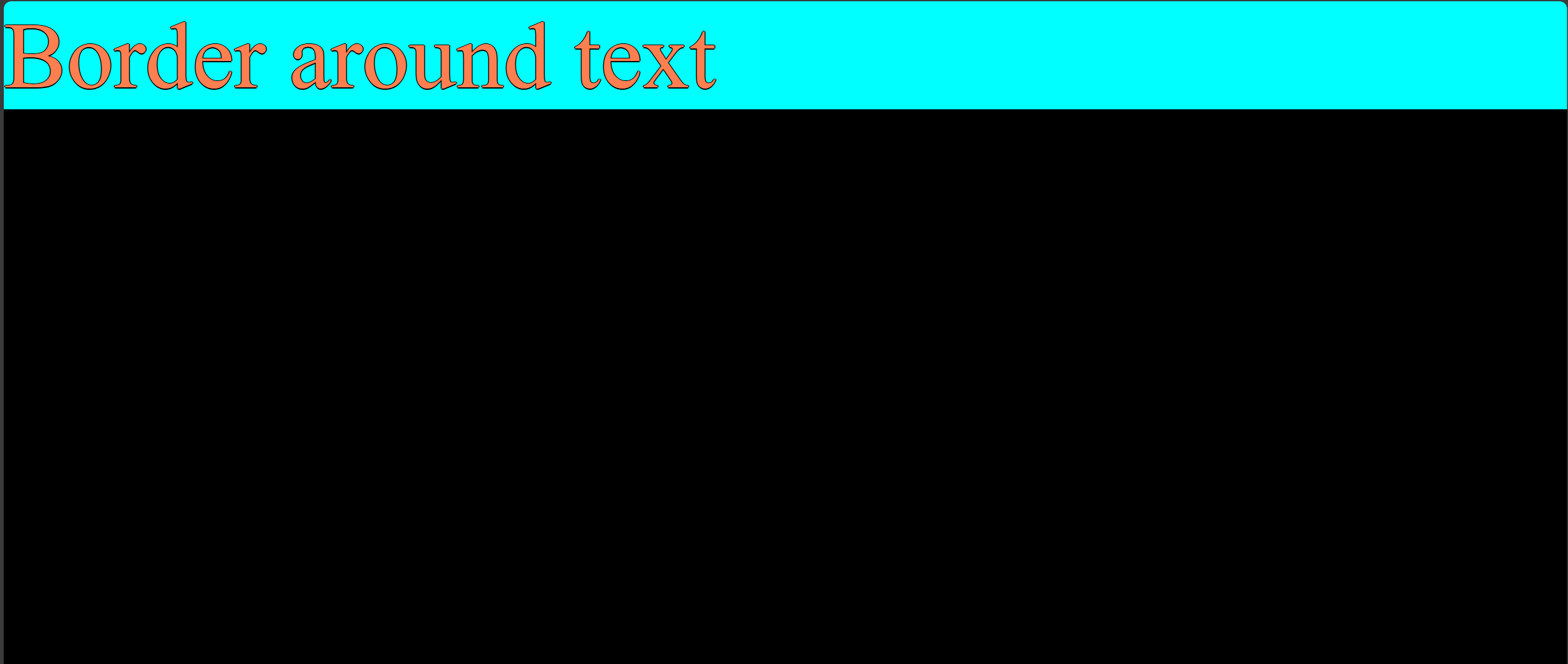
    <div class="element">Border around text</div>
</body>
</html>
OUTPUT:

Subscribe to my newsletter
Read articles from Jalaj Singhal directly inside your inbox. Subscribe to the newsletter, and don't miss out.
Written by

Jalaj Singhal
Jalaj Singhal
👋 Greetings, Jalaj Singhal here! 🚀 I'm an enthusiastic blogger who enjoys delving into the world of technology and imparting my knowledge to the community. 📃 Having experience in HTML and CSS, I enjoy creating interesting and educational content that demystifies difficult ideas and gives readers the tools they need to advance their knowledge. 🌐 I try to contribute to the active tech community and encourage relevant discussions on Hash Node, where you can find my writings on the subject of web development. 💡 Together, let's connect and go out on this fascinating path of invention and learning!